The borrowing of older styles inherent in postmodern aesthetics permuted from a reactive criticism of modernism into an amateur reduction. Due to increasing digital technology and the democratization of industry design tools, personal computers, powerful graphics programs, and instant access to virtually every typeface ever made, lowered the barrier for entry into the world of typography. The legacy of postmodernism regressed into a design culture of amateurism that showcases a lack of historical context, rather than a penchant for experimentation and normative rejection. Graphic design, and by extension, typography still exists in a state of postmodernism, but that state devolved from the roots of the digital revolution to a free-for-all mix-mash of accidental intent into a condition of amateurism.
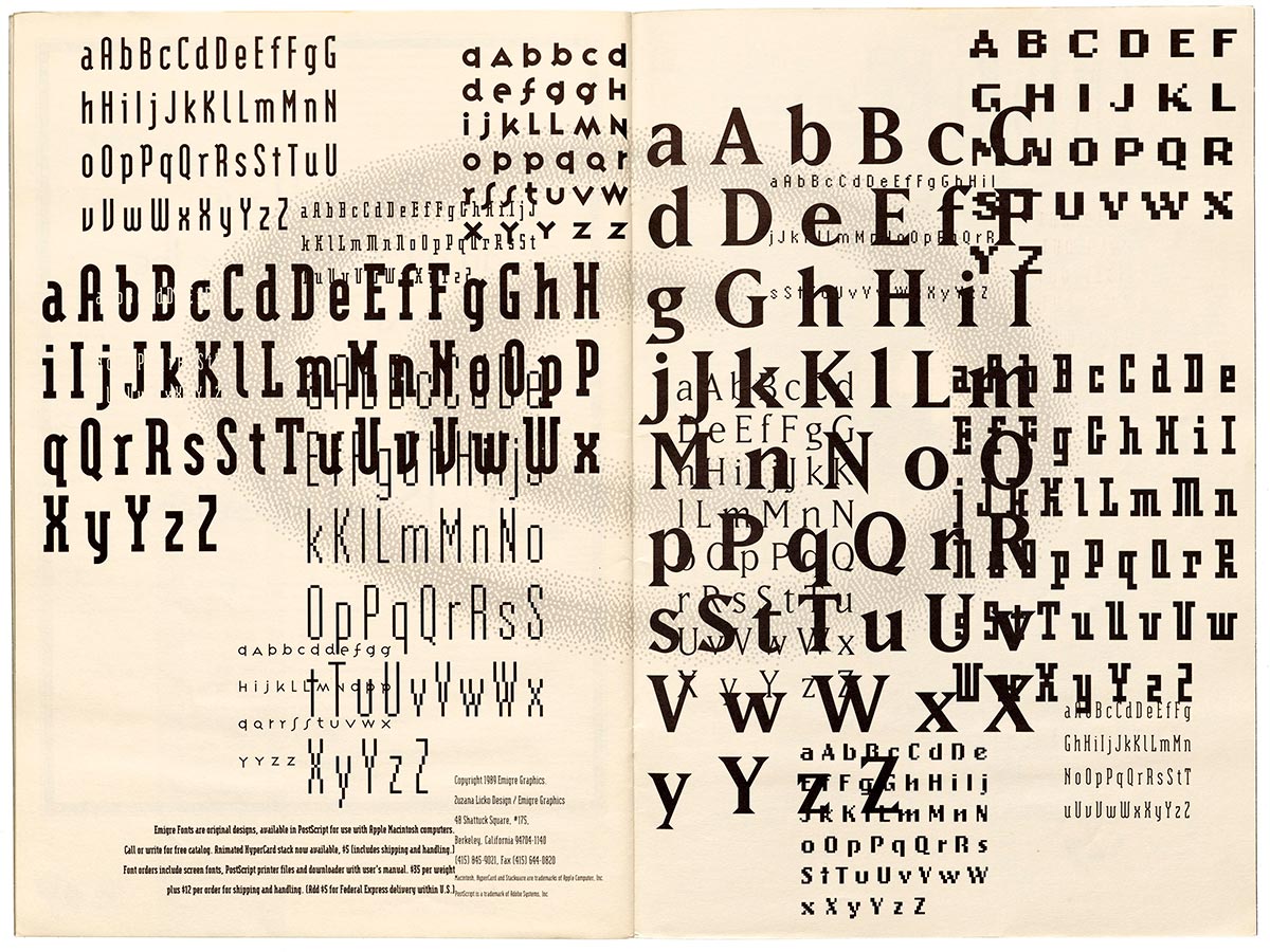
Typographic experimentation in postmodernism rejects the clear yet monotone international typographic style that dominated graphic design of the time and replaces it with individualistic voices and tones, letting the typography speak. Digital typesetting, made possible by modern software, attracted a new sense of experimentation. Before this could occur, many type designers needed to create typefaces for use in the new digital age, but many showed dissatisfaction with converting classic metal typefaces. A digital age called for digital type, and popular bitmap fonts made from pixels suited the new era. Many of Emigre’s fonts have blocky features that are easily reproducible on monitors of the late 80s and early 90s. This typographic trend rebelled against the clear and legible swiss typefaces like Helvetica while announcing to the world the limitlessness of digital design. This new experimentation in typography eventually found its way into student work, a problem eventually exacerbated by today’s internet culture.

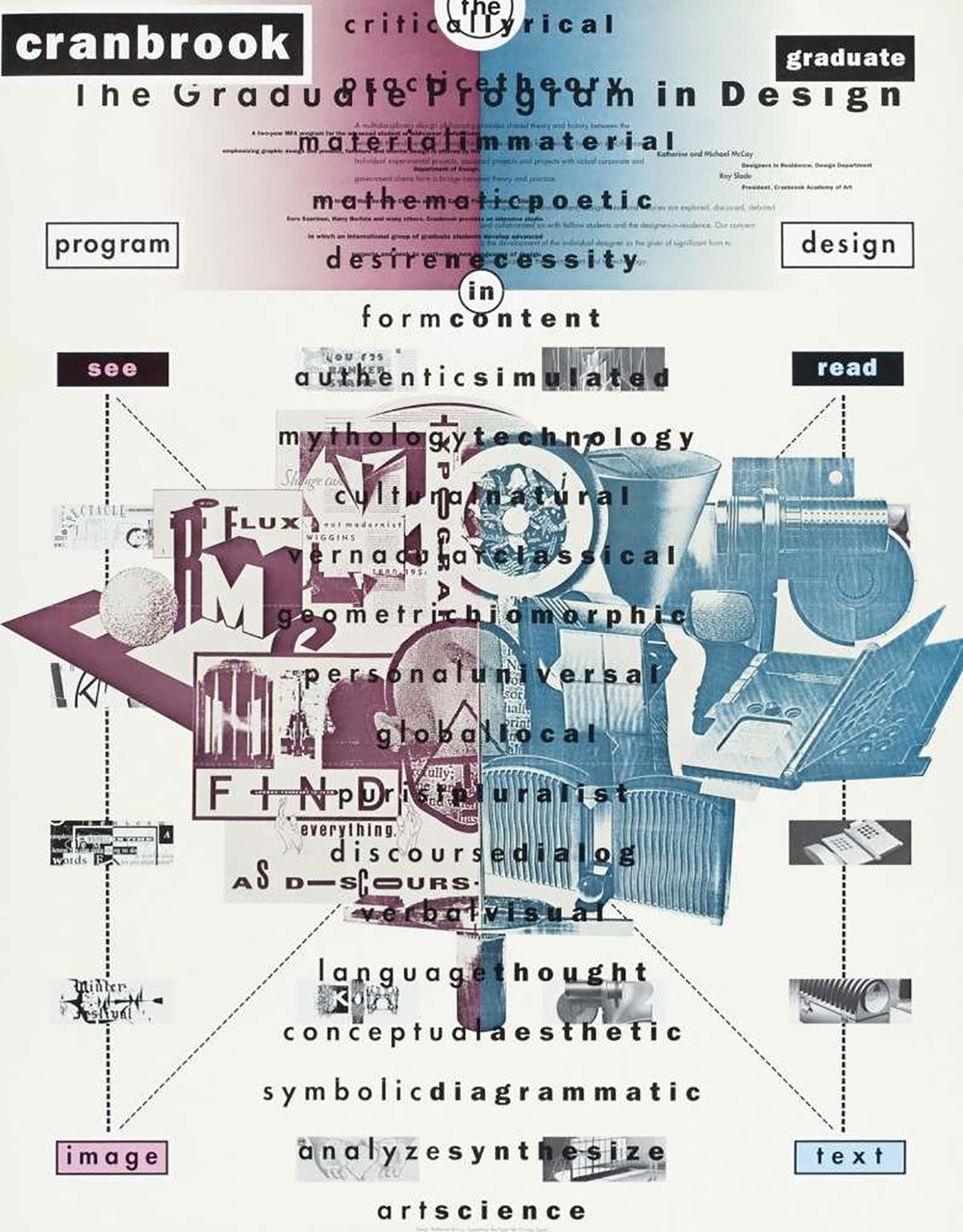
The most prominent student examples of postmodern, experimental typography come from Cranbrook Academy of Art. According to Meggs, “Cranbrook has long emphasized experimentation while rejecting a uniform philosophy or methodology” (492). While nothing is objectively wrong with trying new ideas in design, typographic treatments such as the unusual letter spacing and overlaying of graphic images and words in Katherine McCoy’s Cranbrook recruiting poster, show how students encountered postmodernism at the college level. However, when interviewed, the Cranbrook students often “expressed a need to return to simpler, more direct ways of expression” when asked about the future of graphic design (VanderLans). Seemingly, even the postmodern wave of experimental typography may have just been a passing phase in the eyes of upcoming designers.

So after all this experimentation, why has typographic design not yet returned to a more modernist aesthetic? VanderLans also asks, “Are the graphic designers who concern themselves with complex solutions merely slow learners who try out the wildest schemes only to come to one conclusion, that less is more?” Ludwig Mies van der Rohe’s famous line holds little meaning in the vast world of downloadable fonts. Too many typefaces appear for free with very little information on their intended use. Anyone without a vast understanding of typographic history would have trouble sifting through the mess of sites like DaFont and FontSpace to find something with a fitting voice for a project. Even the most carefully curated of typographic storefronts give relatively little information about the typefaces they sell. Adobe’s own Typekit only specifies the type foundry, and only after digging around the foundry’s site can a type specimen showcasing the intended type treatment be found.
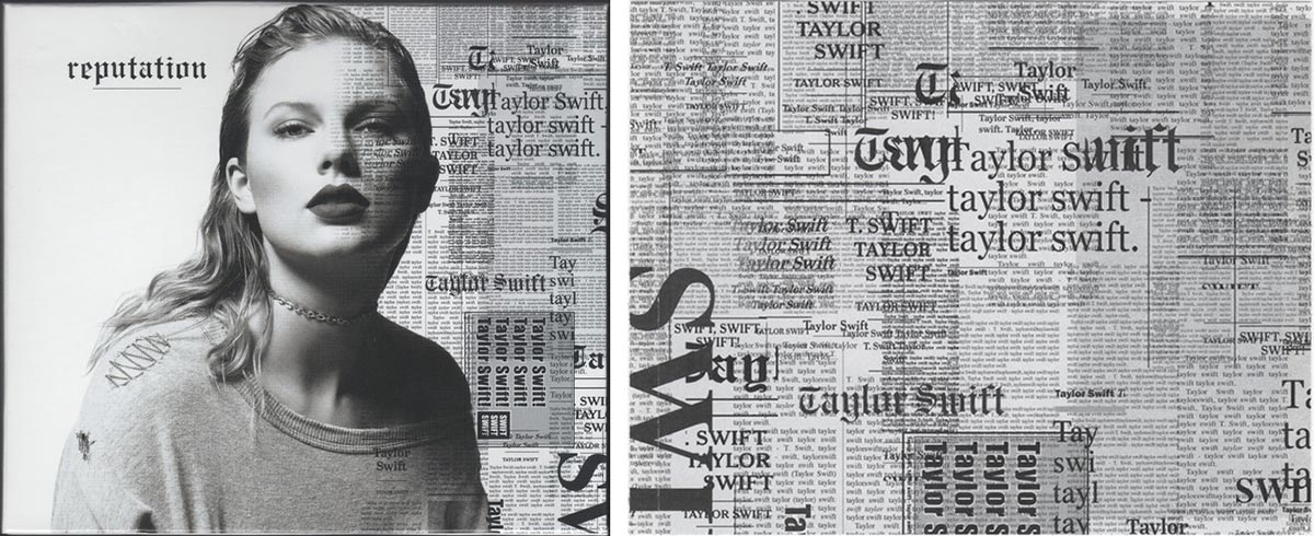
Despite the internet’s huge capacity for information, relatively little can be found about a typeface. Type sites simply classify them by features and shape, with categories like serif, sans-serif, script, decorative, slab, etc. only to ignore that within those groupings are dates and historical context. Bilak states, “Designers are more aware of the body of work and the discourse accompanying it. Proclaiming novelty today can seem like historical ignorance on a designer’s part” (173). However, this awareness rarely applies to the amateur designer, so more and more of the available type choices feel novel to the unstudied. Typefaces are selected because they look cool rather than whether or not they fit the tone of the project. A recent example of this is the album cover for Taylor Swift’s 2017 album Reputation, which released under controversy using a blackletter typeface in the wake of concerns around white supremacy. The cover is a clear example of where postmodernism loses its historical reference, dives deep into amateurism, and takes unintended risks.

Risks make for the foundation of experimentalism, but if the risks become the norm, then they no longer convey risk. When postmodernism first sprouted, it aimed to critique Modernism’s lack of risk. Typographically, this involved experimentation with letters, but the new work produced held novelty and merit as a direct response to historical norms in design. Postmodernism only exists because of the backdrop of modernism, but too many current styles of graphic design forego postmodern referentiality, and echo a collection of unskilled amateur work. The typographic designs of today’s amateurs merely experiment through trial and error, without regard to the borrowed or referenced—setting up a future for graphic design void of concept or historical context. “If fundamental systemic change feels unlikely, then this tends to suggest that the postmodern condition will be our reality for the foreseeable future” (Poyner 171). Despite all our new technology, graphic design and typography changed minimally since the early 1990s and the digital revolution. Our technology increased incrementally, but not radically and not revolutionary. Postmodernism dropped a new concept into the world of design, and without something new to come and take its place, the hole we dig gets deeper and dirtier. Amateurism acts as an extension of postmodernism, but has it driven us too deep to get back to the surface?
From the project: The Underlying Message