A Digital Marketplace
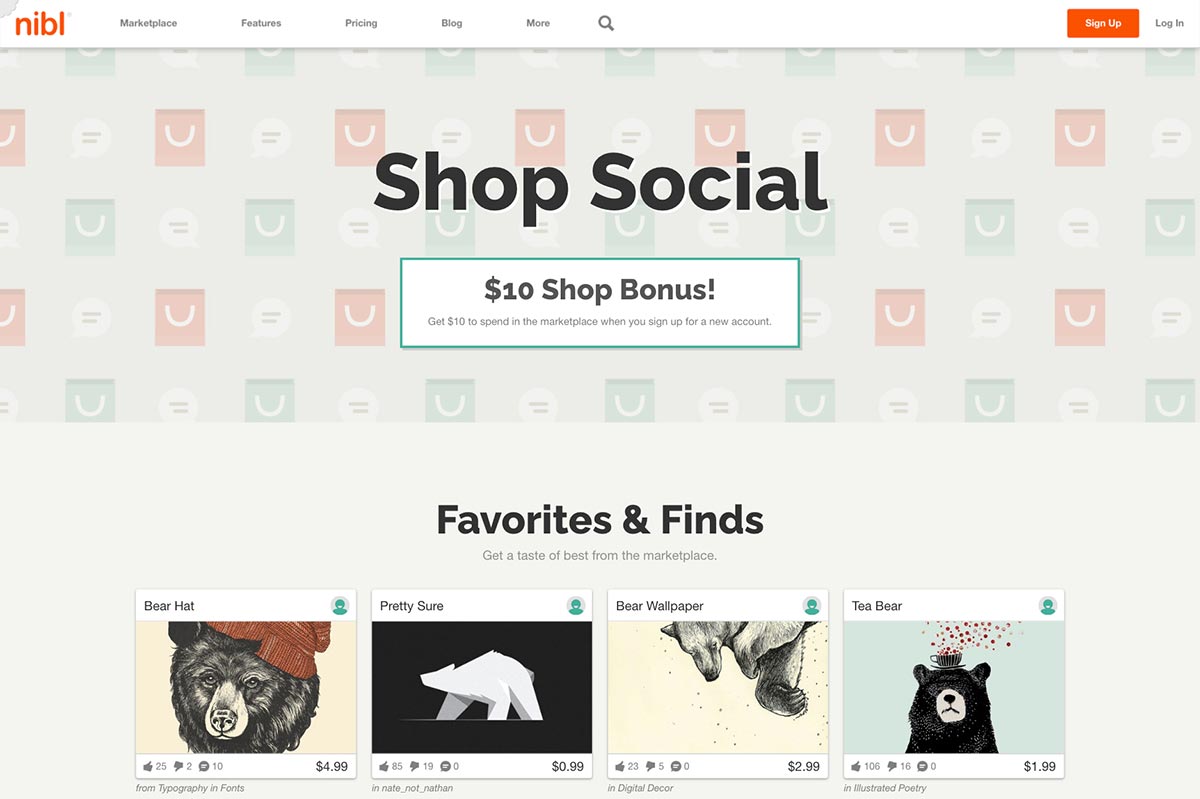
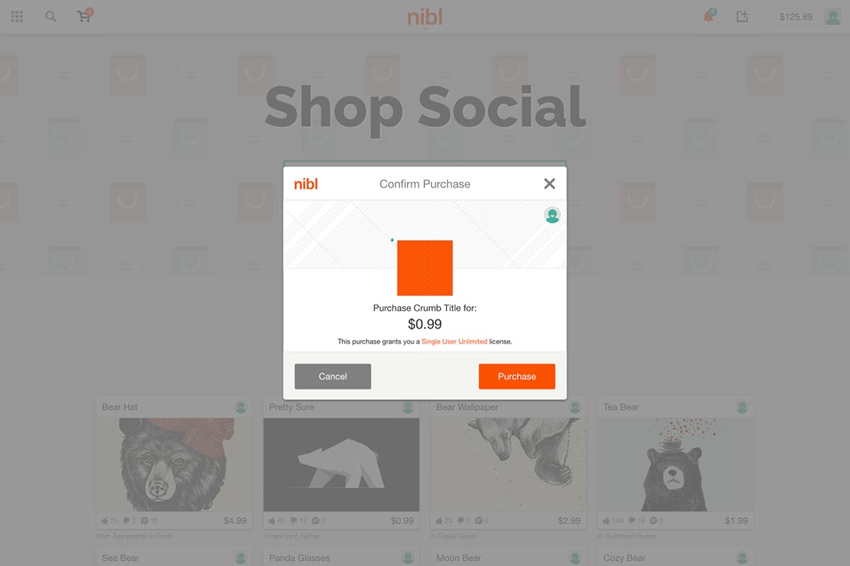
Designed as a digital platform, nibl is a web-application for selling and buying digital content priced below $5. Utilizing a stored balance, users can buy content uploaded by other users and take full advantage of micropayment prices without being charged large credit card processing fees.
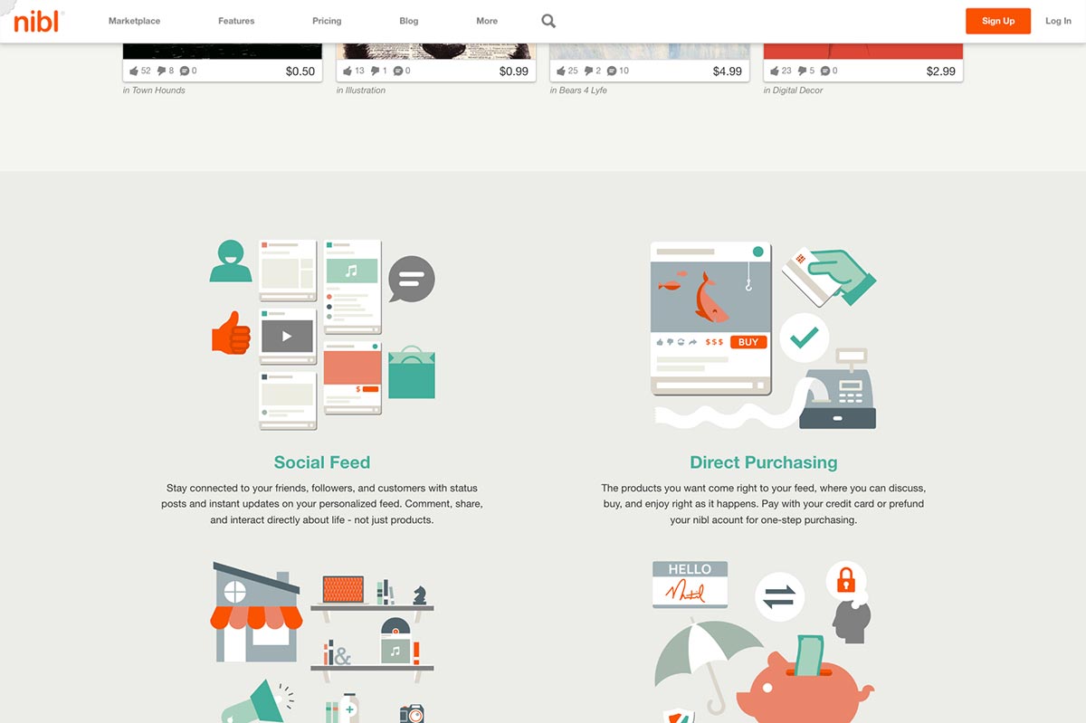
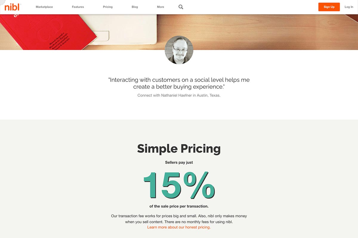
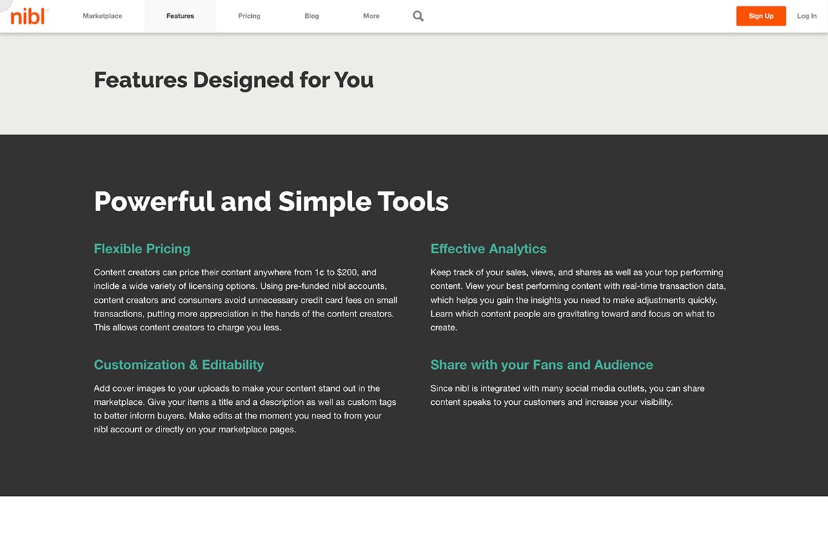
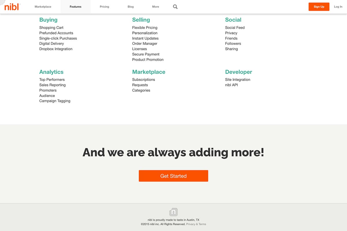
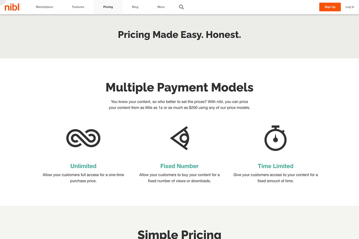
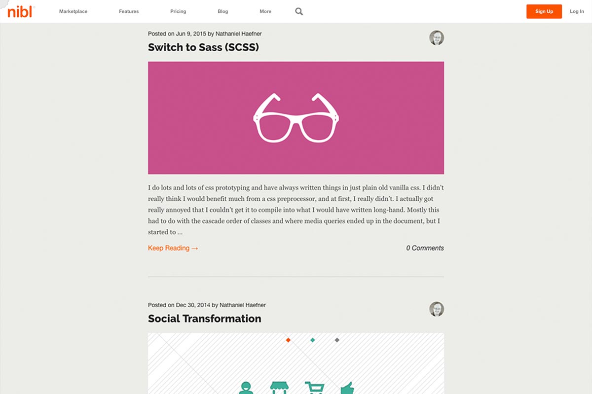
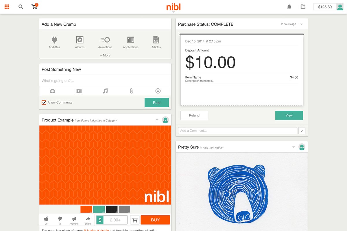
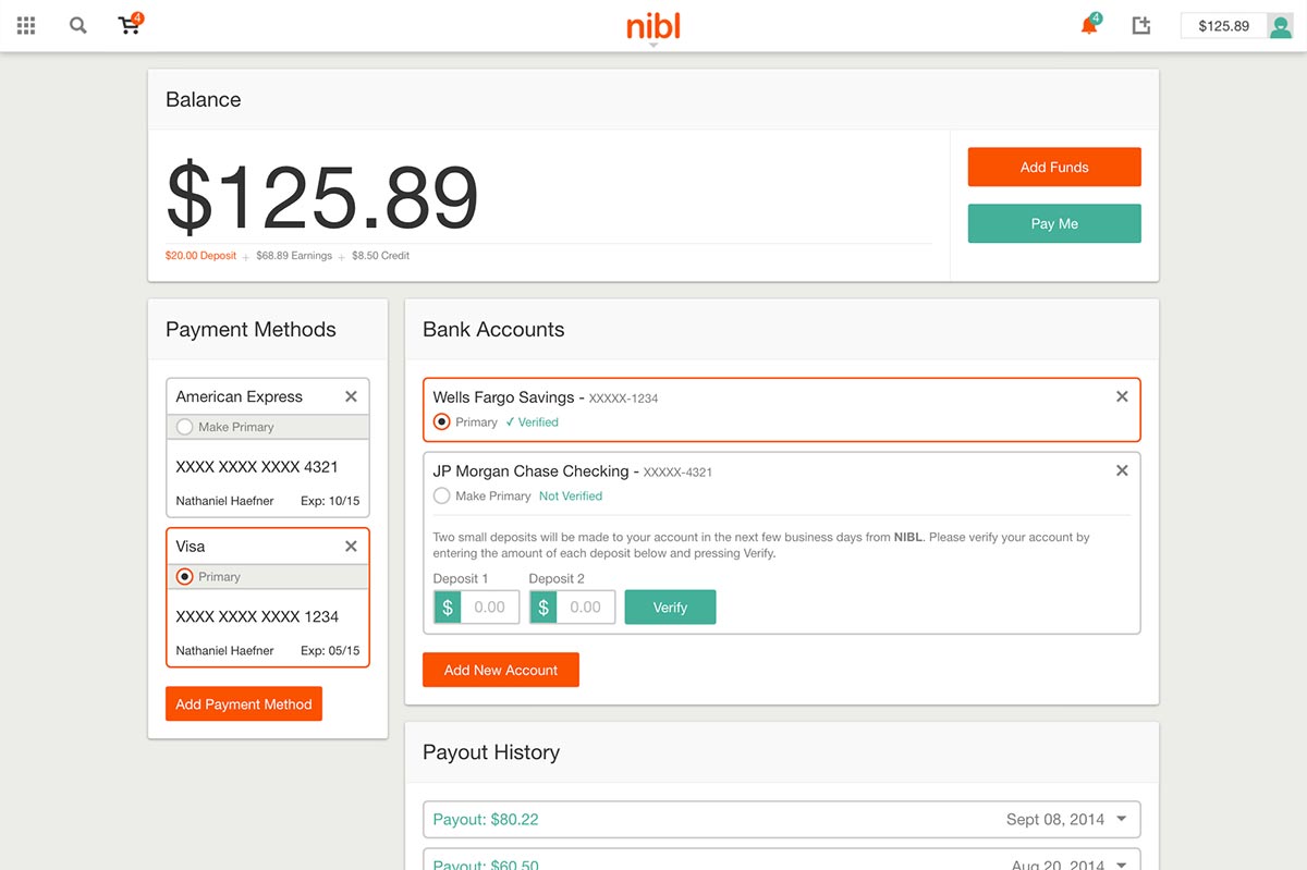
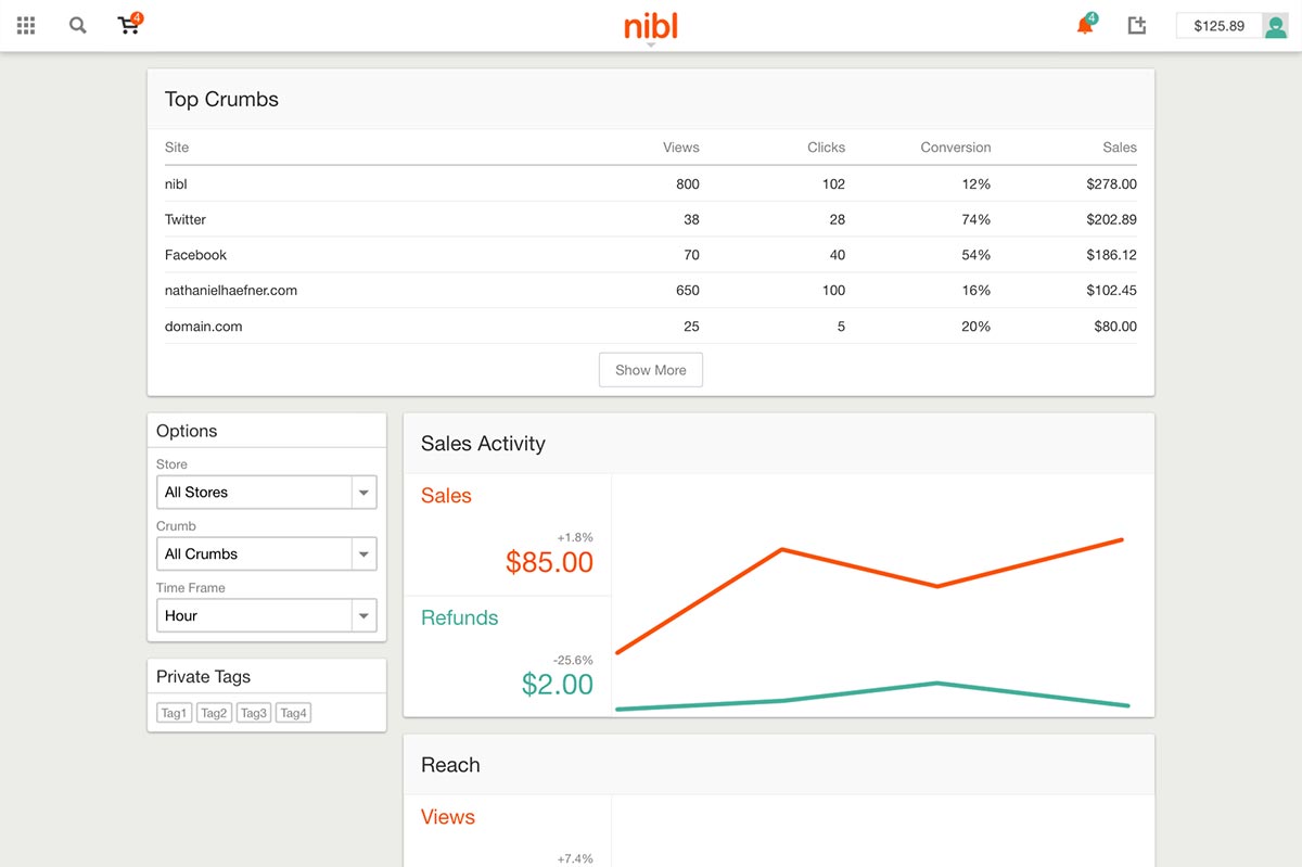
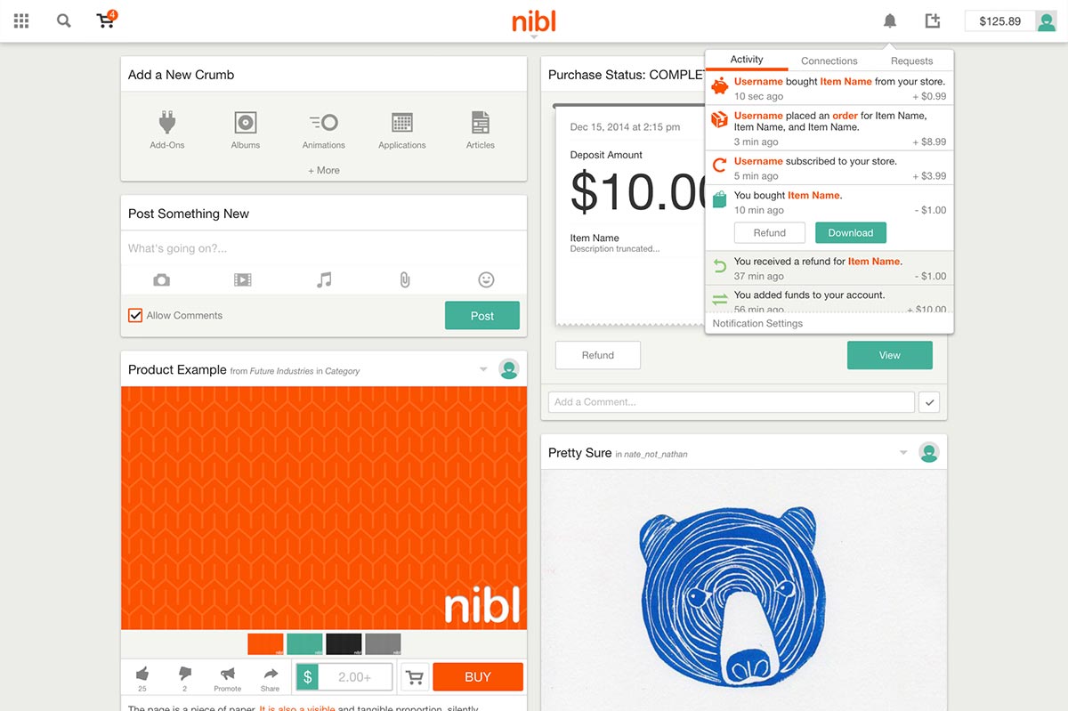
The website consists of an outward facing information portal, a user home feed and profile, settings and balance pages, and tools for uploading and managing content. The site also features a functional analytics page for tracking sales.
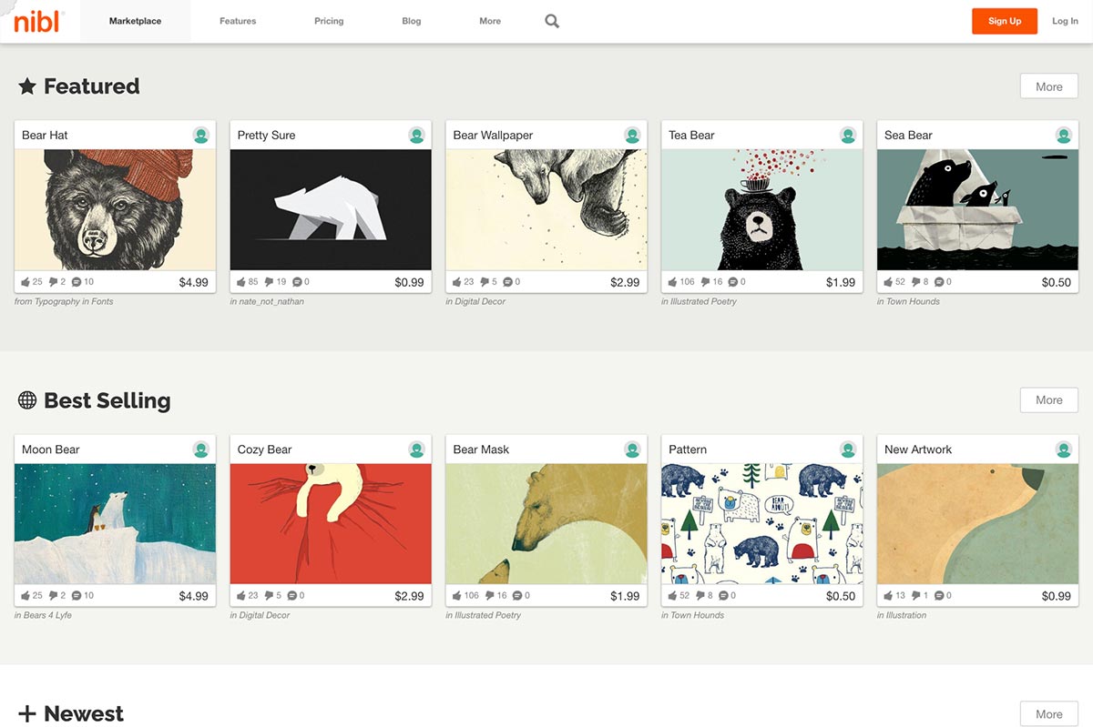
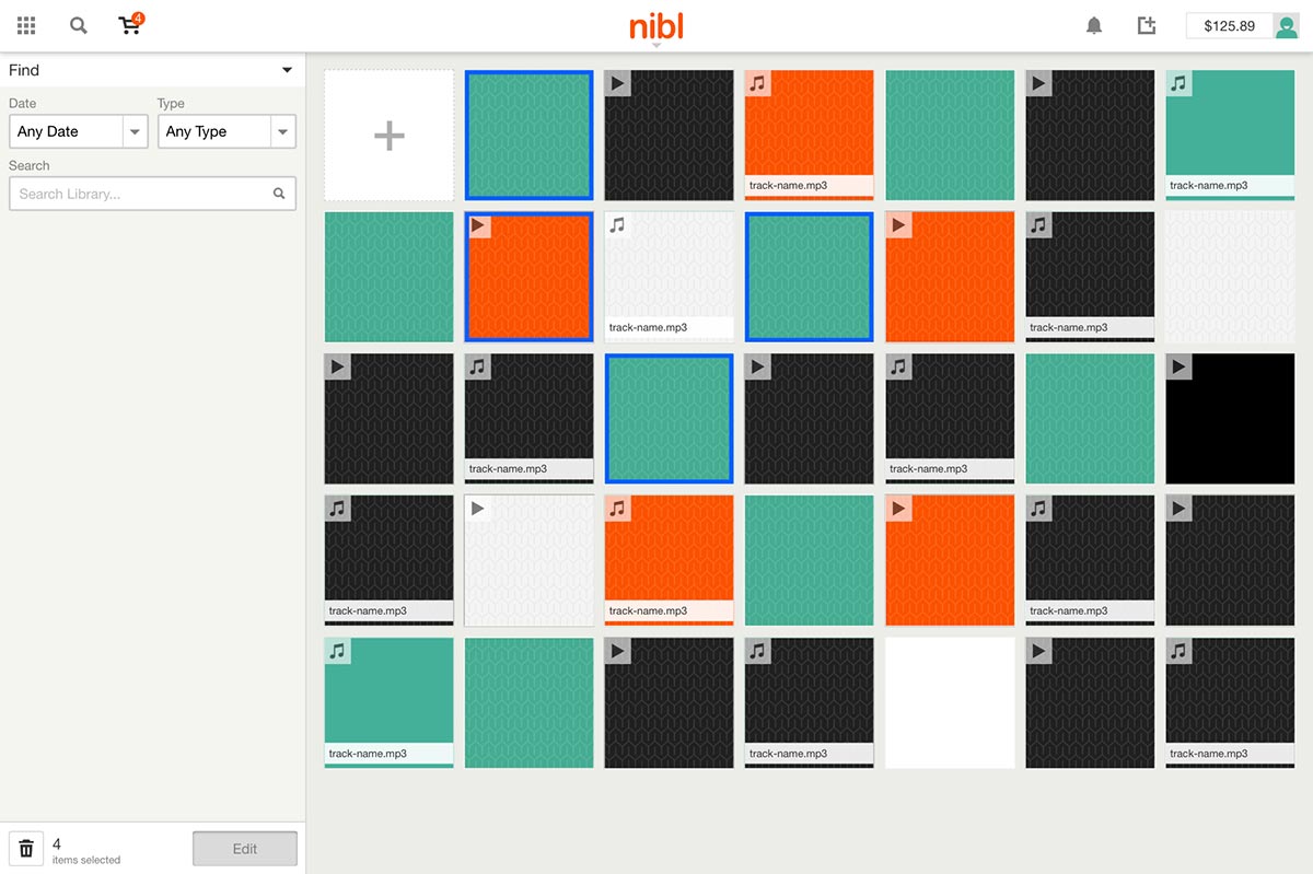
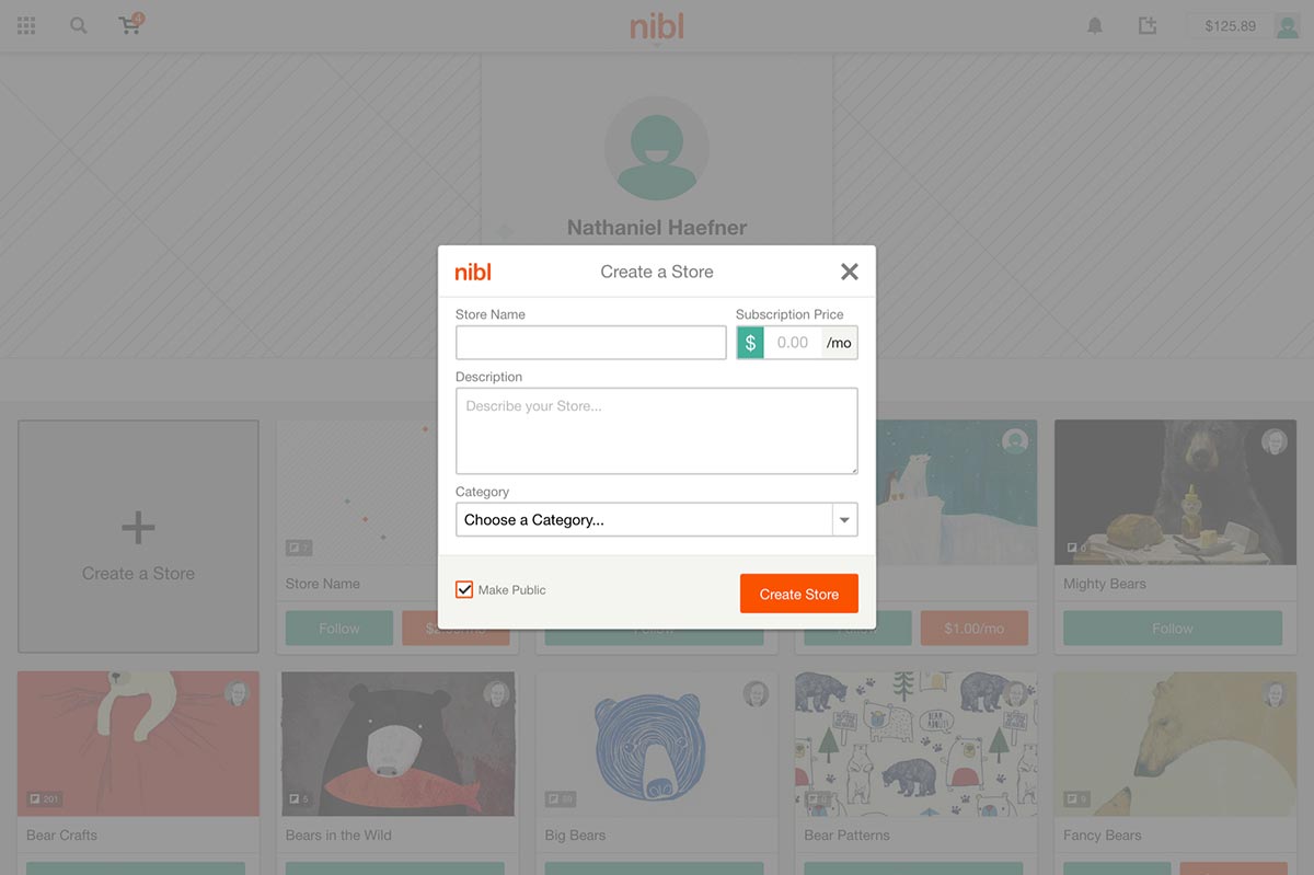
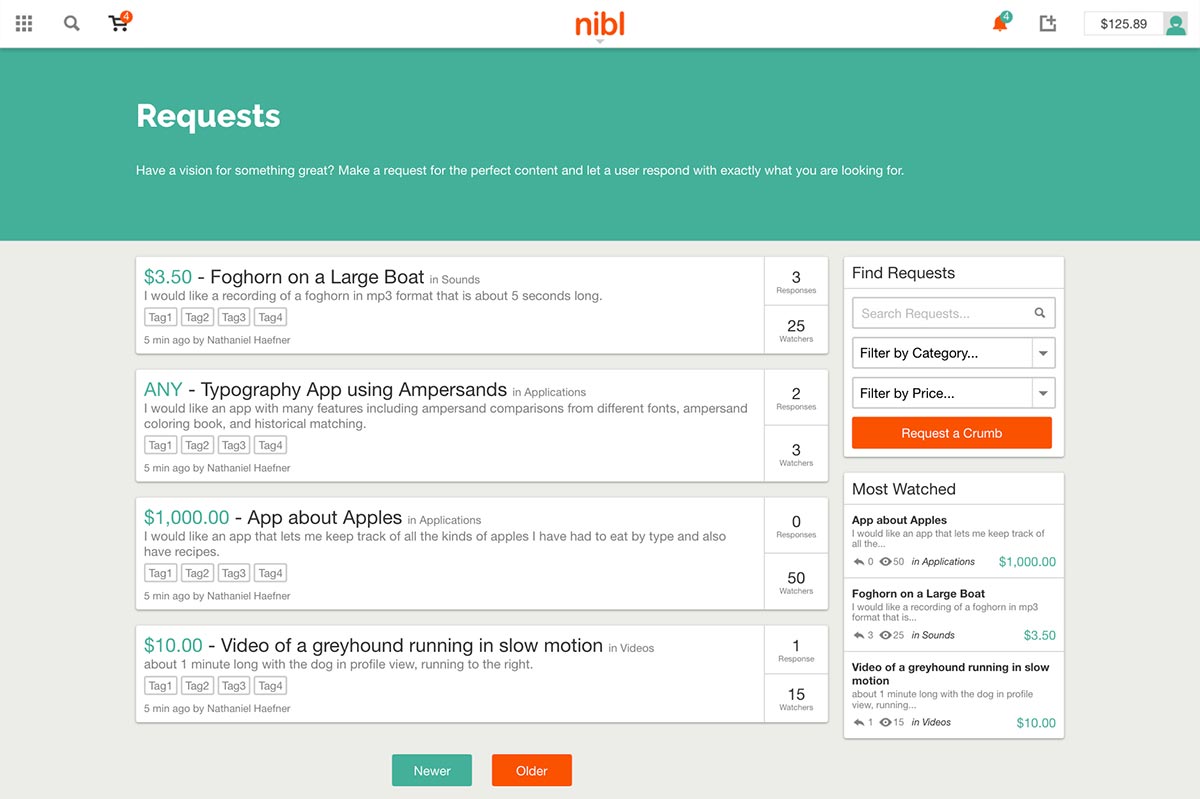
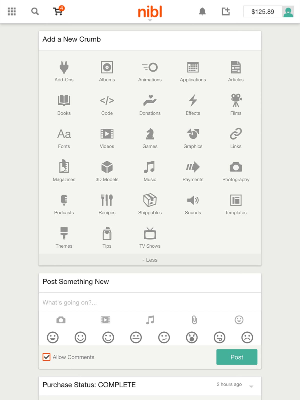
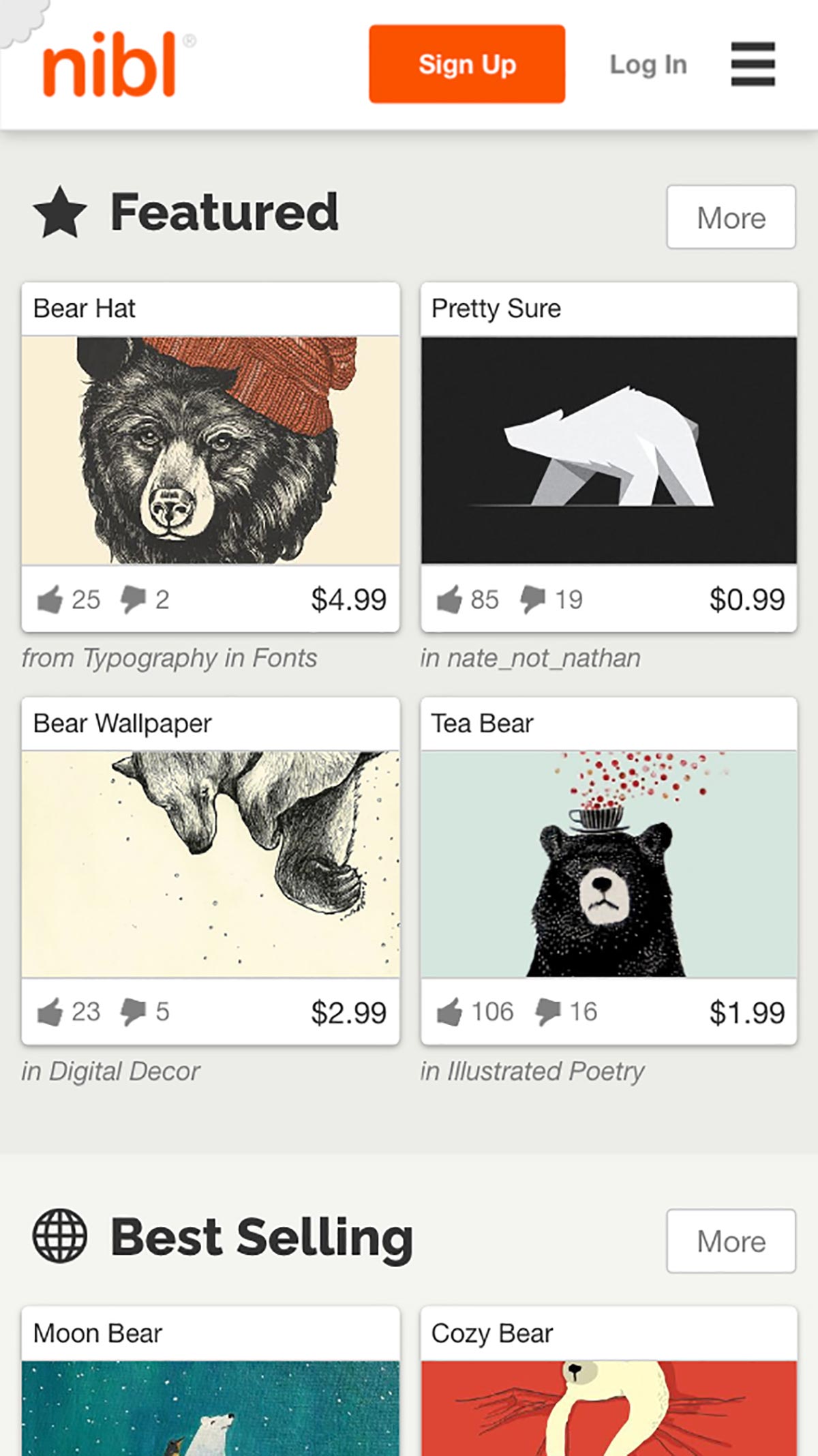
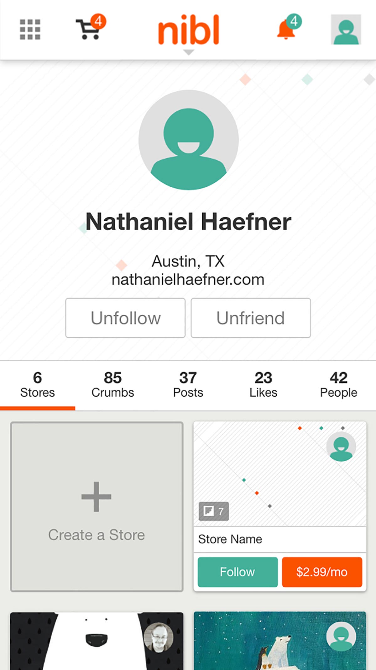
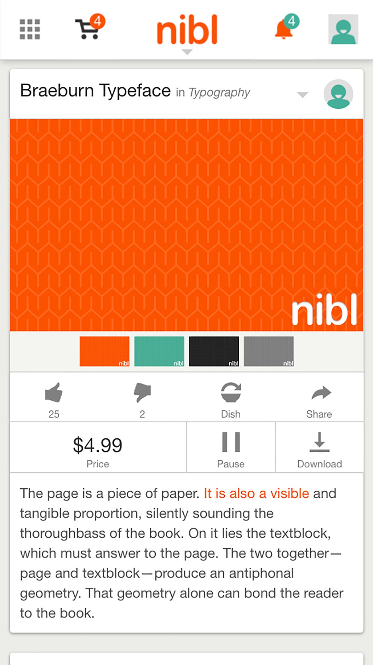
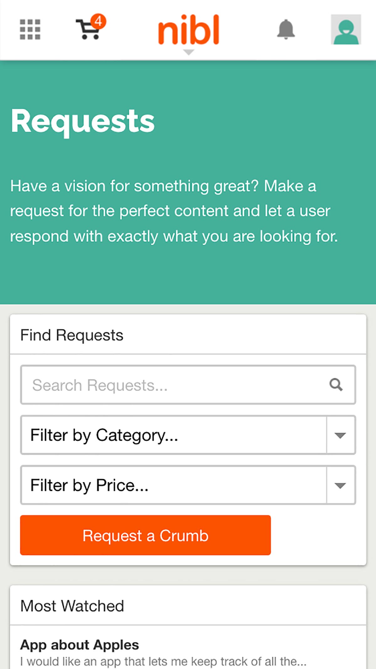
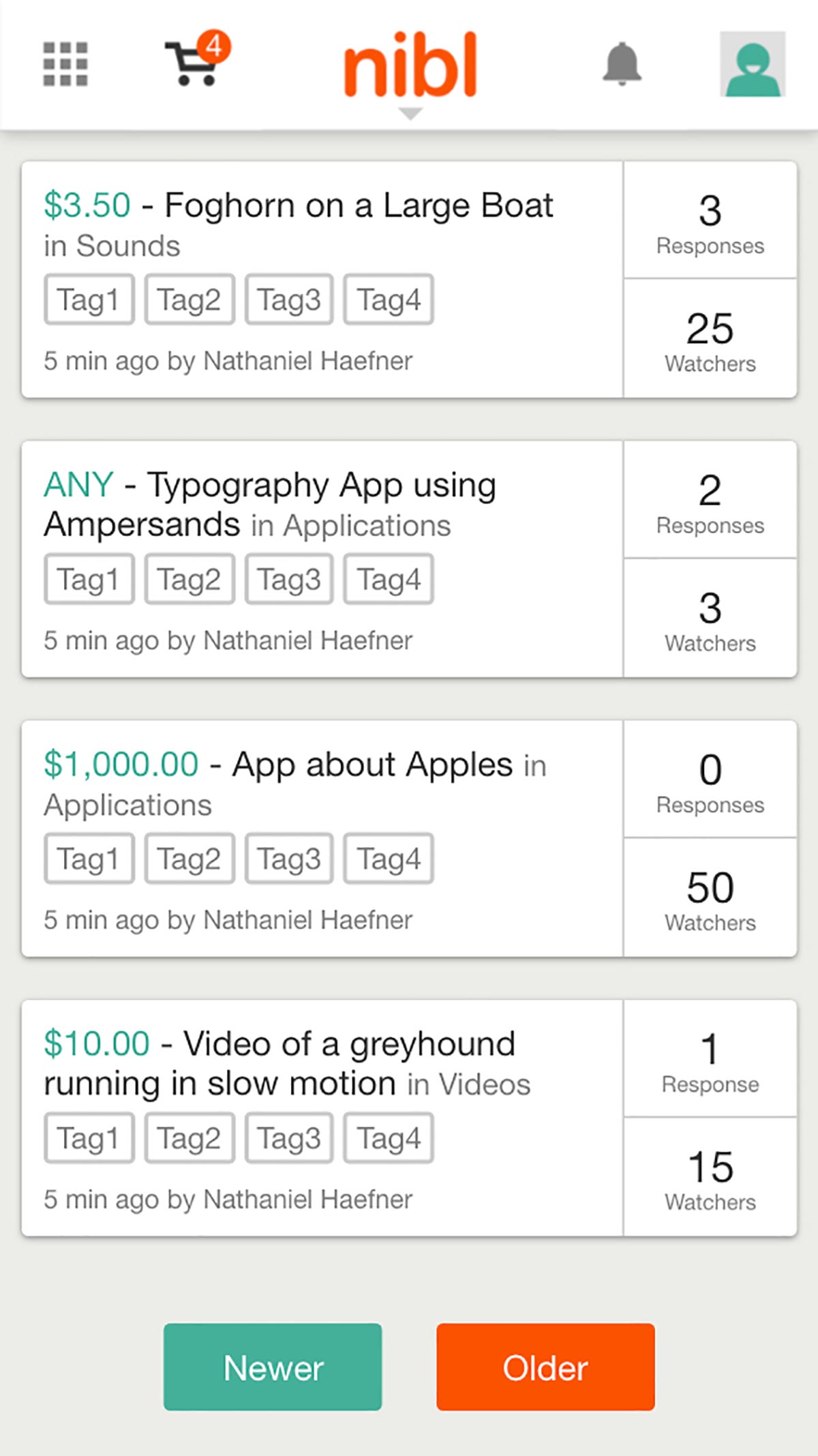
The biggest design challenge for nibl was to incorporate ways to upload and display media of all types including audio, video, photos, code snippets, fonts, Adobe files, recipes, ebooks, and games. Incorporated into nibl, is a social interface and feed, where users can follow other users or one of their curated storefronts. Finally, users could interact and request specific content to be created just for them with the Requests feature.
Each illustration and page layout was designed and coded to make the site fun and easy to use. Being fully responsive, the site is completely functional on any computer or mobile device.
Desktop Scale
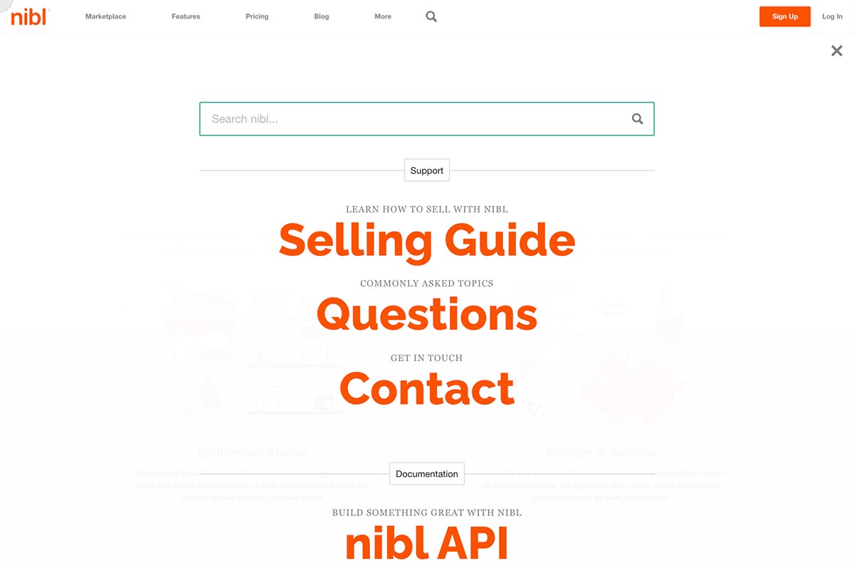
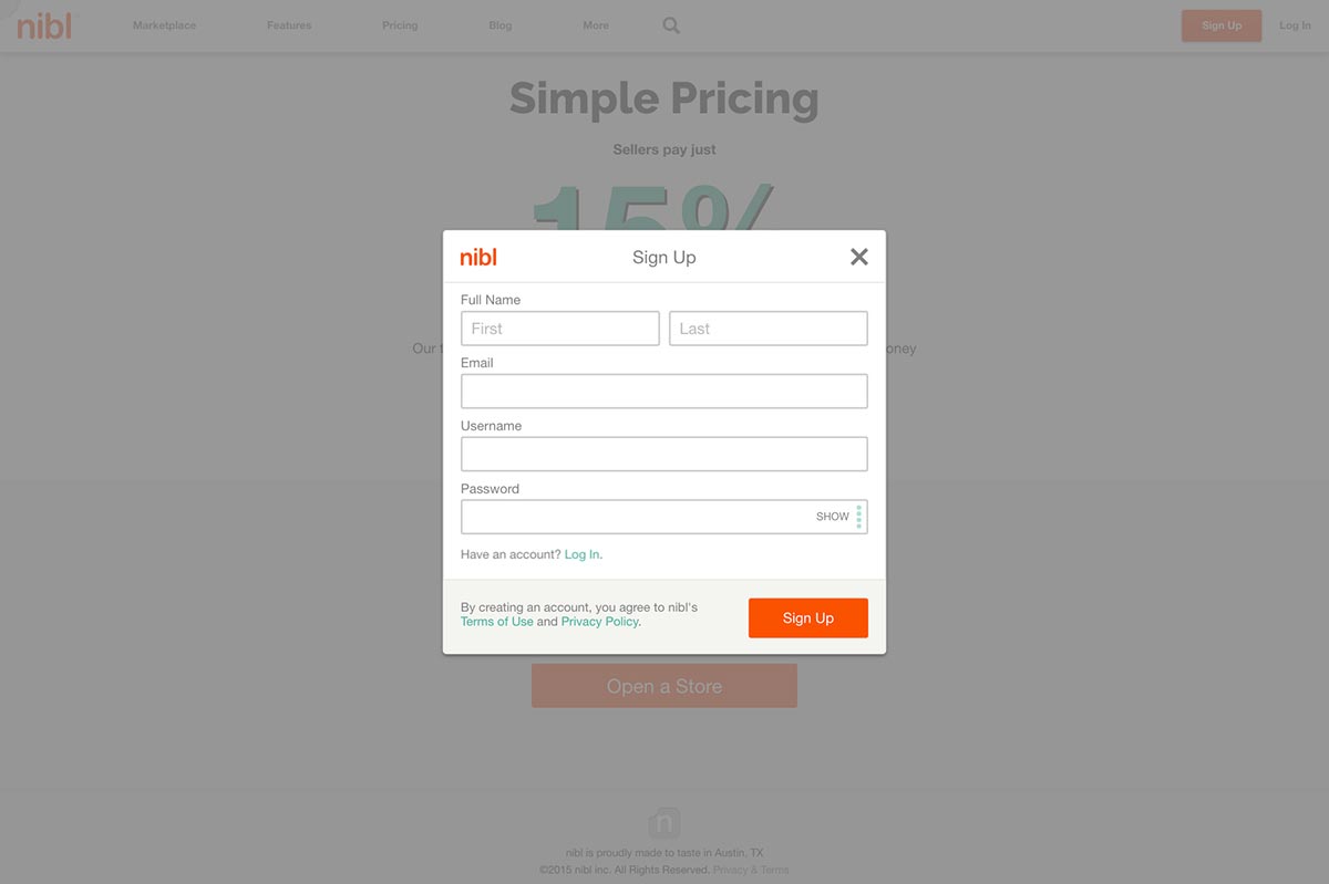
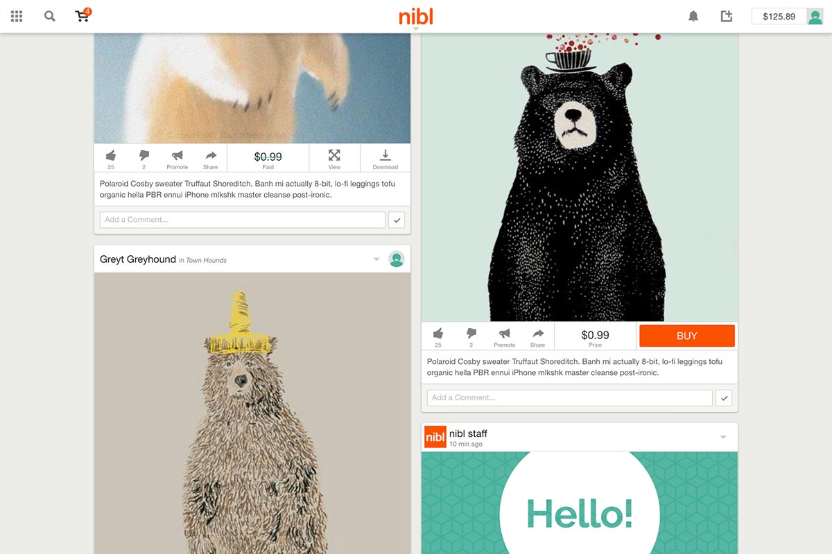
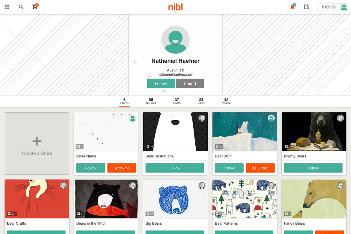
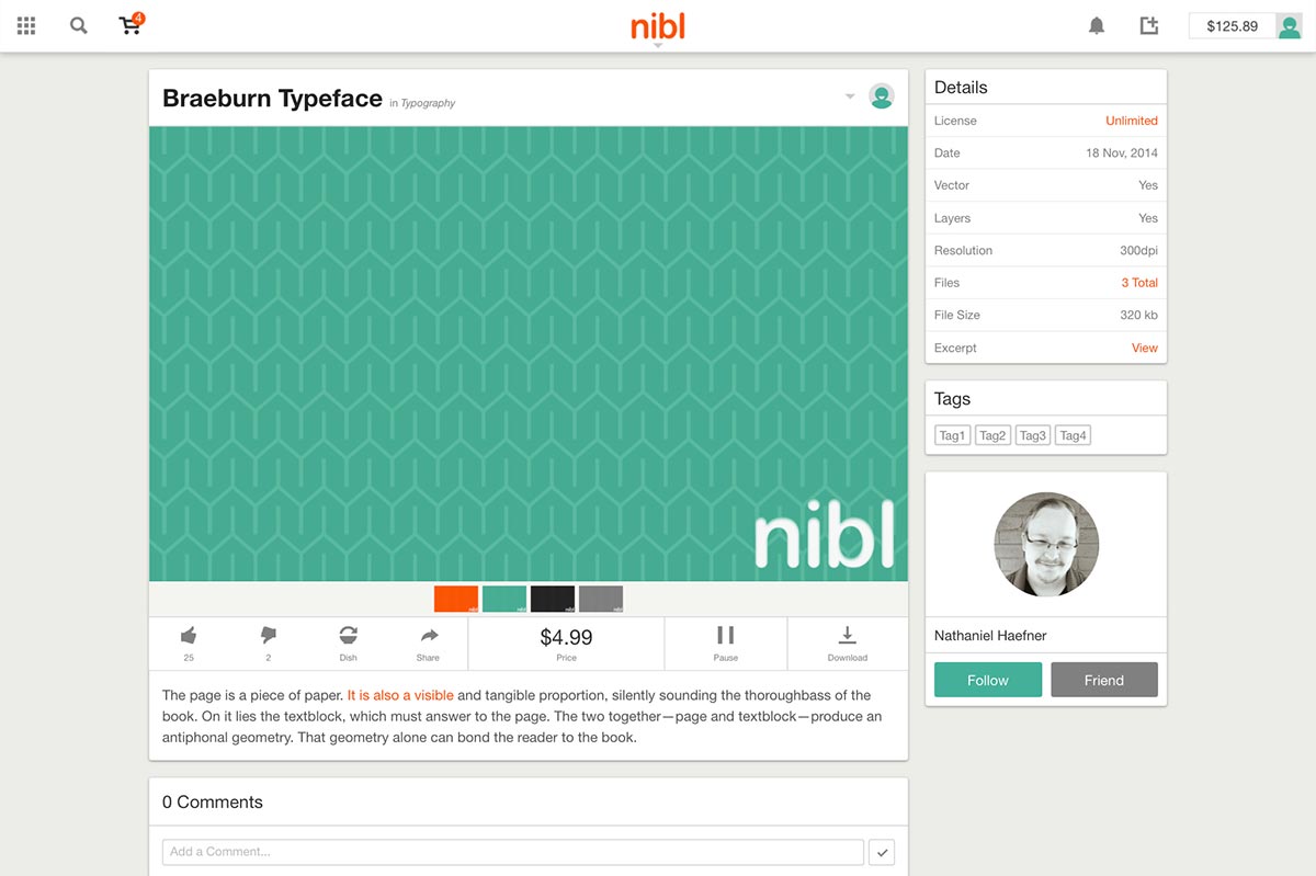
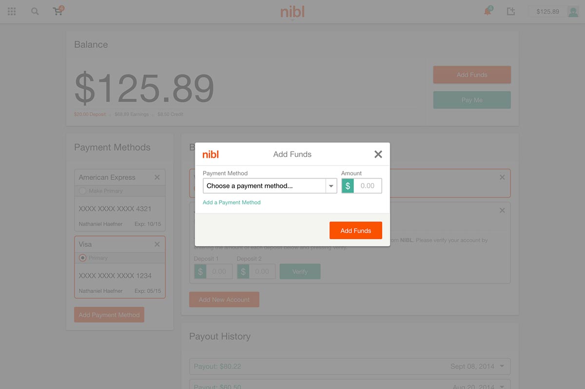
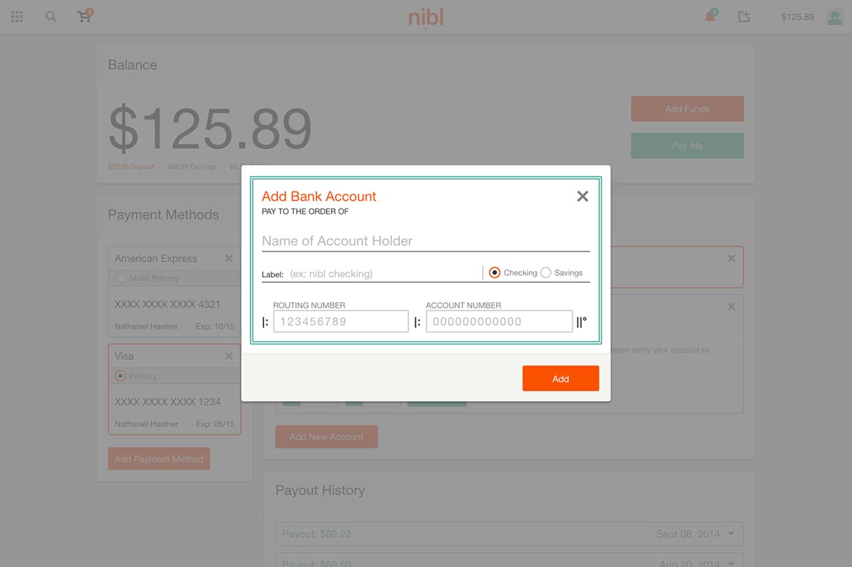
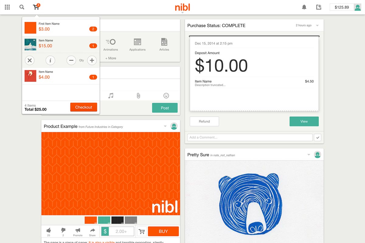
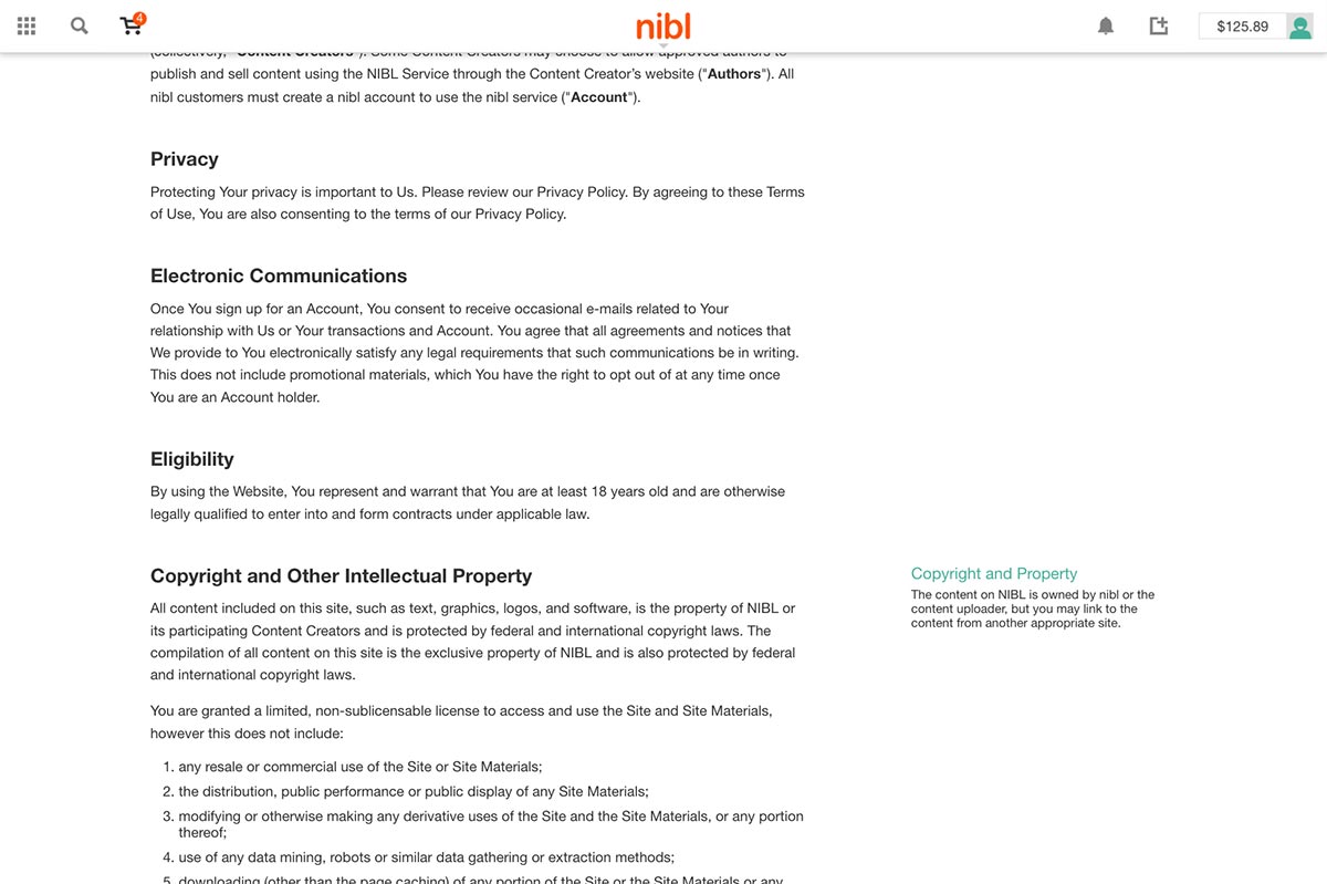
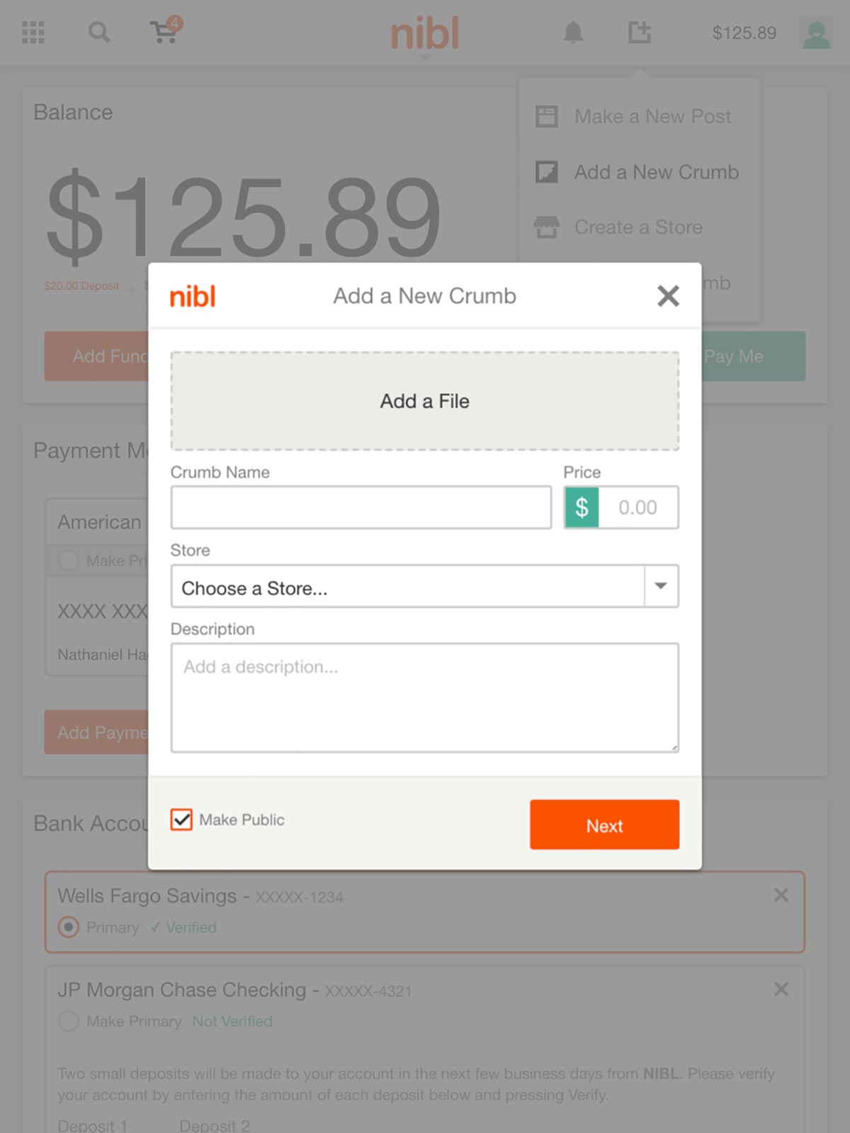
The site design for nible at desktop scale uses two navigation systems—one for selling and one for buying. Since the site is so complex, this dual navigation system kept users aware of how to find certain pages for necessary tasks. The site uses simple animations and clear modal overlays to keep context for users while working within the platform.
Tablet Scale
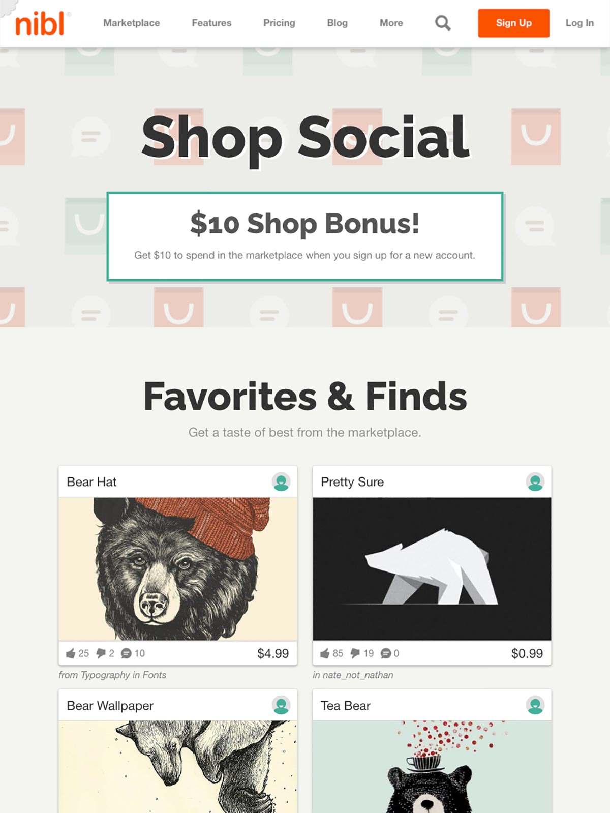
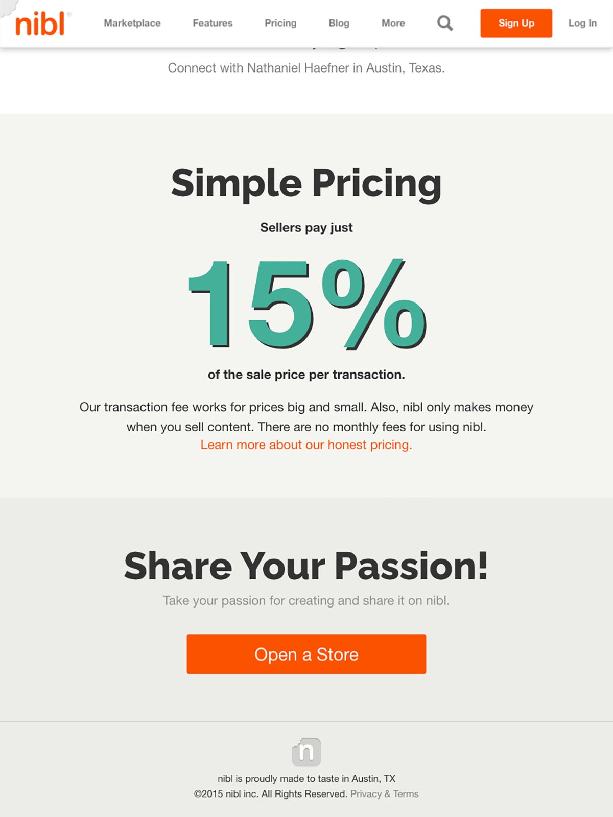
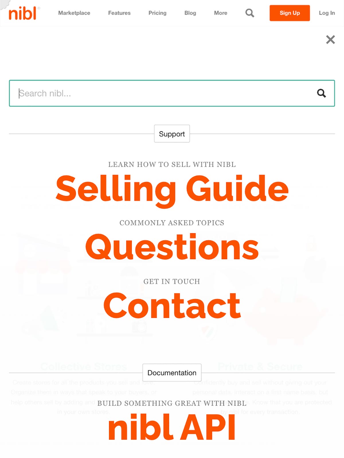
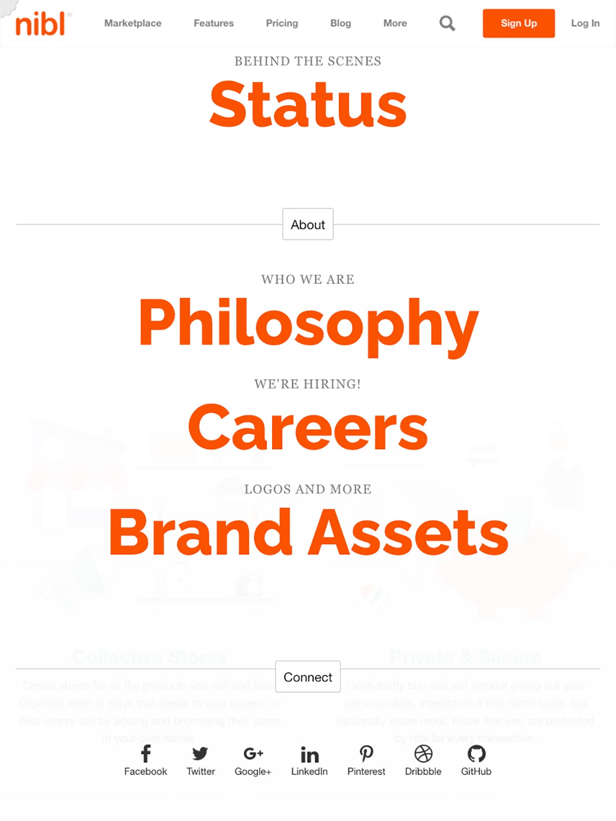
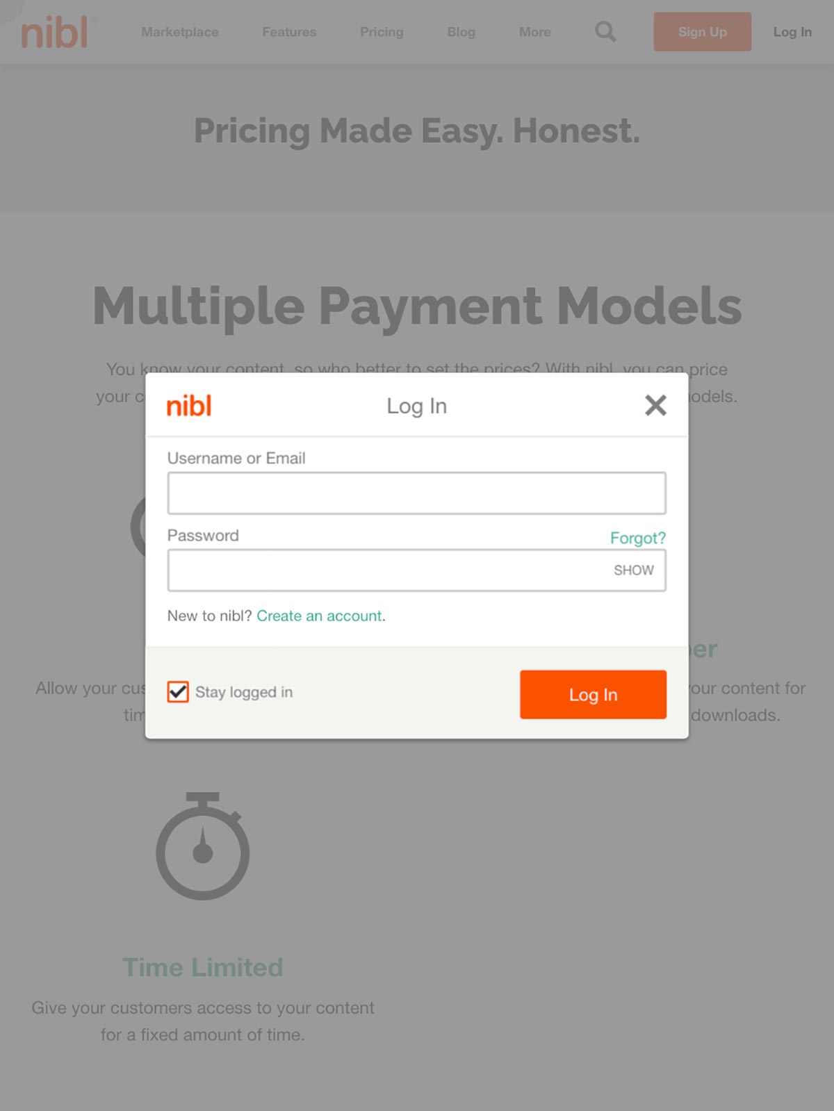
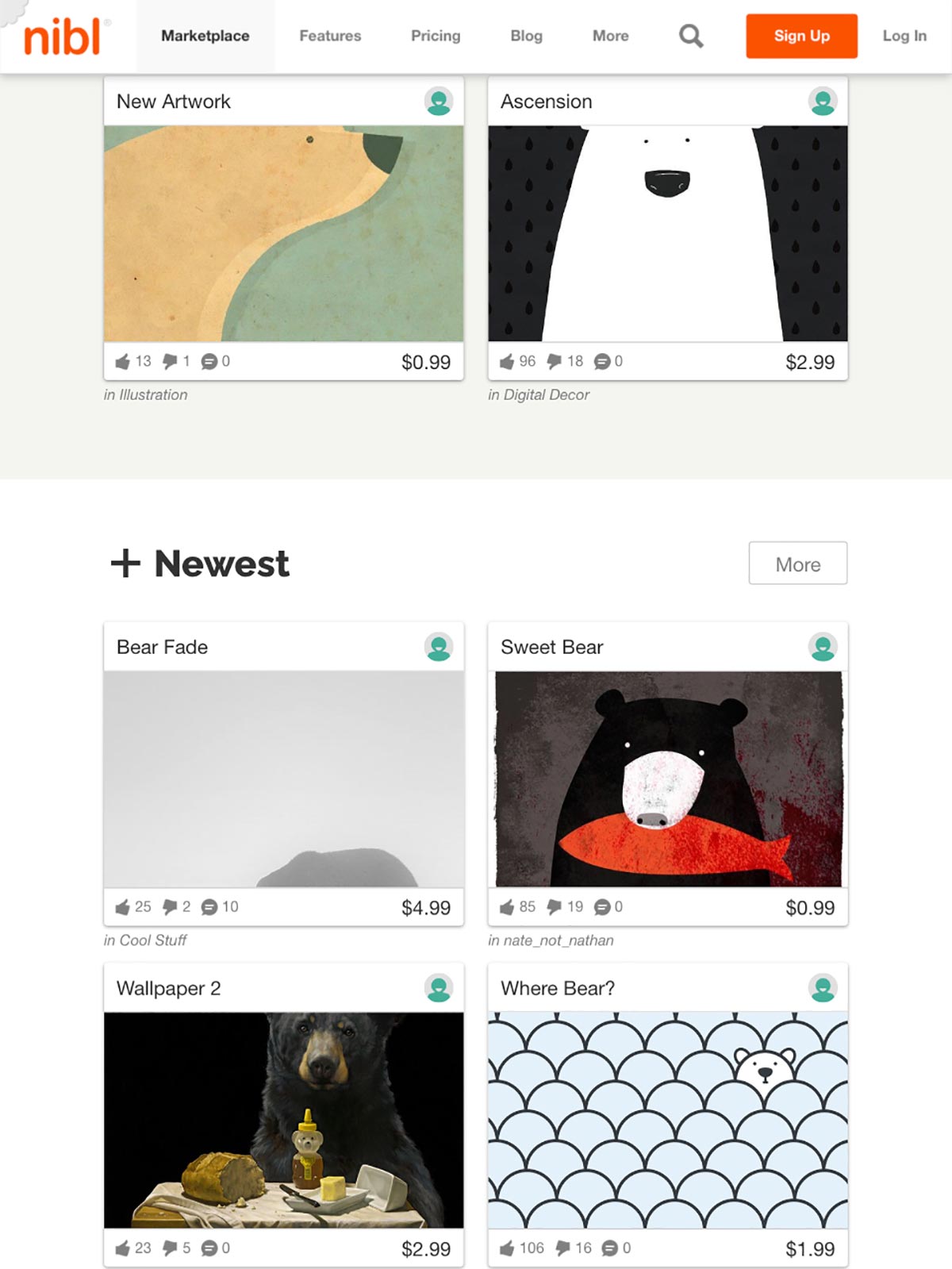
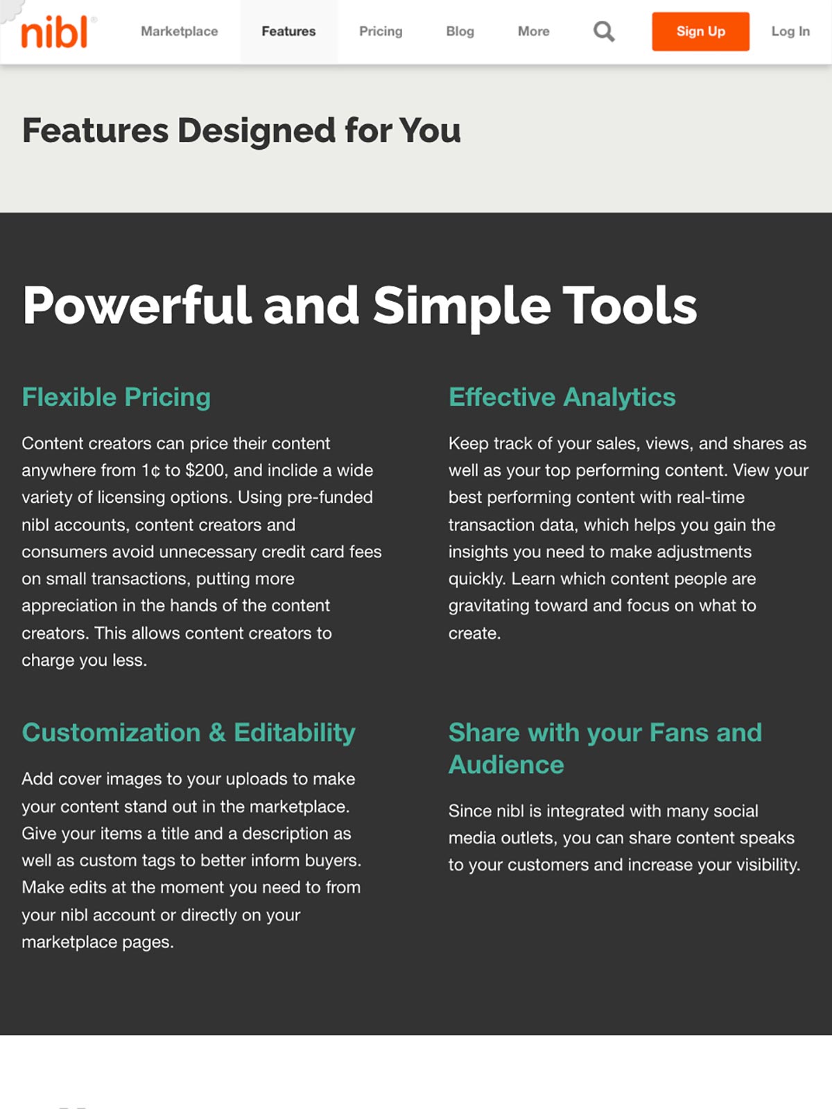
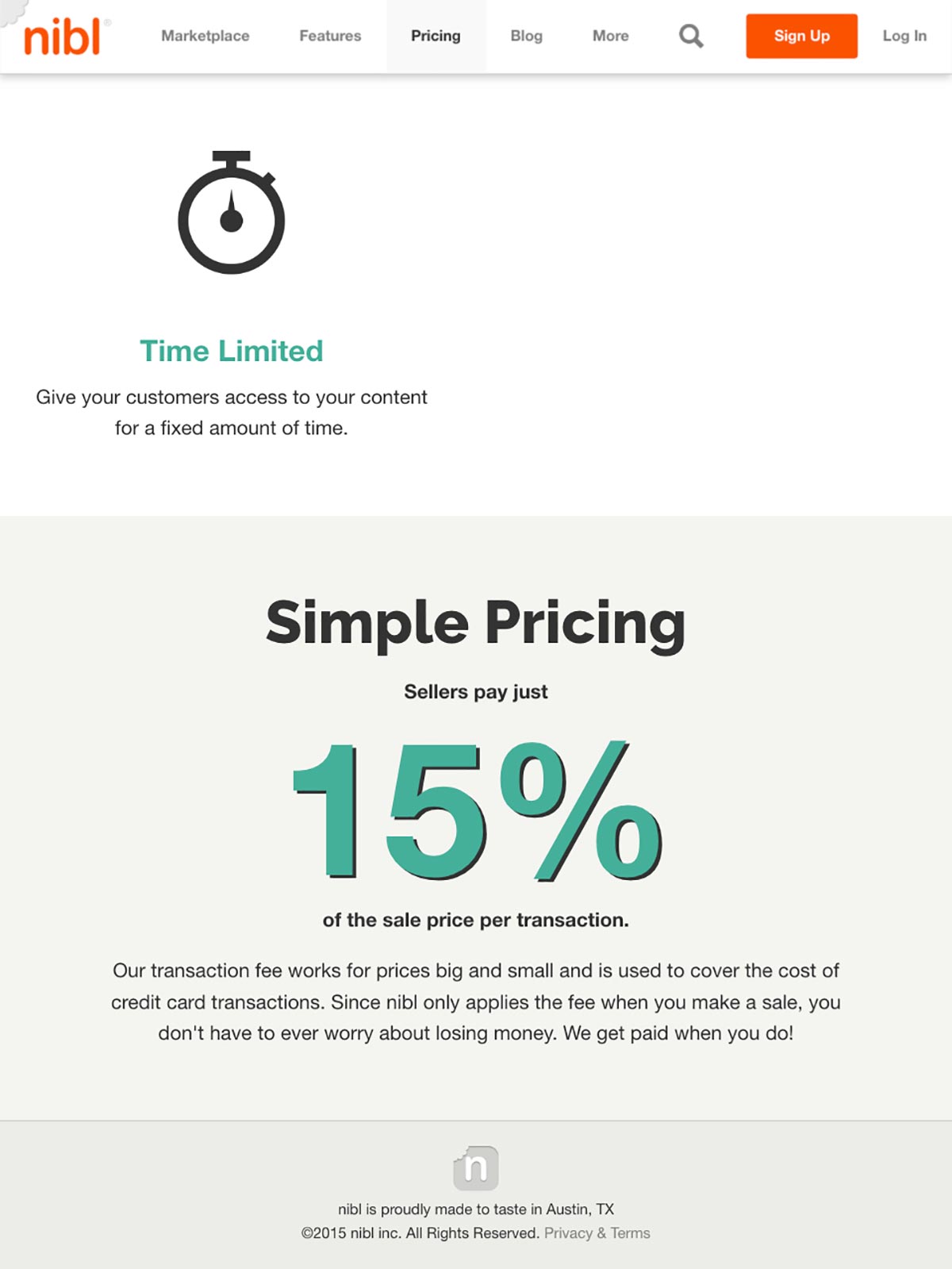
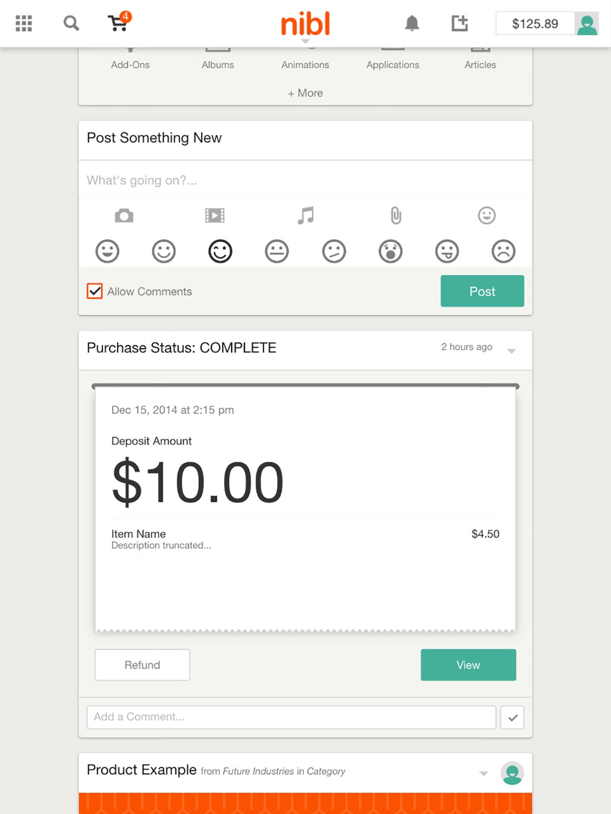
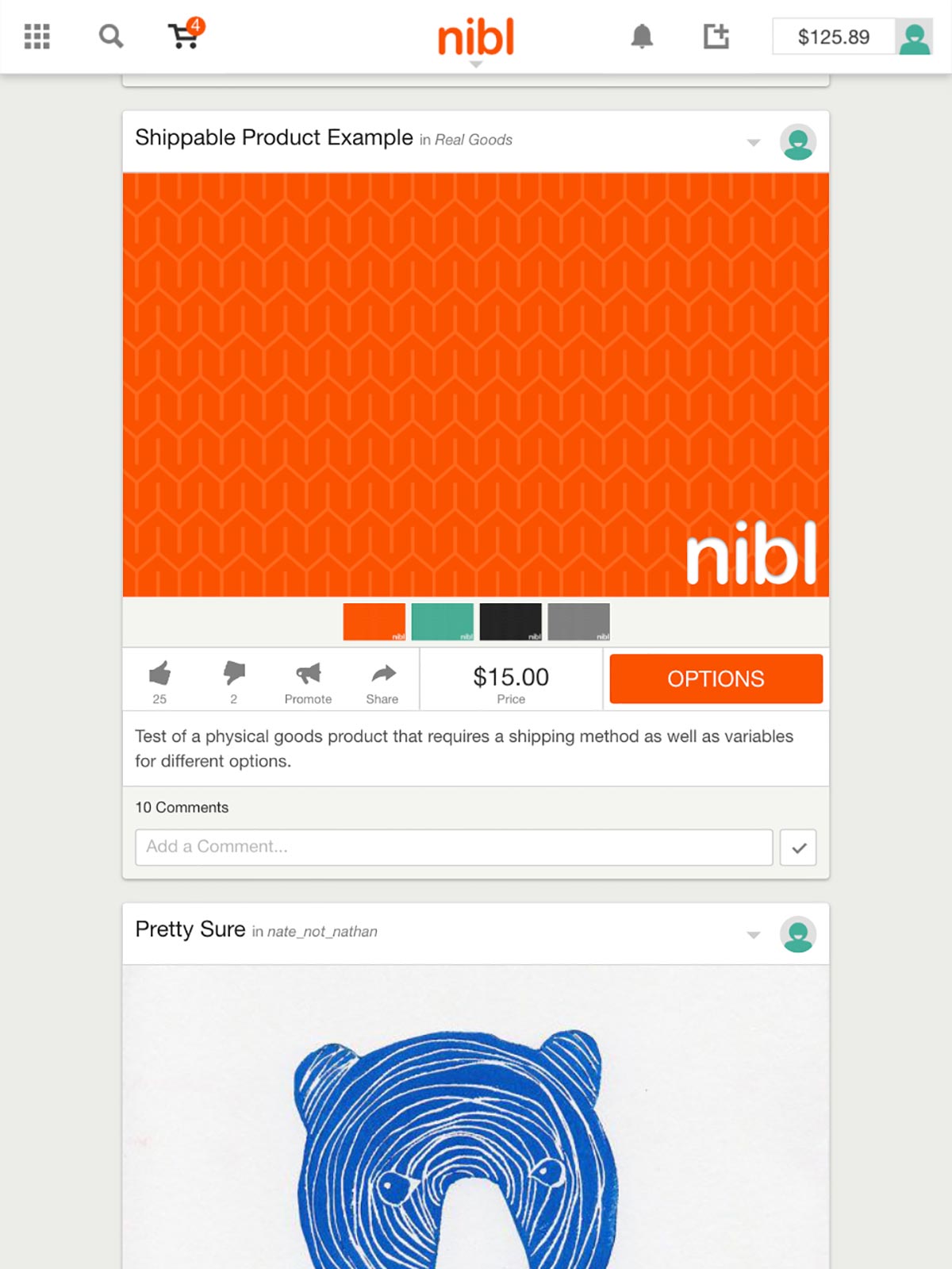
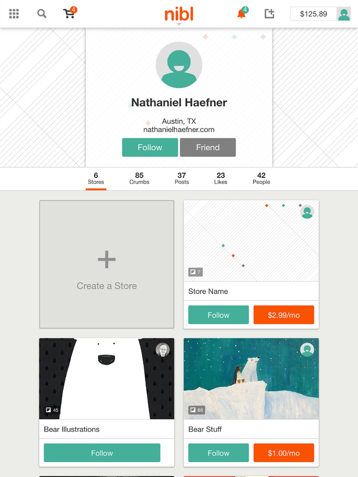
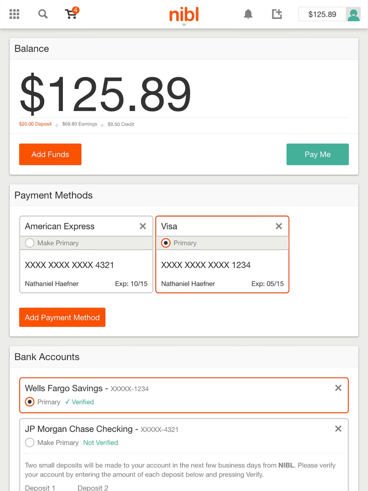
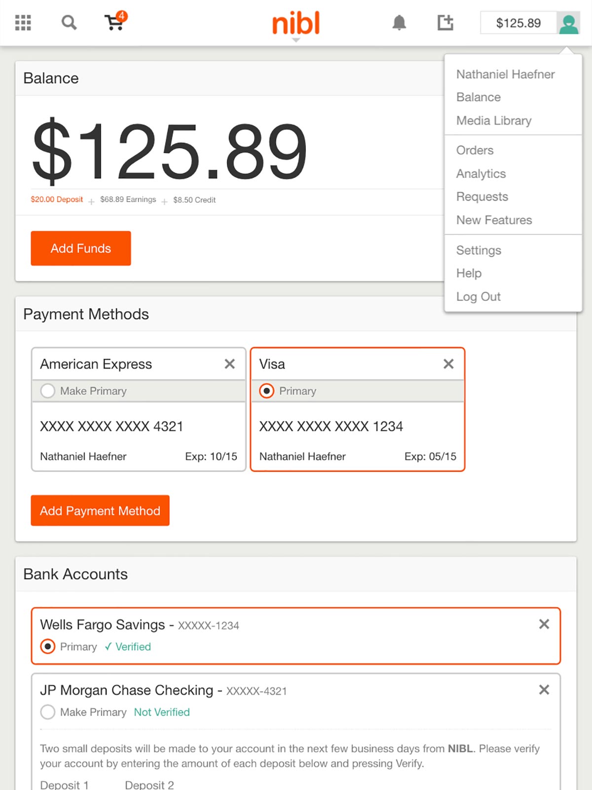
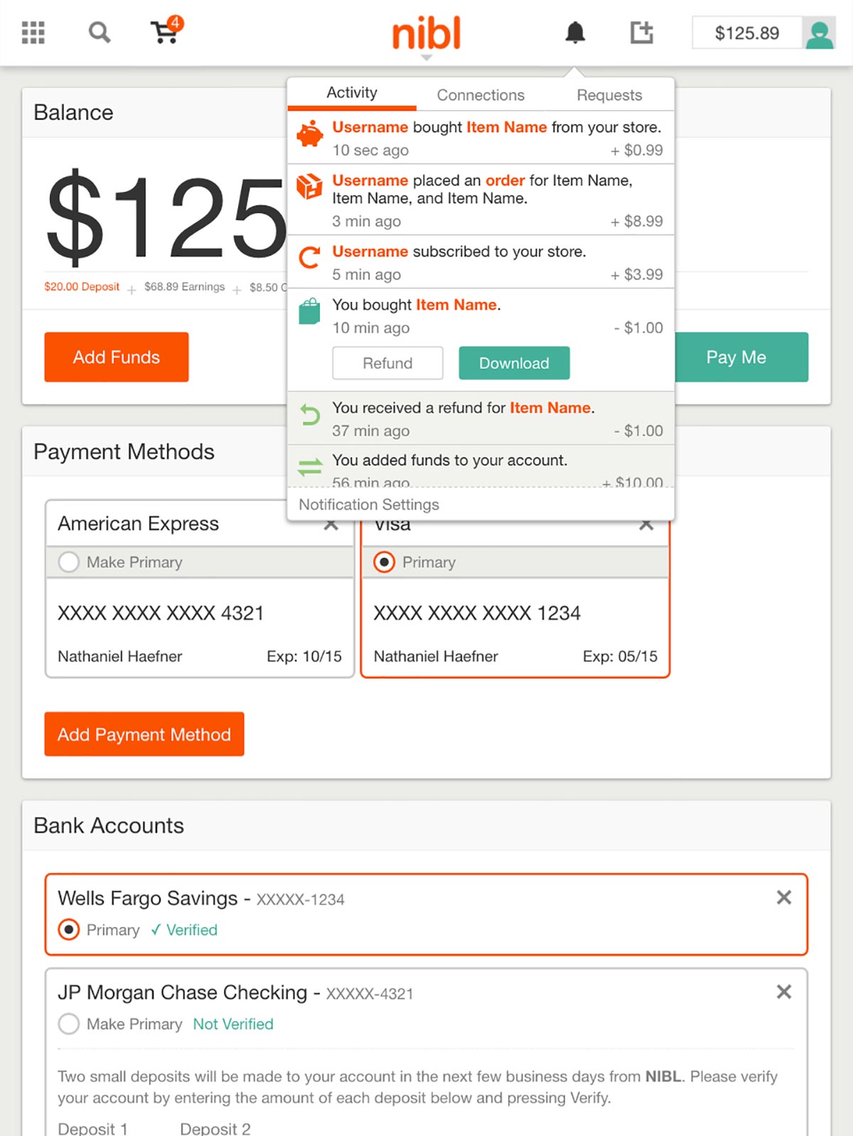
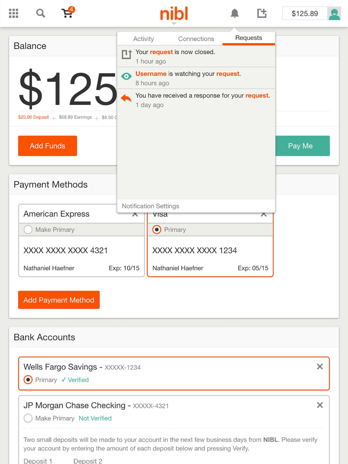
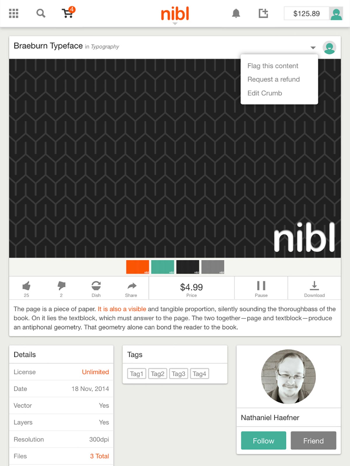
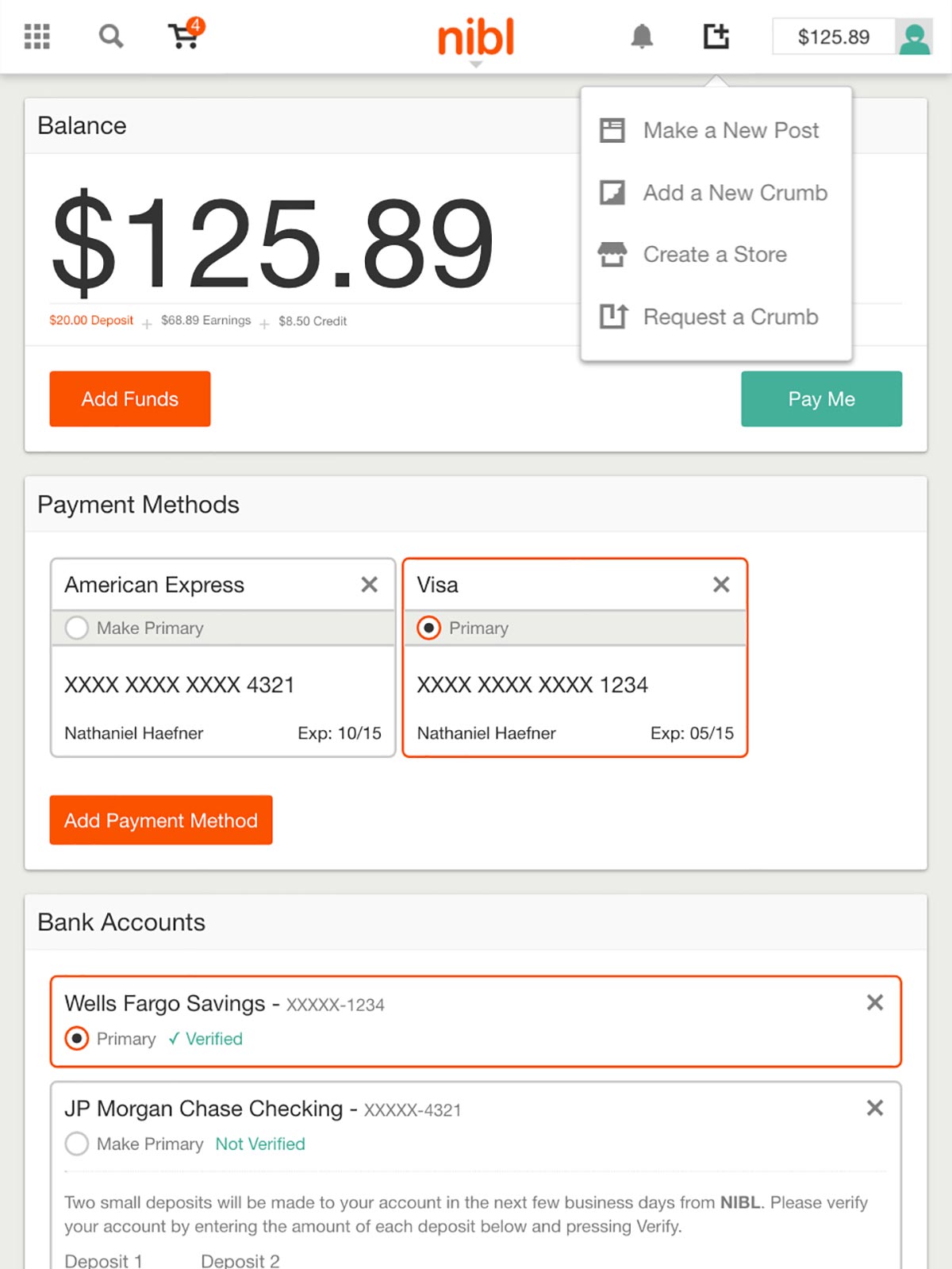
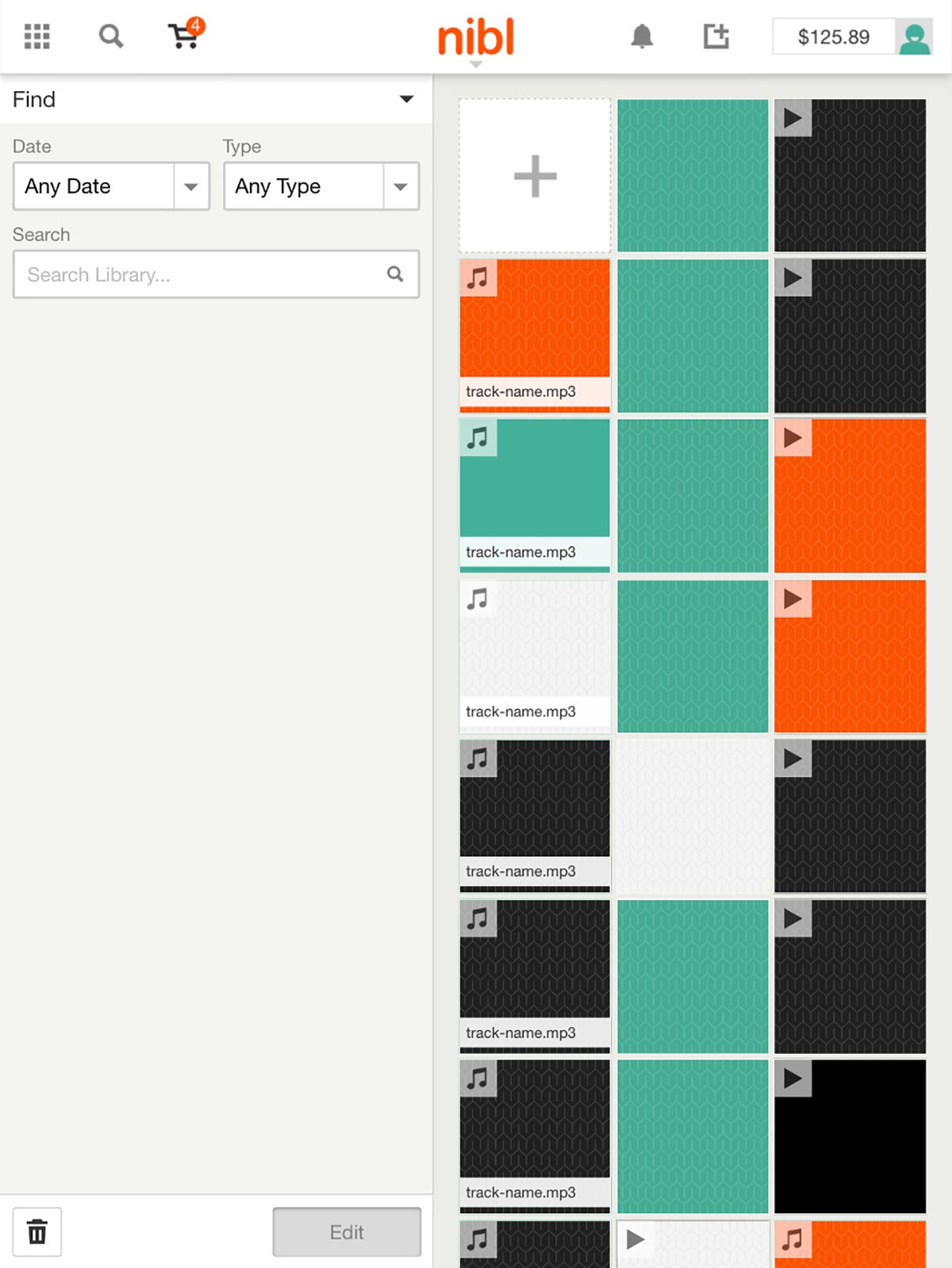
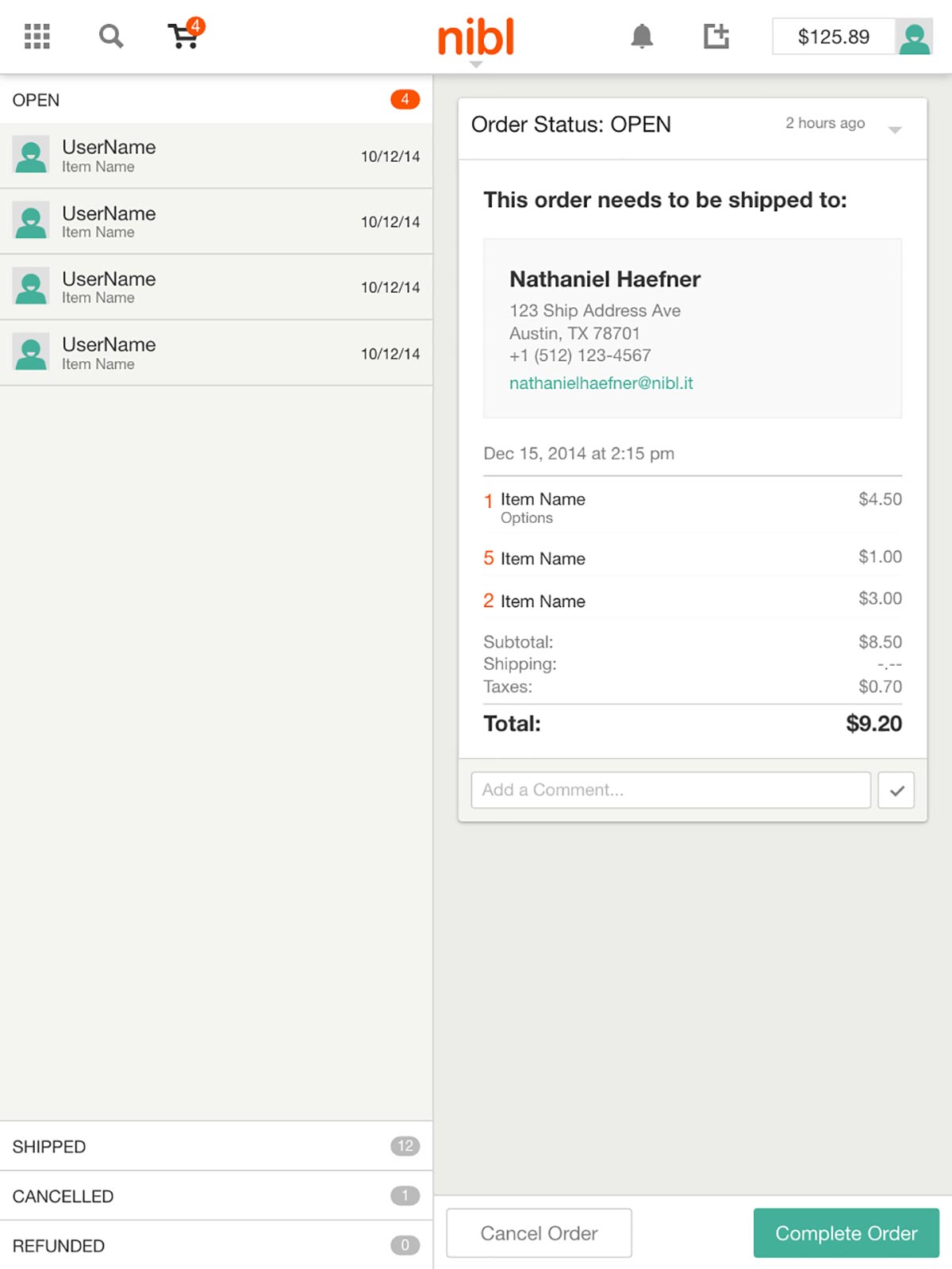
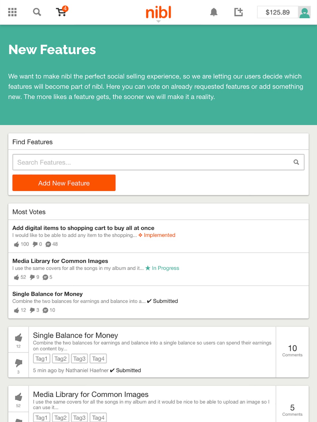
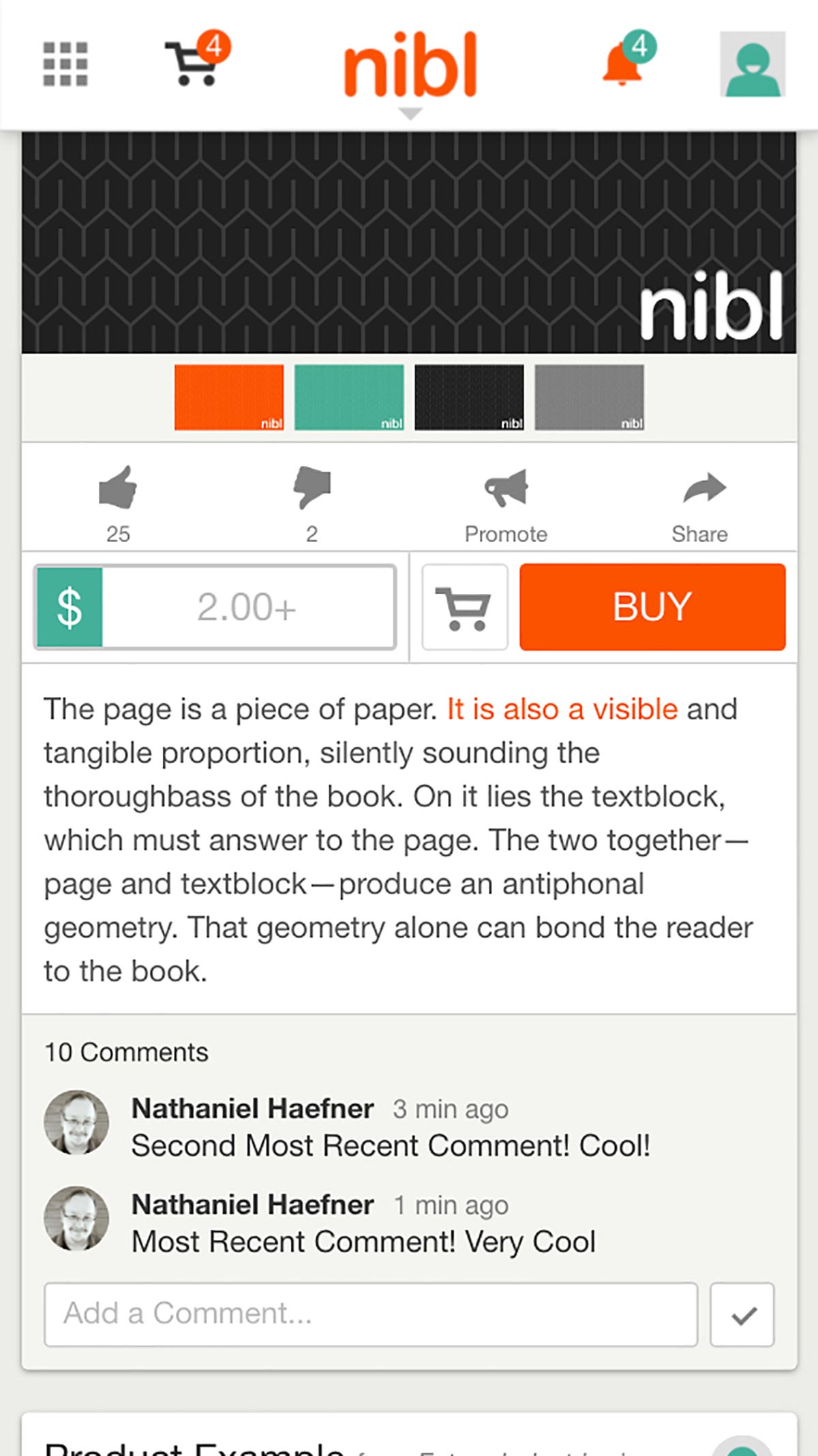
All aspects of the site maintain a visual appearance with the desktop site and are fully touch-friendly. The site uses fewer columns for grids and masonry style feed layouts adjust their width. The most important part of the tablet experience is how purchases are still easy to make and downloads are preserved for when the user returns to a supported device if special content is purchased.
Phone Scale
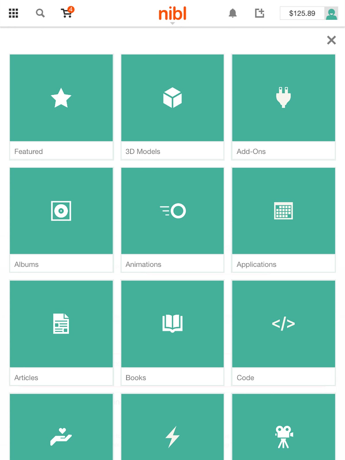
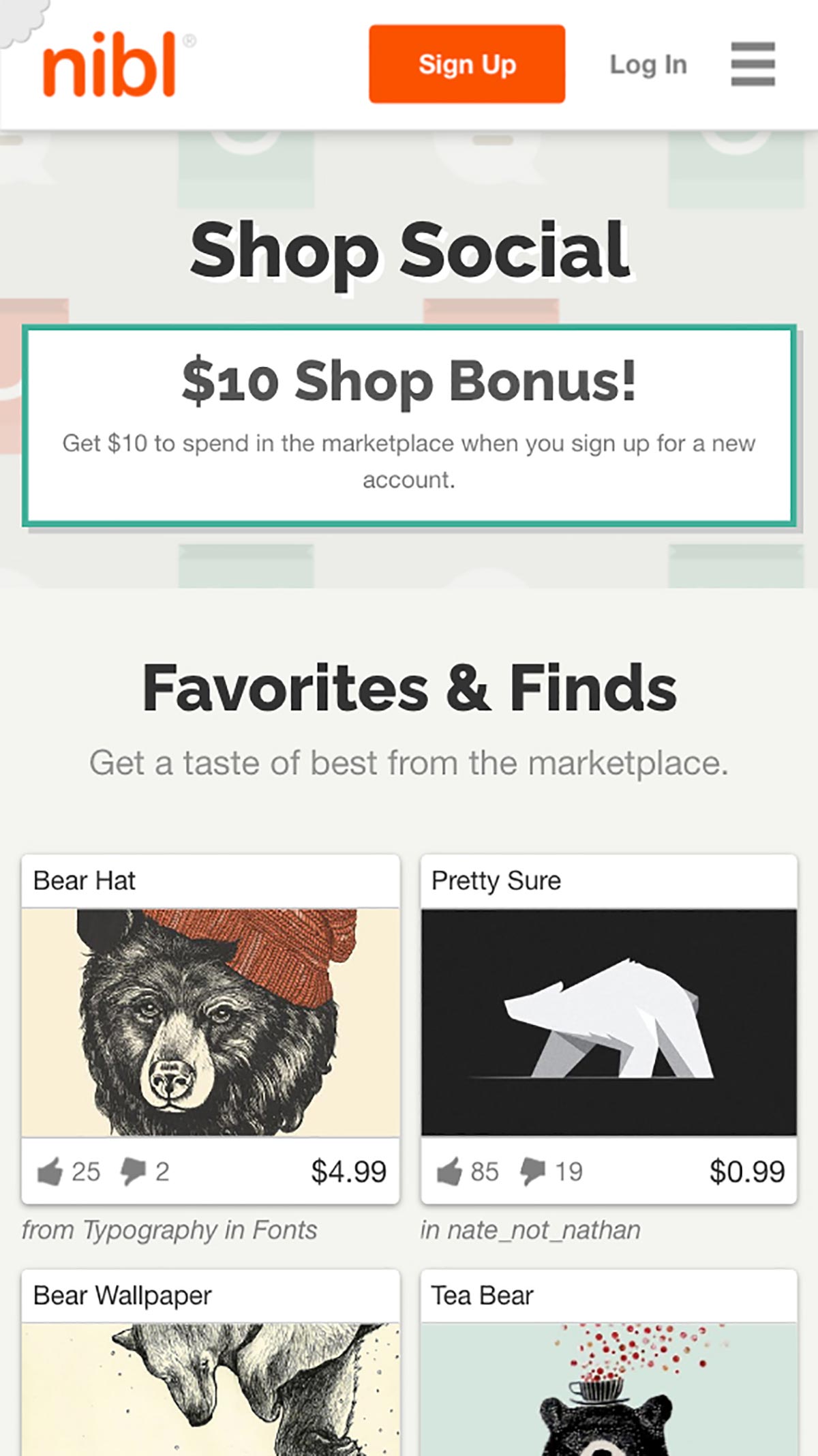
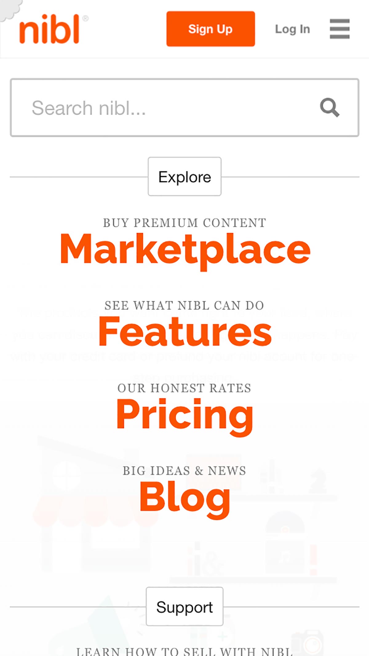
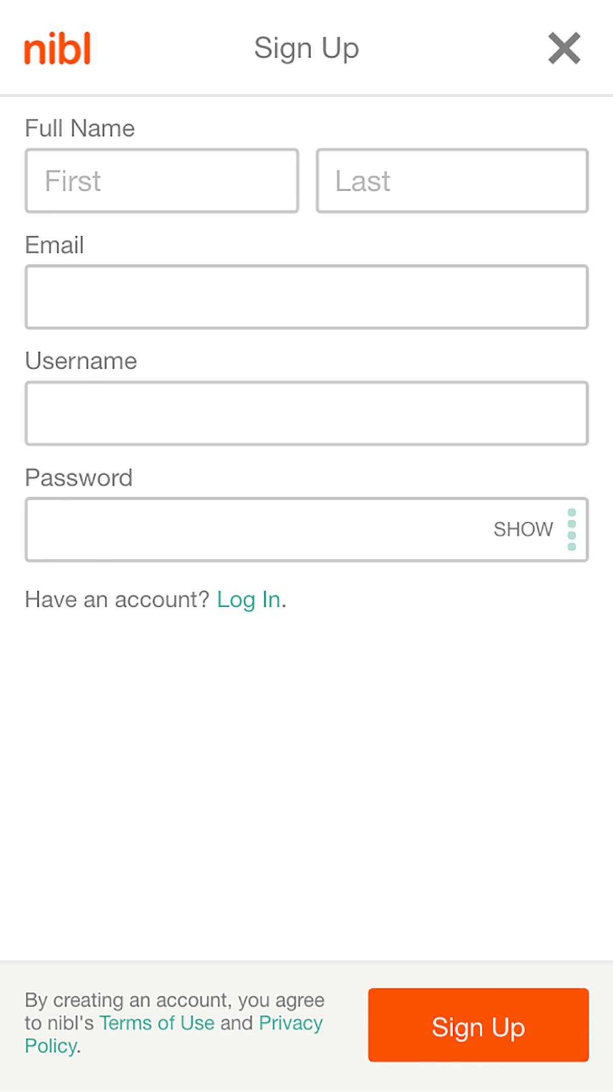
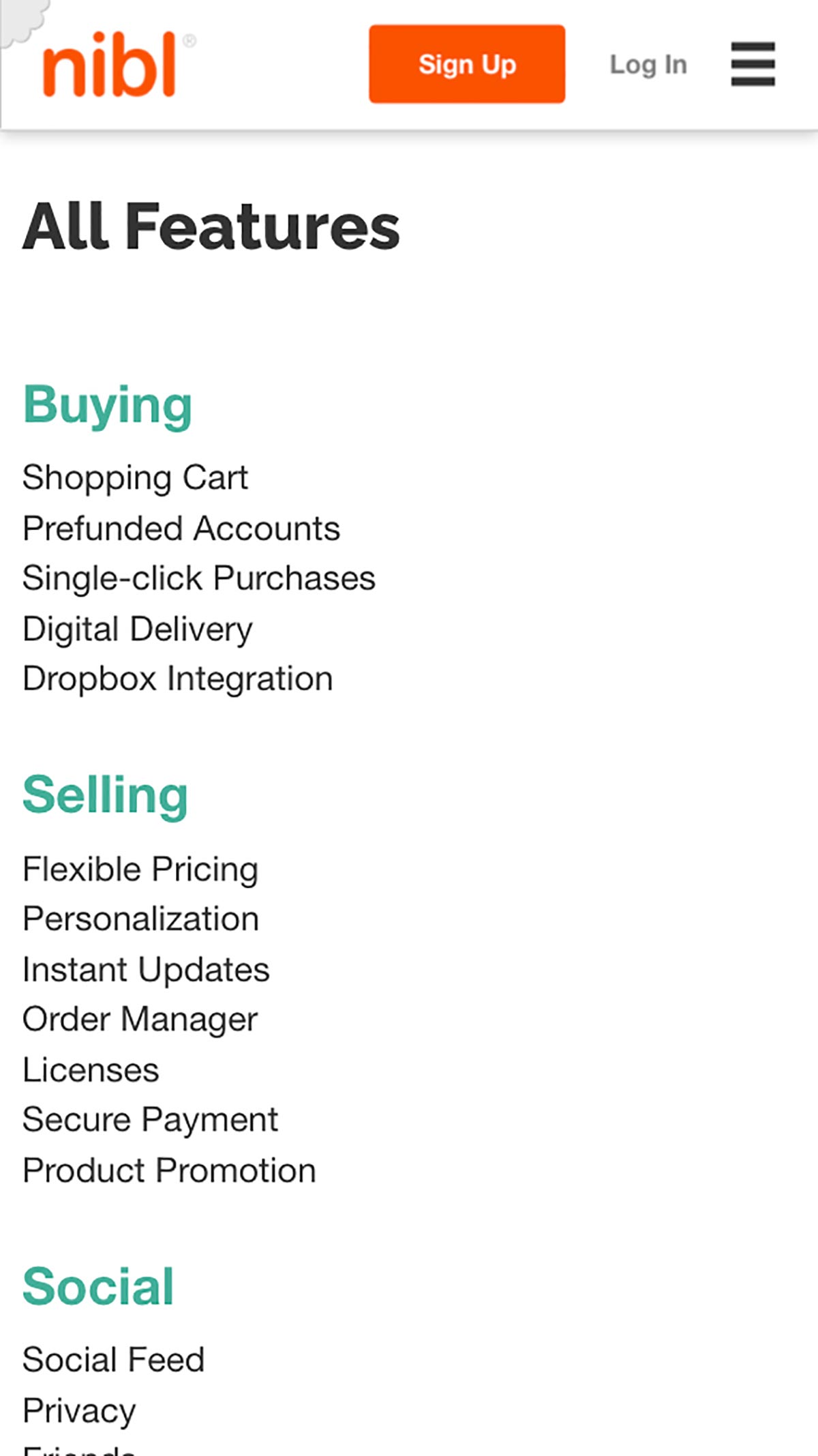
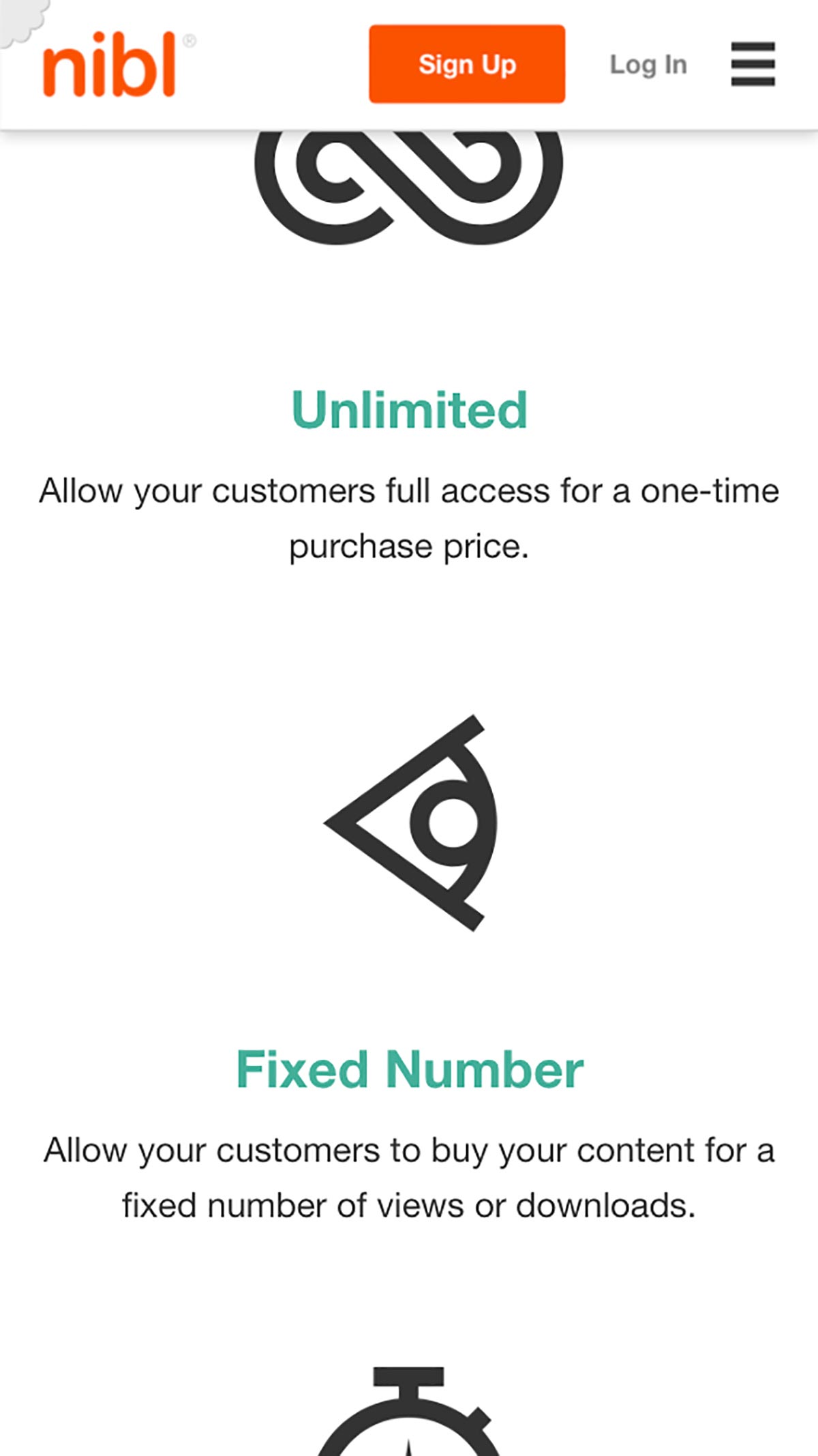
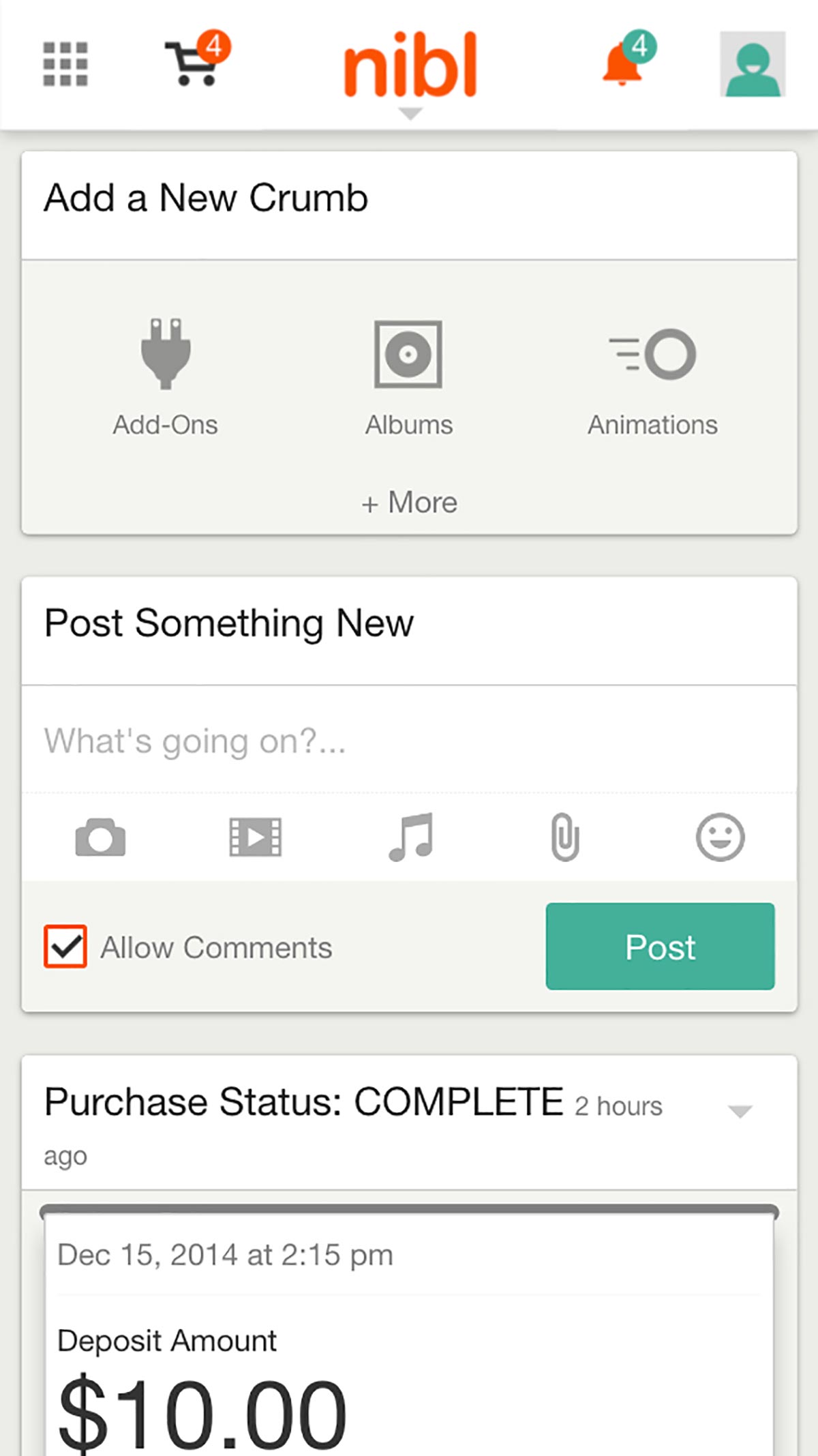
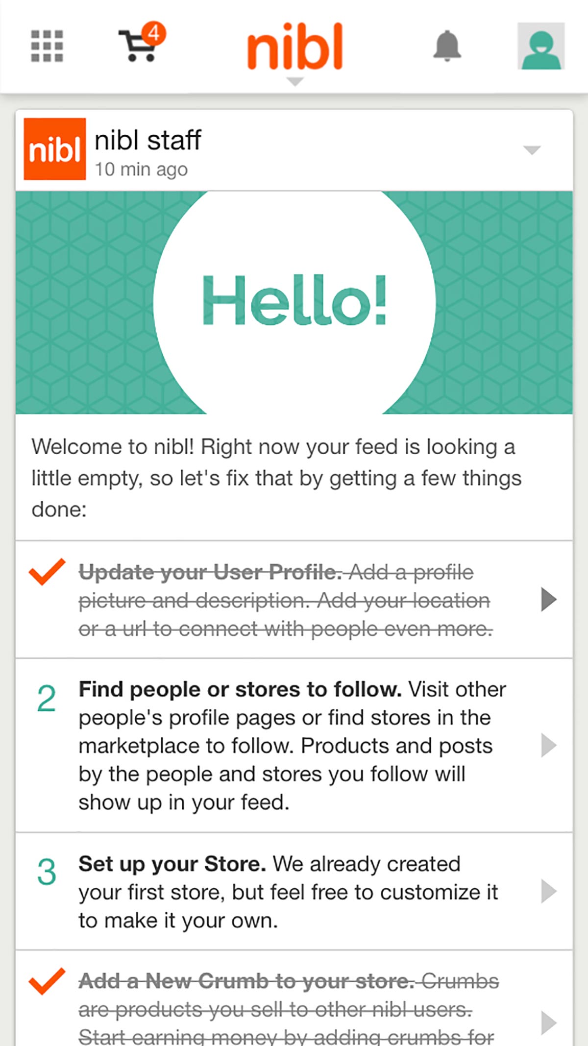
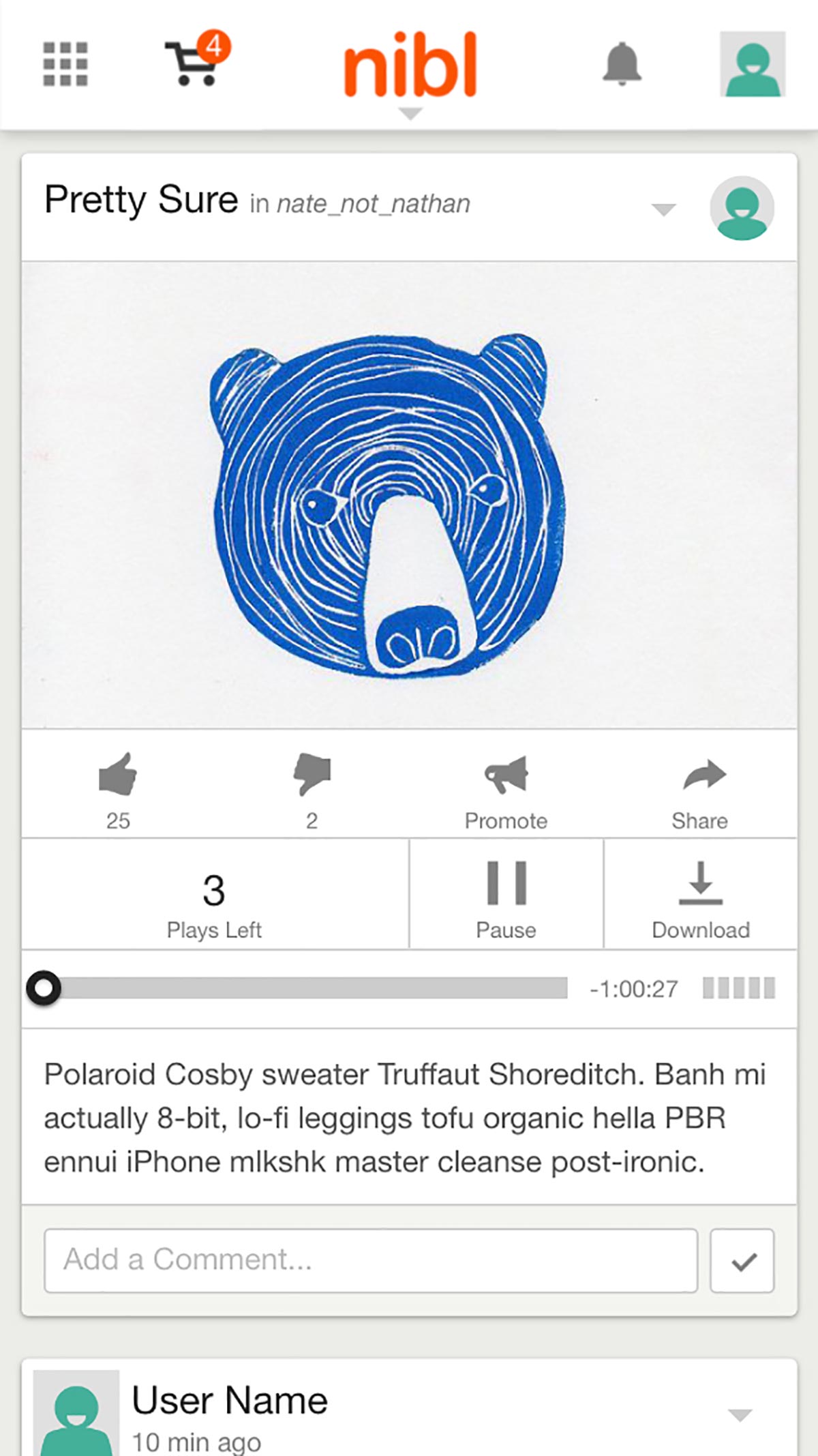
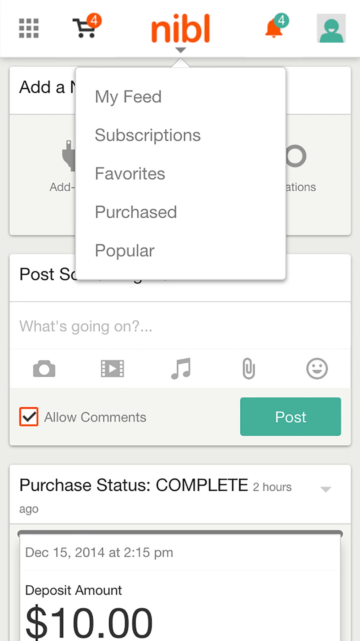
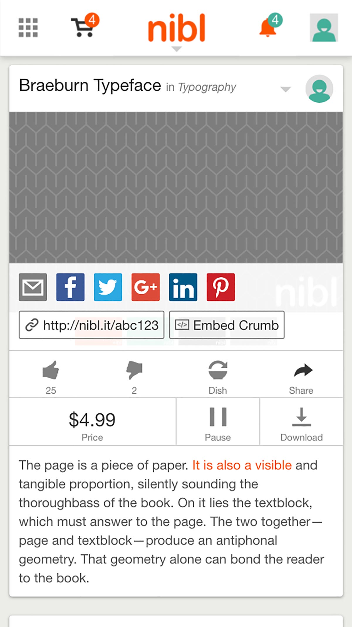
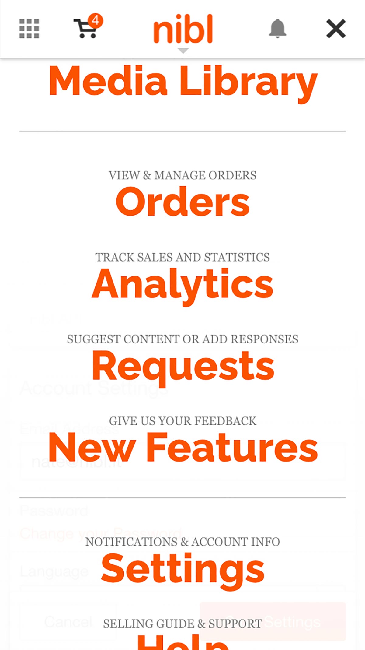
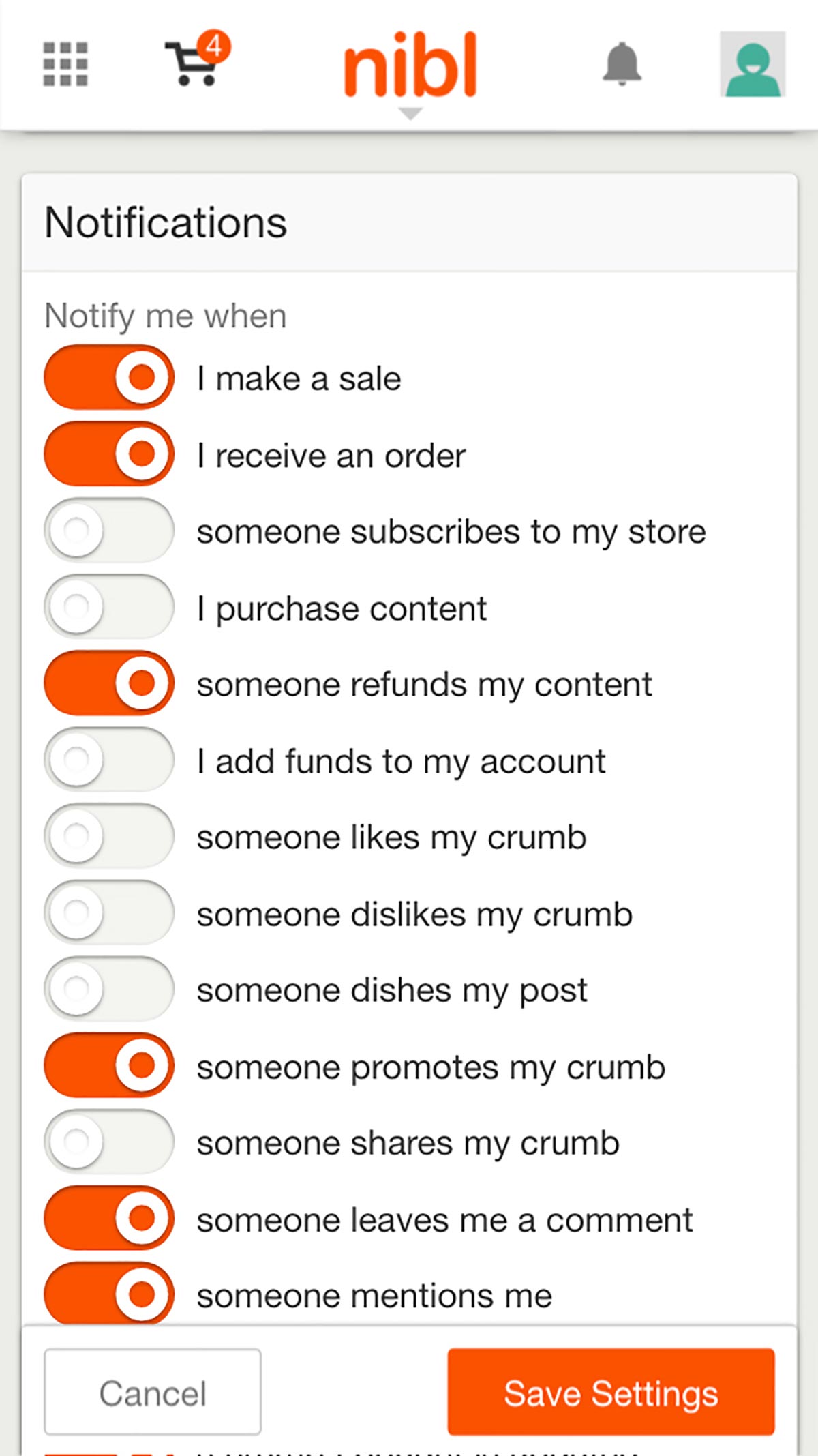
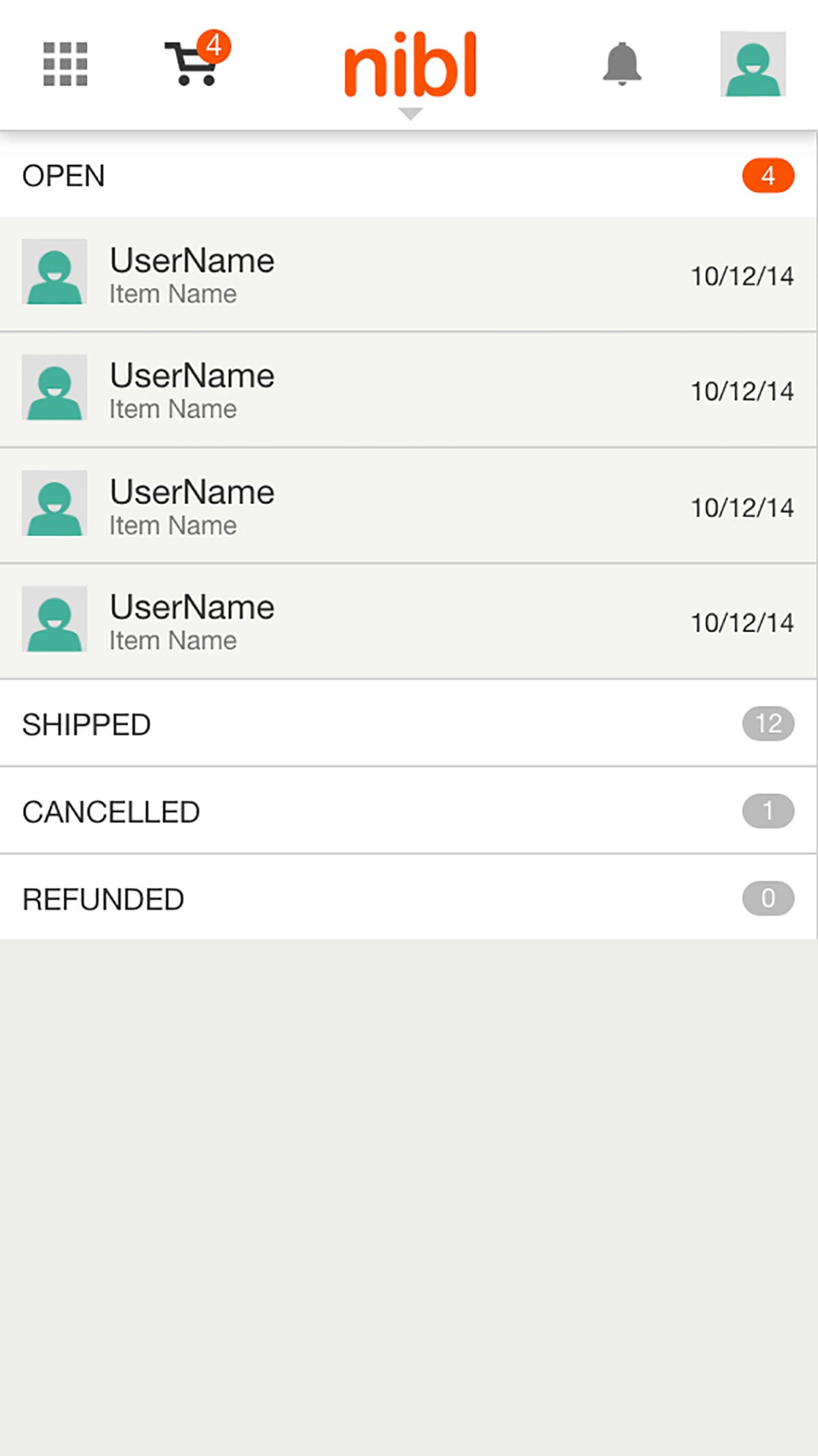
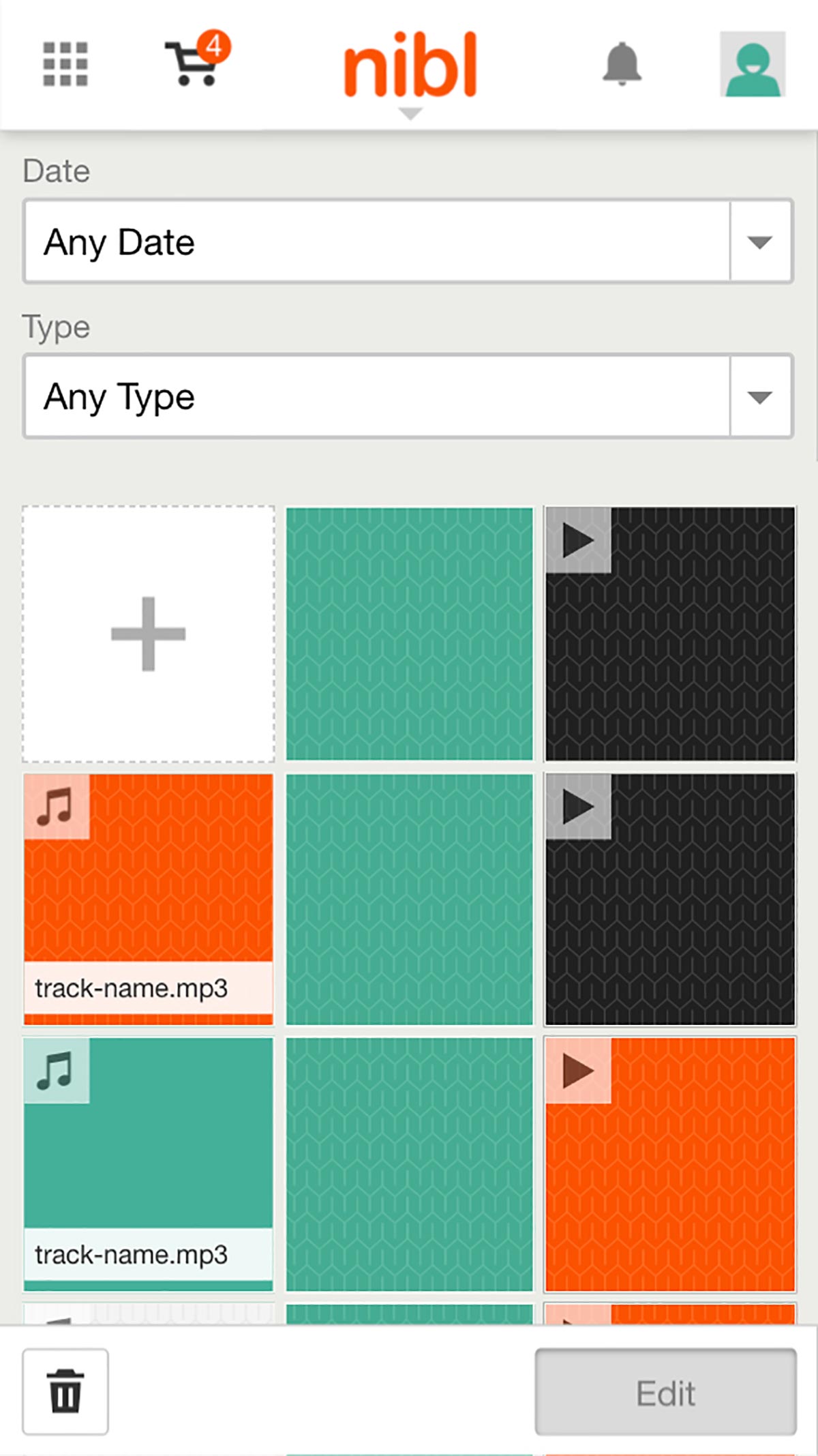
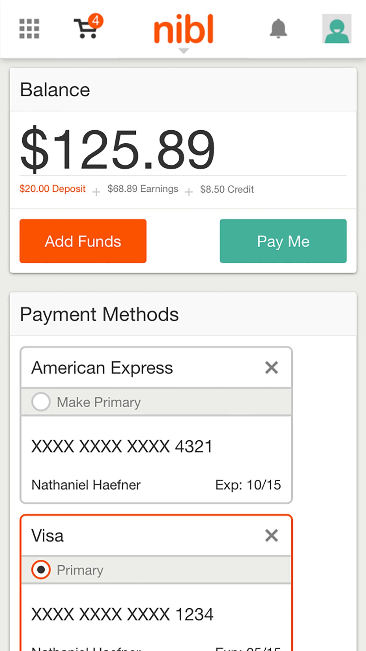
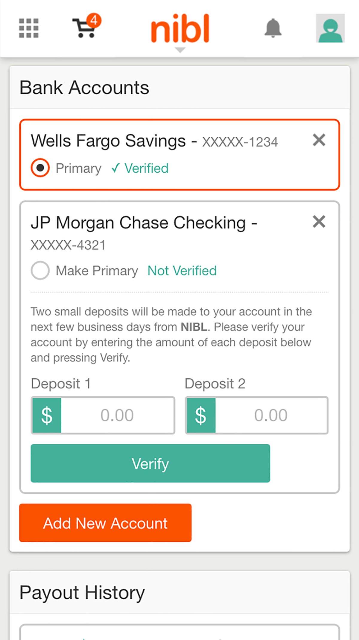
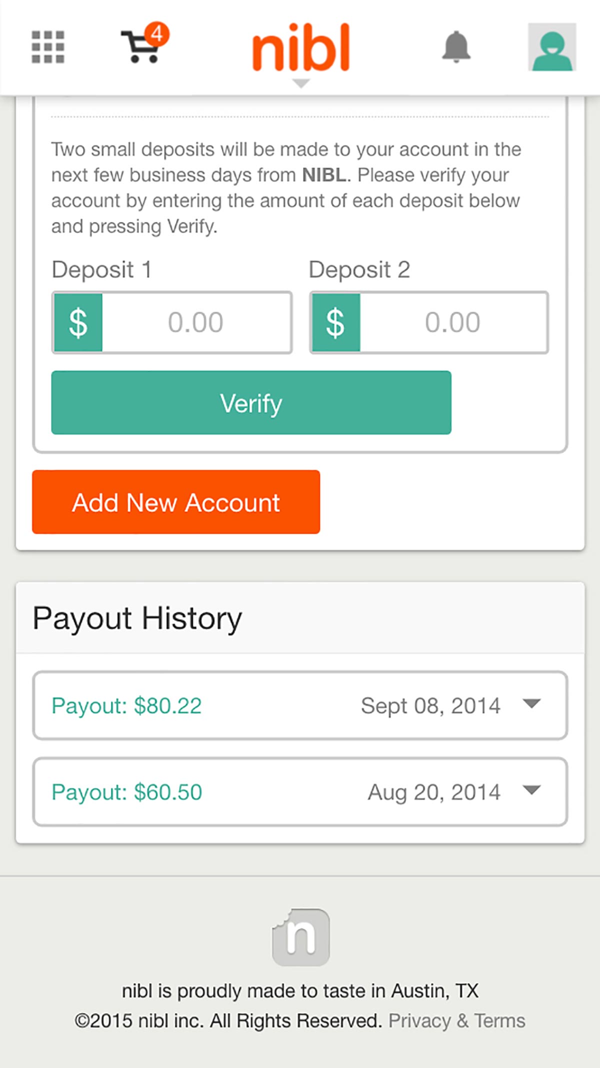
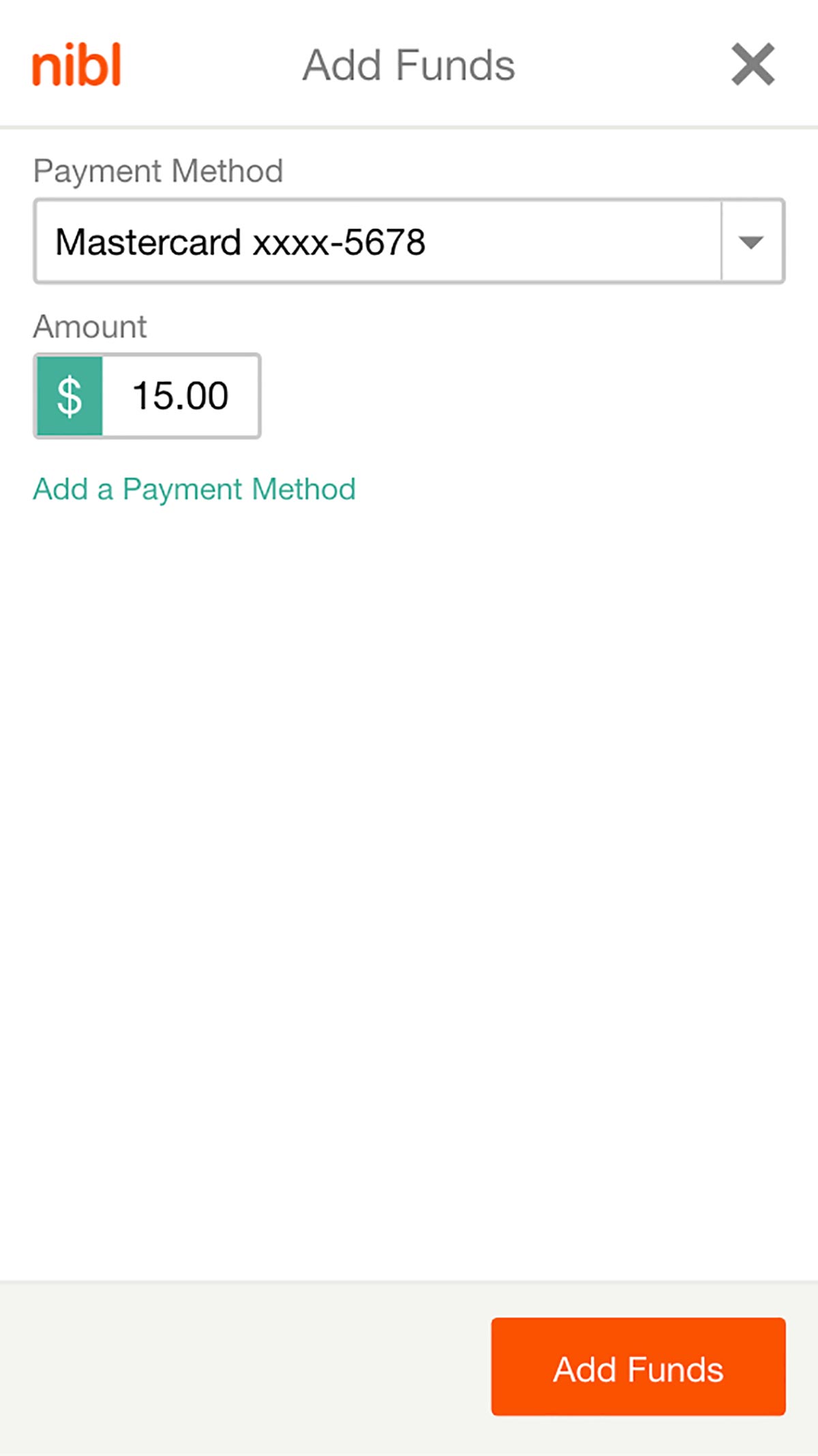
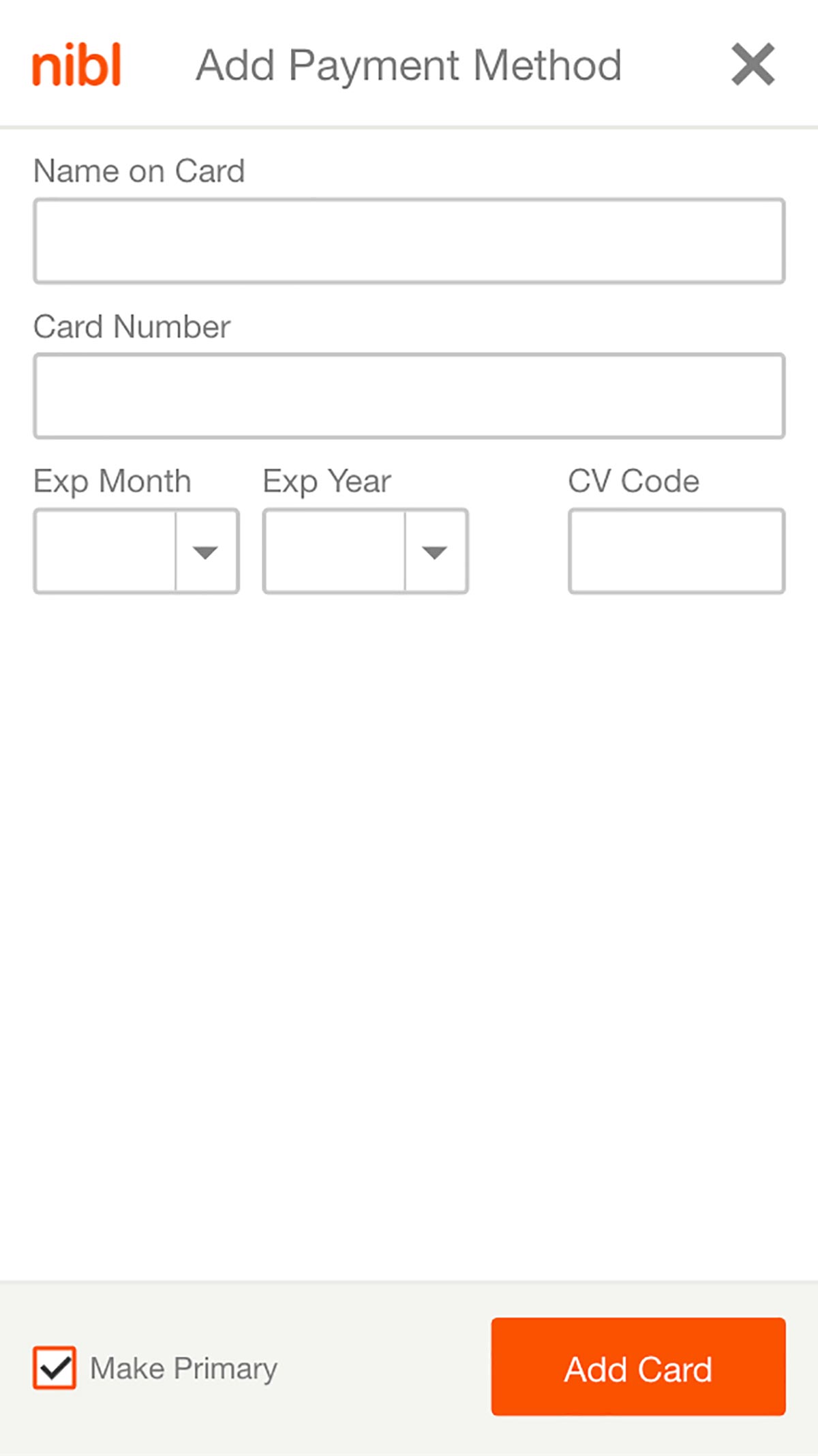
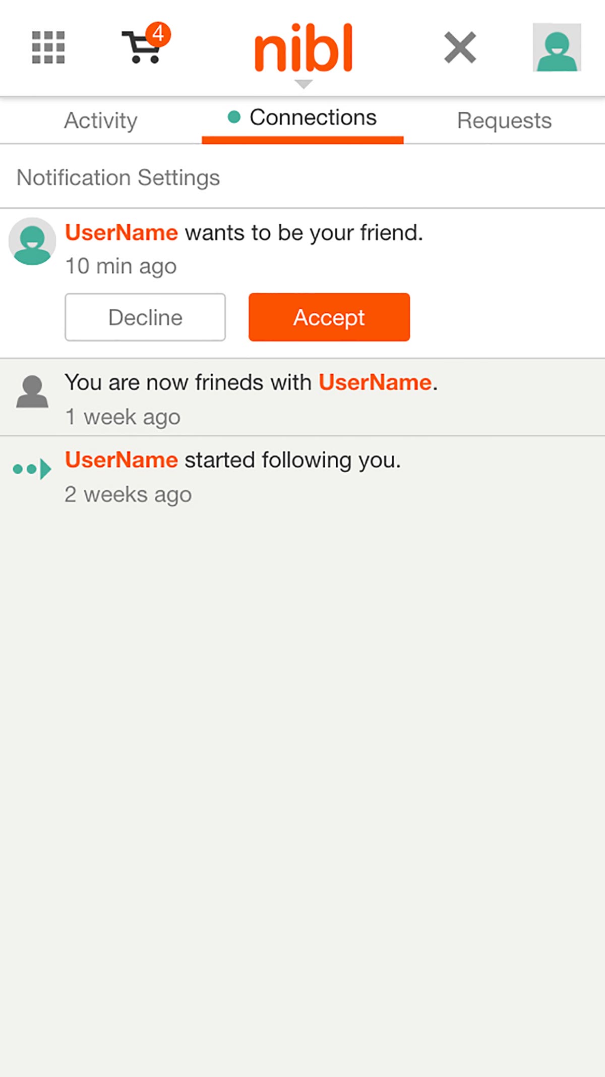
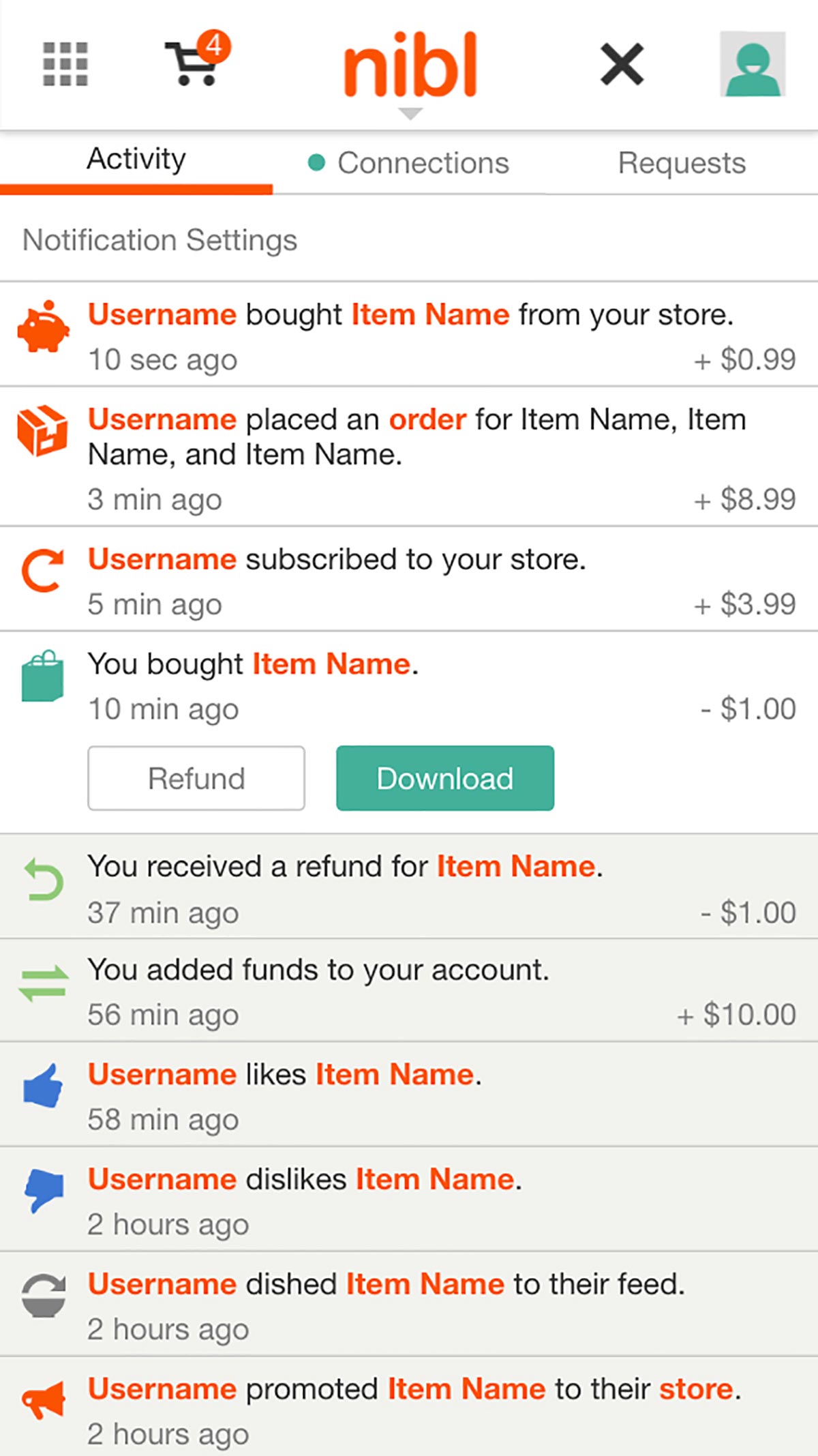
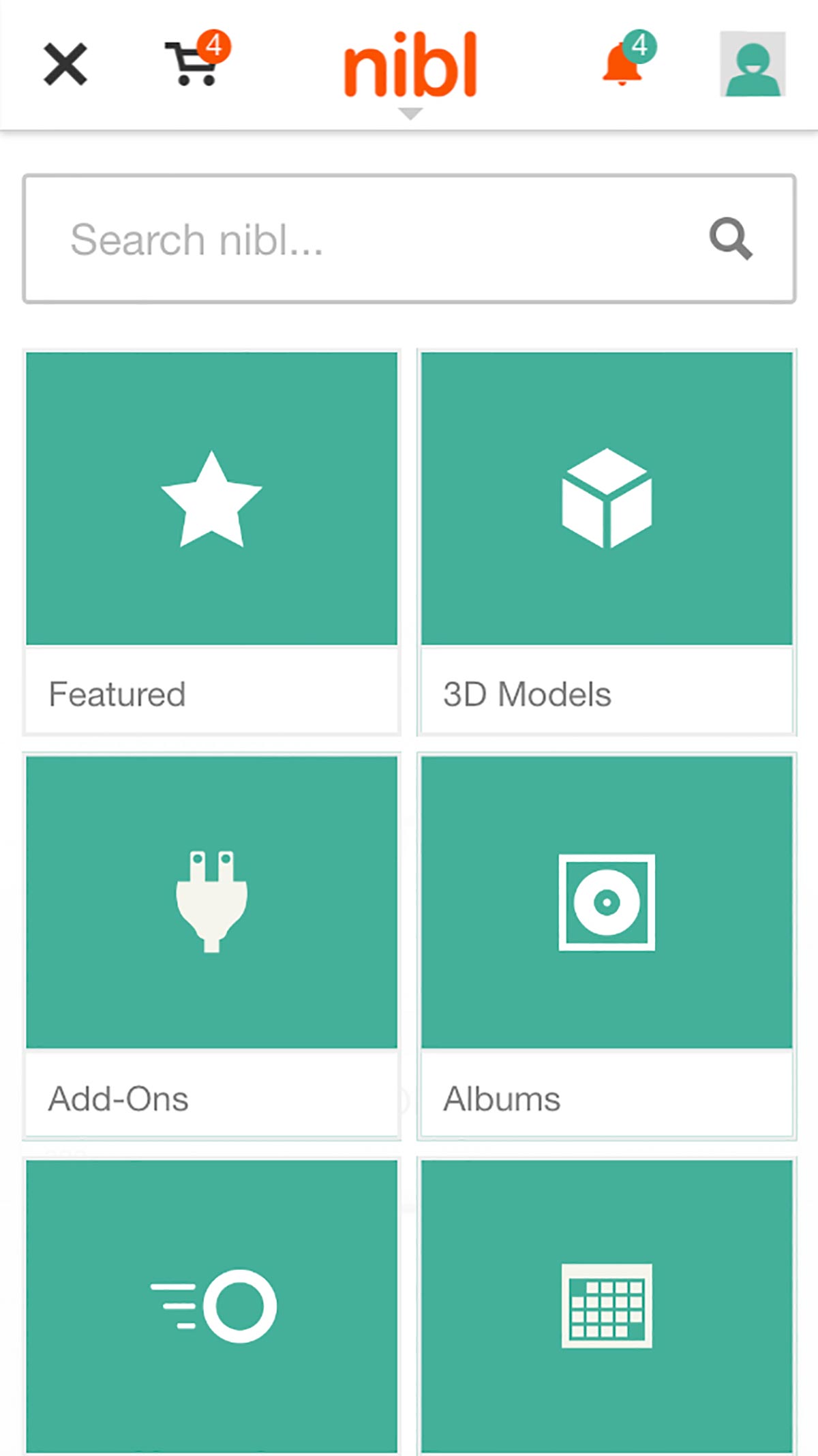
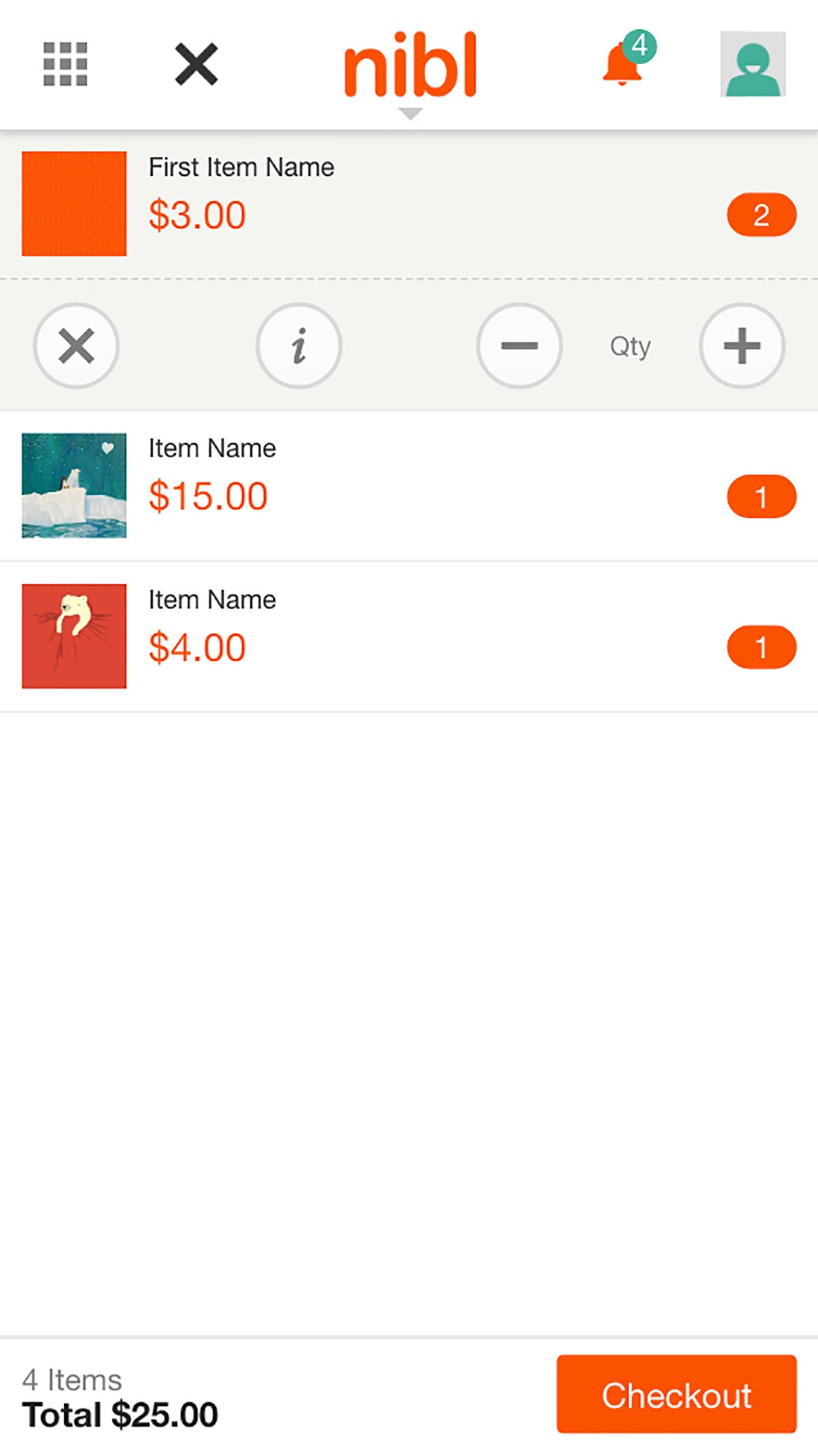
Besides a more concentrated column system, the mobile scale of nibl removes the modal overlays and restyles them to be full screen interfaces. The menus animate in from the direction of the icon that initiates the menu to preserve context.
Branding
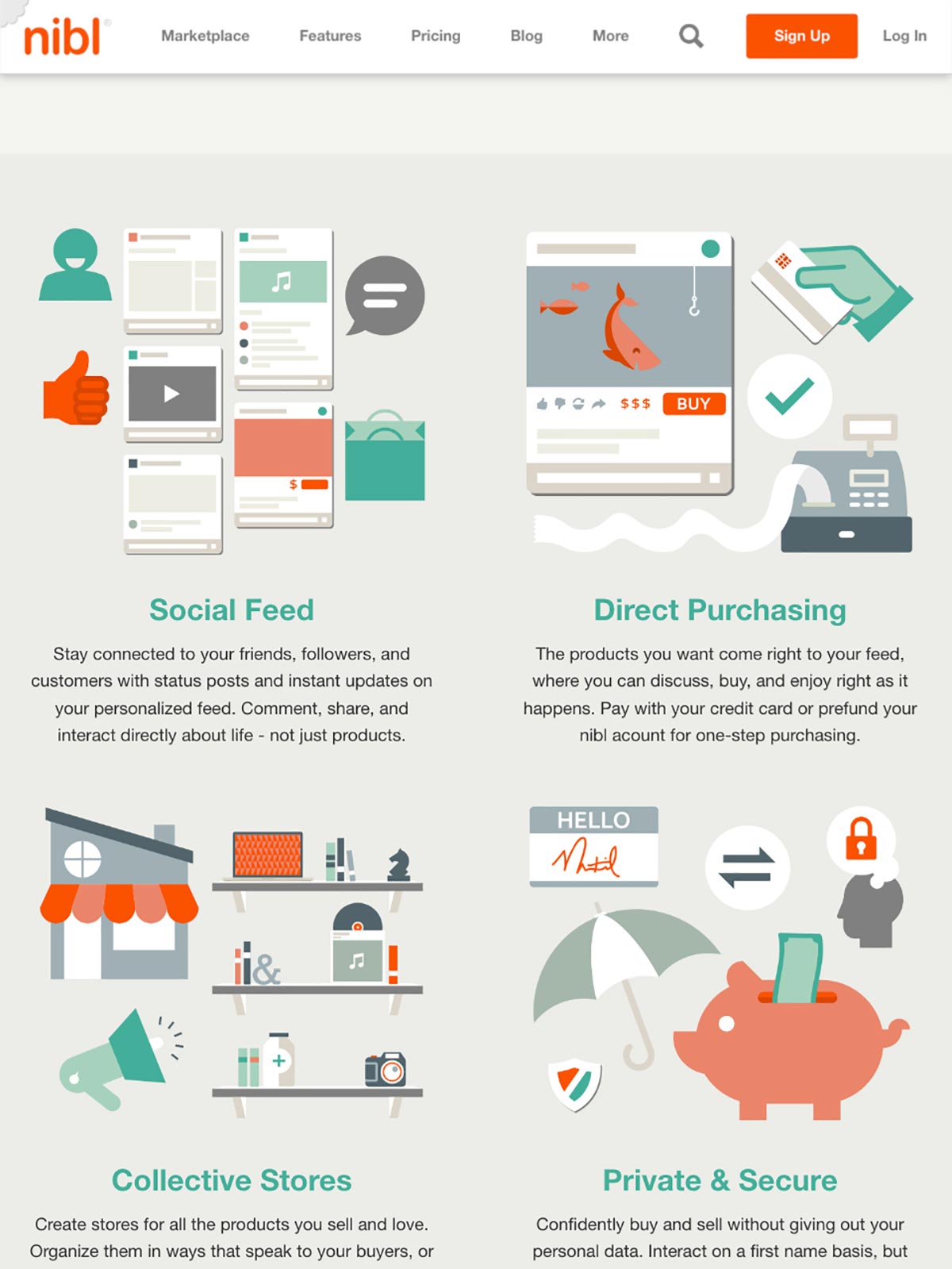
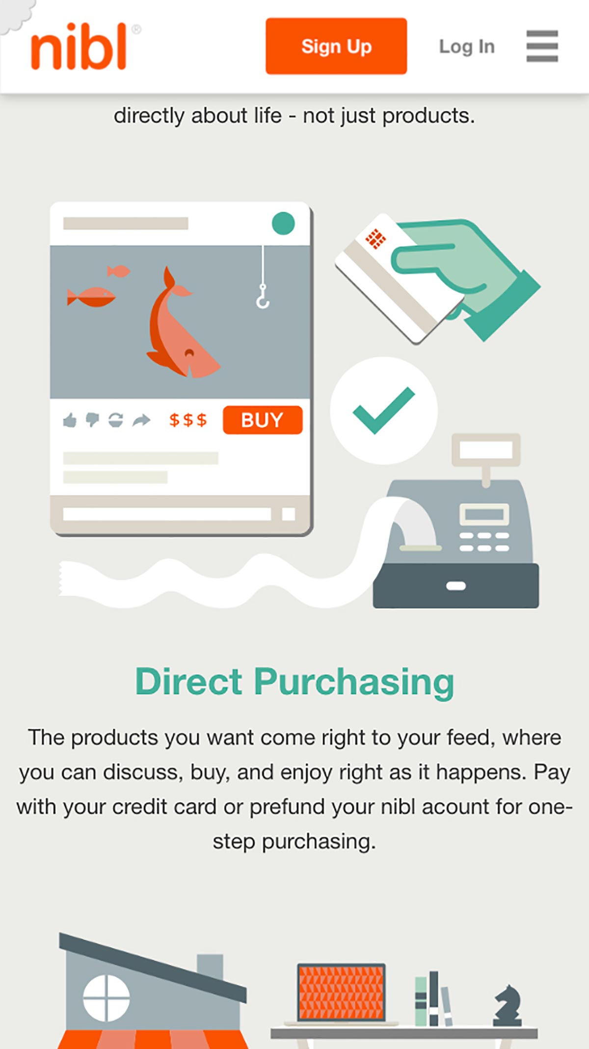
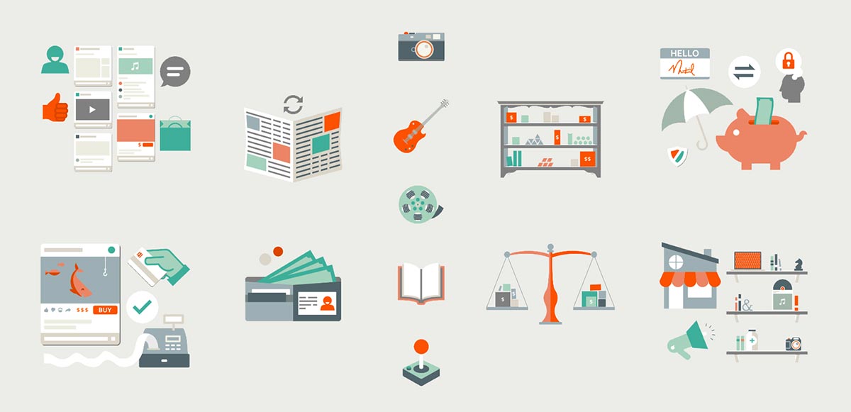
To gain more universal appeal, nibl used a clean and bright illustration style and simple iconography. The illustrations helped convey complex features without a lot of wordy text.
In 2018, the underlying technology for nibl was sold and the site was deactivated. The site was a pet project for a group of web developers at IJJC where I was a front-end web developer and designer.
