Ease of Use
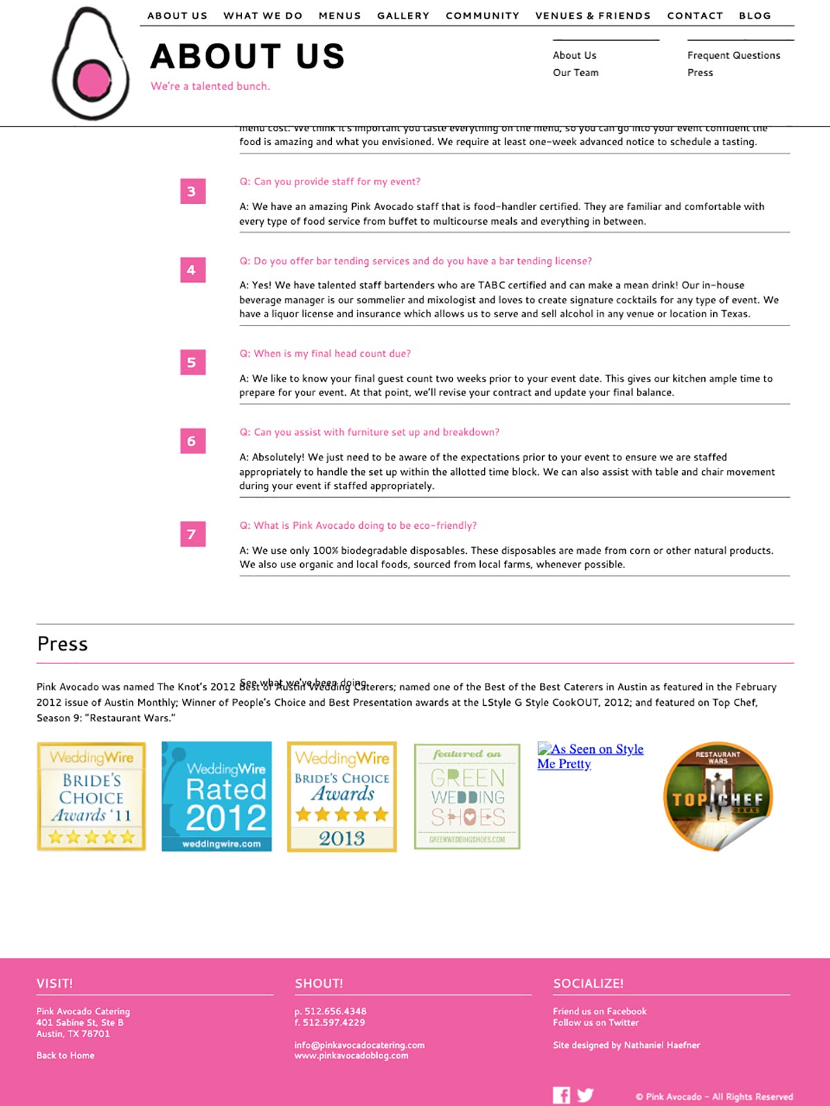
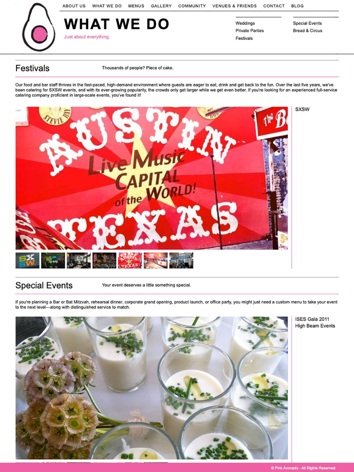
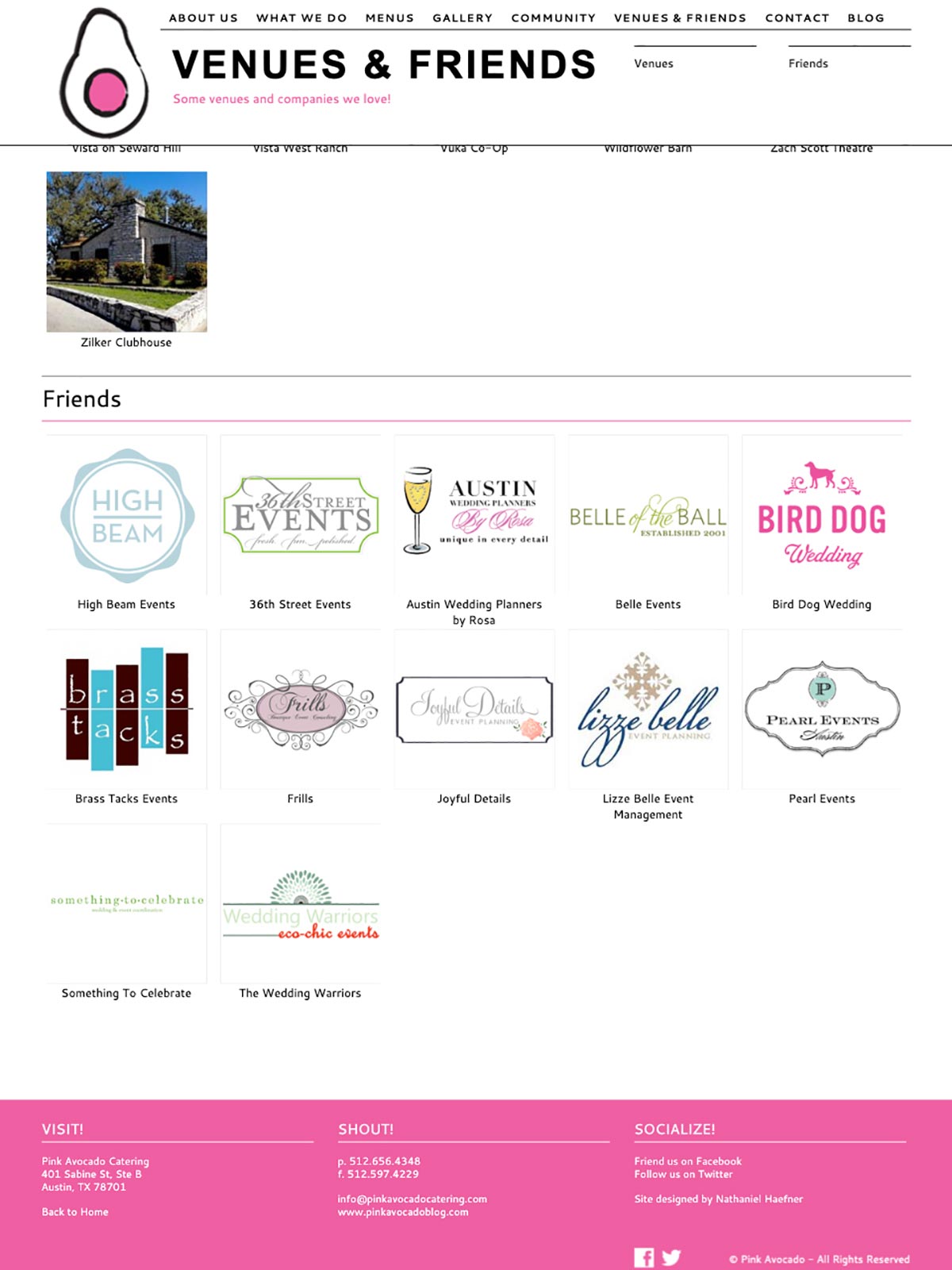
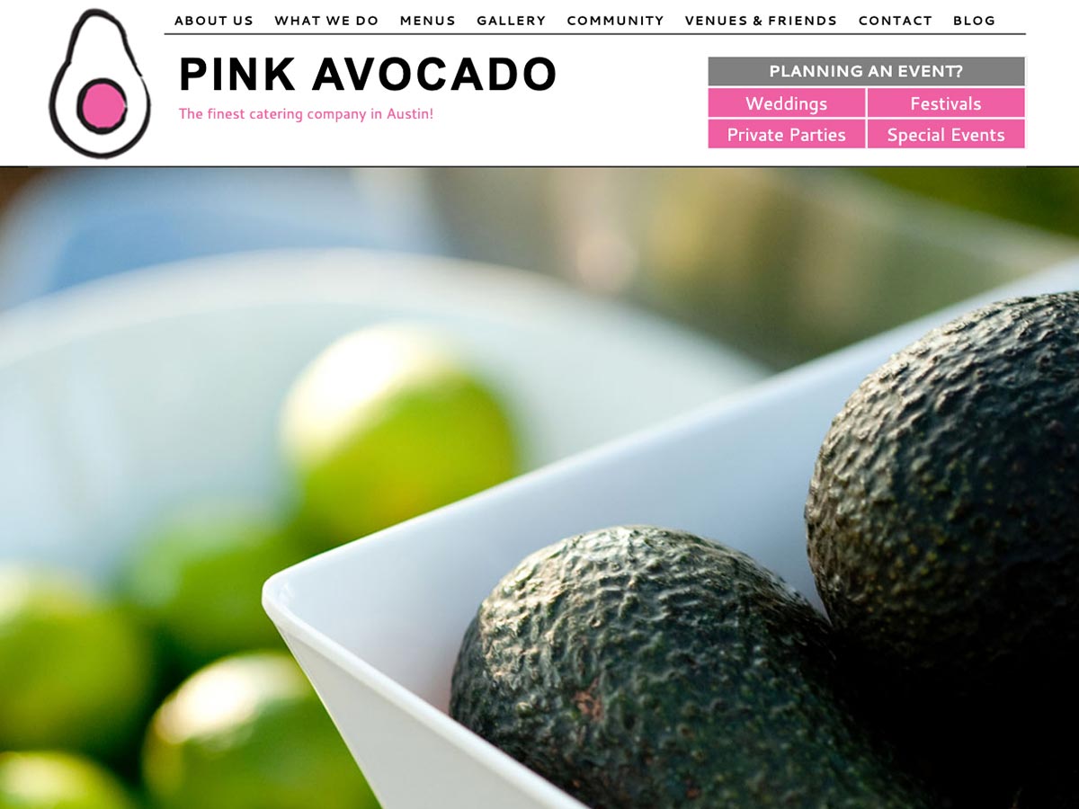
In order to improve the ease and efficiency of the Pink Avocado website for the customers, the site had to be redesigned. The new site is simple and clean and highly functional for the user. The site also had to be compatible with mobile devices and tablets.
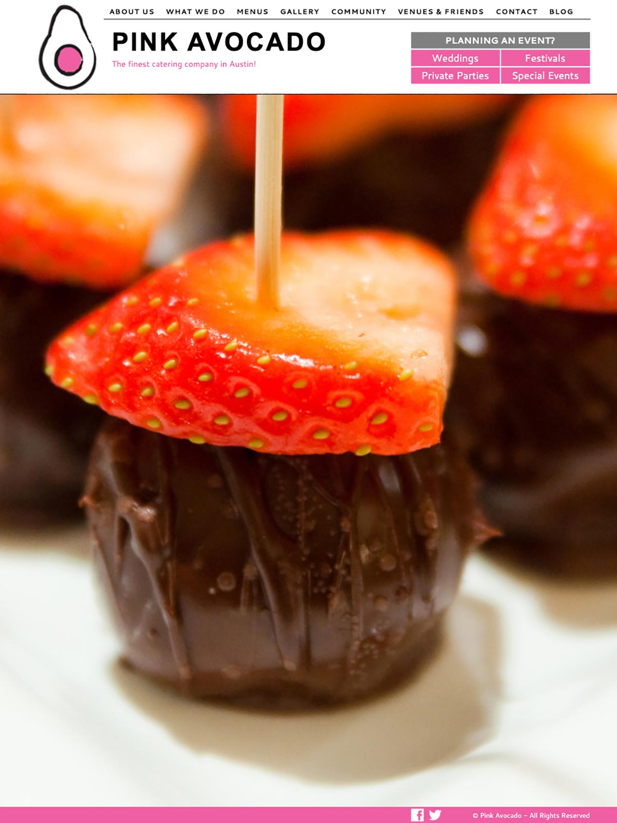
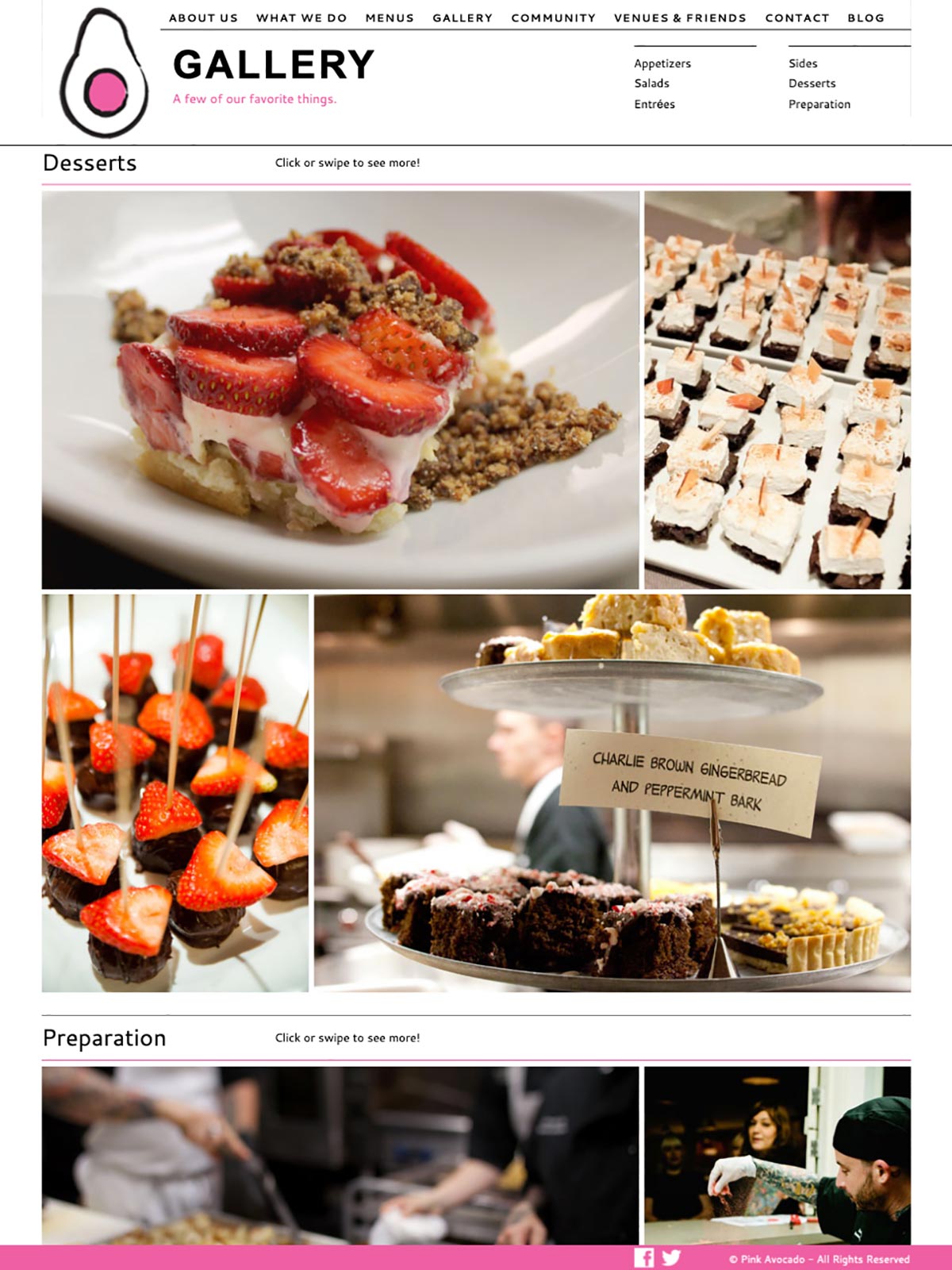
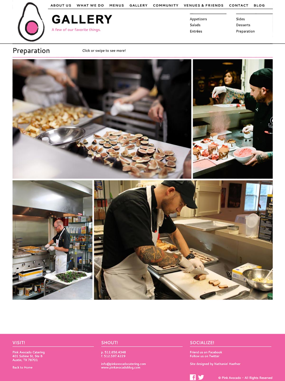
The use of clean typography simple color scheme allows for the photography of the delicious food to really stand out and mesmerize the user. With a fixed header and using quicklinks, the site is very user-friendly.
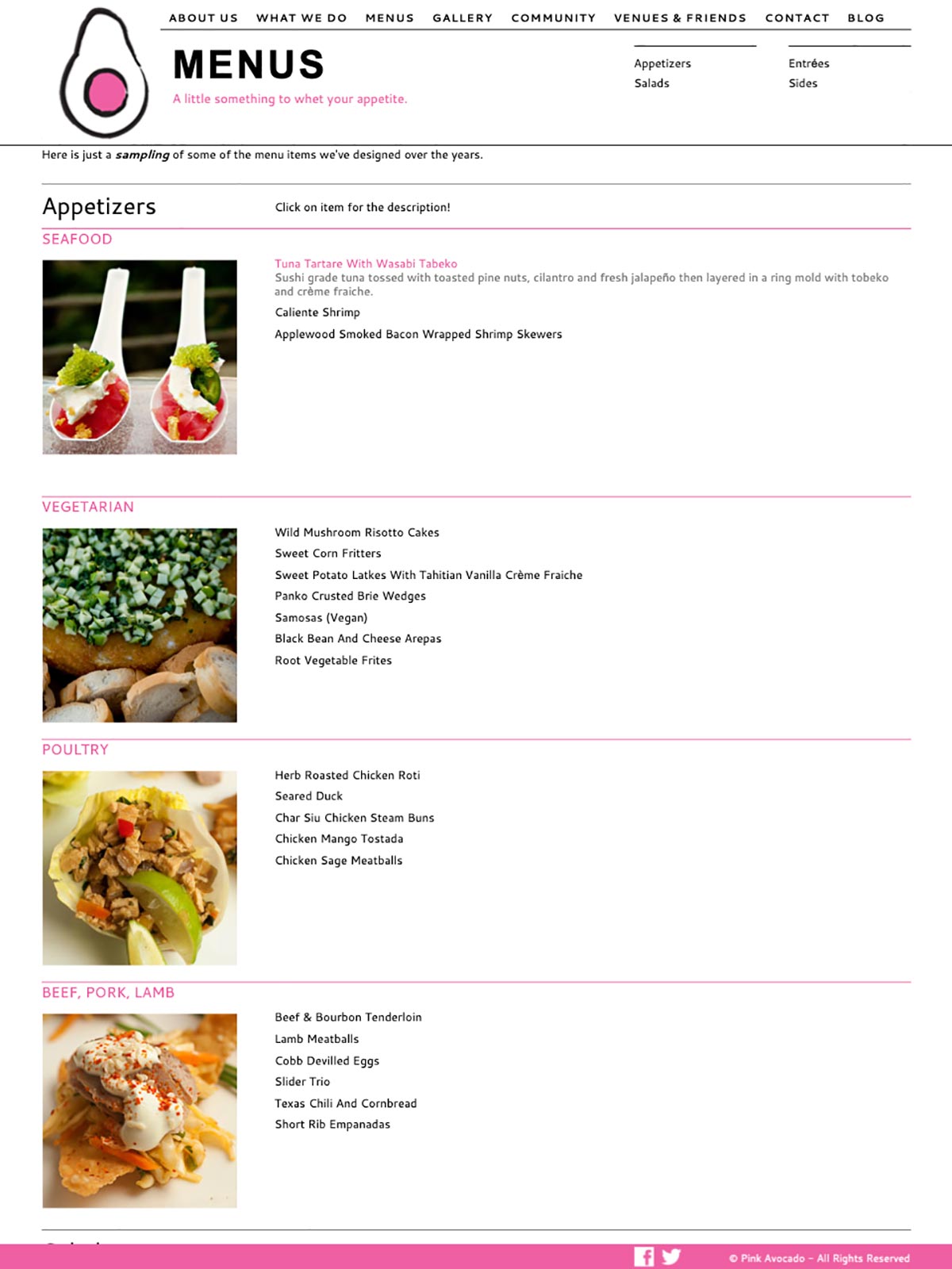
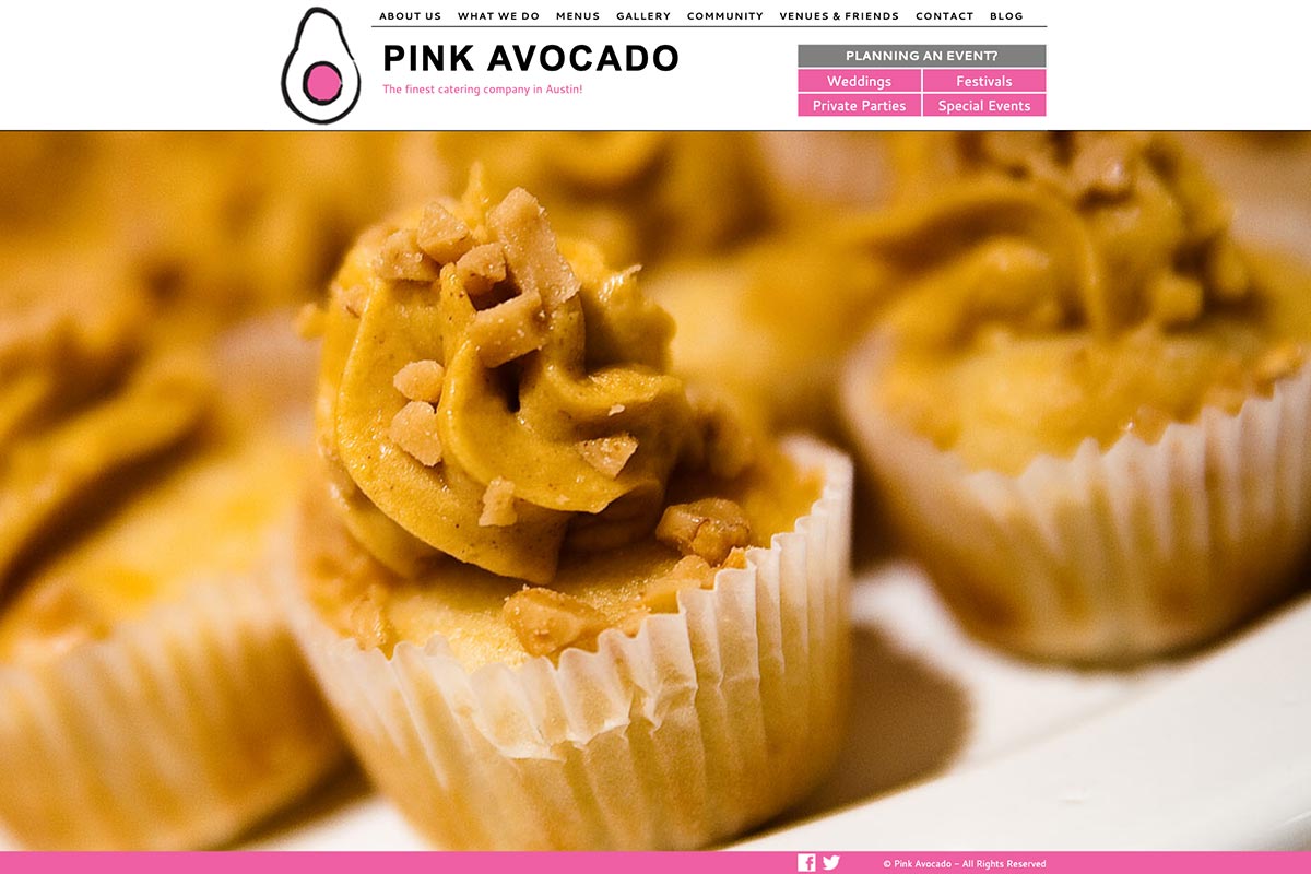
Keeping the food as a focus, the site uses close-up food photography and showcases menu options for any event.
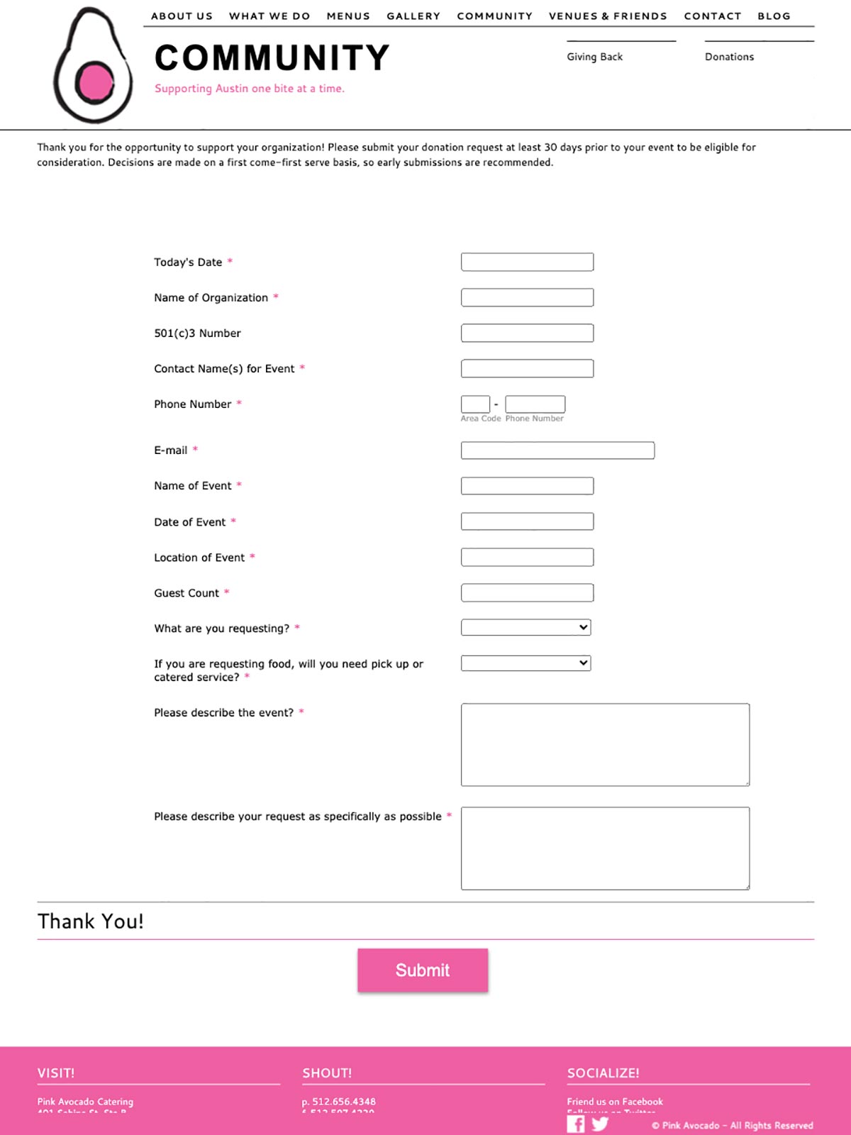
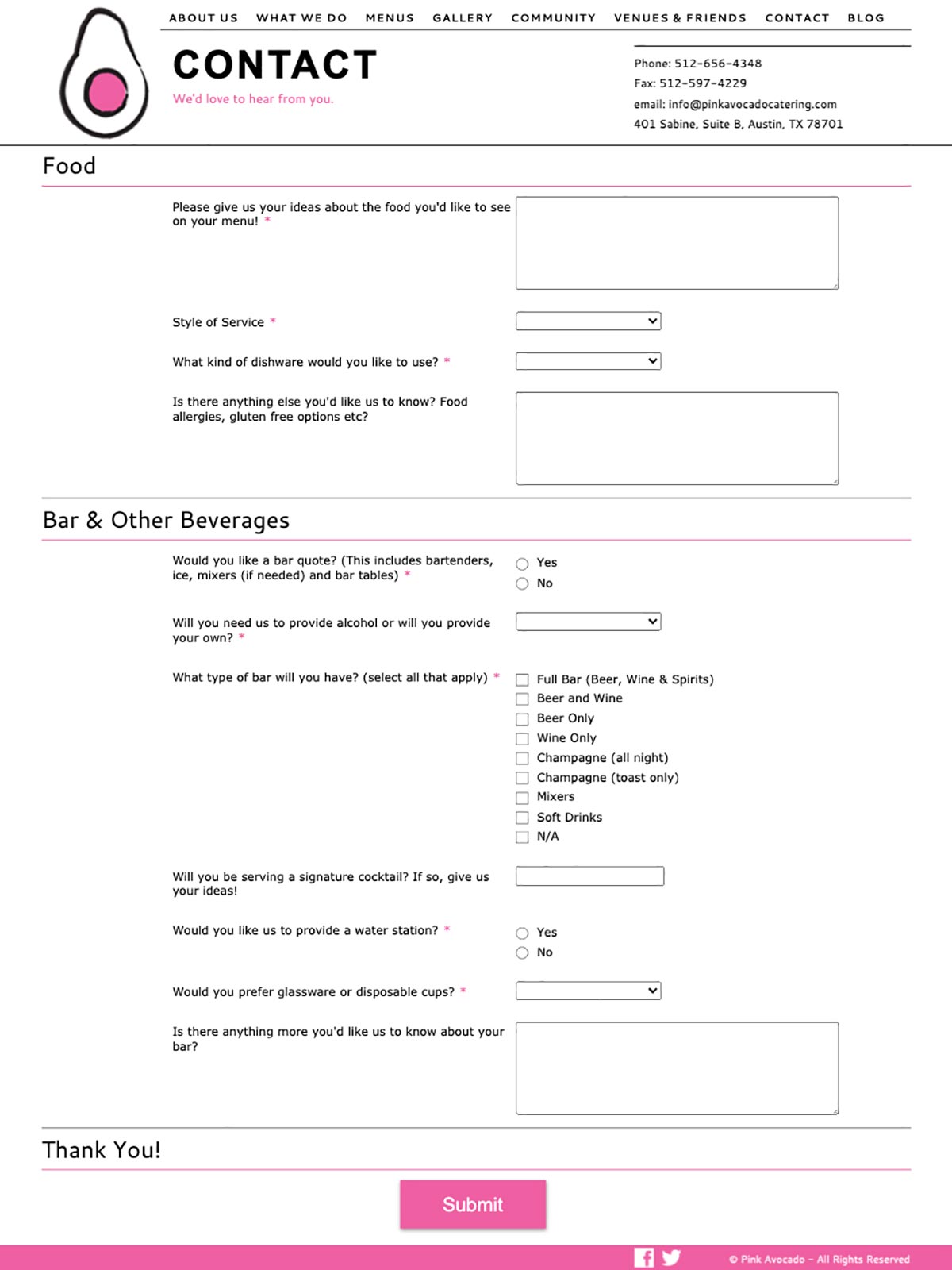
The site features JotForm integration with custom stylesheets to match the branding of the site. This way, employees at Pink Avocado could maintain and update their forms without having the update the website manually.
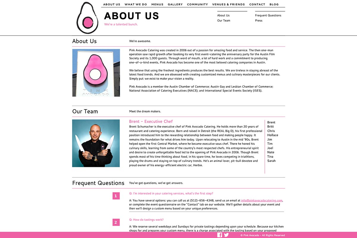
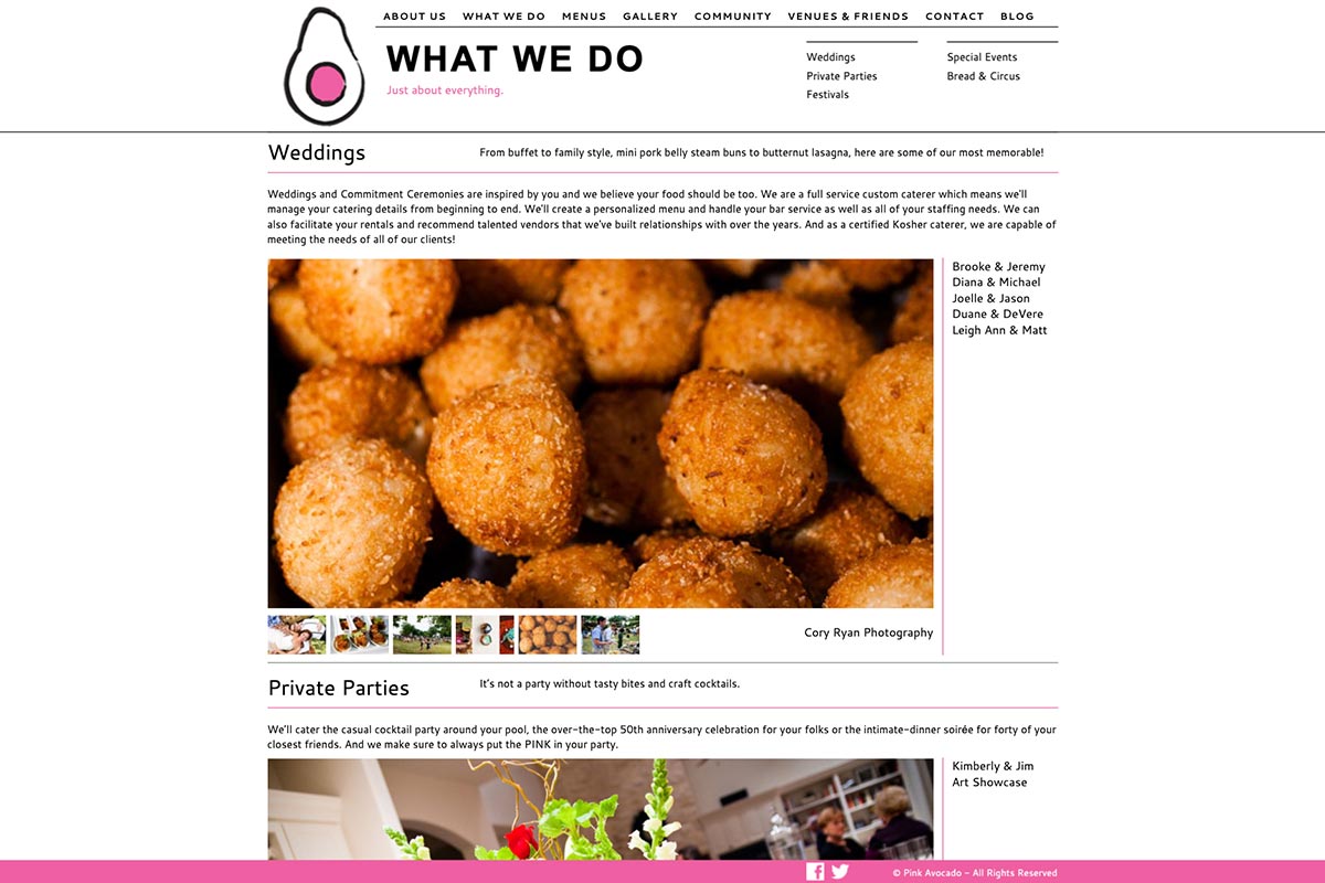
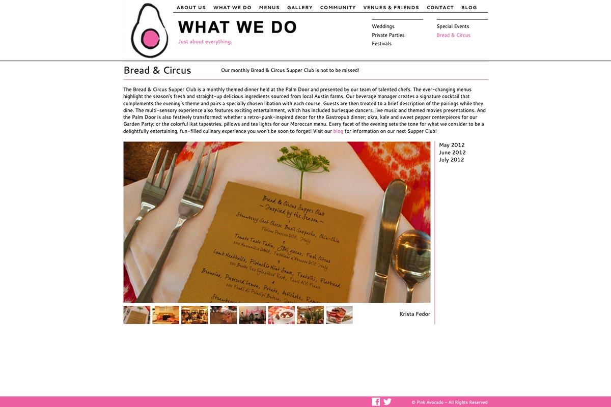
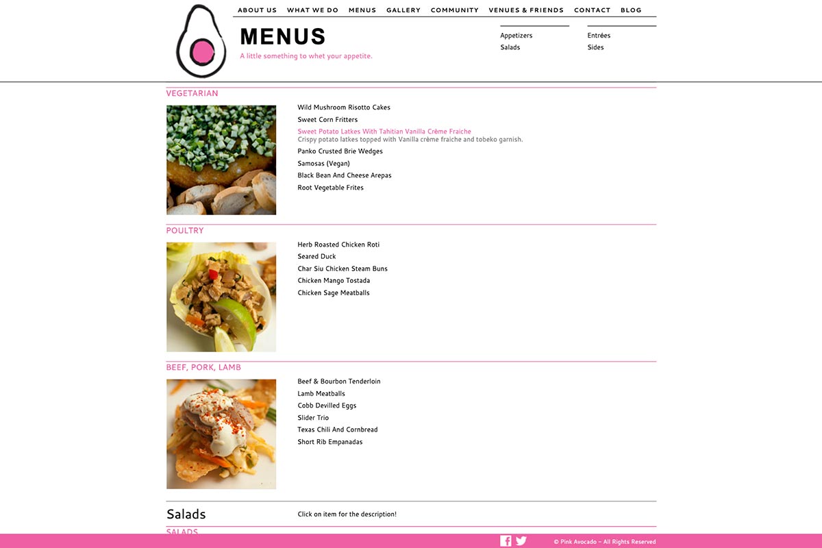
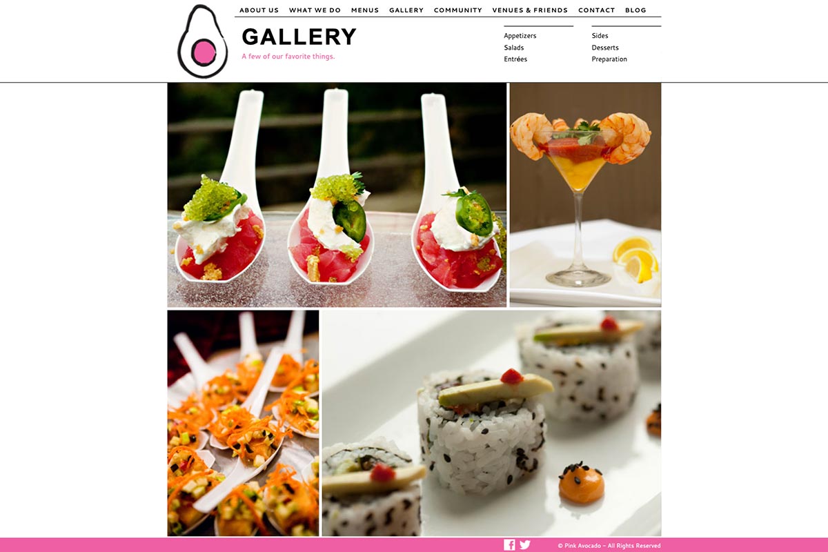
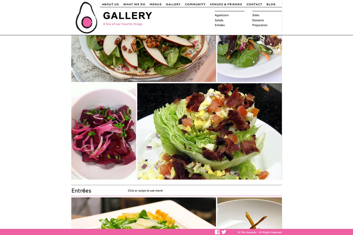
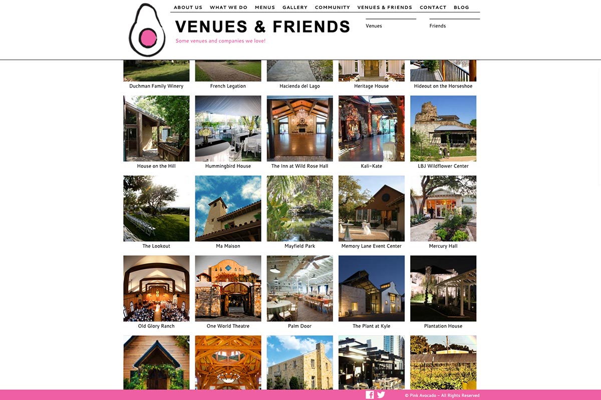
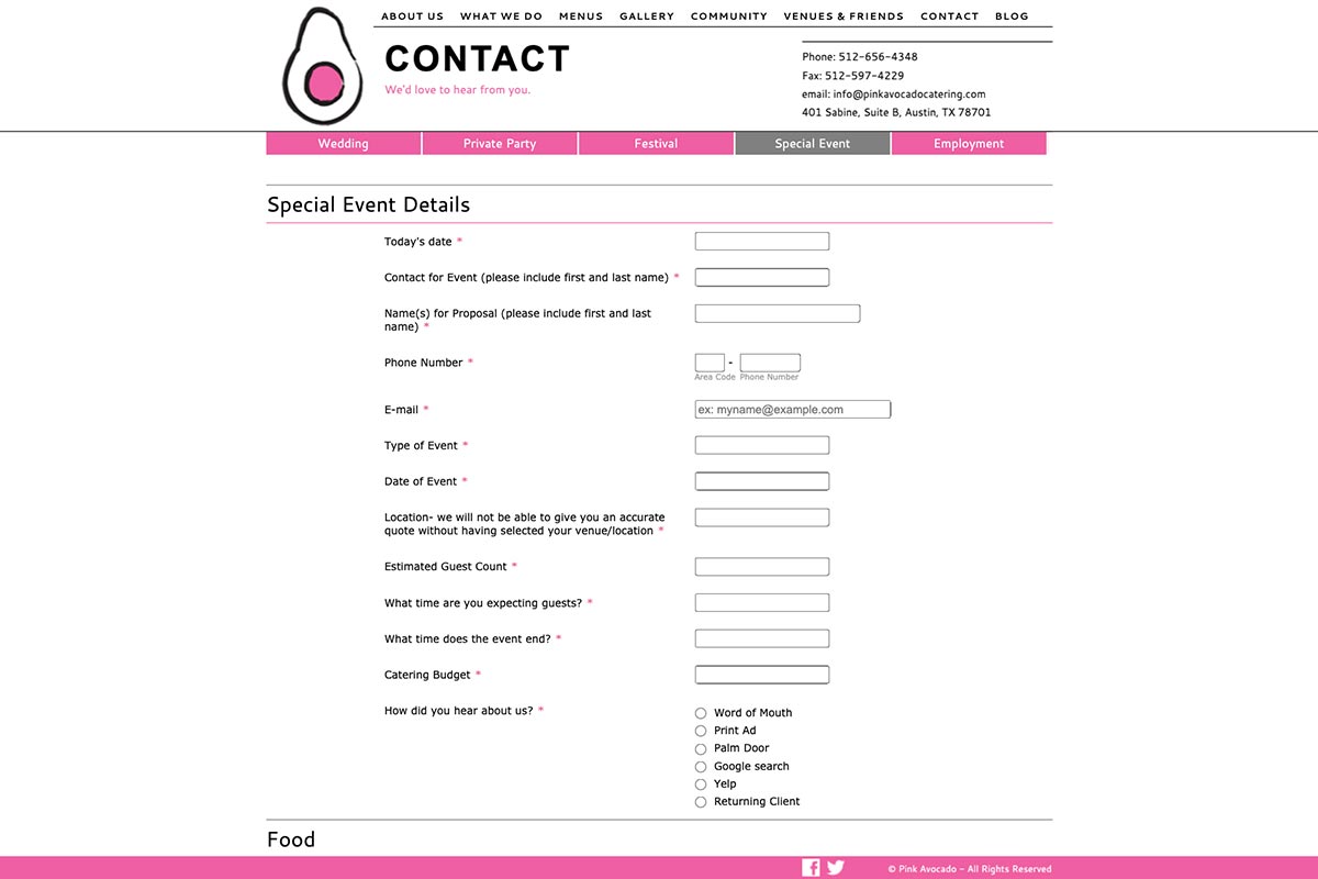
Tablet Scale
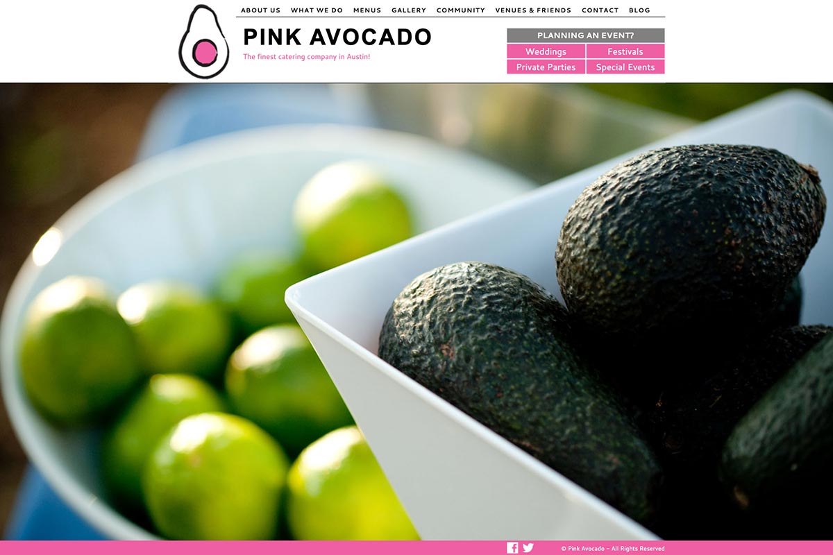
The site works well on a tablet, as it is touch-friendly and scales to fit. Tablets were common at Pink Avocado for helping customers plan, so it made productivity easier to have the site fit tablets. The imagery still remains at the forefront of the design to keep people feeling hungry.
