Designer and Educator
Alvin Lustig may not be as well remembered as some of his contemporaries, but his work forms a lasting impression on graphic design as a profession and acts as a testament to the wide variety of roles modern designers play. His work shows how designers have the ability to impact an entire business and should learn from other designers, artists, and architects (Lustig, himself, spent a brief time studying under Frank Lloyd Wright). During his short career, Lustig generated volumes of book covers, interior spaces, furniture designs, magazines, exhibitions, textiles, album covers, signage, and typographic works (Figure 1). Lustig lived modernism and applied the quality to all his work. Lustig insisted on being a part of every aspect of design for a client, and despite working in so many fields of design, worked at the apex of multiple disciplines. Lustig proves that good design principles span across any industry and unite a large range of interests.
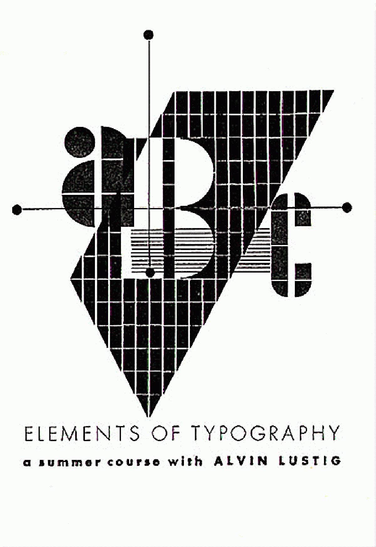
Not only was he a generalist, but he also spent his entire career dedicated to teaching his clients and educating future designers. Lustig saw “design as a curative for society’s ills,” (Remington 120) which evoked a need in him to teach instead of act solely as a commercial designer. He started his work in education by creating design courses for Black Mountain College in North Carolina (Figure 2) and the University of Georgia. Toward the end of his 40-year life, he taught at Yale University where he developed a graduate program for graphic design (Meggs 376). Lustig, despite his own lack of formal education, knew a design education could help transform a person into a positive force in society.
Modernism in Practice
Modernism permeates through many areas of design in the form of systems. Rationalism and the use of a grid to enhance hierarchical relationships justifies the longevity of modernism, especially when the clarity of the message is the most important factor. The American take on the rigid system of modernism, however, brings more of a relaxation to the system, allowing for more emotional content to shift the boundaries of the grid. This subtle difference allows the information to be more personable and therefore more accessible to designers and non-designers alike. In my current work, typography plays a central role, and the American convergence of system and expression helps me to navigate the solutions to design problems. For my future work, modernism will continue to dominate the approach I take. I often find myself thinking, “Why did I put this here, and do I even need it in the design?” A modernist approach to design provides control and brings the concept to the foreground by only using the necessary elements and not embellishing anything just for the sake of filling space.
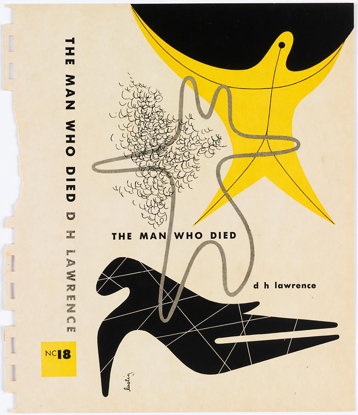
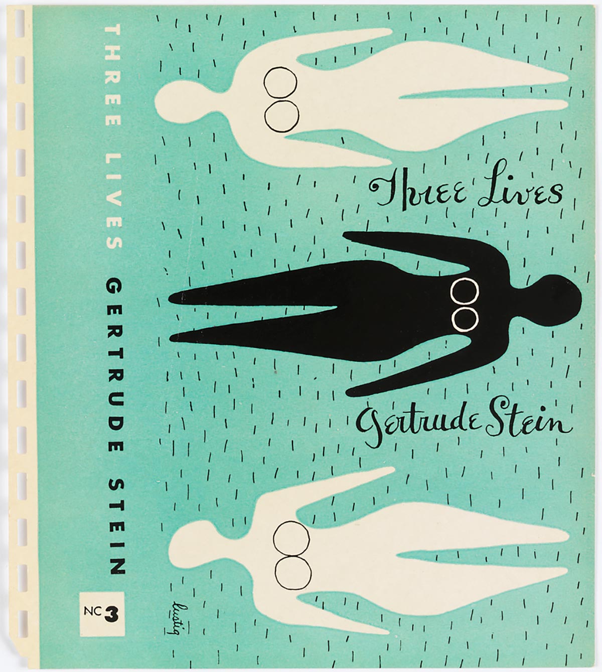
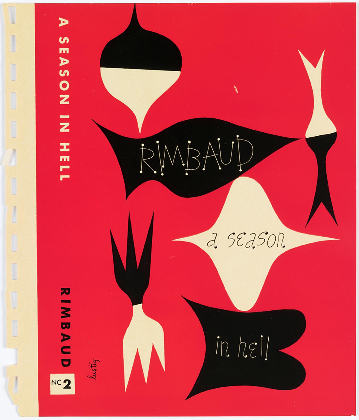
For this publication, I incorporated elements from Lustig’s own works that showcase his modernity as well as his further inclusion of traditional influences over time. The publication utilizes solid blocks of color and widely tracked text reminiscent of his early work, but also incorporates the use of more organic shapes and fluid use of typography, seen in his books covers: The Man Who Died (Figure 3), Three Lives (Figure 4), A Season in Hell (Figure 5), and The Great Gatsby (Figure 6)—all designed for New Directions Press. It emulates the transition in Lustig’s own work from typesetter to expressive book cover designer.

“I think we are learning slowly how to come to terms with tradition without forsaking any of our own new basic principles.”
—Alvin Lustig (Heller 1993)
Typographic Range
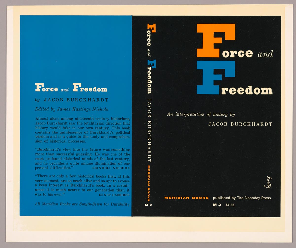
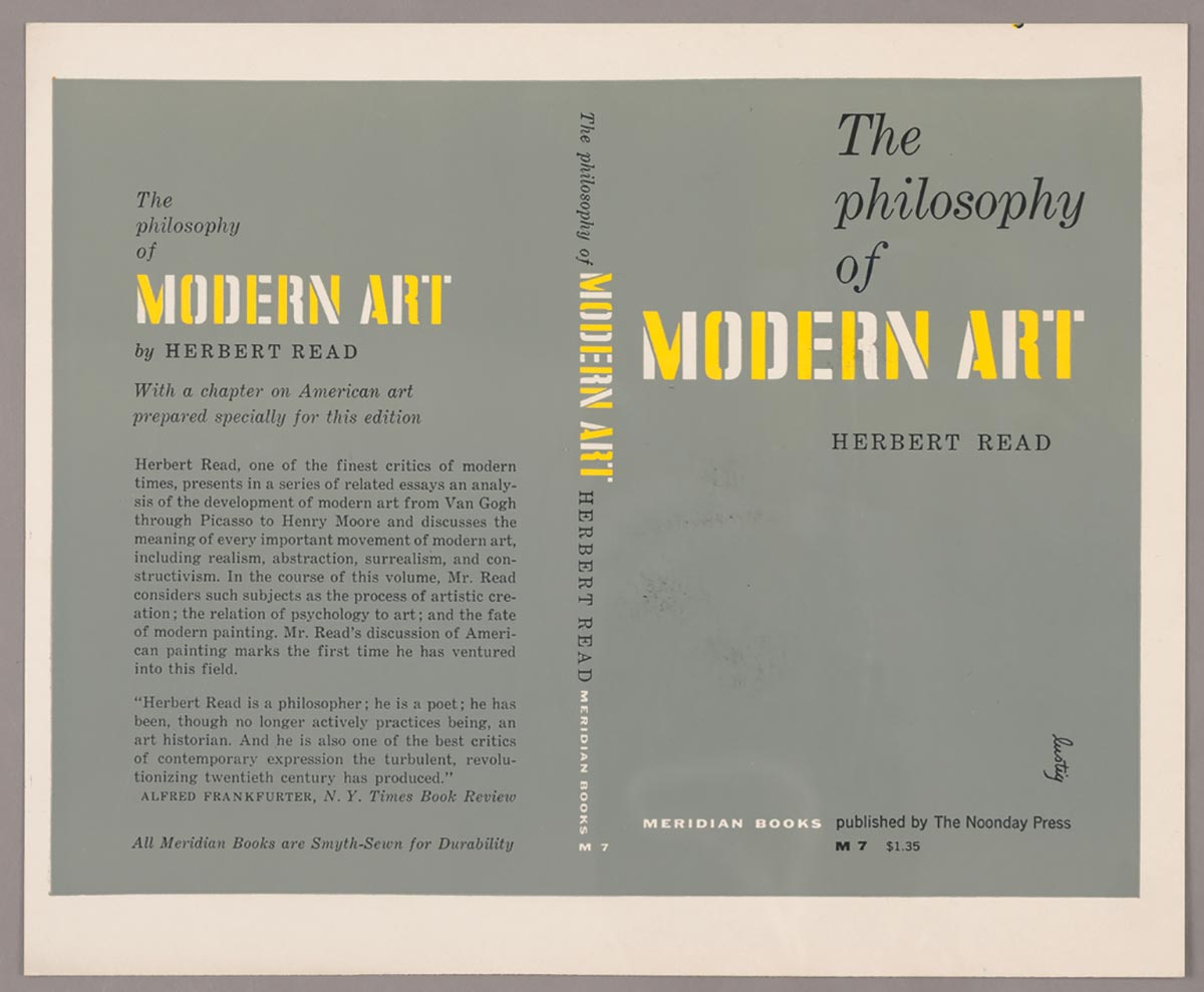
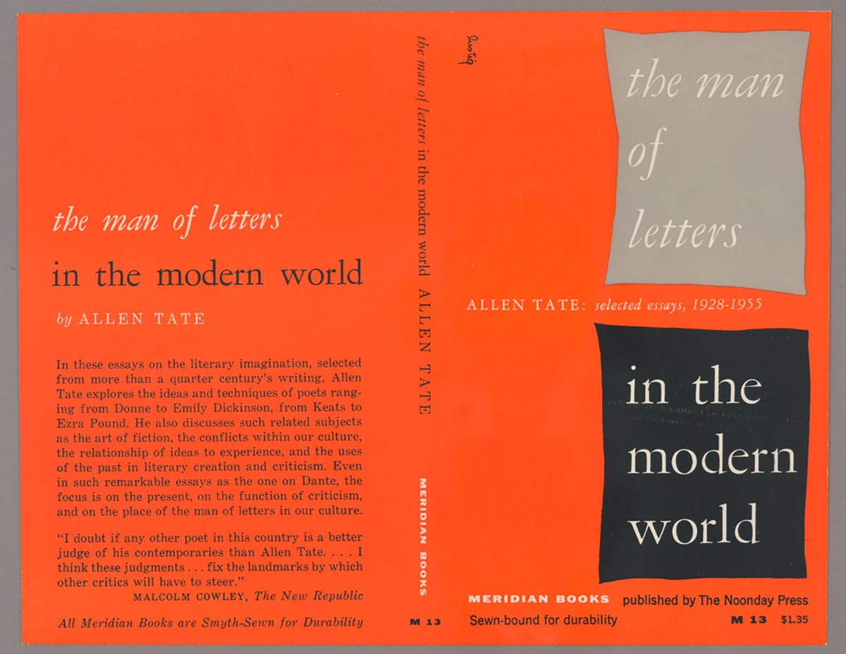
Lustig, while embracing modernism, worked to marry the experimental with the traditional. His typography and his book covers best demonstrate this endeavor. Lustig uses traditional bookmaking typefaces combined with modernist grids and asymmetry. Using specimen books from England and Germany containing slab and serif typefaces, Lustig avoided using purely sans serif types in his book designs. He was interested in interplay between tradition and modernism and warned not to be so quick to discount or embrace tradition in design (Heller 1993). In particular, his work for Meridian Books consisted solely of typographic solutions on flat, colored backgrounds, but used a variety of typography to enhance the conceptual understanding of the book. His covers Force and Freedom (Figure 7), The Philosophy of Modern Art (Figure 8), and The Man of Letters (Figure 9) demonstrate Lustig’s pairing of new modernist ideals and traditional typefaces for the covers he designed for Meridian Books.
See the project: Alvin Lustig: Broad Interests