A Study of Popular Fonts and Typographic Understanding
This thesis is the culmination of my MFA degree. It aims to answer the questions surrounding popular typefaces and how a new system for organizing and protecting fonts would help benefit those both highly involved with the creation of fonts and those who simply use them on a daily basis.
Below are excerpts of the thesis, which can be downloaded as a PDF above.
Abstract
Ubiquitous typefaces, such as Helvetica and Times New Roman, were designed in the age of metal type and, despite their age, are still ingrained into modern software—allowing these typefaces to continue to reach a wide audience and achieve ubiquity. In order for new typefaces to differentiate and compete with existing choices, type designers must employ user preferences and leverage digital technology to create a stronger relationship between typographic voice and physical properties of typefaces. By performing A-B typeface comparisons based on structure with designers and non-designers based on sentiment and perception, establishing emotional profiles for the most common typefaces, and interviewing prominent typeface designers about their practices, this research explores the relationship between ubiquity and physical features to set a baseline for future typeface designs. Further, this research investigates ubiquitous typefaces through measuring physical properties and determining their relationship to non-physical and emotional characteristics to better recognize how typeface design can address user preferences and understanding in a variety of typographic settings.
I. INTRODUCTION
Typefaces impart their characteristics in all forms of written communication. There are millions of typefaces from which to choose in for use everyday correspondence, publications, logos, signs—but a handful appear more frequently and prominently than the rest. How many typefaces are needed to convey the intent of a message to a reader? Some typeface designers argue for a handful, while others proclaim there should be as many typefaces as there are individual people—as each person has a unique voice, so should typography. Despite the plethora of choices, people tend to use only a specific few. Do these typefaces carry such an elegant mix of beauty and function that their gravity pulls and calls both designer and novice into their stewardship, or are they simply selected due to constant availability and perpetual familiarity? Consciousness or conditioning?
Do these typefaces possess intangible characteristics and an underlying feeling that make them the go-to choice for written communication, or are they reused out of habit or complacency by people who pay little attention to the typefaces they select? With this question in mind, this research investigates ubiquitous typefaces through measuring physical properties and determining their relationship to non-physical and emotional characteristics to better understand how typeface design can address user preferences in a variety of typographic settings. The intent is to bridge the gap between intended feel, measurable attributes, and common usage within the constructs of typography.
In looking at the history of some of the most popular typefaces, this research attempts to understand if they were designed under the right conditions to become ubiquitous, or if they are a product of timeless design. Further, an examination of a new system for typeface classification that would alleviate the need for expertise when choosing the right typeface outside the field of design will be conducted. The new system will reflect the state of typographic understanding for non-designers as related to the intent of professional typeface designers.
This thesis will not only explore ubiquitous typefaces, but also examine the role of typefaces as a tool for communication for those outside the design profession. Before developing typographic understandings, a general look at ubiquity will set the stage for dealing with more specific topics inherent to type.
...
VI. TRENDS IN TYPOGRAPHY
Role of Typography
Part of what makes a typeface popular involves the needs of the people using it. To figure out why a typeface meets specific needs, it is pertinent to understand exactly what a typeface does. Many typographers and typeface designers have commented on the nature of the typeface and how it relates to people’s ability to communicate.
“I bring into the light of day the precious stores of knowledge and wisdom long hidden in the grave of ignorance. I coin for you the enchanting tale, the philosopher's moralizing and the poet’s visions...I AM TYPE!” (Goudy 218). This excerpt, written from the perspective of the embodiment of typography, comes from a pamphlet written in 1931 by Frederic Goudy, one of the most prolific American typeface designers—notable for his masterpiece Goudy Old Style (Macmillan 93). Goudy expresses that typography is made for the transmission of ideas. However, ideas can be transmitted differently, as through speech or gesture, but printed words are much less ephemeral.
When speaking, people convey tone, urgency, and severity quite naturally and easily, but the written word needs help in this regard. “In communication, type is the visual equivalent of an audible voice—a tangible link between writer and reader” (Cheng 7). Connecting the reader and the writer involves a bit of translation, even if both understand the same language. Typography can aid in reproducing the subtle nuances of language that the words themselves may fail to communicate. Gerard Unger describes how this clarification comes with other advantages, such as the ability for editing one’s thoughts—allowing for a more organized syntax in what he calls the “grammar of legibility” (Theory of Type Design 29). In essence, typography is a complete system for documenting experiences in a more lasting way, while using the mechanical advantages of easy reproduction through interchangeable pieces. Type grants a lasting existence to the ideas of humankind.
“Typography exists to honor content” (Bringhurst 17). Bringhurst further elucidates the best way to honor content is by using a typeface that embodies the concept of durability in which it links “an earned or unearned interest that gives living energy to the page” (17). Durability is not permanence. A typeface does not insist that it is perfect and immune to change, and yet lasts because it does not give in to flights of fashion. Typography lives in a delicate balance between granting power to written words and being purposefully (or unintentionally) misapplied to remove any semblance of credit to an idea. To honor typography as the physical embodiment of language, how can people make sure to avoid any errors when picking the letters to best represent a written idea?
...
Why People Make Typefaces
“Perhaps one of the most obvious reasons is a personal interest in letterforms and the desire to experiment with them” (Burian). Written language relies heavily on typography, so creating a typeface can be a natural inclination for those who study visual communication. As a pure design tool, typography is an elemental pillar. Typographic design is an endeavor with the impact to expand far beyond one’s own personal reach and outlast any trend or era as designers continue to use the tools created today in future works.
For others, the global aspect of typeface design comes first. “Creating a typeface in several languages at once is a monumental task and needs the contributions of designers who are native users of each script to maintain authenticity” (Riechers). This is the case for a typeface released just over a year ago by Typotheque called Ping. Peter Bil’ak notes his contributions to the typeface with massive language support, “There are way too many fonts available for Latin only, and I see a real value in having truly international projects that explore new ground across cultures” (Riechers). For Bil’ak and the numerous designers involved in the fruition of Ping, they use type design to extend a means of communication to as wide an audience as possible.
Matthew Carter offers a simple explanation to why people make typefaces, “The letters are different because the designers are different. That's all...End of story.” He further adds that in “times of technical innovation, designers want to be pushed into exploring something new” (Carter). Typographers get a front-row seat in the world of changing technology, which will undoubtedly be an endless source of excitement. A complete understanding of typography, if possible, comes from learning about the history, researching underlying characteristics of letters and language, as well as the practice of making letters.
...
VIII. RESEARCH METHODOLOGIES
A-B Testing and Results
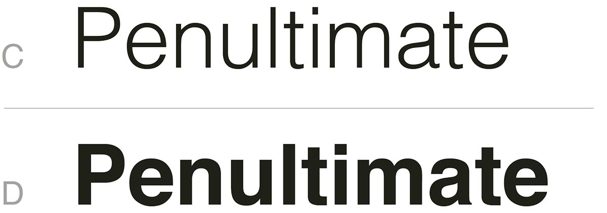
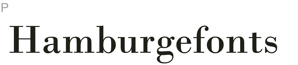
The first section A-B tests two typefaces that are as similar as possible except for one difference in a measurement. Each pairing would only be marked with a set of letters to avoid creating bias from name recognition. Also, certain demo words showcase a wide variety of letters while making sure that progression through the survey is obvious to help avoid anyone accidentally skipping a question due to question similarity. For instance, the survey alternates through Hamburgefonts, Penultimate, Videospan, Resonance, Adhesion, and Handglovery, all at 60 points in size (Figure 26).
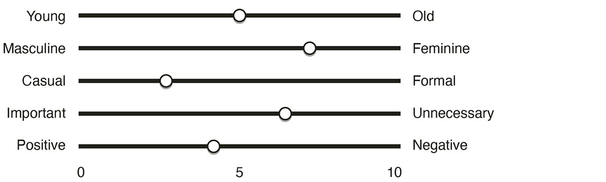
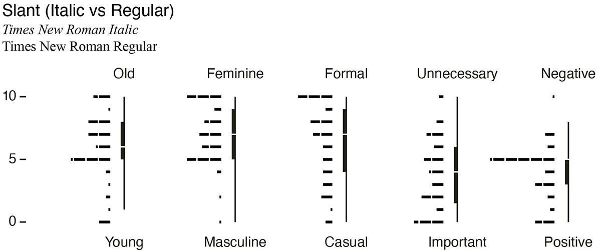
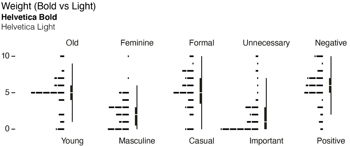
Whenever possible, a ubiquitous typeface is used to keep a lack of recognition from becoming a potential distraction, however, the isolation of a single variable outweighed the need to use a common typeface. These A-B comparisons tested the font pairs in five different categories using a slider value of 0 to 10, where 5 was neutral (as well as the starting value) (Figure 27). Careful consideration was used when assigning each word in the pair to one end of the scale or another to try and avoid dissonance in choosing one side of the scale as better. Users were allowed to slide the scale in 1 integer increments. The categories were human traits including:
These traits would be a baseline for comparing other typefaces in future tests, or for predicting how measurements affect perception in similar typefaces. This would allow for the creation of a low-level spectrum for each trait in regard to typeface design.
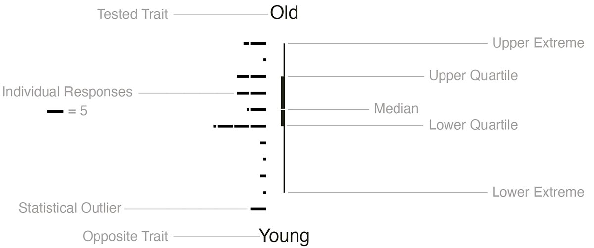
When transcribing the data into the following formats for general analysis, cues were taken from Edward Tufte’s The Visual Display of Quantitative Information on how to best present the data for consumption. His concept of data-ink explains that the core of a visualization of graphics should showcase the data-information and remove all superfluous lines (Tufte 93). The result is the representation of the data using a series of box-plots that would help to show extremes, medians, and reasonable quartiles of how the data skews. This approach is paired with a simple histogram to show individual results as well as to help others visualize the distribution without the interpretation of the box-plot (Figure 28). The histogram also shows statistical outliers for each typeface outside of the extremes.
For testing slant, Times New Roman Italic is compared to the regular cut (Figure 29). A traditional serif italic was picked over an oblique cut of a sans serif because true italics are more common in typeface usage. Times New Roman Italic also has a more angled slant than most typefaces to make the difference stand out more from the regular cut. Prior to the study, a hypothesis was generated assuming italics would skew more in the older, feminine, and formal, but be neutral in the other categories.
For weight, Helvetica Light was paired against Bold (Figure 30). These two weights are commonly found on modern device interfaces and carry a good degree of separation without altering other spacing characteristics. A prediction that bold would show mostly neutral results except for a heavy leaning in importance was determined before results were gathered.
...
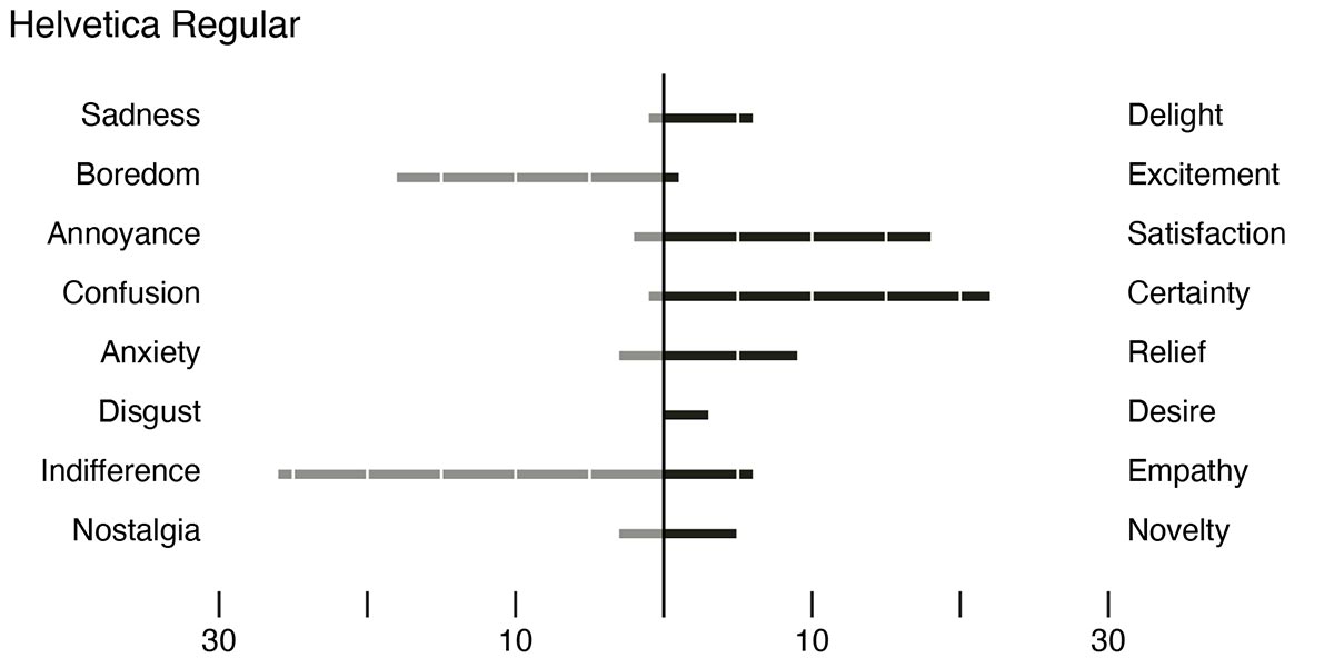
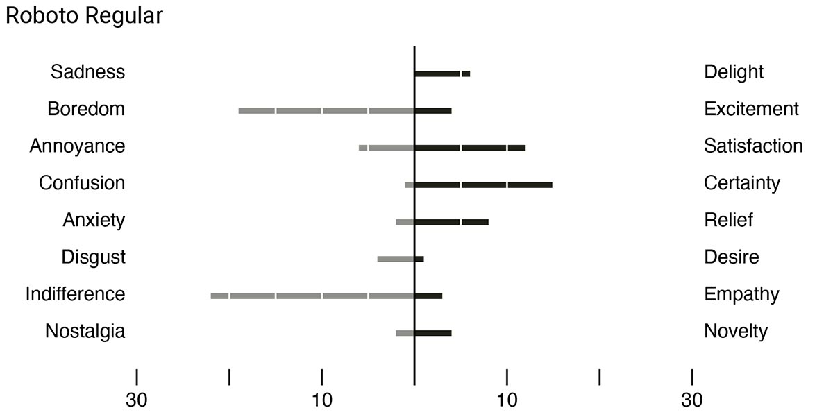
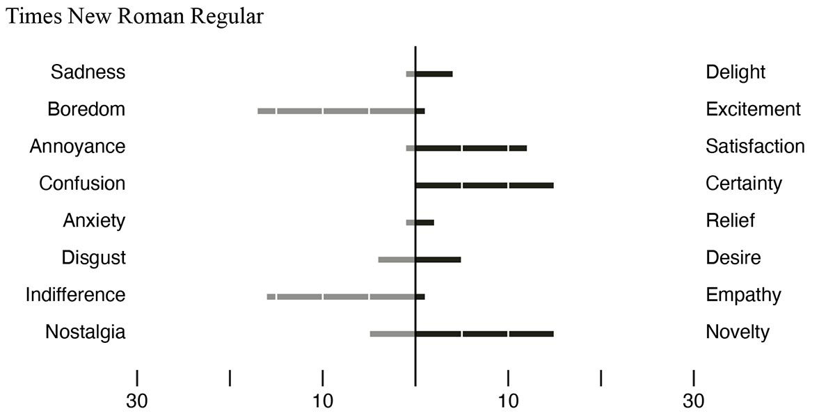
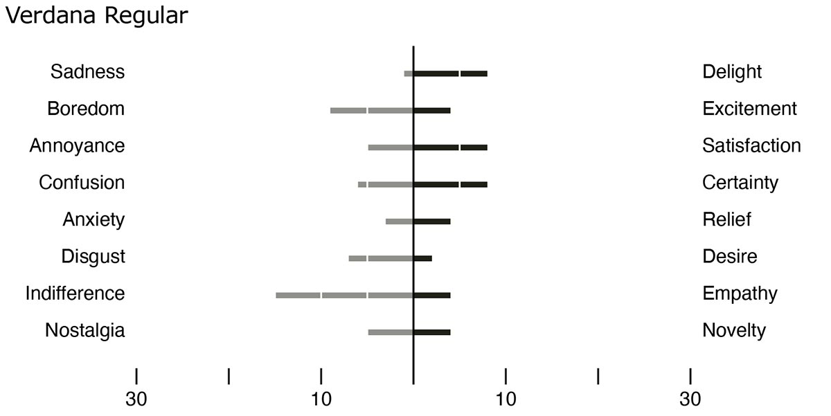
Emotional Profiles and Results
The second part of the survey aimed to create profiles of ubiquitous typefaces based on emotions or feelings (Figure 36). The selections were based on 27 emotions researched by Cowen and Dacher. The emotions were modified to have opposites, which would help determine if people were arbitrarily choosing emotions or finding a consensus within their responses. If a typeface scored equally in an emotion and its opposite, then that data would show mixed feelings and possibly prove the need for more complex testing.
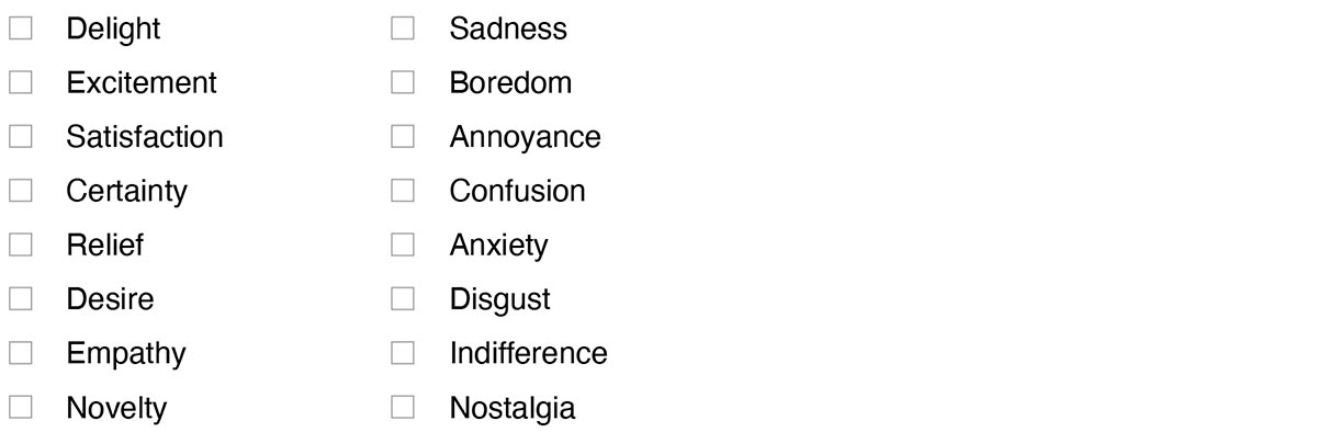
While each pairing is not exactly an opposite, each does its best to convey contrary feelings that would unlikely exist at the same time. Users were allowed to choose as many or as few of the emotions as preferred.
To remove any bias, each sample of the typeface used the same word at 60 points in size—Hamburgefonts (Figure 37), which showcases a wide variety of letter types to give a good overview of the font. Also, each typeface was labeled with a letter rather than its name to keep each font anonymous and avoid any name recognition reactions. The samples are the twelve most ubiquitous typefaces described previously.
To showcase the results, a simple histogram was created that put the opposite emotions on the same row—the same way they were presented during the survey. This way they could easily be compared.
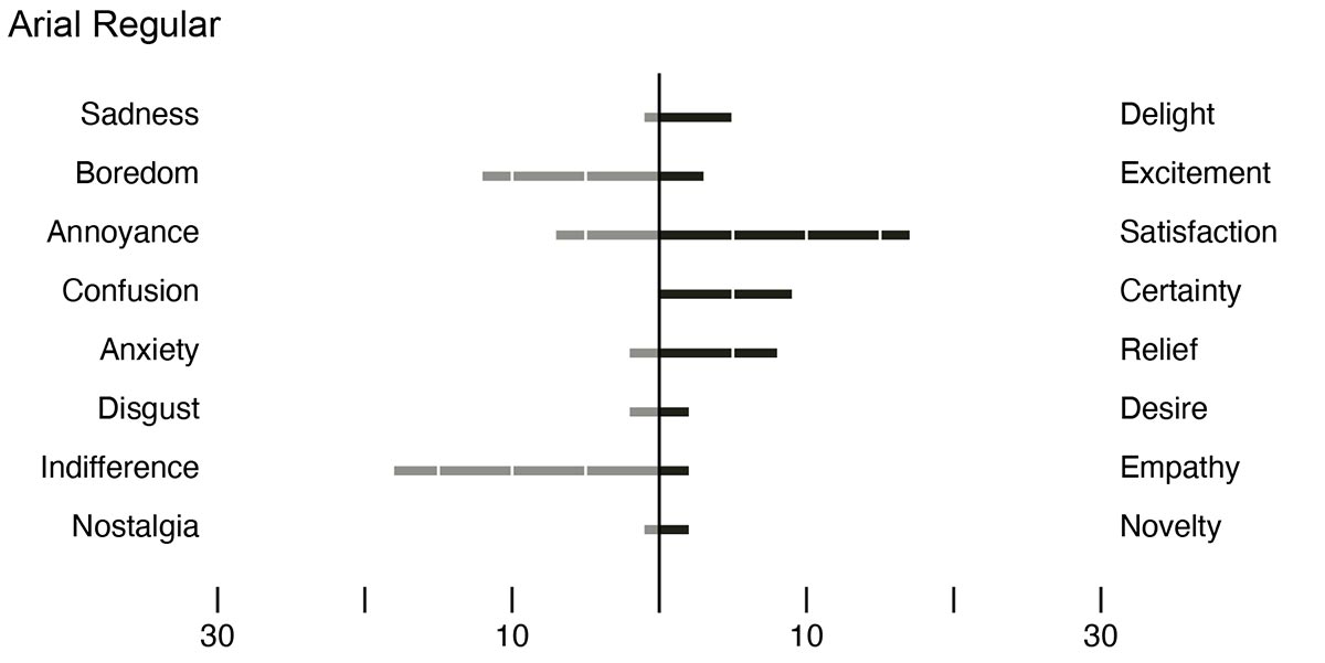
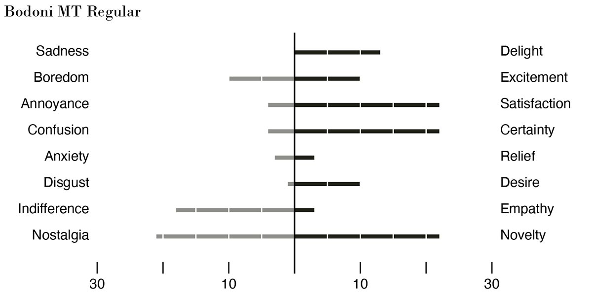
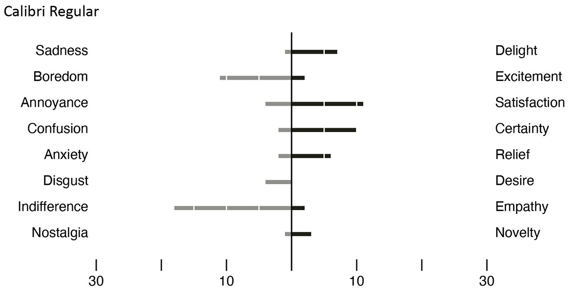
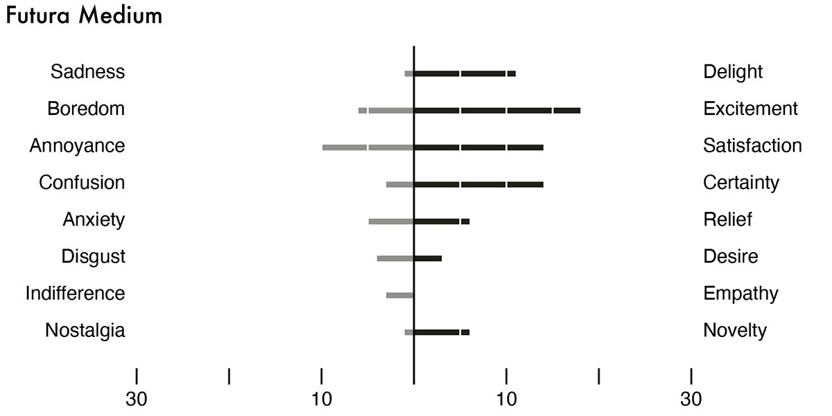
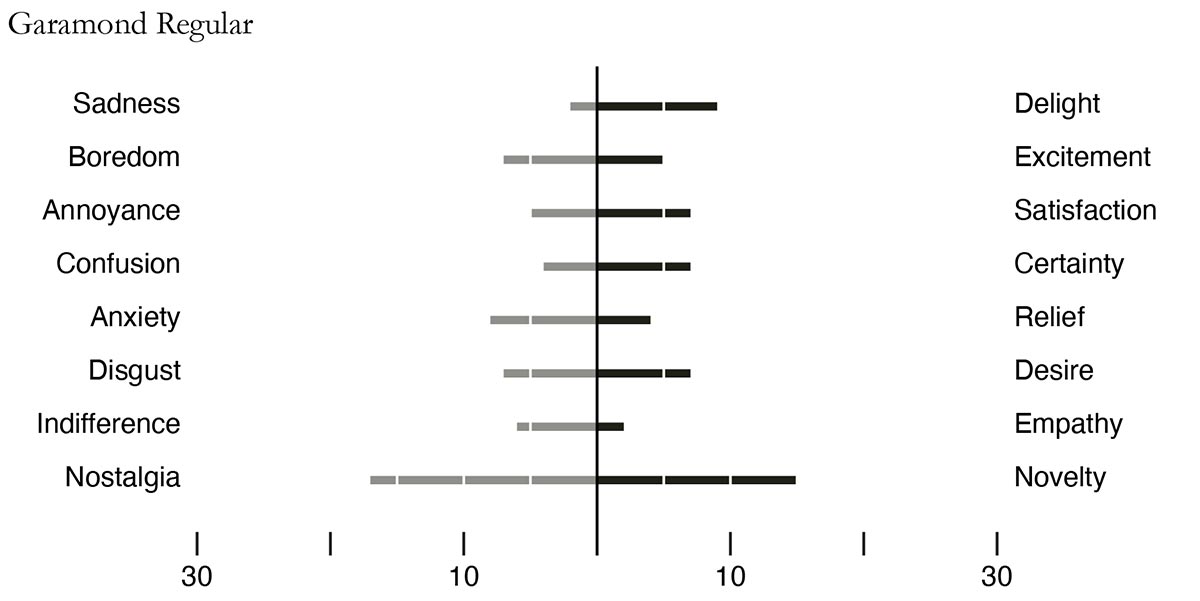
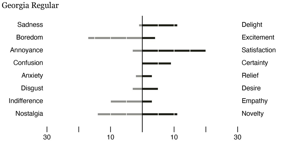
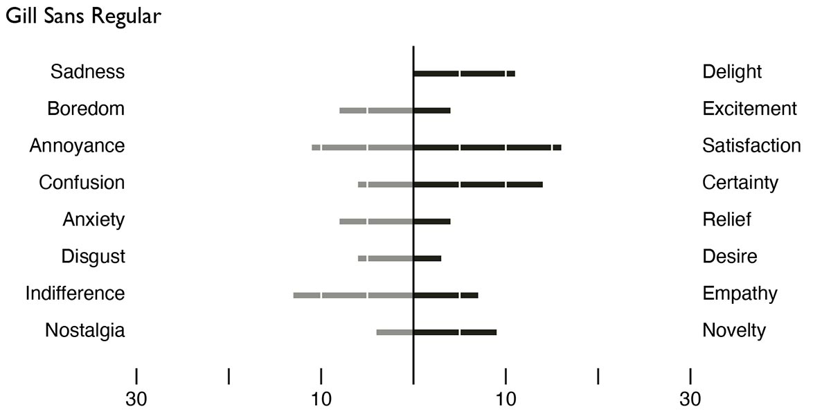
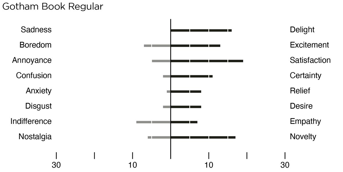
The first profile is for Arial (Figure 38) which shows the most responses for indifference and satisfaction. The profile for Bodoni (Figure 39) shows the most responses for satisfaction, certainty, nostalgia and novelty. Bodoni received the most responses out of any of the typefaces in the survey and was the highest-ranking result for satisfaction, desire, novelty, nostalgia, and certainty. Calibri (Figure 40) was the typeface that received the least amount of total responses with its highest category being indifference. It was also one of the lowest scoring typefaces for nostalgia and novelty. Futura (Figure 41) averaged on the positive side of the chart and took the highest spot in excitement. It was also the only typeface to not have anyone select empathy as one of its traits. Garamond (Figure 42) was a very indecisive typeface as it received counts quite equally in opposite emotional choices. Its main responses included novelty and nostalgia, with nostalgia being slightly favored. However, Garamond was the only typeface to receive two votes for sadness. Georgia (Figure 43) scored well in satisfaction and boredom as well as having zero responses for confusion. Gill Sans (Figure 44) did not stand out in any category but did score well in satisfaction. It also tied for first in empathy. Gotham (Figure 45) is noted as the most delightful of the typefaces tested as well as scoring second best in excitement. It was also one of the lowest picked for anxiety, and the results lean overwhelmingly on the positive side of the choices. Gotham tied with Gill Sans for the most empathetic typeface. Helvetica (Figure 46) ties Bodoni for certainty while it easily received the most responses for indifference. However, it also received the least number of disgust responses with zero, making it seem like a soft indifference. Roboto (Figure 47) can be noted as the most boring of the typefaces. It just edged out Helvetica by one. Roboto also scored high in indifference. Times New Roman (Figure 48) tied with Helvetica as the least exciting typeface as well as tying Gotham for lowest anxiety. Verdana (Figure 49) was a low response typeface but that did not stop it from gathering a fair number of votes for indifference. Many responses were fairly equal between opposing emotions.
...
IX. NEW FONT CLASSIFICATION
As a conclusion from survey results and designer interviews, an overhaul to the typeface classification system would improve the connection between the intent of typographic design and how users perceive and use typefaces. Gerard Unger warns of creating typographic theories on design that are too specific to a particular way of working, as typeface designers may have many reasons for drafting and designing letterforms (Theory of Type Design 11). But from the responses of professional typographic designers, it is somewhat clear that typography does not fully involve the user during the design process—a standard occurrence in product and interactive design.
As technology grows, typefaces, in their natural state of evolving with it, must embrace the idea that they are becoming more technical and advanced in their design. Font files are no longer static, but versioned and living. Typefaces should respond to user preferences to help make them better rather than be the product of a few close associates or the indulgences of their creators. While this is not always the case for all typeface designs, it is especially true for typefaces that hope to gain global importance as a vessel for language.
Typography cannot be a club for the highly trained when it clearly holds such an importance in the very fabric of communication. As previously addressed, typography has barriers of terminology and history that are difficult for those not devoting their design practice or education to understand. To help aid the removal of this barrier, a new classification system that helps make typography more accessible to non-designers as well as making the user a more central component of the design doctrine surrounding typeface design and theory could be conceived.
Proposed New System of Classification
Jonathan Hoefler writes, “If there is a Holy Grail of typography it is surely the Omniscient Typeface Classification System, which will organize and index the complete typographical output of mankind” (201). Many attempts have been made to redesign the classification system, including the archival works of Central Lettering Record, a database from the era of the CD-ROM, that “involves using conceptual underpinnings...and a plane, formed by the intersection of a time-line on the one axis, and a list of identified typographic models on the other axis” (Hoefler 208). While this system sounds much more comprehensive, its usability feels like it requires advanced degrees to operate.
The Holy Grail of typography is a lot to strive toward, but a new classification system based on emotional rather than physical characteristics, countries of origin, and time periods would give typography a new accessibility as well as alleviate the problems with the current system involving overlapping categories.
Hoefler argues that “assigning type to discrete time periods also intimates that historical styles are visual explorations that have long since been completed” (205). To avoid the creative stifling of the existing system, typefaces could be classified as joyous, surprising, sarcastic, upsetting, satisfying, indifferent, or certain. Old standard physical terms like regular, bold, italic, or monospaced, extended, and condensed would no longer be needed as typeface designers will understand how these traits can be imbued within the design. Classification systems based on whether the typeface has serifs, and to what extent do they become pointy, leave the untrained person out of the loop when picking a typeface.
People use typography every day, but they are not aware of how to use it properly. This new system would give them a better understanding of what characteristics translate into the intended purpose of their use. Instead of choosing a typeface that looks pretty or is bold, they would choose a typeface that expresses formality, sympathy, or relief. Why should typographers force a layer of interpretation onto the users of fonts? Typefaces lack instruction manuals, but this system would adhere to the usability principle of recognition over recall and let users make informed choices when selecting a typeface by evoking universal emotions.
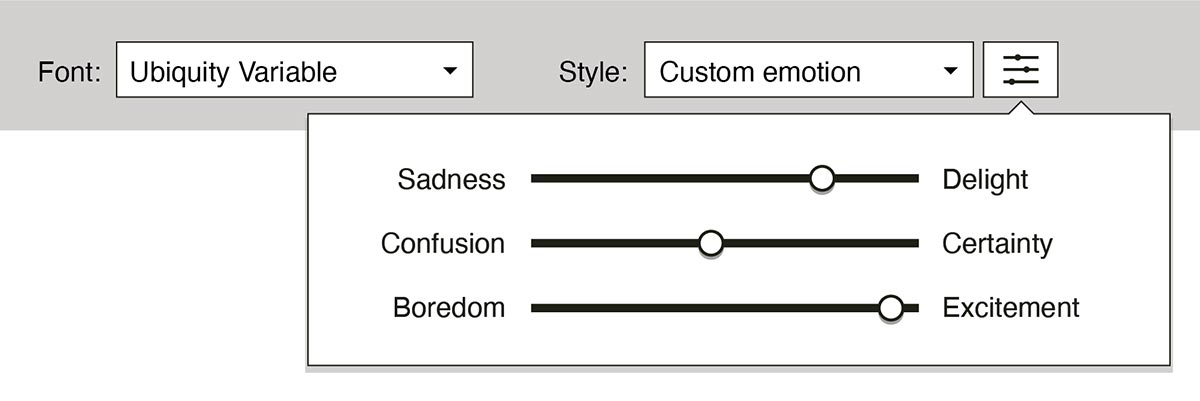
Many users experience typeface choice as a single dropdown menu of preloaded fonts and through semi-obscure interface elements like the ubiquitous B I U menu in their word processor or email programs. Occasionally a choice of individual weights is offered through an extended menu, but these choices lack the ability to convey the purpose of those designs. An interface that replaces the weight names and allows the user to pick from a range of emotional qualities instead would help the user express the content of their message or understand what they are reading. Changing the interface would not be too difficult to implement as it just restructures the options. Even the B I U menu could use a pictorial system to show common emotional expressions in the same way emojis and emoticons do. For users that desire more control over how much of each emotion a typeface could express, a system of ranged sliding inputs could make for easy adjustments (Figure 55).
This new classification system also would give more control to the user in terms of typesetting. Certain emotions may be best addressed using the space between letters rather than manipulating the letterforms themselves. For instance, designers will often increase the tracking or letterspacing to make words appear more formal or give them a better sense of hierarchy. Many word processing programs do not easily allow for this adjustment, but if it was designed into the style of the typeface the user could access the feature.
Foreseen issues with this system include more technical applications of typography. Some typefaces have alternate styles in order to maintain legibility depending on the color and size of the design. These completely physical differences exist to give better contrast when using a typeface on a dark background or to grant a subtle boost to hierarchy without changing the mood or feeling of the work. While the current classification system caters to the subtle typographic changes needed by professionals with extensive typographic understanding, most users of type have few concerns over page texture and hierarchy during daily use.
Another issue could be the potential for sending mixed signals while communicating when users fail to choose a typeface that matches their intended writing tone. As useful as it might be to include that intent through a font style, users may feel obligated to avoid neutral settings and oversaturate their writing with numerous fonts for every type of emotion expressed. The use of too many fonts in one work can make for a poor reading experience and shows immaturity in current communication design practices. Despite the potential downsides, the upside of having the general population more conscious of their decisions when communicating with type would add a positive awareness to typeface design profession.
This was just a short excerpt from the work. Download Full PDF