
Typeface for a Grocery Product
In recent years, the marketing of branded produce increased dramatically due to the popularity of apples like Honeycrisp, Sweetango, Zestar, and Cosmic Crisp. Without the polish behind the new apple campaigns, apples once popular, such as the Winesap, have become second tier apples despite their quality and growability.
In order to level the playing field in the apple market, I wanted to create a typeface and branding that could be openly used by anyone growing winesap apples and give stores a reason to continue selling the variety.
Logotype and Mark
The logotype is anything but standard with each letter connected to another by a ligature to symbolize the connection of the fruit to the tree. Some ligatures have physical connections, but the most unique ligature is the w, which stands on its own. It reaches up to pluck the tittle from the i enticing the onlooker to follow suit and also pick Winesap.
The mark uses the same reaching w from the logo, and its distinct style keeps the brand recognizable. The website is also included to show the full apple name and provide a place to find more information.

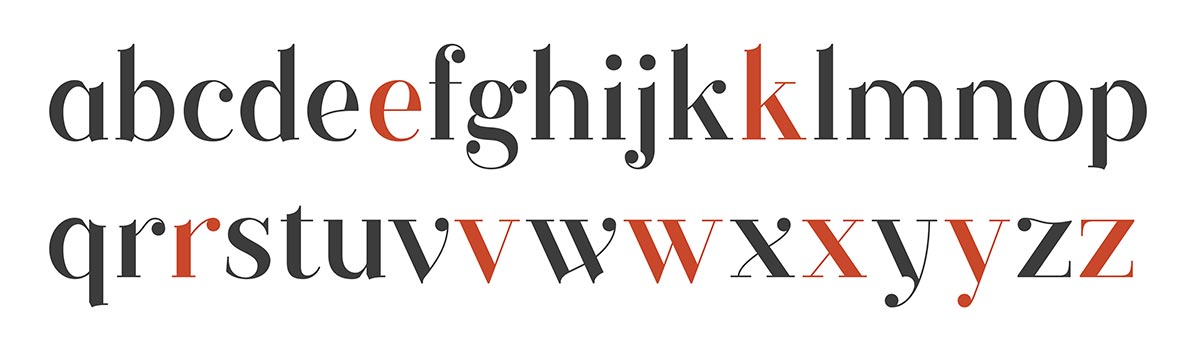
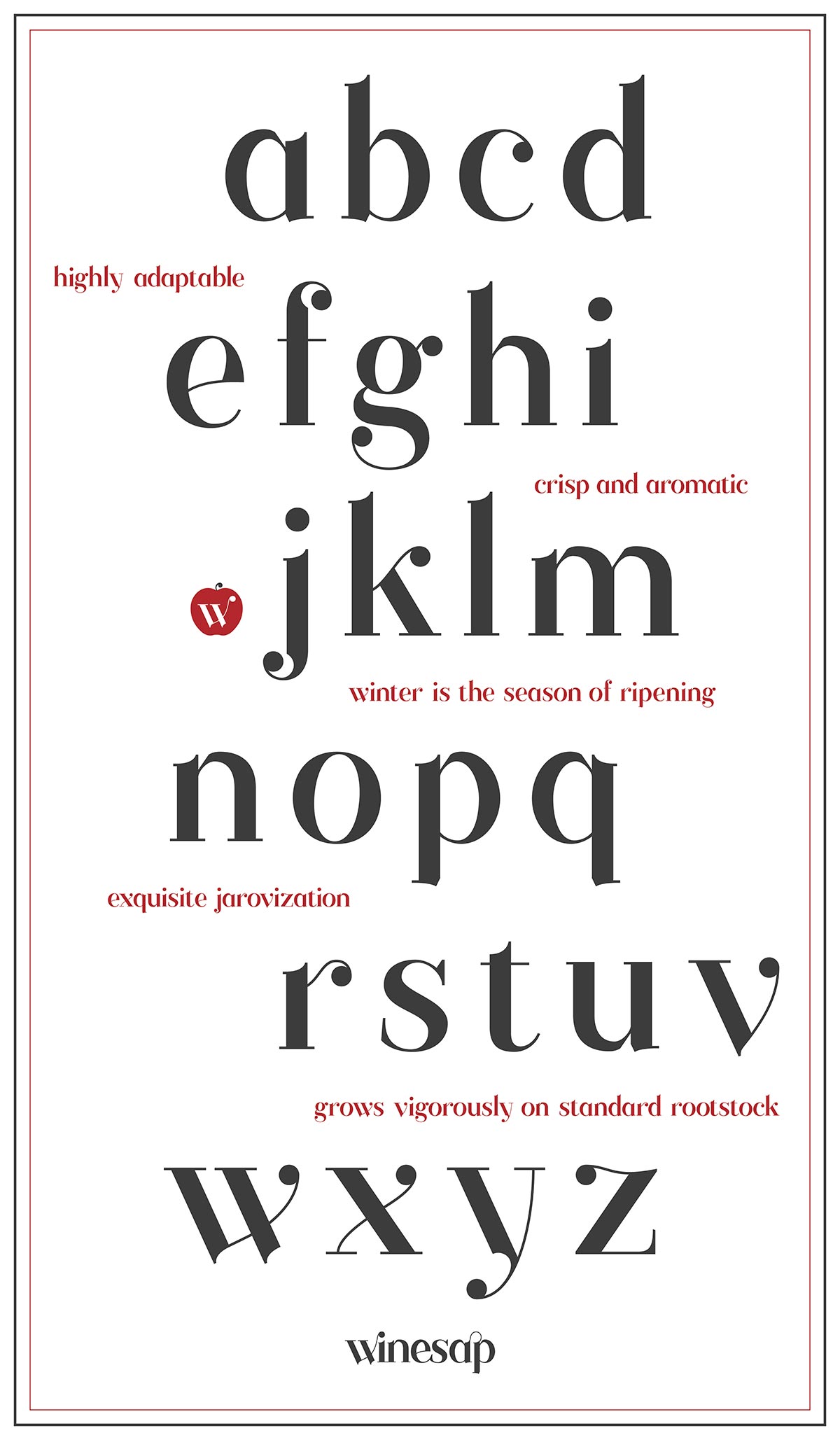
Alphabet
Conceptually, the shapes of the letterforms in the typeface relates to the organic process of growing and picking apples. Each letter aims to have high stroke contrast with geometric elements as well as sliced hard angles reminiscent of pruning. Winesap’s letters embody the squatty and rounded proportions of the apple’s shape with reaching stems and curving thin strokes to signify the branches and buds of an apple tree.
While the overall appearance of the typeface is modern in the Didot sense, the attention to detail that breaks from the structured choices of many modern typefaces gives the Winesap type its unique character. The axis for the counters and bowls tilts slightly off center to give Winesap a more organic quality.
Ball terminals on the ends of curved strokes add to the recognizability of the letterforms and further enhance the growing concept. Included are alternate letterforms with more traditional lines and serif endings when a more time-honored and traditional typesetting is required.
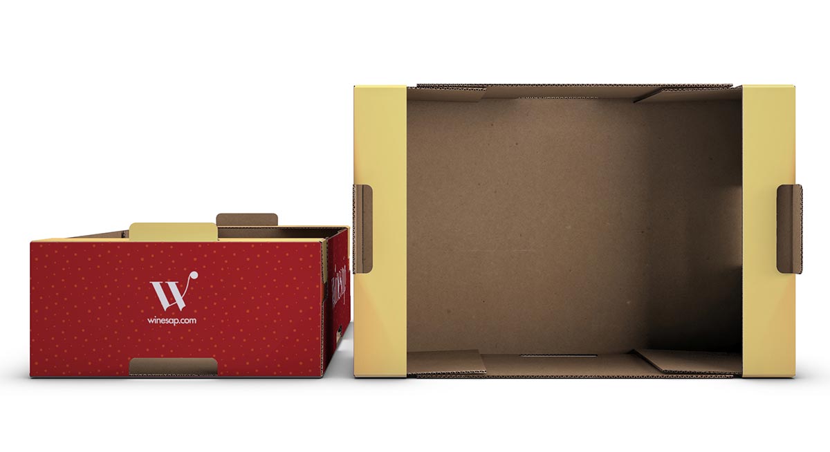
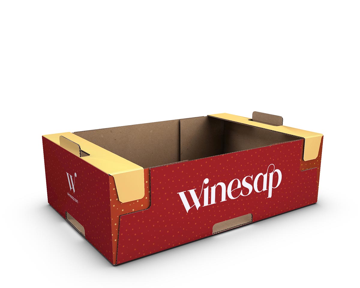
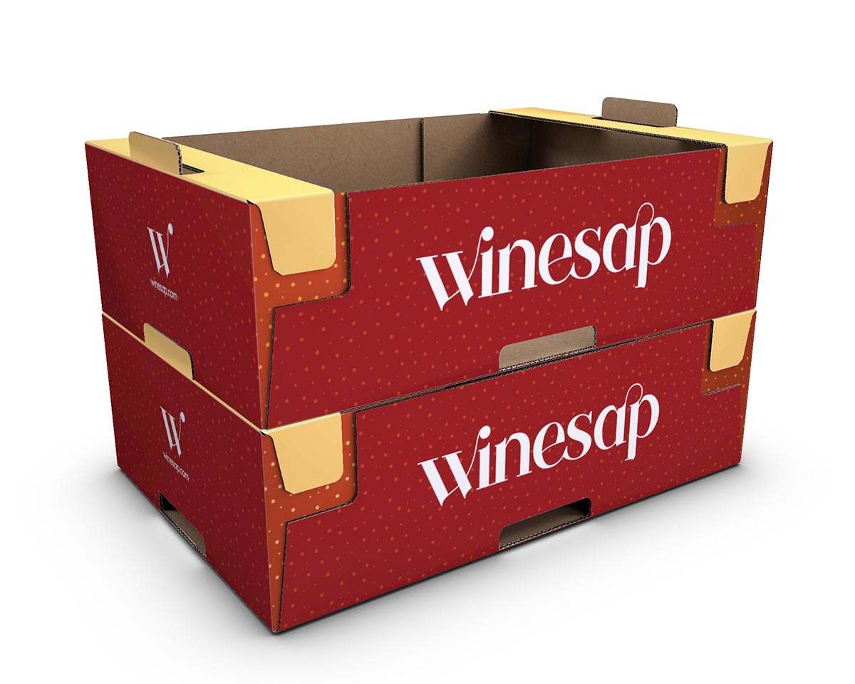
Packaging
The apple box has a deep and crisp color palette that matches the hues of the apple itself with patterned nods to the apple’s russeting. The mixture of dark red and lighter red speak to the variety of colors found on the surface of the apple, while solid areas of pale yellow allude to the patches of yellow formed on the shady side while growing. The box shows the logotype on the long sides and the mark on the short sides to tie the sticker into the full brand.

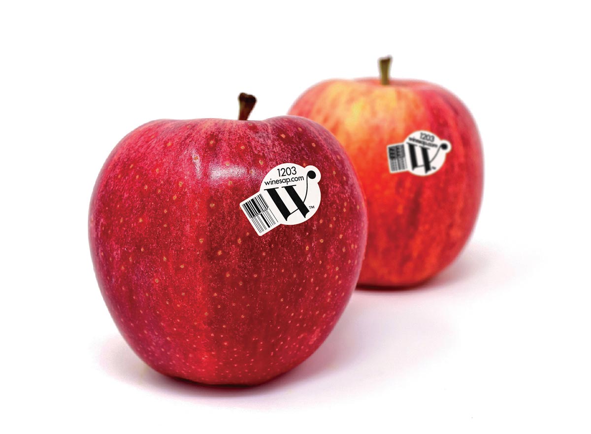
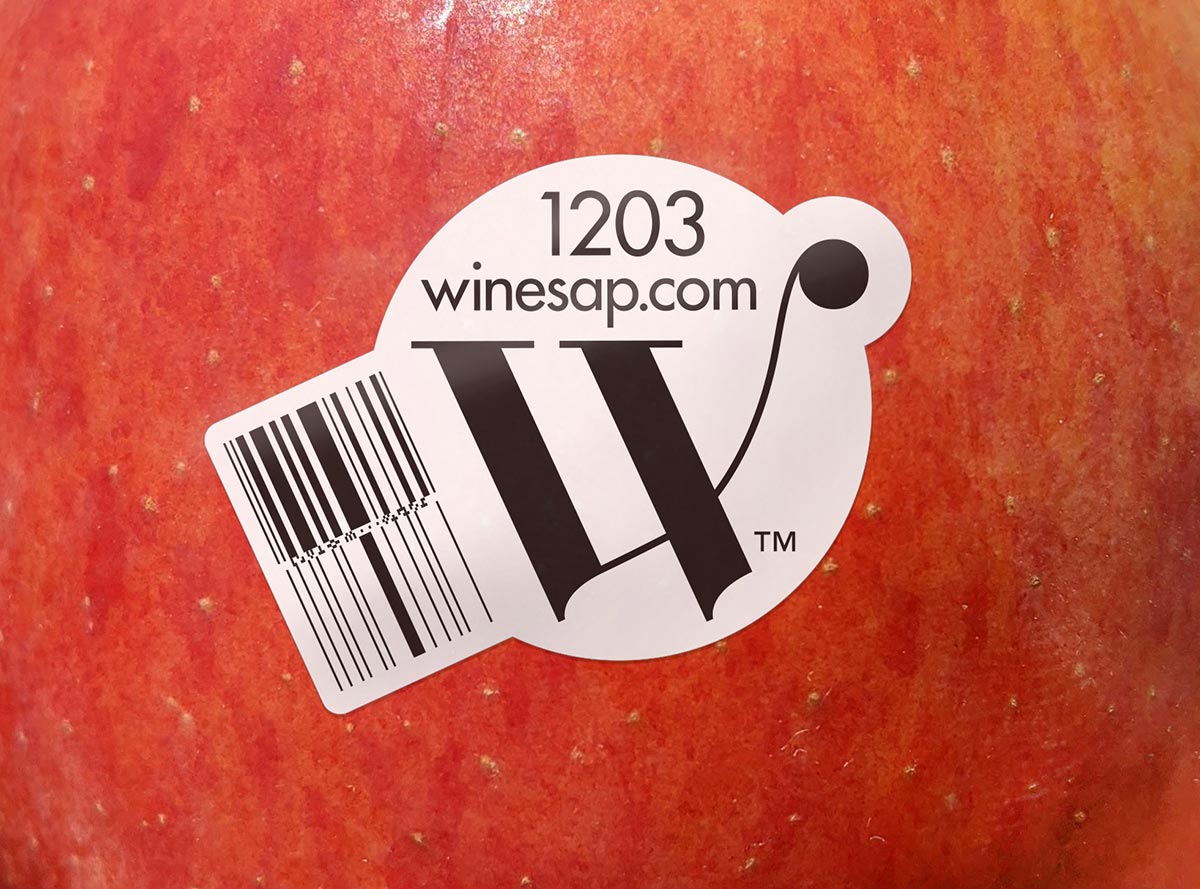
Being memorable, the w serves as the mark used on the label sticker for the variety. The label is a modest 1 inch sticker in black and white designed to let the apple’s bright red color be the center of attention. The ball terminal on the w lands on the peel tab of the sticker to provide a playful interaction point for the purchaser of the apple.
The typeface pairs with Futura for the smaller type on the sticker since it shares a similar geometric quality with sharp edges. The thin strokes of Winesap would not be suitable for the small scale applications, which is why the w acts as the recognition point for the apple.
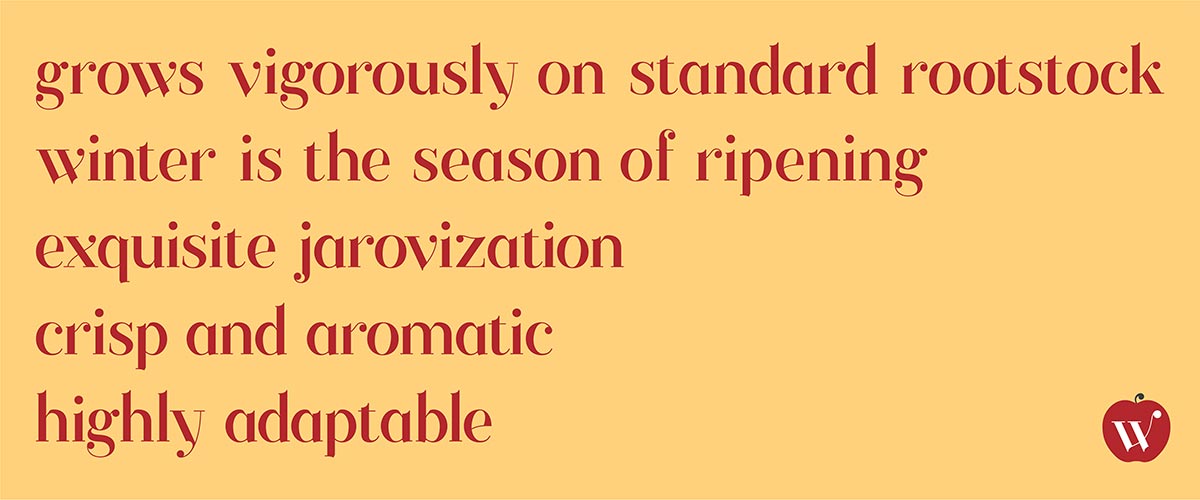
Type Specimen Poster
The poster for Winesap shows the characters and words describing the growing process of the apple.
Having a typeface that speaks to the unique qualities of the apple as well as a prominent box and label will help reestablish Winesap apples as a staple variety in the competitive apple industry.