Translating Iconic Interactions
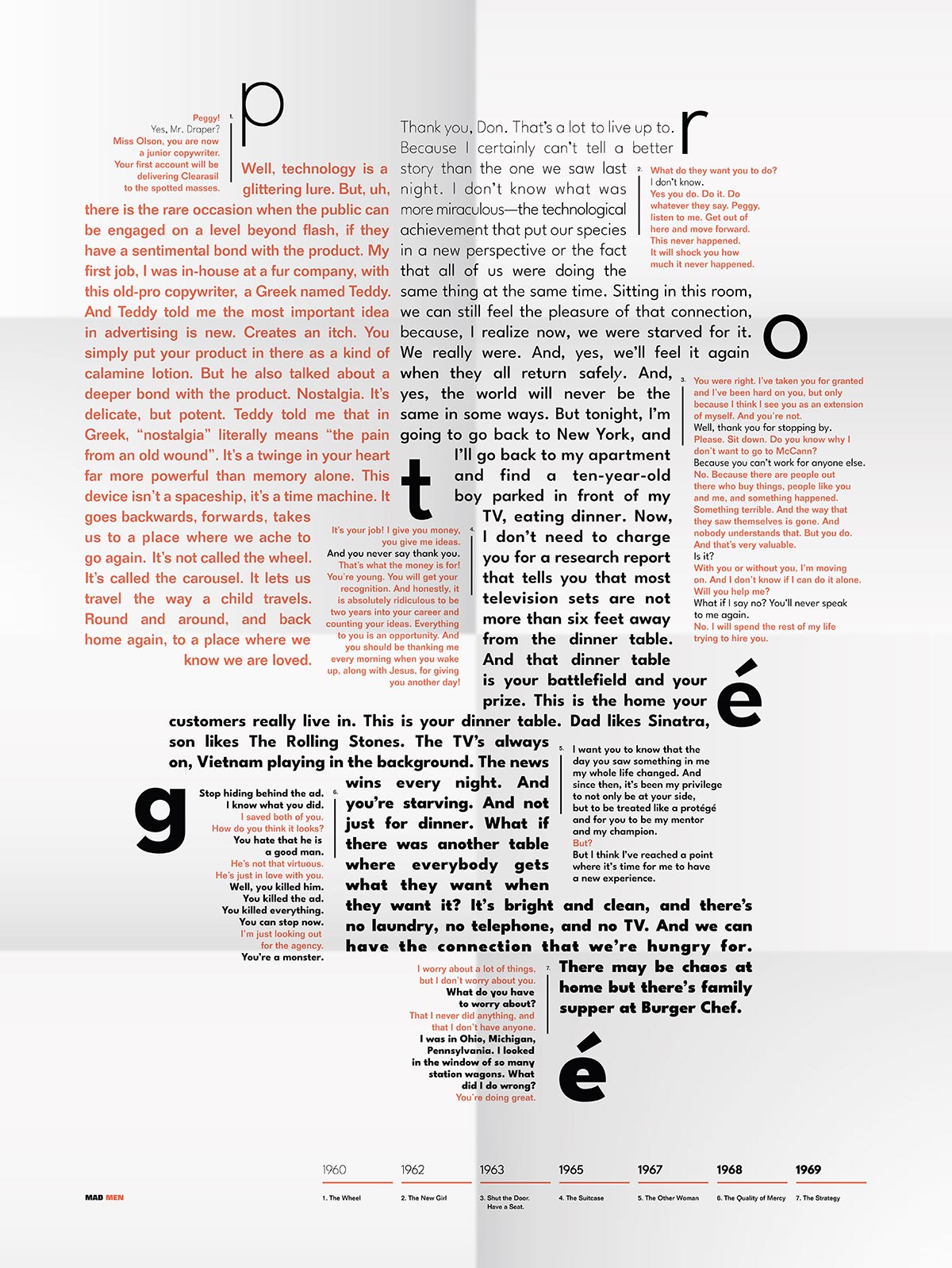
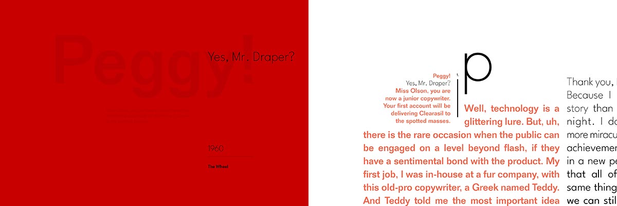
The television series Mad Men mainly focuses on the professional and personal relationships of a fictional 1960’s art director named Don Draper. One of the most intersecting relationships between his two worlds is the relationship between him and Peggy Olson. Peggy starts her career as Don Draper’s secretary and works her way up to an artistic equal. Their dynamic is often that of a mentor and an unspoken protégé. The excerpts are from iconic monologues from the show, in which each character gives a pitch for an ad campaign to their respective clients.
This project aims to show Peggy emulates Don, begins to recognize his weaknesses as a person, outgrows him, and becomes a master in her own right.
Typographic Choices
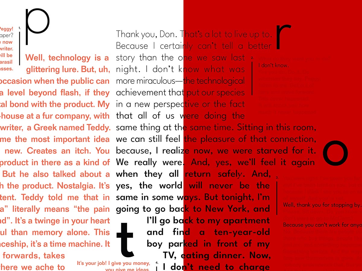
The typography for this project pulls from typefaces of the era, or at least a typeface based on popular typefaces at the time. Careful consideration between scaling for emphasis and overlap lead to different sizes in each typeface to better relate to difference in x-height. Also, a common baseline is established to better organize the content across columns and the square shaped grid. The two typefaces serve the content well and allow for the subtle expressions needed to convey a sense of dialogue.
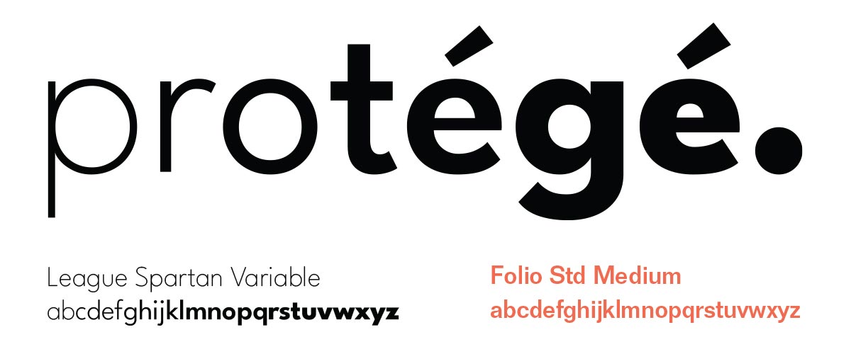
Peggy’s typography uses a modern, variable typeface called League Spartan Variable, developed by the League of Movable Type. Spartan has similarities to Futura, but has fine control of weight from extra light to black with an almost infinite amount of steps between. This allows for a subtle change between weights from word to word to create a smooth transition in text color. By creating this transition, the typography reflects how Peggy constantly grows and changes over time.
Typographic choices for Don are also based on how he doesn’t really change his mentality during the decade—remaining a bolder weight than most people in Peggy’s life. So I represented him using a typeface from the era, Folio Std, in a medium weight rather than book.
Shifting from Don to Peggy
The relationship between Don Draper and Peggy Olson on the television series, Mad Men, starts out with a subservient and wide-eyed Peggy acting as Don’s secretary. Gradually, and through persistence, Peggy becomes a fully realized copywriter in a time and industry that rarely gives chances to women. Although their interactions are short often filled with negativity, Peggy and Don have a relationship of protégé and mentor.
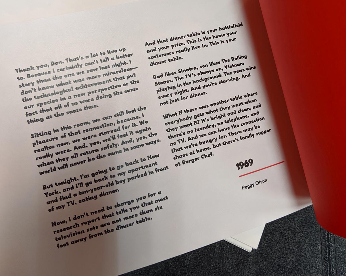
While Don shows his talents for the influential monologue early on in the television series, all the abuse and manic moments in their relationship lead to Peggy having the best pitch on the show, with Don fully realizing and appreciating her earned talents.
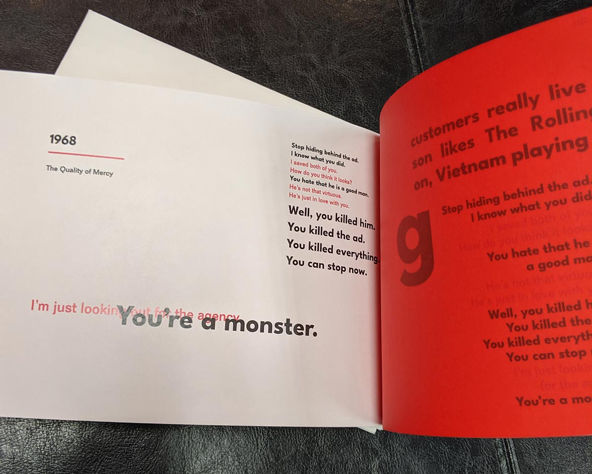
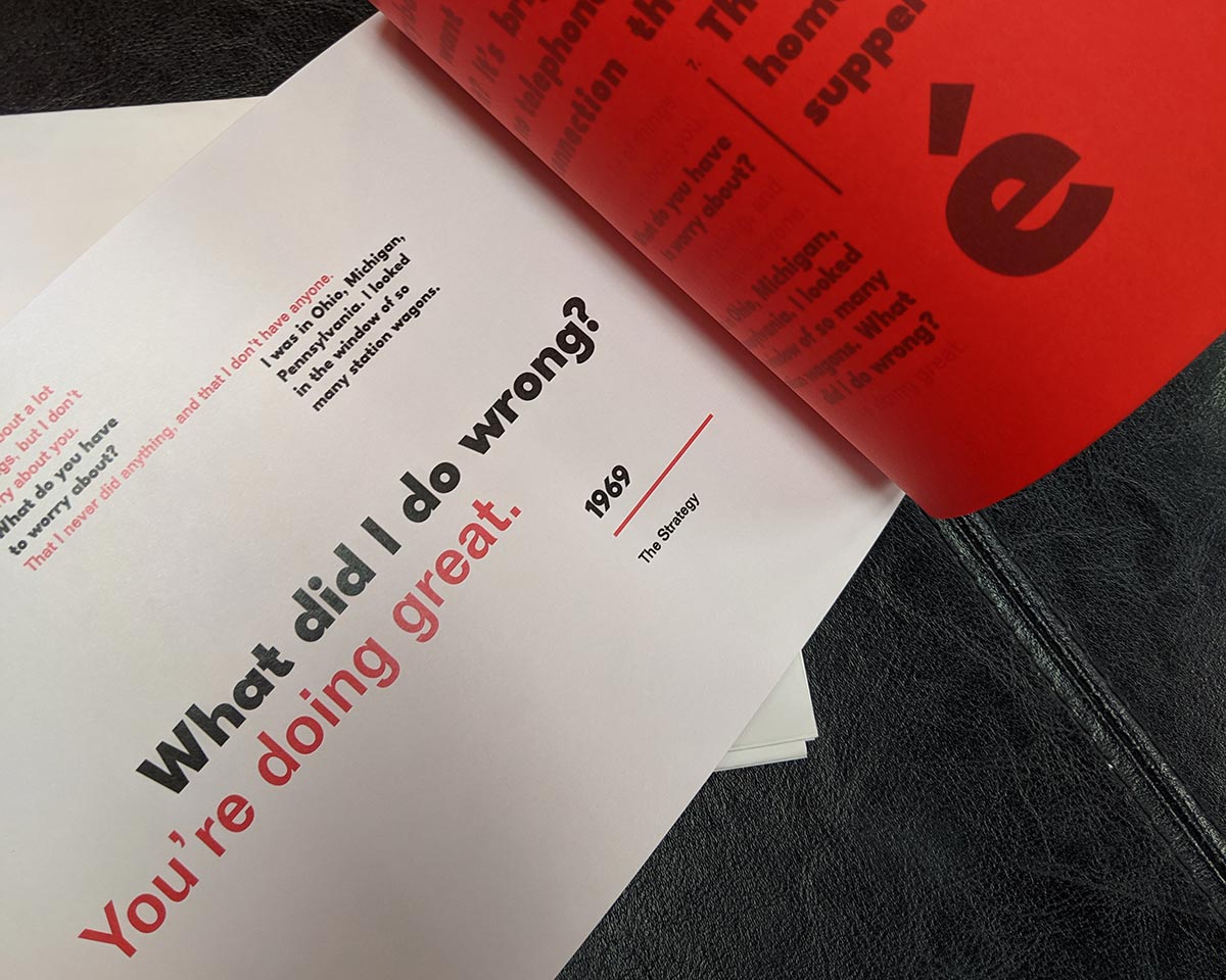
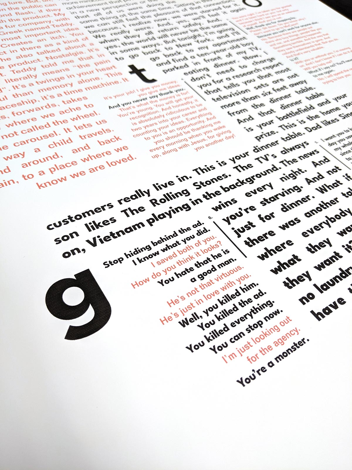
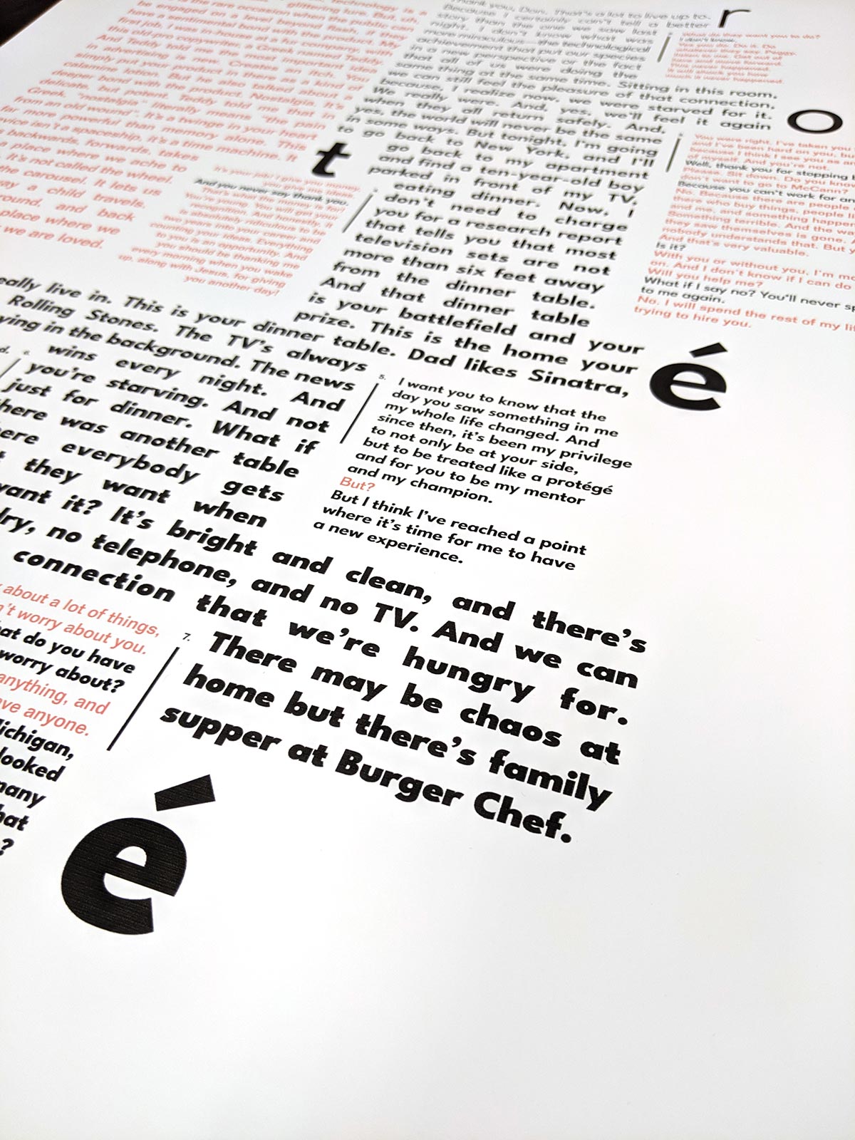
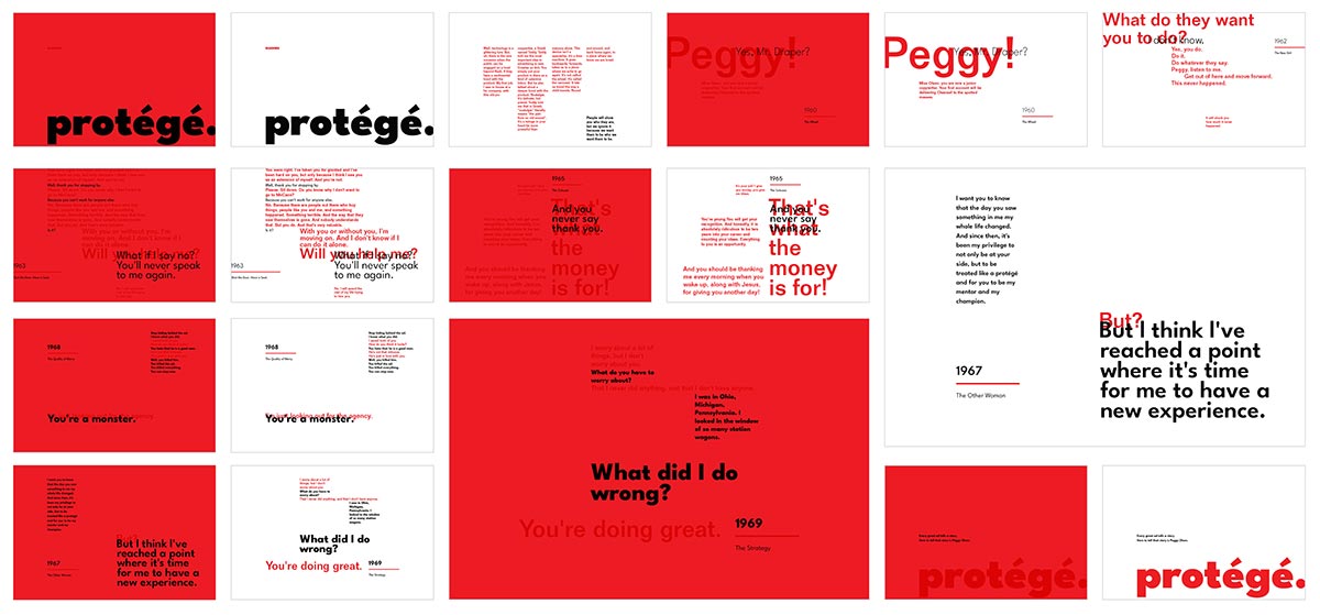
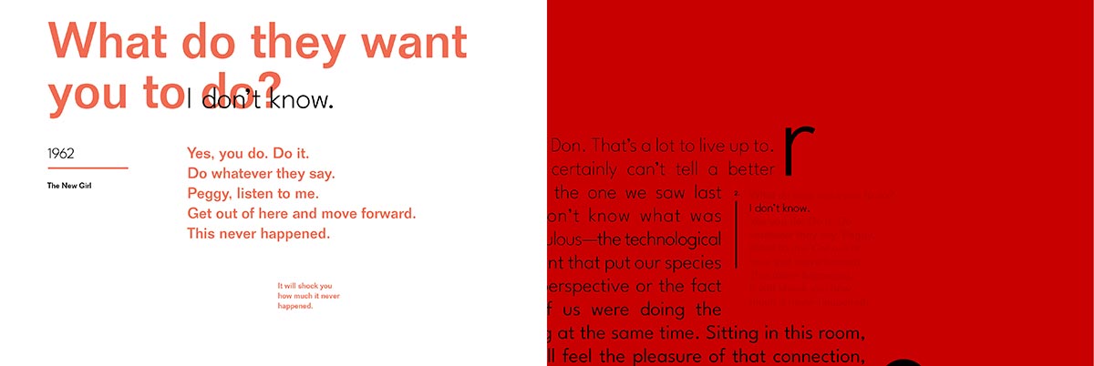
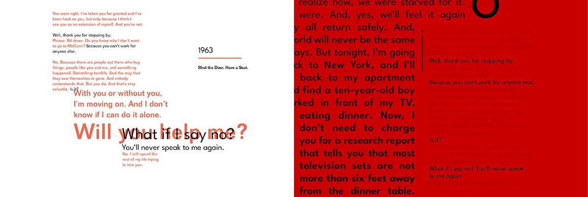
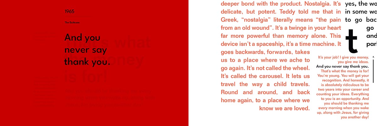
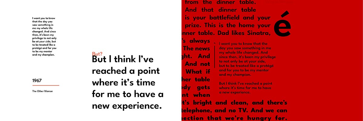
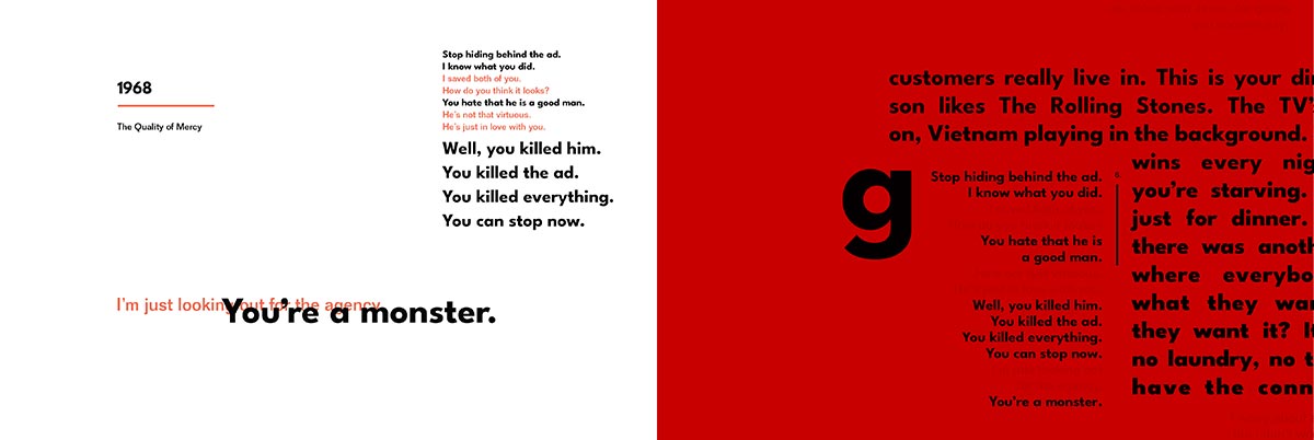
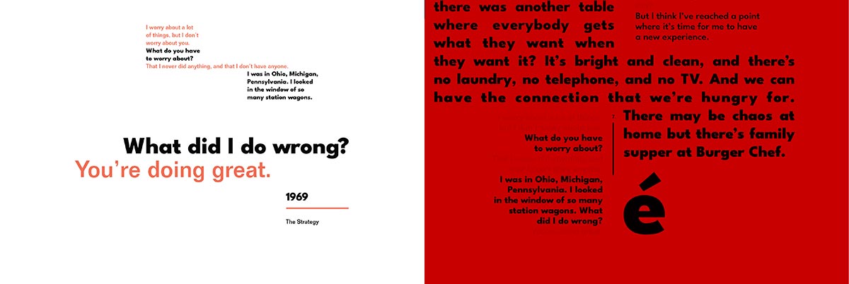
The interactions between the two were selected to show how their relationship changes from year to year. Peggy, voiced in black, and Don voiced in red is often overshadowed by Don, but without Don’s voice, Peggy’s story is a more effective voice for communicating the struggle for women in the 1960s.
This dynamic is shown visually in a typographic poster, where the weight of the Peggy's type increases as she becomes less dependent on Don for her own accomplishments and successes.
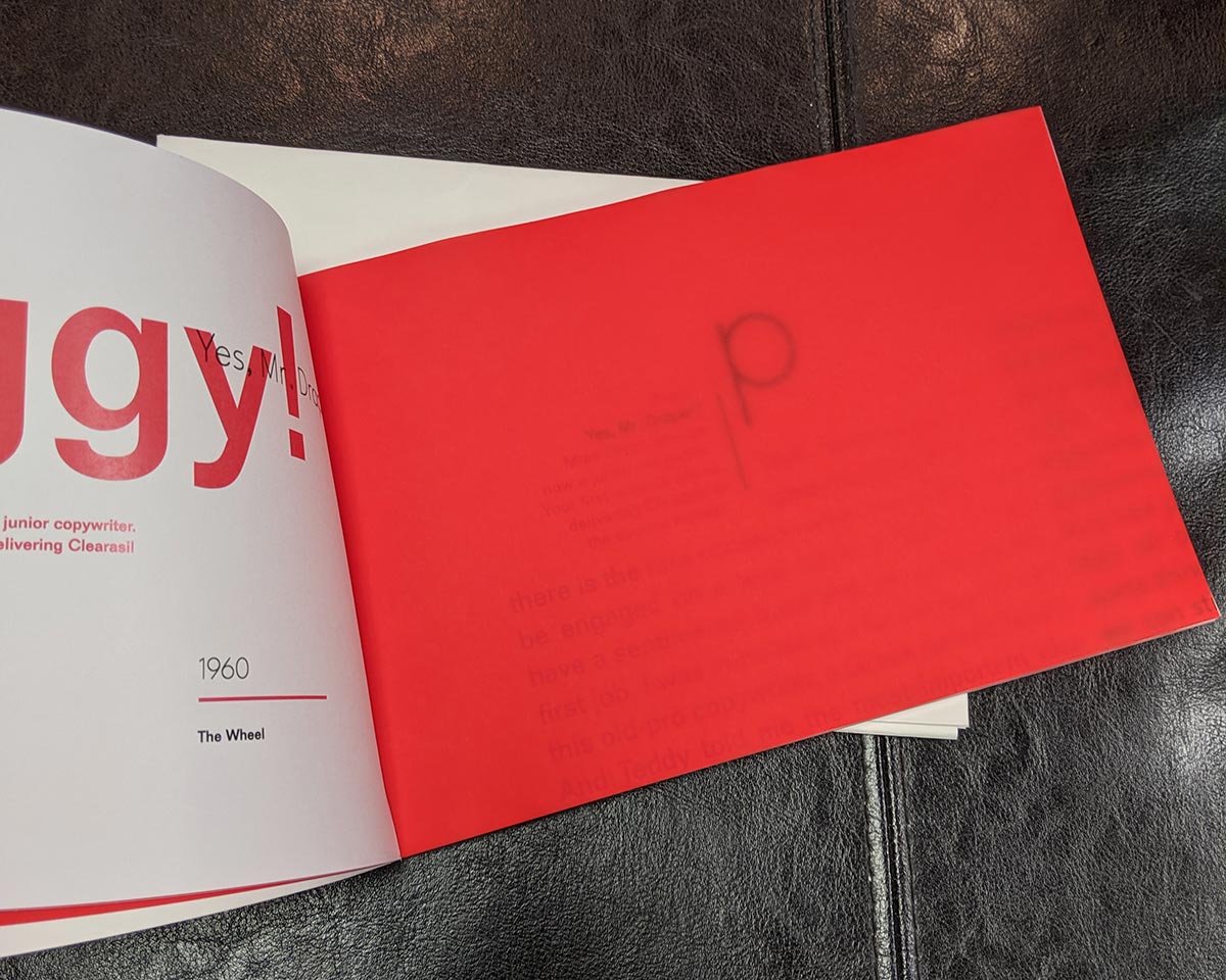
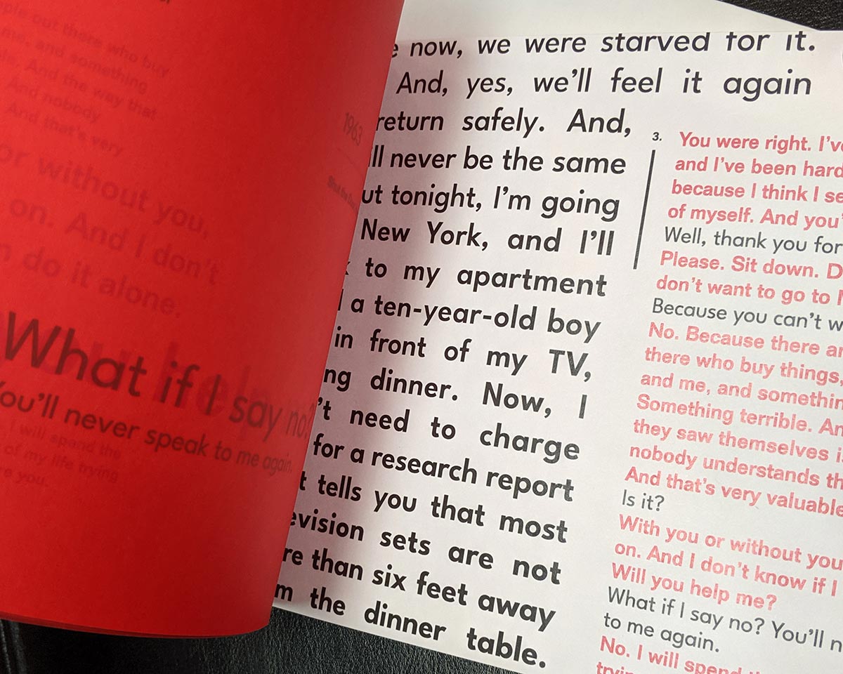
Red Filter Overlay
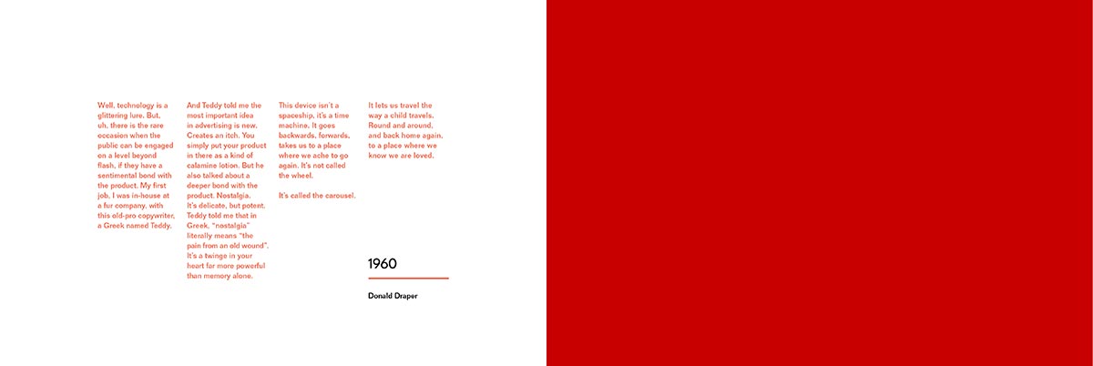
In order to remove Don’s speech from the layout, a transparent sheet of red vellum is inserted between each page of the book, allowing the reader to see the red and black text, or just the black text with the red filtered out. In order to have the red text still slightly visible, a series of red print tests allowed for the optimization of the red color.
Interactive Book Spreads
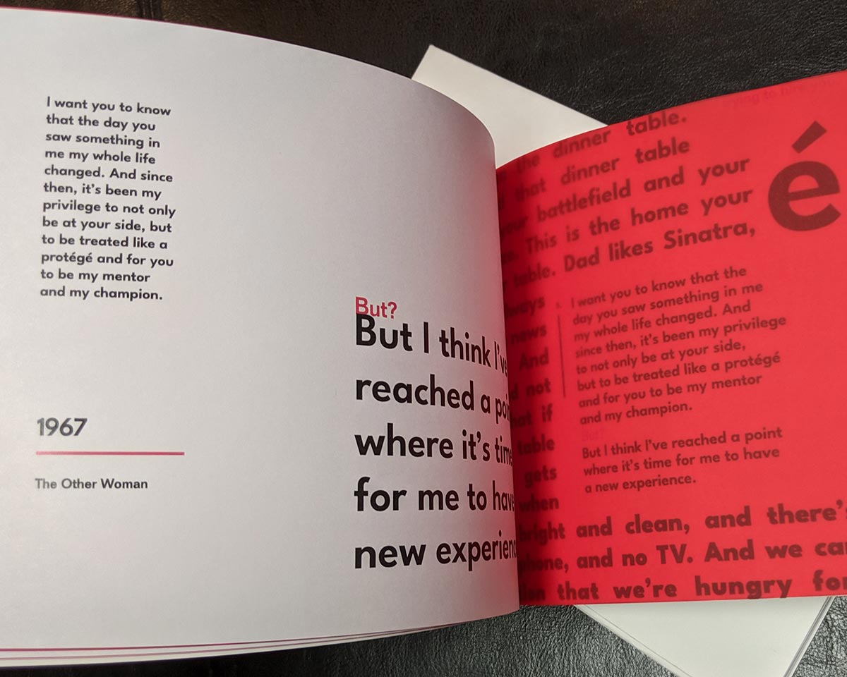
The filter process led to the thought of how Peggy internalizes her experiences with Don, and to showcase that more clearly, each spread is designed two separate ways. The verso page, is a singular view of their interaction, while the recto page showcases the same interaction in context with the monologues. This gives the sense that while their relationship is not always healthy, it does become a catalyst for change in Peggy.
The layout itself aims to show how the characters’ lives overlap and influence one another, but still allow for the full text to be visible. And even with the red overlay obfuscating Don’s text, Peggy cannot completely rid herself of the influence of Don. Even though his words still leave an impression on her career, her own words speak more to her own accomplishments.

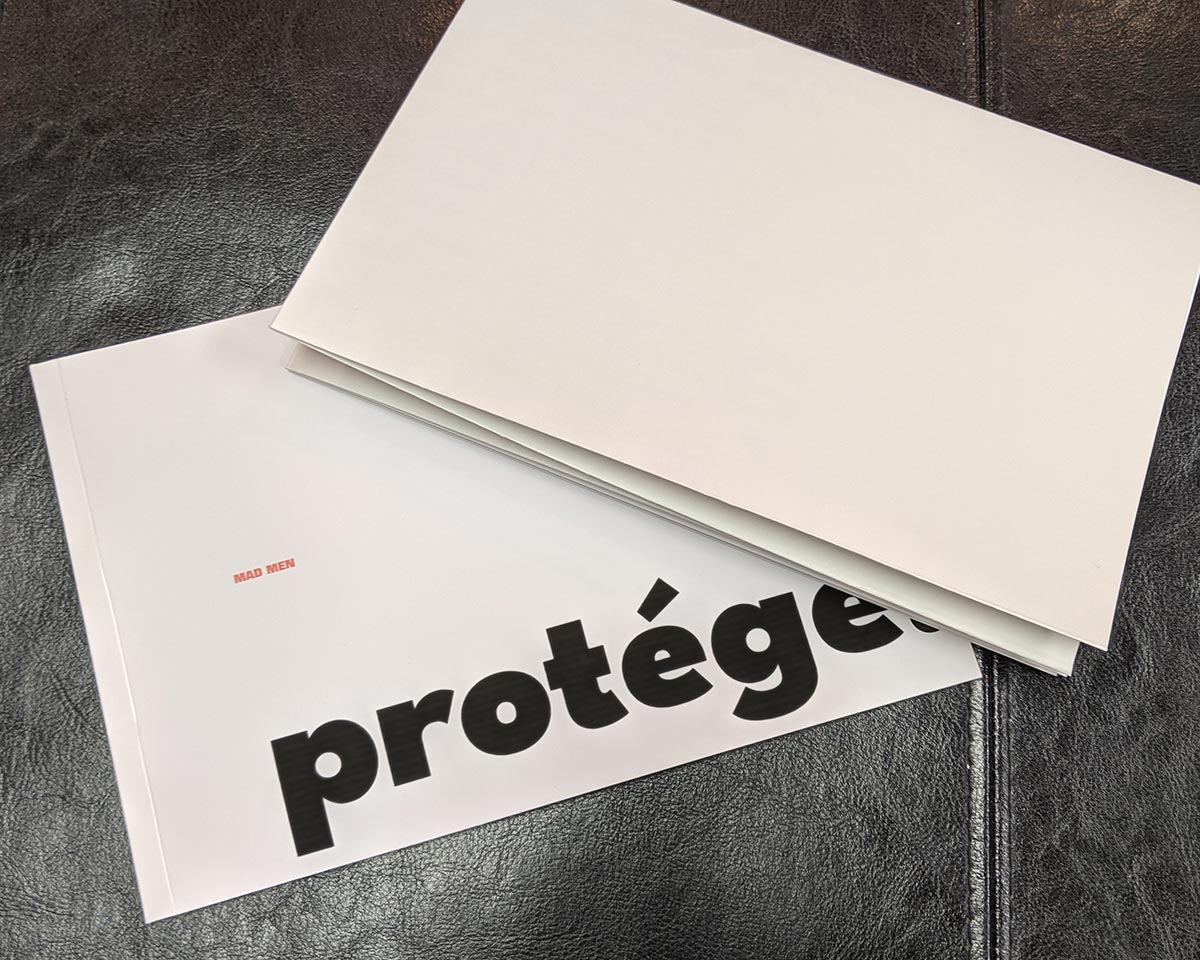
Book Prototype
The final book showcases how the reader is to interact with the book, especially the red transparency pages that hide the text. The book is perfect bound for a cleaner and more sturdy binding that accounts for the various properties of each paper type. The book is quite thin, but the small nature allows for the reader to pour over the details of the text and fully immerse themselves. The poster is included as a folded insert, rather than being bound into the book. This makes the book both more economical and easier to flip through.