Abstract
Telling a story with the data lends itself to further community engagement and reveals the invisible patterns we create in our lives. Working with large sets of data allows for a powerful narrative to unfold. A narrative driven by data speaks to the truth and authenticity of a community story that could not be captured through the perspective of the individual. By massing our data together as a city, we can uncover patterns of human behavior, which is invaluable to designing a solution. This project aims to take the massive quantity of data and visualize a narrative in an interactive, understandable, and convincing way in order to motivate and promote changes to the way Austin perceives and participates in cycling as primary means of transportation. The City of Austin Open Data Portal grants access to the aggregate data on public life, and in the case of this project, the habits of Austinites regarding bicycle ridership. Combining the large data of B-cycle trips with Mobility Talks survey data and TxDOT crash and accident data, a new narrative unfolds describing the issues of infrastructure, safety, and community revolving around riding bicycles in Austin.
Keywords: bicycles; data; interactive media; narrative; design;
ISBN: 978-1-940297-49-1
1. Introduction
In order to craft a story driven by data, questions regarding the public as a whole need to be asked in order to start the research off in a compelling direction, and cannot be solely based on a personal account of what it is like to live in the city. Using the City of Austin Open Data Portal, which contains massive databases related to traffic, infrastructure, and mobility, a question can be formulated: How can Austin improve the safety and accessibility for people who ride bicycles as a primary mode of transportation? This question led to a data-driven narrative that would help to explain the current way that people in Austin use bicycles for transportation as well as examine and explain the plans for new street designs to improve mobility for people on bicycles. Other data sources were needed to help craft a more comprehensive picture of Austin, which included TxDOT accident data to address safety for various types of transportation and Mobility Talks surveys to gauge the level of interest in riding bicycles from the public. Trip data from Austin B-cycle, a collection of over 660,000 individual trips, allowed the visualization of current habits of riders in the downtown area as well as for finding out popular times and destinations for riding.
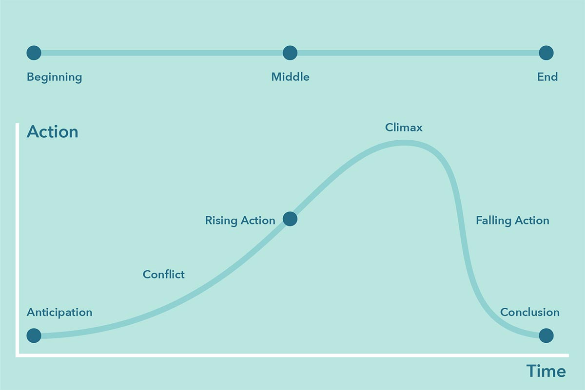
A major part of interactive storytelling is the linear narrative structure. This simple structure of beginning, middle, and end allows the story to help pace the data being visualized in a way that is common to many people. To give a more complex and flexible pacing to the story, the linear narrative structure can be related to action over time, where the story starts with anticipation, moves into initial conflict and rising action up until the climax of the story. After the climax, the story winds down with falling action and the conclusion. Setting a pace for the data and placing it on the linear narrative structure not only holds the viewer’s attention, but makes the data more impactful and memorable. Combining interactive visuals and sticking to a simple narrative structure allows for a complex method of storytelling that works well with large data sets and can convey a great deal of information to people who are not data analysts or visual designers.
2. Materials and Methods
The materials and methods used for creating the data visualization include Tableau software and Tableau Public Servers for sharing the outcomes and visualizations. Tableau is a data visualization program that allows for the representation of map data through latitude and longitude coordinates, pie charts and graphs from tables, and numerous other types of visualizations. The program allows for custom colors and filters to be scripted into the program to create a visually pleasing experience for the viewer. Microsoft Excel was also used in order to prepare the data for compatibility with the design goals of the project. This included rearranging columns and rows and combining data sources.
To achieve certain visuals, new spreadsheets needed to be generated from existing data. In order to create a line between two points in Tableau for certain visuals, two sets of paired latitude and longitude coordinates needed to be designated. This required using a scripting process to manipulate the data and automatically duplicate the values for making the pairs.
Other data, such as the survey data from the Mobility Talks needed to be entered into a spreadsheet by hand, since the data was not tabular, but rather listed in charts. This process was necessary in order to mix qualitative data with quantitative data, since Tableau works primarily with quantitative data to create visualizations. In order to add Austin specific maps to Tableau, such as those marking the boundaries of the 10 city council districts, a geojson map needed to be imported into the software. Many maps of this type are readily available online, but steps need to be taken to match the map data with the proper labels in the geojson file.
The combination of the programs allows for large scale data visualization through comparing multiple data sources and generating interactive visualizations including heat maps, word clouds, geographical maps, point arrays, line graphs, and pie charts. Uncovering the complex data and presenting it to the public can help a city make bigger decisions as well as change public opinion on the need for change in the way we use our city’s land resources and protect its inhabitants.
Additional narrative elements were created in Adobe Illustrator to enhance the visual identity of the story and provide more context to the data. These narrative elements help to ground the data and pace the story. These narrative elements included diagrams of streets and iconographic renderings of bicycles to give more narrative clues and provide visual breaks from large clusters of data. Files were saved as png in order to import them into Tableau.
The order of the visualization follows a linear narrative structure with a beginning, middle, and end (Figure 1). The structure is further divided into sections of action over time, starting with a preliminary anticipation while establishing the characters. Next, the story initializes conflict followed by rising action up to the climax of the story with the most action. The action then falls down to the conclusion where the viewer is presented with a call to action or a hopeful statement to think about going into the future. It is clear from the figure that the more advanced division of the narrative still holds true to the concept of beginning, middle, and end, with the dots still falling on the action curve.
3. Results and Discussion
Apart from the order of the story, the visuals play a huge role in helping the audience understand what they are looking at. The idea of visual simplicity works to display information in an organized manner without any compromise to the data. Visual simplicity is achieved through the interactive nature of the data. Rather than list a large table with visible values for each entry, interactive visualizations allow for the data to only be presented when the user requires it. In my visualization, this comes in the form of hovering over a map or chart section, selecting a range from a drop down menu, or choosing an item from a filter.
While it can be useful to have many elements hidden initially from the viewer, there still needs to be clear indicators on what elements can be interacted with and what elements are likely to show. Adding titles and labels to graphs and charts gives hints to what the chart means but specific details and quantities are reserved for interaction.
Using colors to give relational meanings to the data is also an important step in visual simplicity. Rather than using multiple colors to indicate a range of information, a series of colors from the same hue can provide the viewer with the context to understand the information on a macro scale. When a value transitions from light to dark, the user can correctly infer that darker means more and lighter means less. This often negates the need for a color key or legend. However, if the color values are not picked with enough visual difference, the chart may not lend itself to an inherent readability.
When dealing with big data, it is really easy to display 10,000 points on a map and leave viewers to search. However, through the use of color and scale, 10,000 data points can dissolve into a few brightly colored focal points that carry the entire message. If the imagery wasn’t simple and playful (Figure 2), but rather detailed and complex, the audience would have a hard time moving from one data visualization to the next.
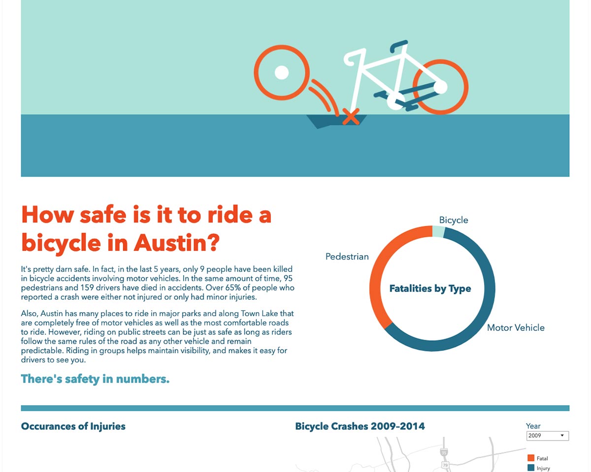
This visual hierarchy of information not only helps guide the viewer from one section of the visualization to the next, but it also provides reference points to help the viewer make deeper visual connections to the information. In the ring charts (made as rings rather than pies to mirror the imagery of a bicycle wheel), the color used to represent bicycles is always the same and the order of the information on the rings is in order of severity. The lighter, cooler colors are less severe than the bright and eye-catching oranges that represent the most shocking of data. In this regard, the orange often represents fatalities consistently in all the charts and points on a map. While this is a general trend, the brighter colors can be used for other points of emphasis.
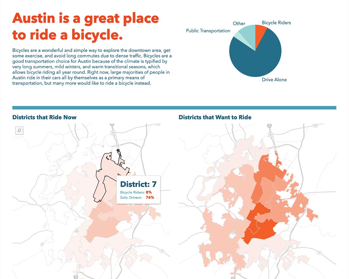
Maps are especially important when telling a story about a city since it visually shows the layout of the area. It allows for the narrative to have context and works as an anchor point for the complex data being visualized. Maps also help to give a boundary for the location of the story, which is useful when introducing a character in a narrative. Since the audience is likely a resident of the city, they themselves are, by default, characters in the narrative. The first map in the story (Figure 3) shows all of Austin’s ten districts and how residents feel about riding bicycles. Now everyone can start to formulate their opinion based on what their neighbors feel. The maps also serve as identifying landmarks.
People recognize different things in the map and they will naturally focus on areas important to them. To some, this is the river and town lake, to others it’s a small intersection where they usually get lunch. This pulls them into the story even further because they recognize real places. Data-driven stories are great for backing up the sentimental with facts. Bicycles go well with maps since they are being discussed as a form of transportation. In many cases, data sets on transportation feature distances and locations described by latitude and longitude. Having precise coordinates allows for showcasing the data in a variety of ways. Individual coordinates can be plotted as dots on a map or whole areas like districts or counties can be highlighted. In either case, maps provide the visual narrative with a sense of place.
Pacing the story in the linear narrative structure allows for a story to keep the viewer engaged during each narrative section. By separating the narrative into five parts, each part can focus on a specific aspect of the story structure. The first part provides anticipation by stating the problem and introducing the characters. To achieve this, this visualization introduces Austin through its current transportation makeup, which will include everyone living in the city. The audience vicariously becomes the character, because he or she can relate to either the statistic for someone who already rides, or someone who only drives or takes other forms of transportation.
The next phase is to introduce conflict, which shifts to showing a few barriers of entry to starting to ride in Austin, but also showing how the character can move past them with minimal action required on their part. There is also a color shift in the presentation of this page to orange, which is used to indicate a shift in tone. This part of the narrative deals with place even more than the first part with all the charts and graphs dealing with location. The next phase of the narrative increases the action and gives the character a sense of urgency and immediacy. This part looks at the times people ride on an hourly basis as well as on a yearly basis. Having the narrative cover such a broad and fine scale keeps the story relevant no matter when the story is viewed. This part of the story makes for the best time to use the most complex forms of visual information, since the viewer is already invested in the story, but not fatigued with information yet required on their part. There is also a color shift in the presentation of this page to orange, which is used to indicate a shift in tone. This part of the narrative deals with place even more than the first part with all the charts and graphs dealing with location. The next phase of the narrative increases the action and gives the character a sense of urgency and immediacy. This part looks at the times people ride on an hourly basis as well as on a yearly basis. Having the narrative cover such a broad and fine scale keeps the story relevant no matter when the story is viewed. This part of the story makes for the best time to use the most complex forms of visual information, since the viewer is already invested in the story, but not fatigued with information yet.
The most simplified part is the climax in terms of visuals. Only a few bits of information are needed, but the viewer will likely spend more time interacting with this data than any other part. The climax of the story is where the narrative pushes the biggest challenge onto the viewer. For riding bicycles in Austin, this is the issue of safety. The charts are the most simplified, but deal with the worries that often prevents most people from riding in the city.
Finally, the last part of the narrative brings down the action and leaves the viewer with a job to do, or a call to action. Not all narratives need to end this way, as the story may not have a resolution, but this part should still bring the story to a close. At this point, the viewer has gone through all the convincing, and they are left with a small task that is immediately achievable and attainable. This final call to action leaves the viewer knowing what to do and how to do it. They don’t have to think or do any more research on their own—it’s easy for them to become part of the solution.
4. Conclusion
Crafting a story using large data sets doesn’t have to be complex and filled with tables and unreadable graphs. The creator of the story just has to identify the most relevant parts that push along the narrative and design the visuals to only focus on specific aspects and goals. Following the basic narrative progression allows the data to have the most impact at the right time. The interactive visuals in the narrative should not remove the details in the data, but only obscure them until they are needed by the viewer.
The only way to know what kind of story your data can tell, is to spend as much time with the data as possible. While living in Austin gives a person some clues as to what story to tell, the real story came from analyzing the data. Data-based narratives are not a work of fiction—the facts of the story already exists in the data, waiting to be uncovered. Data is closest to truth, and truth makes for authenticity. Authentic stories make great narratives, since they are believable. By using data to present a narrative, it is easier to prevent the narrative from being biased or skewed, since the data will no longer support the narrative. It is up to the visualizer to uncover the story hidden in the data and clearly communicate it through visual simplicity.
You can read the published paper on the SEGD site: Let's Go for a Ride Abstract