
We Love Books
Love Booksellers is a branding concept for a local bookstore revolving around a kinetic logo and color palette. The multiple versions of the logo allow the designs of coupons, flyers, and bookmarks with great variety.
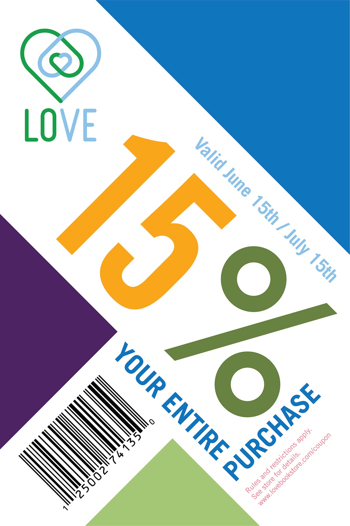
The logo features an intertwined and nested heart shape using two colors to represent the relationship between customer and the local shop. Using a large system of bright colors, the identity can appeal to a wide audience that appeals to the sense of choice that reflects the content of a bookstore.

Dynamic Identity
Setting the type on an angle helps maintain the dynamic visuals that the rest of the brand achieves. The logo is also used to create wallpapers for the interior of the space, and can designate different sections of the store using different color variations.


Bookmarks
To show off the potential of the colors, angles, and variations designed into the brand system, a series of bookmarks was designed. The bookmarks use solid blocks of colors all pulled from the vast color choices.