The narrative of Against Fiction meanders from topic to topic just as the letterpressed text almost randomly jumps from size to size, majuscule to minuscule. In a deliberate postmodernist fashion, Johanna Drucker acts as both the author and the designer, simultaneously writing her work, while hand setting the type letter by letter. While the mixture of cases, sizes, and weights in her typography may be jarring to a reader expecting tradition, her ideas of creating textual meaning generate a high probability for “adhesive reading” (Drucker 16) and prominently impacts the narrative of the book. Forcing the reader to slow down during the transitions between formats, Drucker insists the reader should contemplate and perhaps better understand the text.
Composed like articles in a newspaper, each page, or column of text, instead, contains what must be a snippet from a much larger work or the start of a story not yet finished. Each fragment somehow relates in context to the other tangential stories. Describing the graphic meaning of a page in relation to the linguistic meaning, Poyner relates Ellen Lupton’s principle of a “visual dictionary” to showcase how the designer grants more meaning to the text by merely arranging it with purpose (124). This idea of the designer acting as the author to embellish the meaning of the text holds quite true in the case of Against Fiction. As the designer of her own book, Drucker frees herself from the space in the text block. The book itself is rather large, coming in at around 13 by 16 inches, but the hand setting of type for the letterpress format almost requires a bump in scale. Since Drucker had to place each letter painstakingly, it would have been much more challenging to arrange type below a standard pica in size.
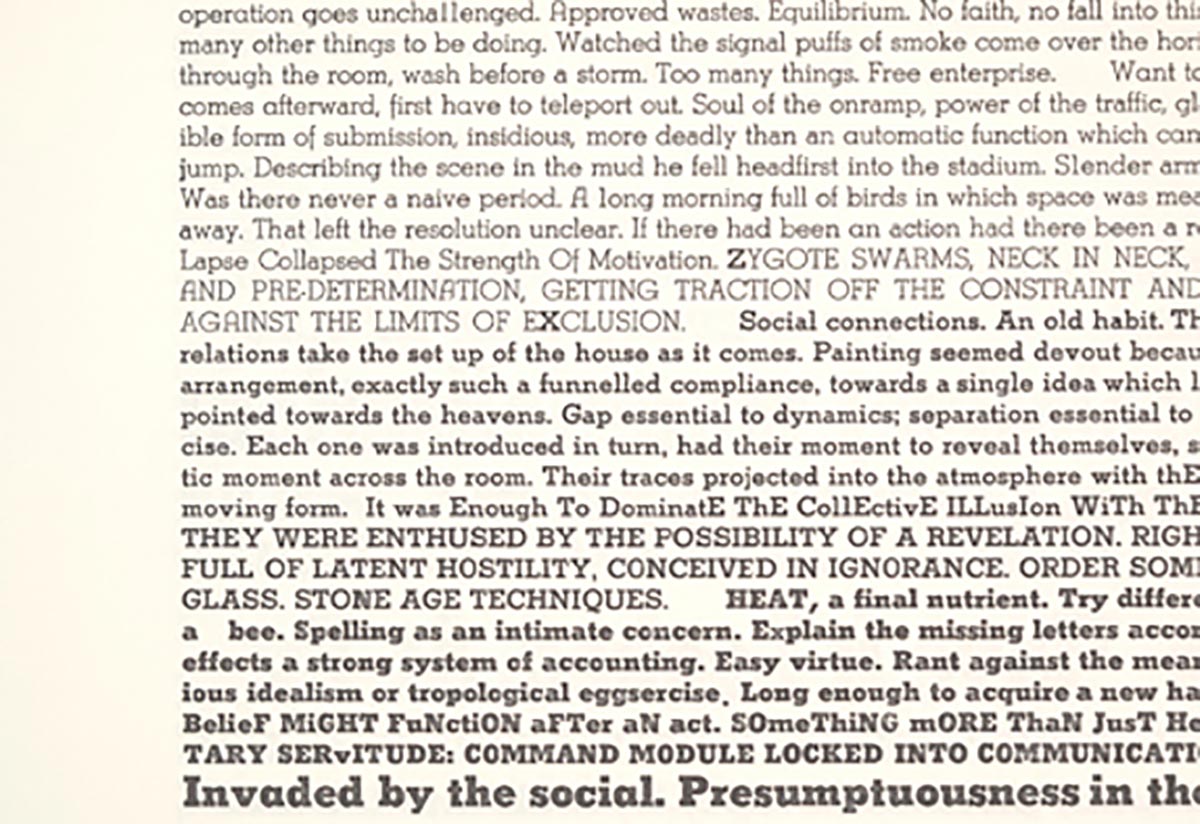
Technical limitations play a huge role in how the type conveys the message in the work. In an interview with Ellen Lupton for Eye, Drucker talks about the process behind the work and how she “wouldn’t let [her]self make any arbitrary or non-standard decisions until the stock of letters in the typecase had been exhausted” (Lupton). Her decisions readily make an appearance on page 8 of the book, where a few missing letters in a set required the use of bold alternatives to an X and Z. Drucker started with the intent on setting type according to traditional rules, but would often improvise as the metal set of Stymie ran low.
Drucker, frequently composes her work on the spot stating “because there’s no more M’s, and you think, well how am I going to say mother? Or how am I going to say, murmur?” (Boulton). She also notes that this is something that only the designer acting as author has the opportunity to do. Setting predetermined text would never grant the same compositional freedom to a designer without the ability to change the words to fit the letterpress format.
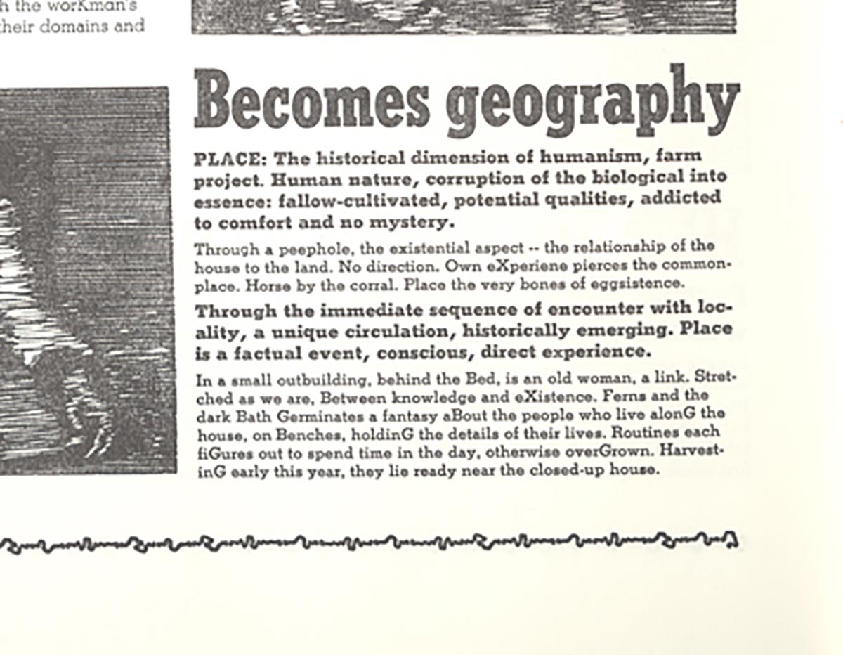
Due to a similar limitation, but used much more deliberately, Drucker often exchanges the cases of similar letters in the same sentence. For example, on page 24 in the last section on Becomes geography, she uses uppercase X, G, and B instead of the lowercase letters in almost a sort of pattern, which emphasizes those letters. The reason the limitation feels self-imposed is because there are lower case letters used before and after the uppercase substitutions have been made, implying she did not run out of proper letters before their insertion but instead inserted them for visual and phonetic texture. They act as hard beats in the sounds made when reading aloud, giving the prose a more poetic rhythm.
Perhaps the most notable change typographically is the dramatic change of scale at the beginning or end of each page or column. Interestingly enough, some of the writing seems to be about the work itself, like this passage where Drucker reflects on the process of typesetting. “Fragments mark the degree of change. If rendering noted only the duration it would be insufficient. Change more than scale” (Drucker 16). The largest size of type directly plays into the idea of fragmentation present throughout the work, since the heavier weight and scale prevents whole sentences from fitting on a single line. In order to fit the sentence, Drucker writes a fragment and leaves the reader to interpret the missing pieces.
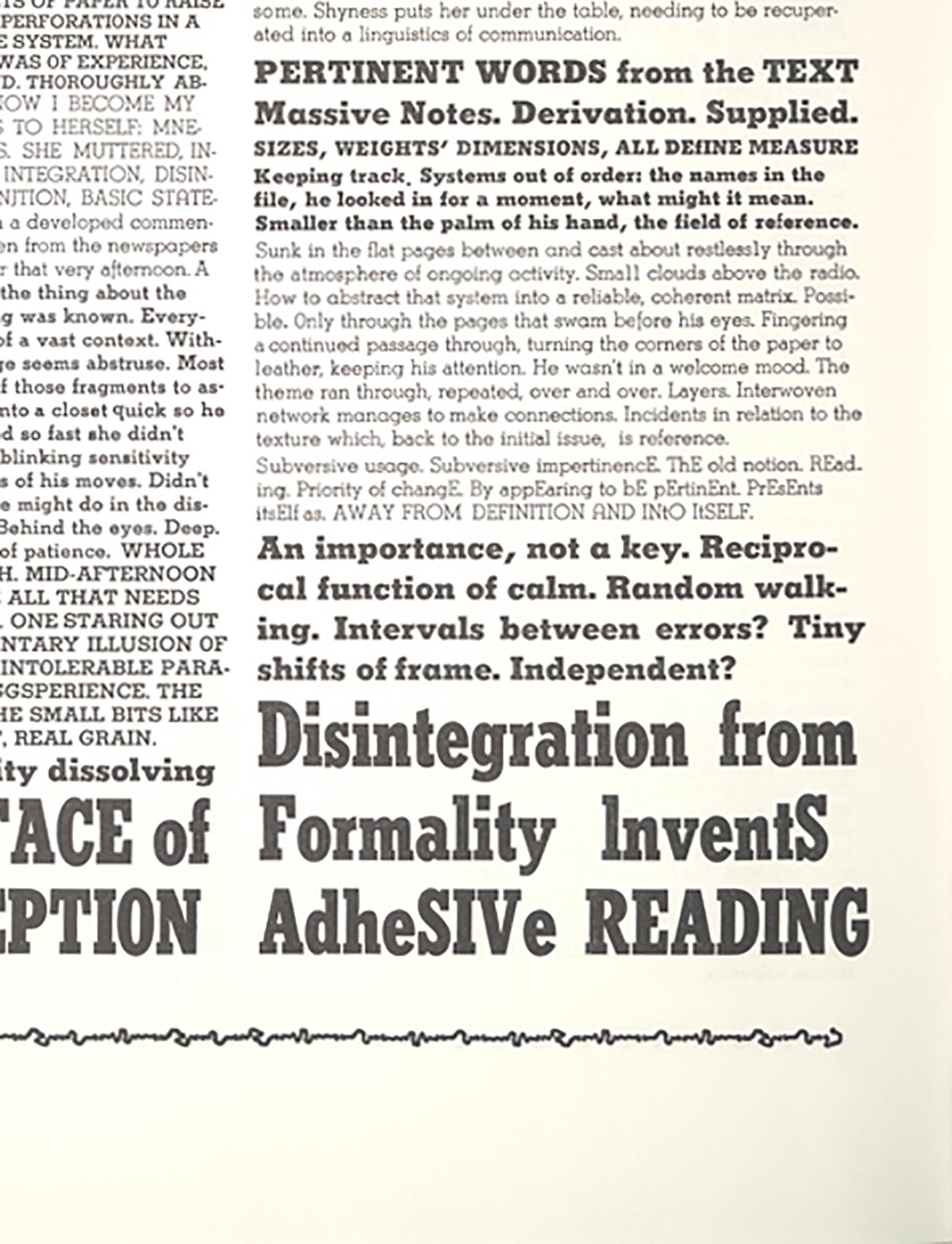
Any commonality between the words from each page plays a secondary role to the typography. The work as a whole maintains unity with the consistent use of typographic style from excerpt to excerpt. Drucker again, in a seemingly meta-observant part of the book, describes the typography as “random miscellany, the ultimate nemesis, the font, the real, cropping up continually, defining rather than being defined” (10). So if her type is helping to define her work and combat the randomness of the words themselves, it must be the essential aspect controlling the pace and understanding of the book. By breaking the flow of the text, Drucker’s experimentation with scale, readability, and typographic interchange allows her to force the reading into a state of consciousness, where they actively interpret the work and become fully immersed by each word on the page.
From the project: The Underlying Message