Typography and technology live and breathe together. Anytime a new advance in technology occurs, typography is right behind, giving a new device life and voice. However, when designing typefaces for use in the digital era, aspects of past type design must be incorporated to create a work worthy of becoming a classic. Typographic creation requires a variation in character depending on the intended use and display medium, and only careful study of past methods of type design can lead to the creation of new and successful typefaces using modern, digital processes and tools.
Gutenberg’s printing press helped spread knowledge across the world, but only with the advancement of typographic matrix casting. Movable steel type cast from copper molds made typefaces practical and powerful for reproducing large volumes of text. Soon, mass production demanded new technology, and type went from being set a single letter at a time to whole lines of letters thanks to Linotype’s hot metal press (Osterer 22). Decades later, the technology of typography advanced thanks to innovations in photography. Typefaces were now cut from film, exposed onto rolls of photosensitive paper, and magnified or reduced by a lens. Phototypography broke the physical boundaries imposed by cast type, allowing overlapping and infinite scale adjustments. Typography reached a new potential, but another technology would change it further—the personal computer.
“Behind every typeface are two distinct sets of influences: the personal tastes of the designer on the one hand, and the functional constraints of the machine on the other.”
—Tobias Frere-Jones
The Macintosh computer ushered in a new era for typography with a screen designed with type in mind. With a pixel resolution of 72 dots per inch to correspond to points per inch on the typographic scale, technology once again joined inseparably with typography (Annand 28). Each iteration of technology advanced the typefaces themselves. Metal type came in few sizes and usually just one weight due to physical volume taken up by the blocks of type. Phototype saw an expansion of characters, such as bold versions of old faces, italic variations, condensed and expanded weights. However, computers led to the biggest explosion of character sets—a new typeface for every occasion. Computers made typography commonplace, and designers could create typefaces with ease. The computer made typography ubiquitous, but is this pervasiveness a strength or a weakness?
With the aid of computers, more people than ever are designing typefaces. Since type creators no longer require elaborate training, many have stopped adhering to the traditions of typography rooted in clarity, proportion, and rationality. In that regard, weakness exists in new typefaces. New faces are often incomplete and created without regard to multiple uses. Still, a new strength arises for the typefaces not born from molten type of the past. Digital type is boundless. It can stretch and warp and be infinite in size. These new characteristics let typography grow in new directions, but is it at the expense of what old type technology teaches about typographic fundamentals?
Typographers in the digital era have to decide if their work should be based on classic technology or represent the modern era. Tobias Frere-Jones claims that “behind every typeface are two distinct sets of influences: the personal tastes of the designer on the one hand, and the functional constraints of the machine on the other” (Annand 8). When redesigning a new font based on an old face, different versions and impressions must be taken into consideration, especially when it comes to the size of the specimen. A digital reproduction of a 12 point face looks and functions differently from a 72 point reproduction, where proportion and stylistic elements adjust as point size changes. Also, should the reproduction be based off of the metal cutting, which is thinner, or should it be based off of the document, where ink has met paper and given the type a thicker and possibly more intended weight?
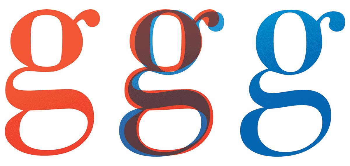
Scalability gives digital typefaces the biggest challenge when combining style with the limitations of the medium. Characters from specimens at small point sizes are often wider and have taller x-heights to prevent counters and bowls from closing. Serifs are made more prominent in order to survive the printing process. Larger display types often get the reverse treatment, where strokes are thinned and spacing and proportion are optically shrunk. Faces with different character sets for large and small sizes will perform the best and allow the digital medium to stand the test of time and adapt to all digital mediums.
Unfortunately many digital typefaces neglect the subtleties of their medium since the same face gets used at every size of reproduction. The differences in appearance of the same letter at different sizes go ignored in favor of simplicity in digital type creation. Only the faces redesigned from traditional sources succeed. Even the digital medium cannot escape the timeless rules of geometry and aesthetics. Digital typefaces must follow the same path of metal type. Faces must be designed for their intended use and size, not as a one size fits all solution (Hoefler&Co 2).
Computers make this easy, with infinite space for character sets in all sizes. Creating a one-size-fits-all typeface is the biggest omission in the digital era of typography. Designers should stop neglecting the power of digital tools and start to embrace it. Modern technology allows for greater complexity in type families making it much easier to account for all the different sizes and uses especially compared to older manufacturing techniques. Even if the older technologies had limitations, digital typefaces need to draw from their pedigree in order to become as timeless as faces born from technology of the past.
See the project: Technology Strengthens Typography