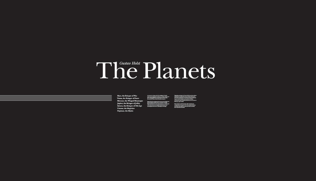
Celebrating 100 Years
The first public concert occured on February 27, 1919 in London by the Royal Philharmonic Society conducted by Holst’s friend Adrian Boult. Since the music composed by Holst felt so new and original in the eyes of Boult, he decided the audience could only handle five of the seven movements, and it wasn’t until November 15, 1920 that the public would hear the entirety of the opus.
Planetarium Installation
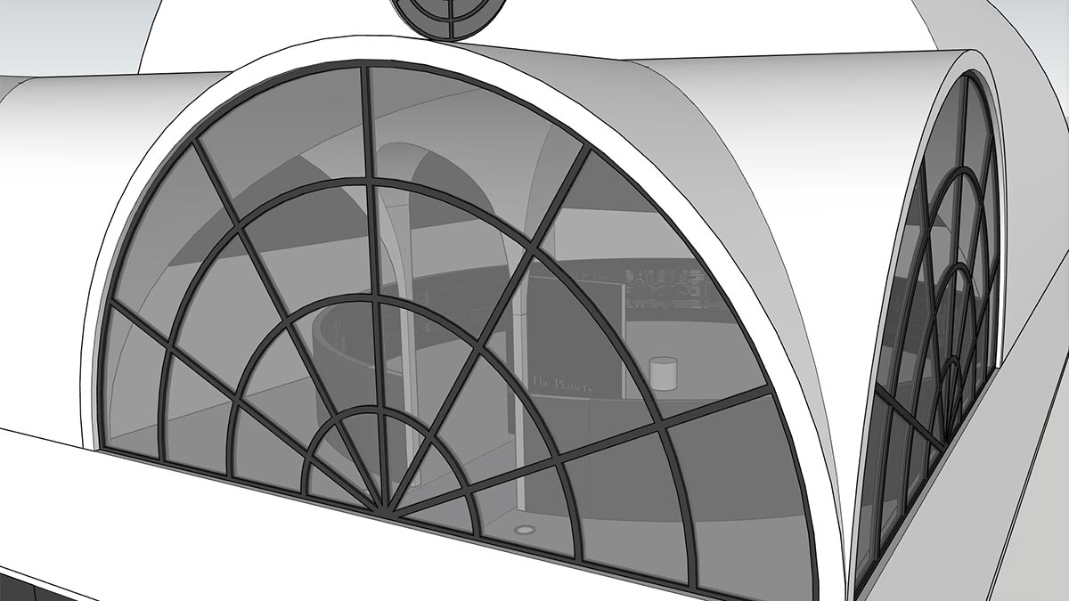
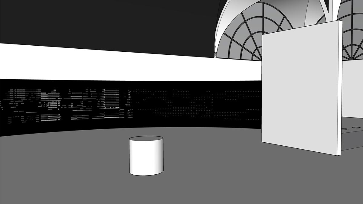
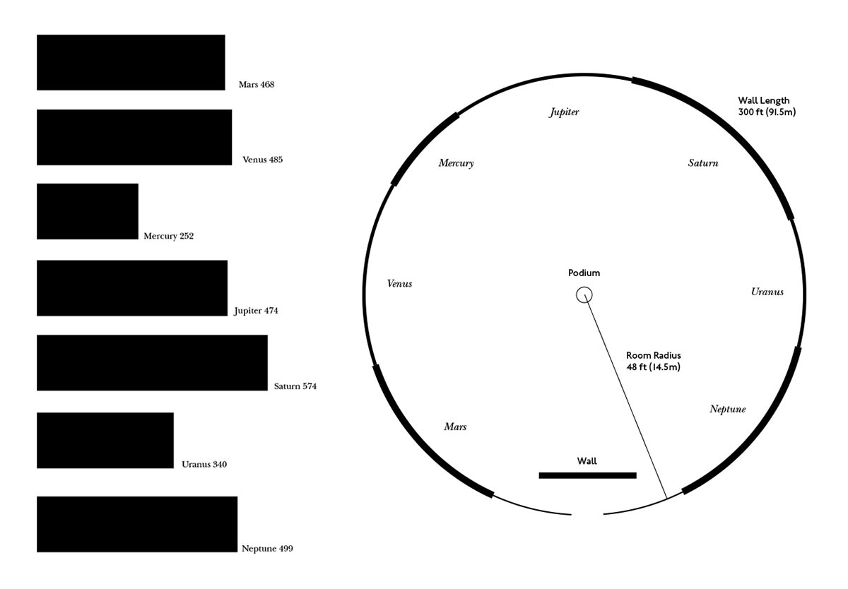
To celebrate the centennial of Gustav Holst’s The Planets, a typographic concept for an illuminated installation that synchronizes the music to a typographic display of written orchestration, creates a visual take on his symphony like that of the stars in a planetarium. The whole room consists of a dimly lit, circular wall with a diameter of almost one hundred feet with an eight foot opening at the front. Just beyond the opening, a 21-foot wide flat wall acts as an introduction to the work and prevents the external light from entering the room.
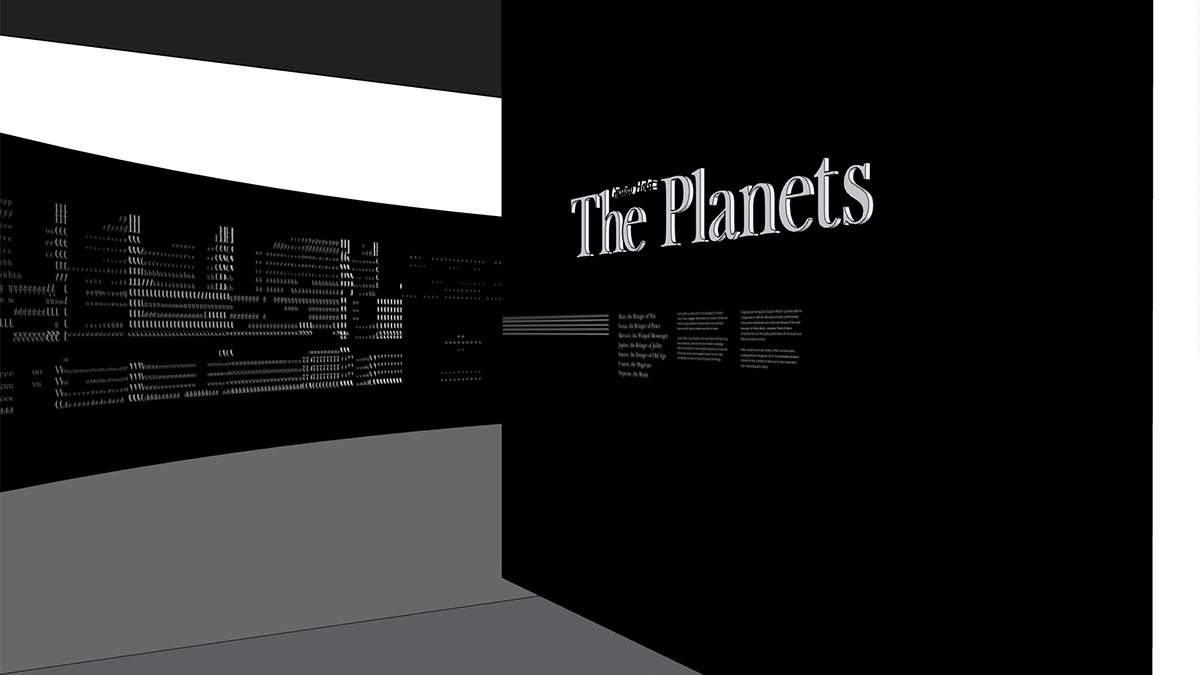
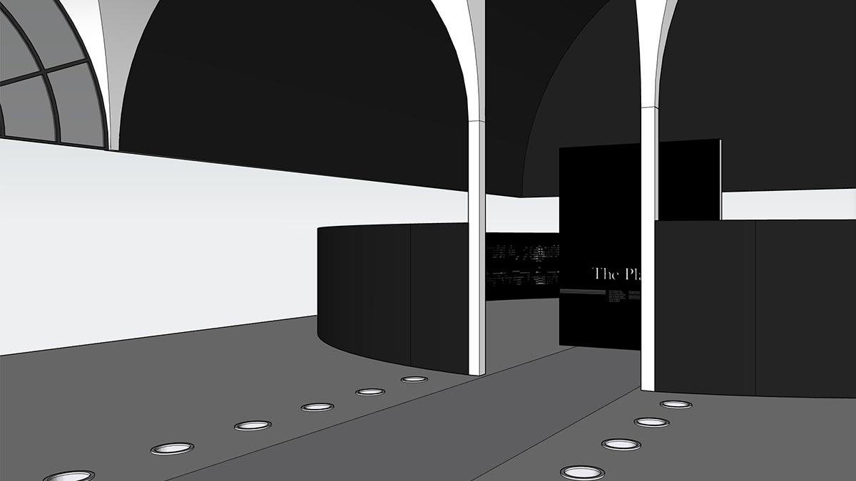
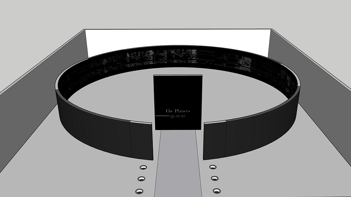
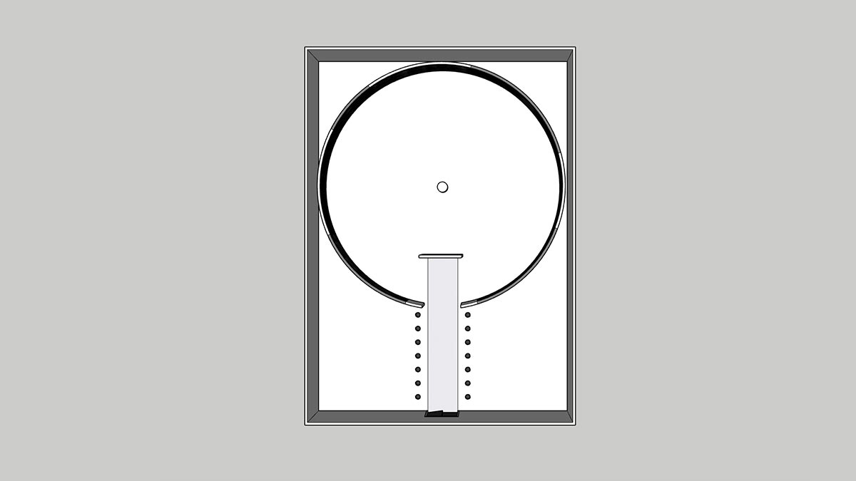
In the center of the room, a small podium stands as a monument to Holst, with the works revolving around him. A light from the center of the room shines on the wall to brighten the vertical section corresponding to the music playing. The entire length of the symphony runs just short of an hour, giving the light time to make a full revolution and for the audience to experience the entirety of the suite audibly and visually.
Typographic Representation
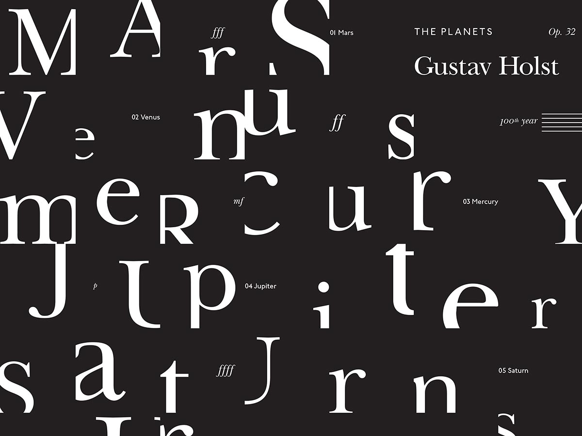
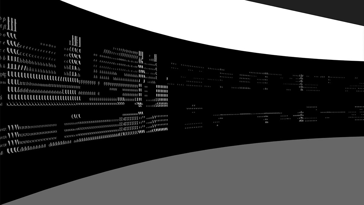
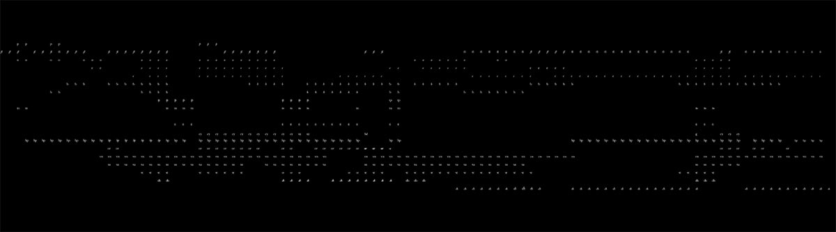
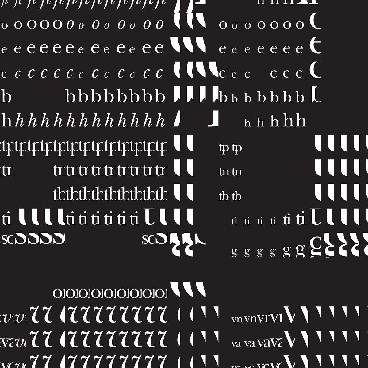
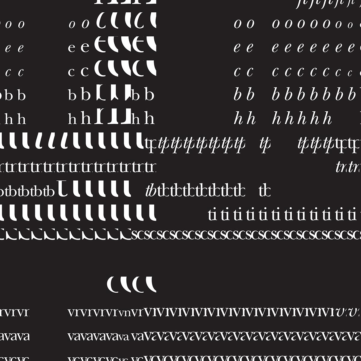
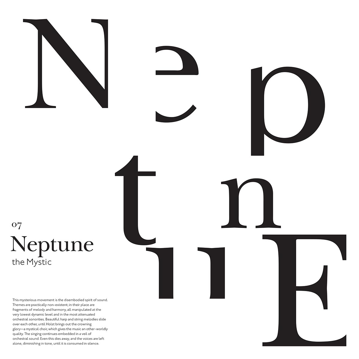
When typographically representing a symphonic piece of music, the elements that most deserved visual representation are the space around and loudness of the instruments. To accomplish this, a grid system is employed similar to sheet music, but represented each instrument as a typographic abbreviation rather than notes on a staff. By confining each instrument to a measure and increasing the or decreasing the type size relative to the dynamic level of the sound, an interesting texture of positive space emerges. Louder measures fill up the grid space, but begin to appear as fragments of type anatomy—quieter measures showcase the letterforms in full, but have more space around them.
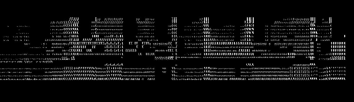
In addition, the instruments that hold the melody are treated in italics to provide a stronger sense of movement. This captures an intricacy of the music and visually pairs well when viewed synchronistically with each planet’s score and allows visitors to experience The Planets within a new dimension.
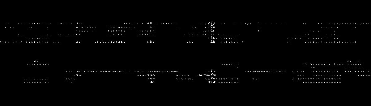
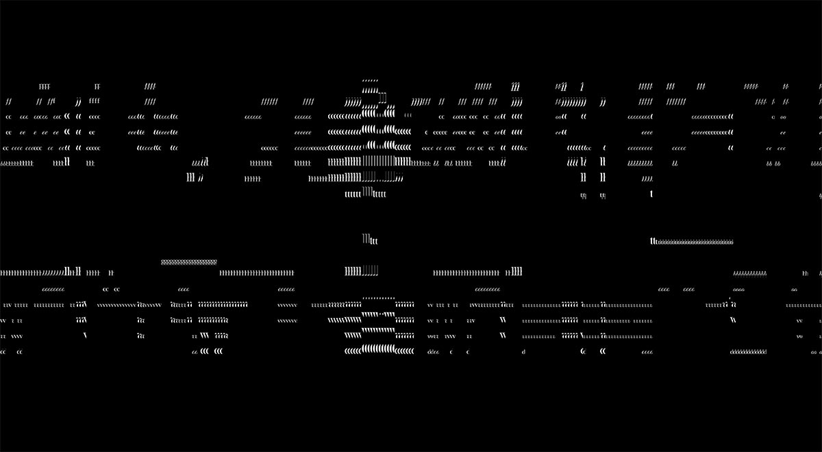
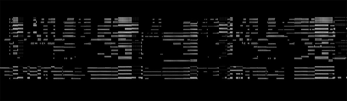
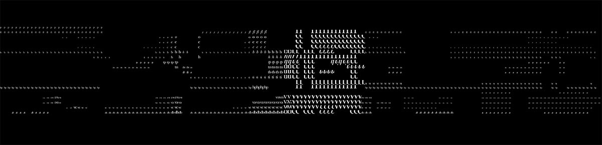
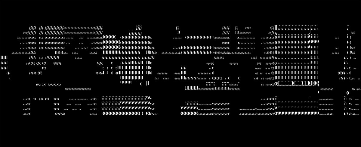
Each wall section is installed along the curving surface of the space. Since each movement of the orchestration is a different length, the sections of wall are naturally different sizes, but all unified by a common height. This ensures that the timing of the exhibition remains linear to match the music.
Virtual Exhibition
In order to make the event more accessible, the installation also can be viewed as a virtual environment with inexpensive VR headsets. The full suite plays while "guests" can freely explore the space, moving and looking in any direction.
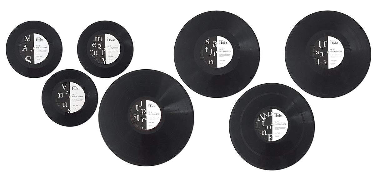
Limited Record Release
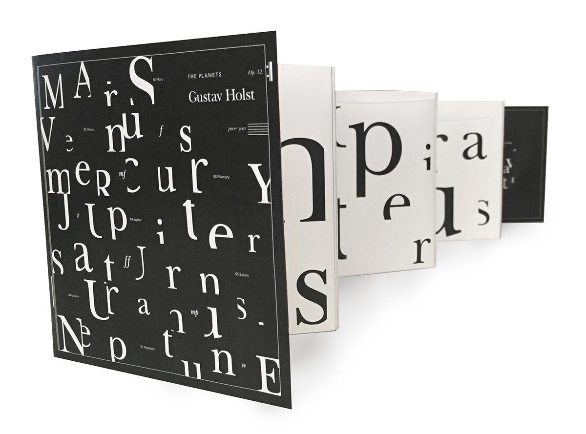
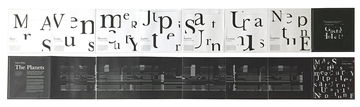
In addition to the installation, an exhibition catalog in the form of a multi-record vinyl package completes the experience for visitors.
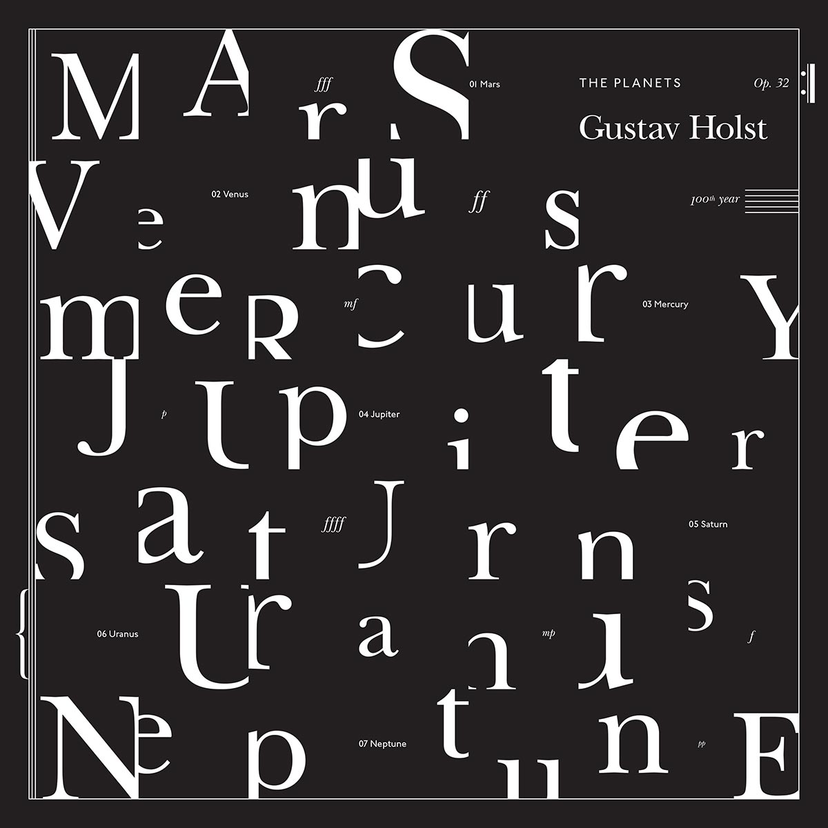
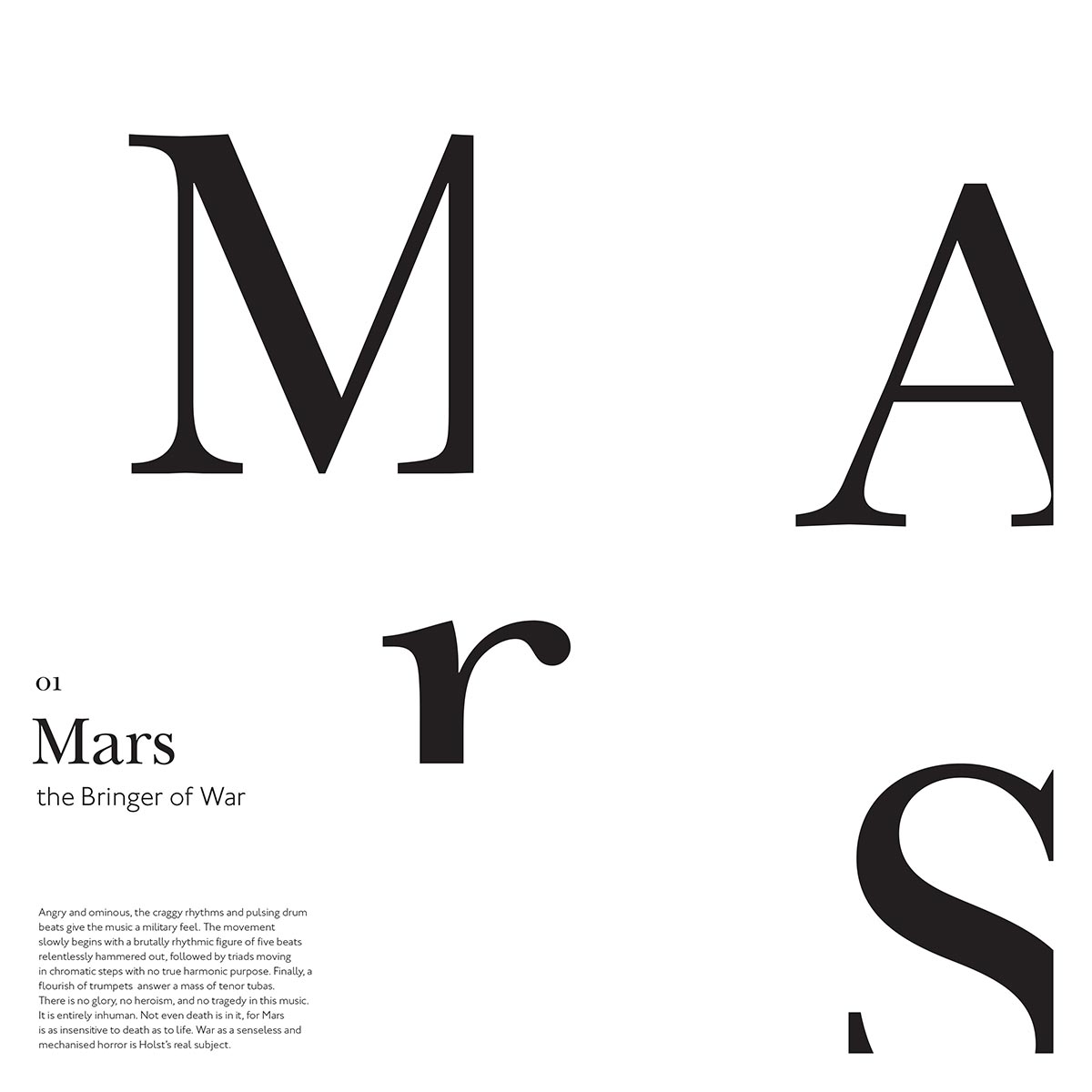
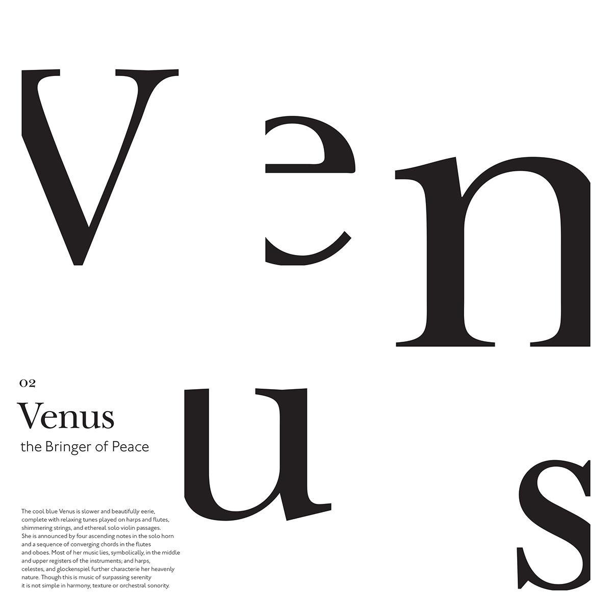
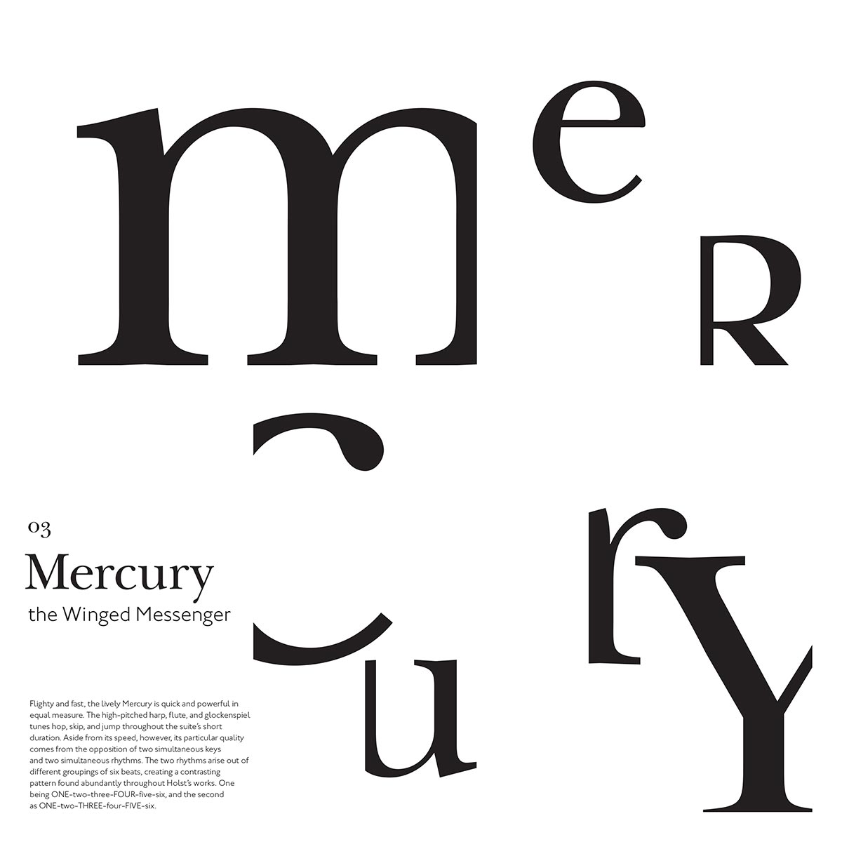
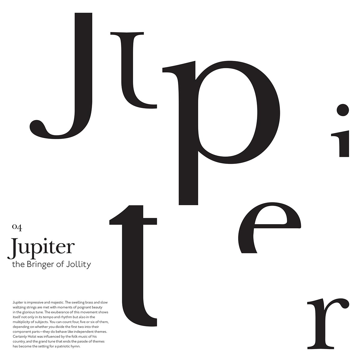
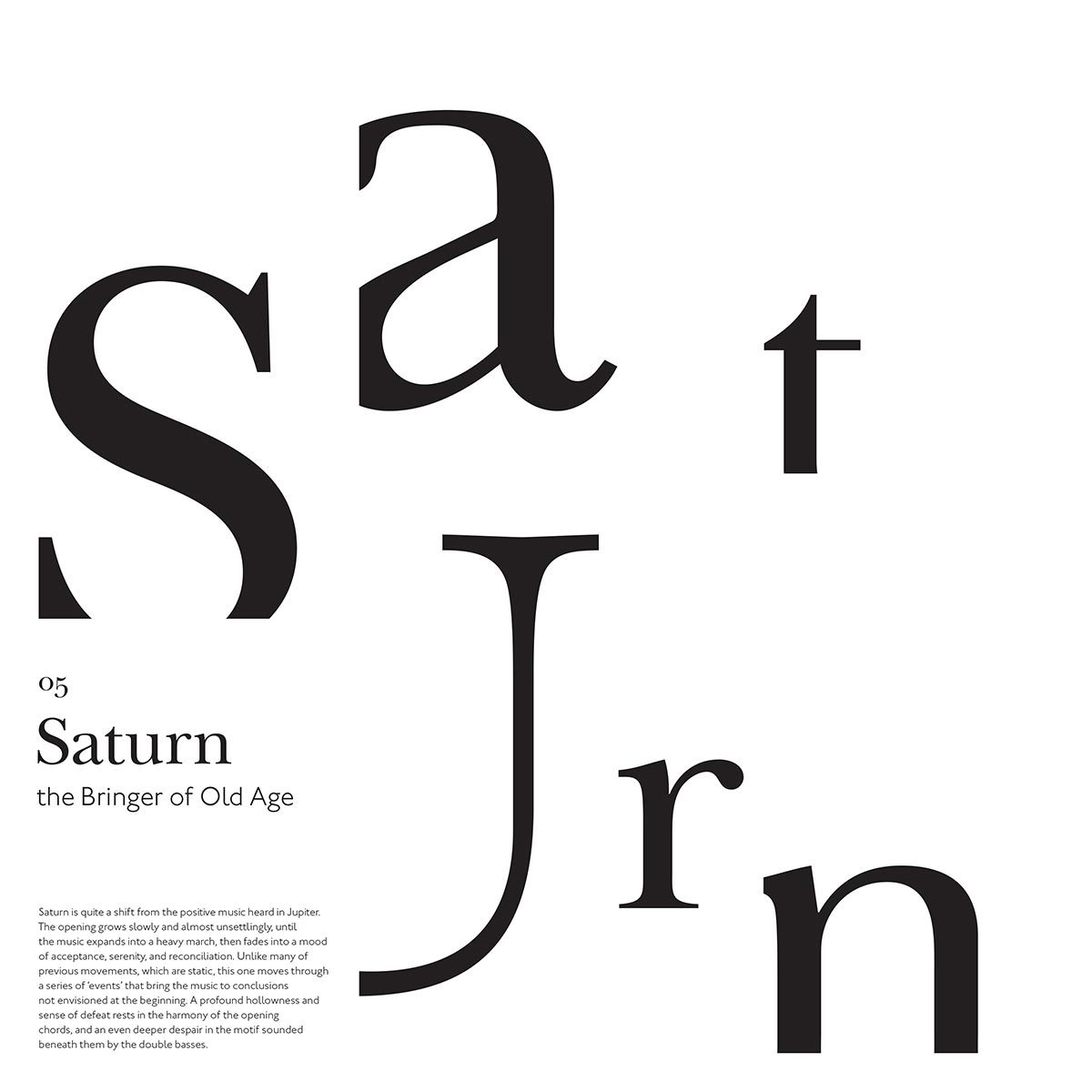
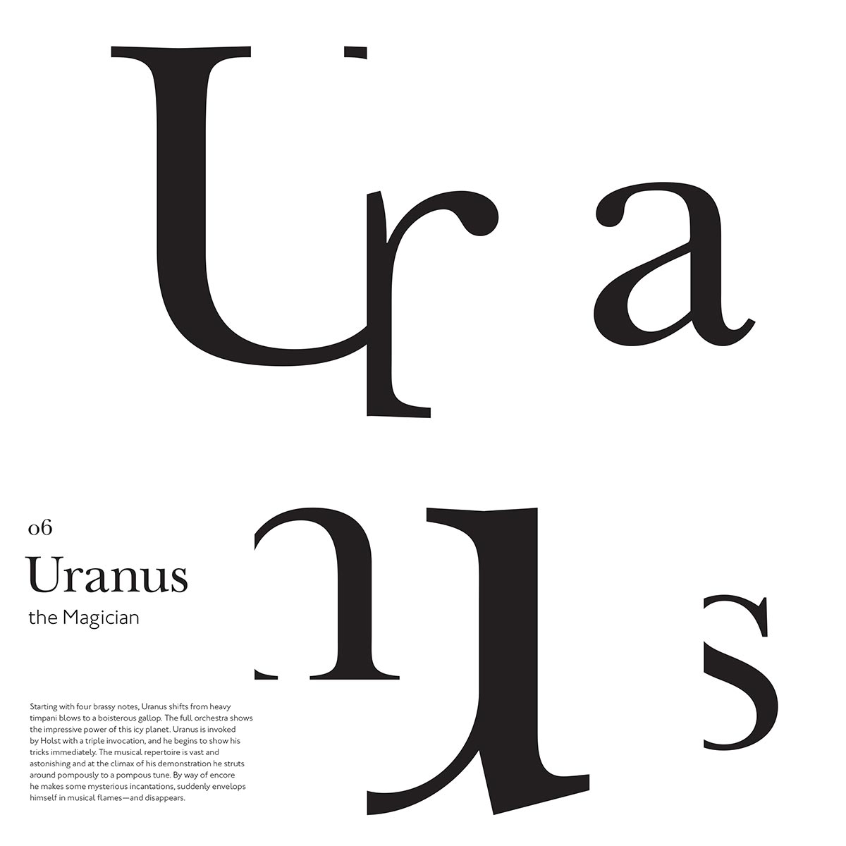
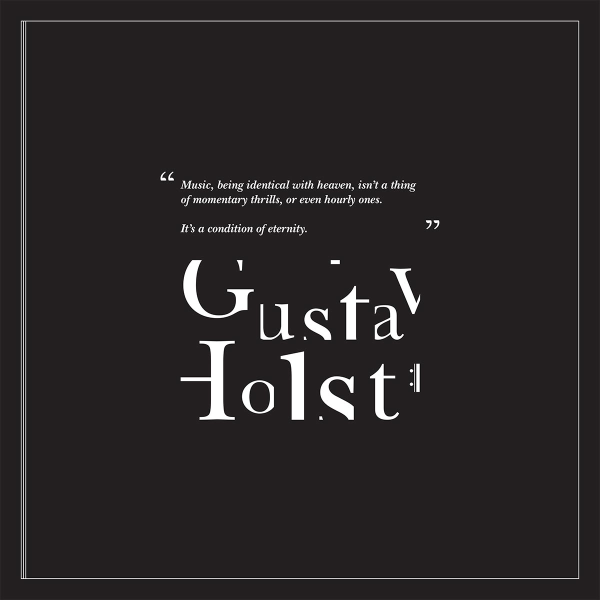
The typographic styling of the record cover reflect the modular grid of the installation, where the letters of the names of each planet are confined to a grid and enlarged and arranged dynamically. Any parts of the letters that overlap the designated space is trimmed away, leaving a distinct spacing between still-recognizable letterforms. This represents the play between space and recognition inherent to Holst’s work. Hiding part of the letters shows also evokes the connection to works of other composers, in which Holst’s revolutionary style can be heard influencing and peeking out in modern scores.
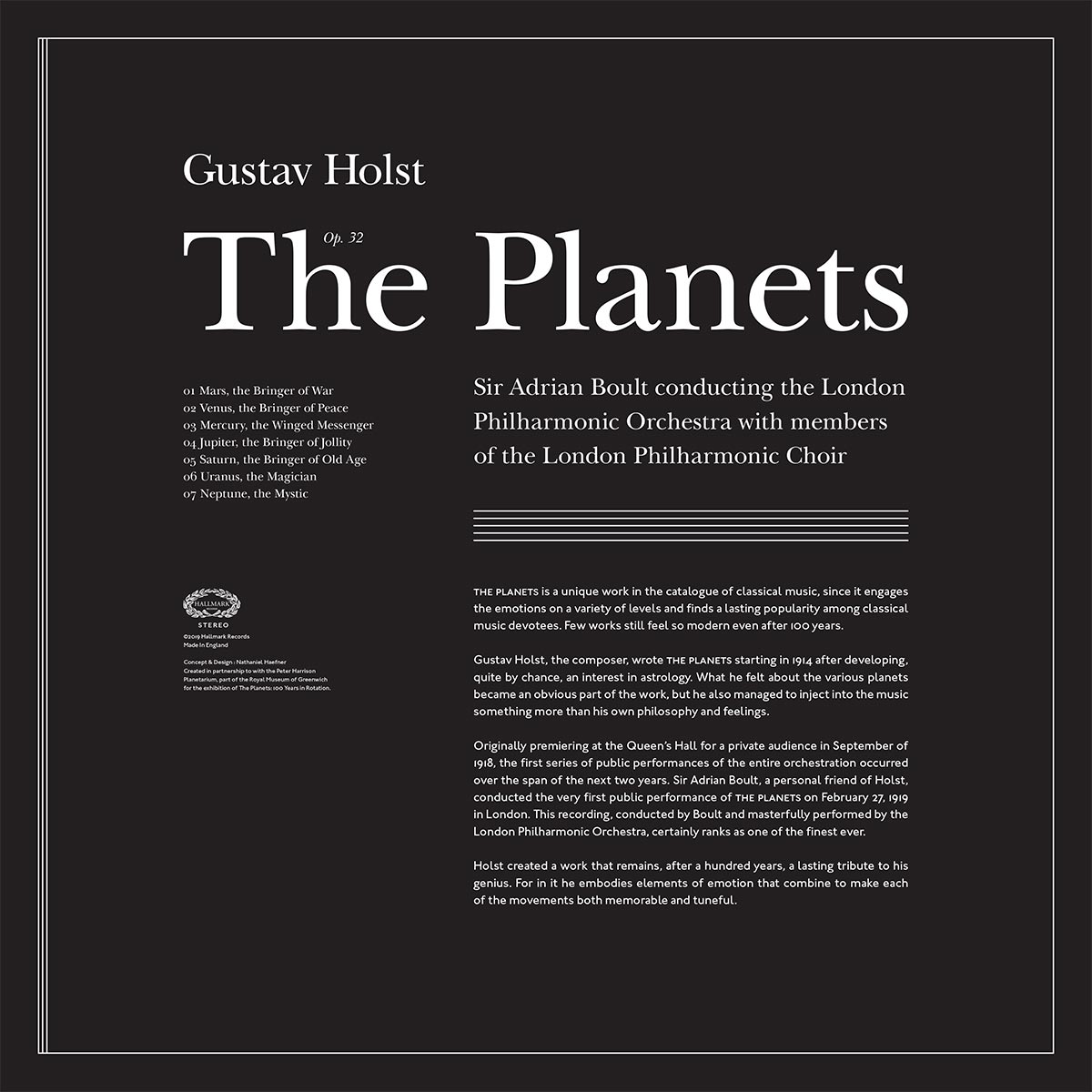
The package functions as an accordian fold and showcases new album art, seven separate records for each of the seven movements, and infor-mational sections on each panel interpreting the sounds heard for each planet. The back of the record sleeve tells the story of Holst and his famous composition. A modified version of the wall graphics take up the remainder of the space on the back of the sleeve.
Holst is exclusively known for The Planets, but he always experienced a disconnect between its popularity and to his preference for works later in his career. Perhaps as any artist might sense, Holst felt his appeal revolved around this one work and its lasting popularity would always define his whole career. The installation and exhibition record sleeve capture his sentiments and showcase his masterpiece with a new perspective.