As skeuomorphism began its non-adaptive and highly polished decline, the sensible and practical world of responsive web design pushed aside the extravagant and realistic style holding back the web—creating a parallel to the Bauhaus’ rejection of embellishment and the unessential in the design of everyday objects. The Bauhaus and responsive web both embody the ideals of legibility, use of technology, and universal access to good design, yet greatly diverge in terms of execution and ideological success. Responsive web design roots itself in practicality like the Bauhaus, but takes design further, acting as a system encompassing true universality and immaterialism.
Responsive design aims to create an architecture for how websites react and display information when viewed across multiple screens and devices. The content adjusts in size, rearranges and stacks—all in order to create an optimal experience for the viewer. Before responsive web practices, websites existed at a fixed size, and on mobile devices would simply shrink to an unusable size, crop the content, or in the worst case, fail to show any content. The movement of responsive sites aimed to fix usability problems and make the web more accessible from any device.
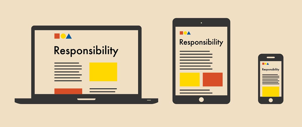
The Bauhaus and responsive design share a legacy in making typography legible. László Moholy-Nagy wanted the Bauhaus to “create a new language of typography whose elasticity, variability, and freshness of typographical composition” (Meggs 313). A responsive design means scaling type to fit the device and still maintains hierarchy and understanding (Figure 1).
Elasticity is key. The design must be flexible, yet uncompromising in delivering the content. “The strength of the message should not be sacrificed to accommodate design choices” (Lewis 2016). Hierarchy and legibility plays just as an important role for designs created at the Bauhaus. The Kandinsky poster by Herbert Bayer (Figure 2) utilizes a highly legible typeface in addition to visual hierarchy, which generates an understood order for the information to be read (Meggs 317). Responsive web design takes the same concepts applied statically in print from the Bauhaus and applies them to the dynamic array of device sizes.

Technology played a driving force for the Bauhaus with materials and manufacturing. According to Oswalt, the Bauhaus focused on the “exploration of a new realm of possibility [with] the new technologies and the new ways of thinking that were emerging at the time” (364). Responsive web design differed by demanding more from technology. Forcing the change upon the web, its growing popularity dragged non-compliant browsers into modernity. Programming languages required updates and standardization in order for the web to accommodate responsive design. It was a new way of thinking in itself. Web design battled with the technology and moved it forward, while the Bauhaus embraced the new for its own advancement.
The idea that good design results in reducing forms down to the necessary function and making the result effortless to use further ties responsive web design to the Bauhaus (Concannon 2014). The Bauhaus championed making good design affordable and available to all people which would lead to better living. Responsive web design also employs a similar ideal; design should allow easy access to information no matter the delivery platform. This accessibility of information promotes better living through device usability. People only having mobile access to the web still have a good experience and equal access to information.
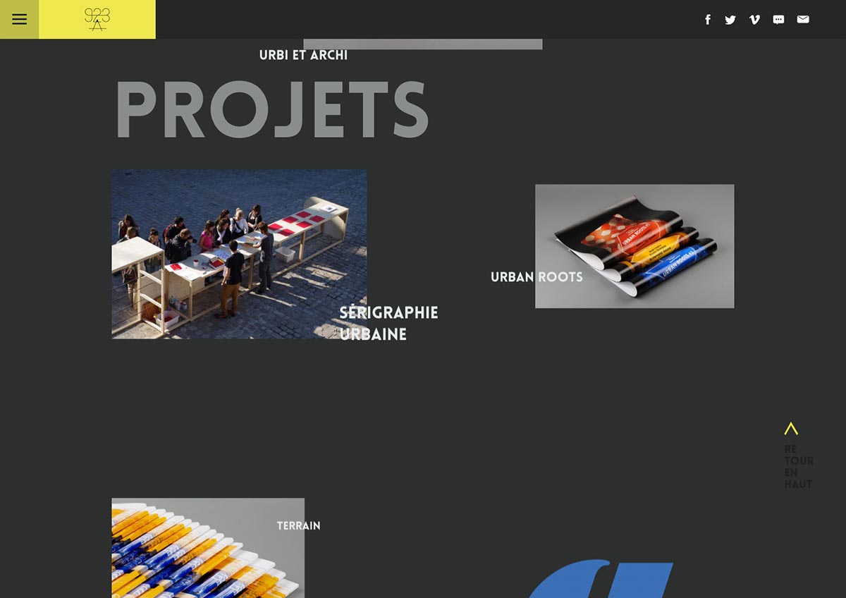
Responsive web design, like the Bauhaus, favors flatter designs void of all objectivity. Function dictates form and the flatness puts the content at the forefront and maximizes usability. The responsive site of Studio 923A utilizes Bauhaus design and showcases the same information on a large screen (Figure 3) that it does for a small screen (Figure 4) with no compromise to functionality. 923A’s design owes the efficient use of shape and color to principles established by the Bauhaus (Lewis 2016). Responsive design takes Bauhaus design language further by applying it as a dynamic system rather than a static instance.

The Bauhaus, with its focus on materials, excelled in manufacturing and prototyping utilitarian objects. Although created with quality and usefulness, the designs failed to reach a universal audience. Reproductions of objects designed at the Bauhaus now sell for prices unmanageable by most people, limiting the effect on society and negating practicality. Responsive web design, while still applied to physical devices, takes a more ubiquitous approach, in which the concept is not bound to any specific material or form. It acts as a design principle and is agnostic to the content being presented. Responsive web design accounts for any quality of device, public or private, and in any location. So while it shares a goal with the Bauhaus in universality, responsive web design manages to achieve it, and the Bauhaus falls short. The immaterial nature of a digital approach allows it to permeate society and grant true access regardless of income. While the Bauhaus and responsive web design share similar goals of creating quality in design, only responsive web design truly succeeds in making a practical impact on the things people use every day.
See the project: Bauhaus Ideals: A Practical Web