Back to Basics
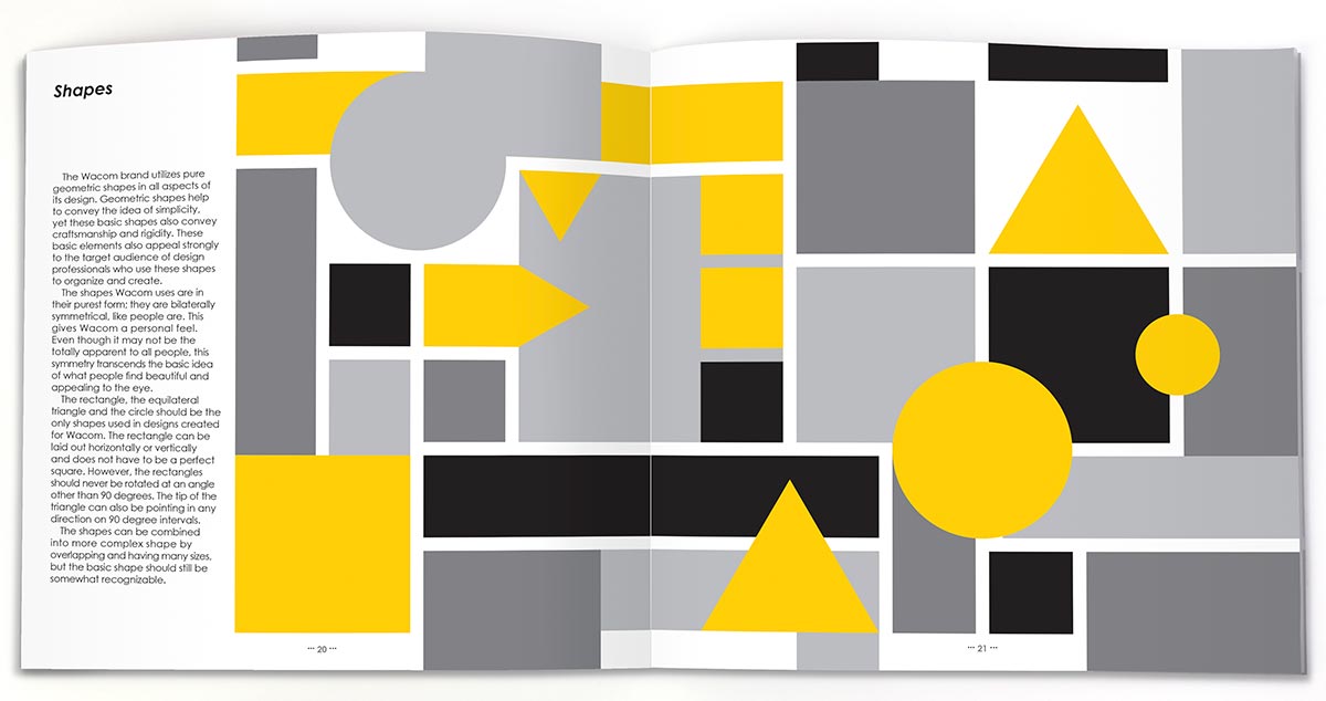
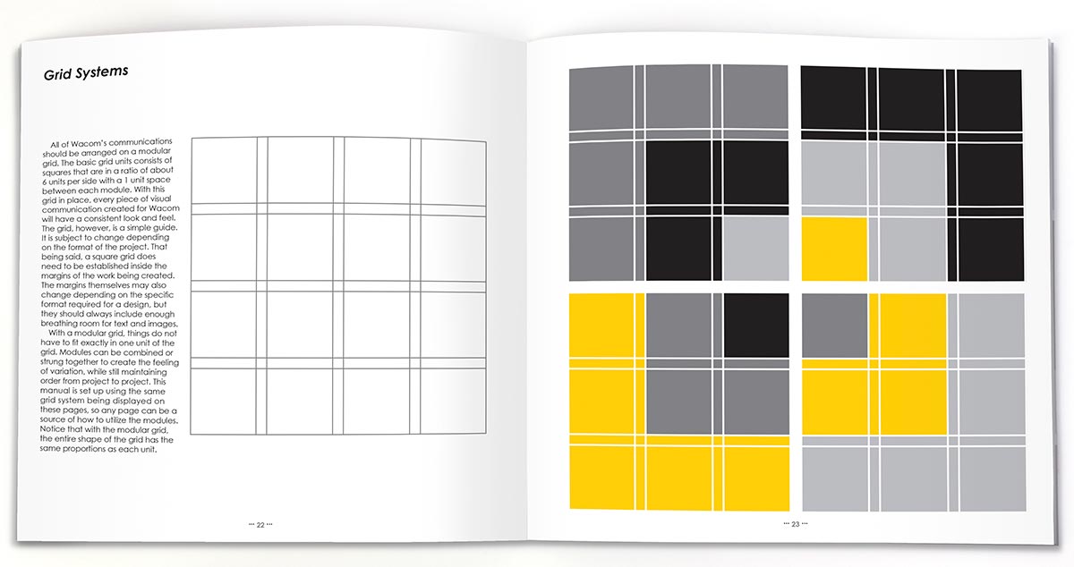
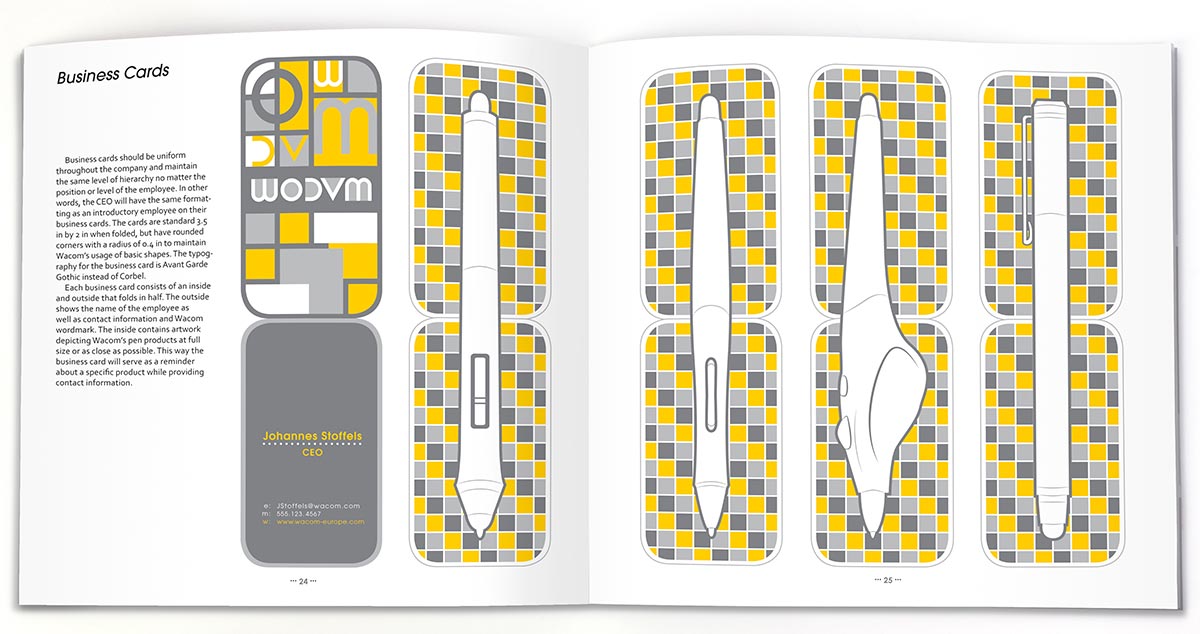
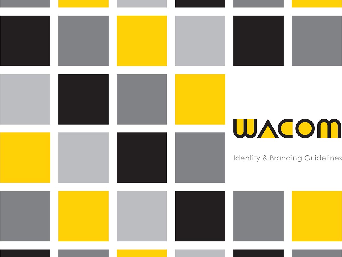
Redesigning the Wacom logo as well as the brand standards manual for collateral required the new design to appeal to Wacom’s primary consumer–designers. Through the use of simple shape and pattern and a limited color palette of yellow and a few neutral colors, the brand will stand out in the technology departments of stores. All the pieces of the new identity create continuity to reinforce the brand and make Wacom stand out.
Brand Identity Manual
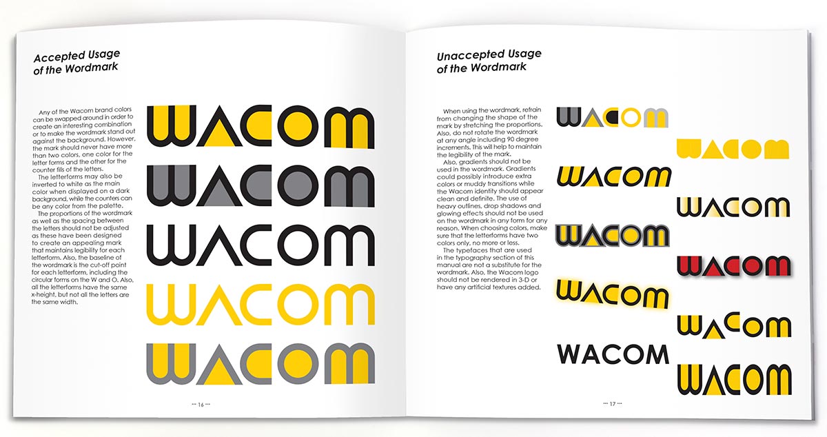
The brand manaual serves as a guide for designers and marketing people inside of the company. The book gives examples and best practices to maintain the visual identity of the brand.