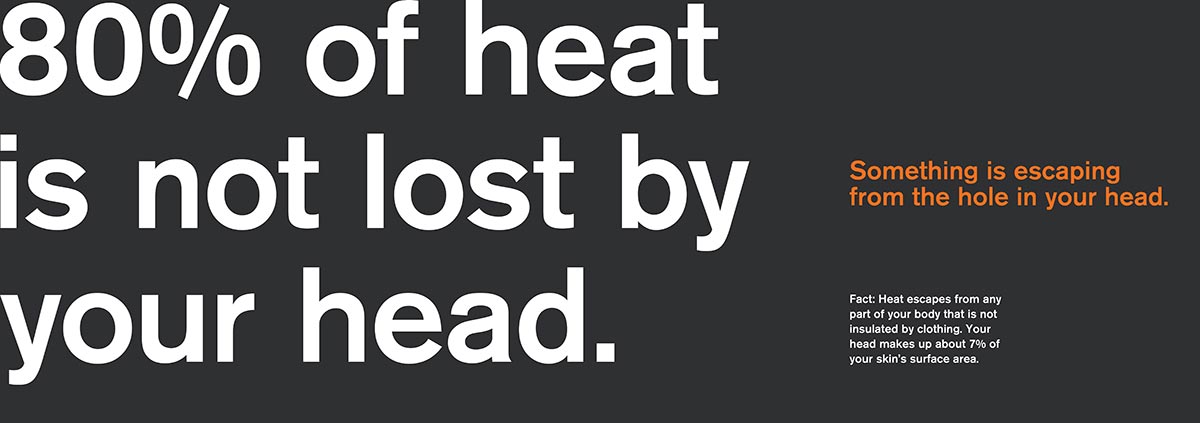
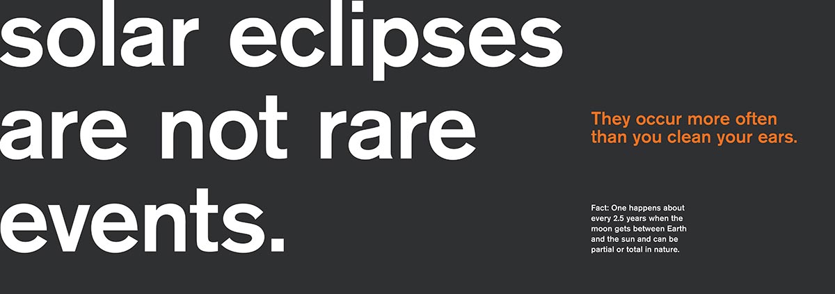
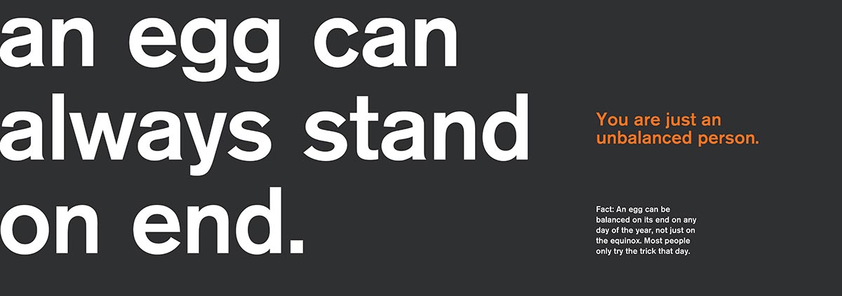
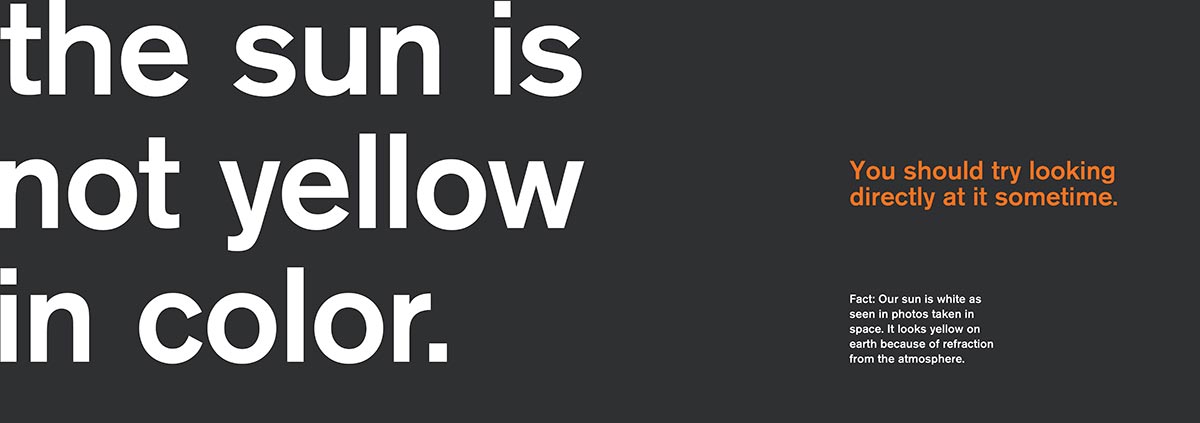
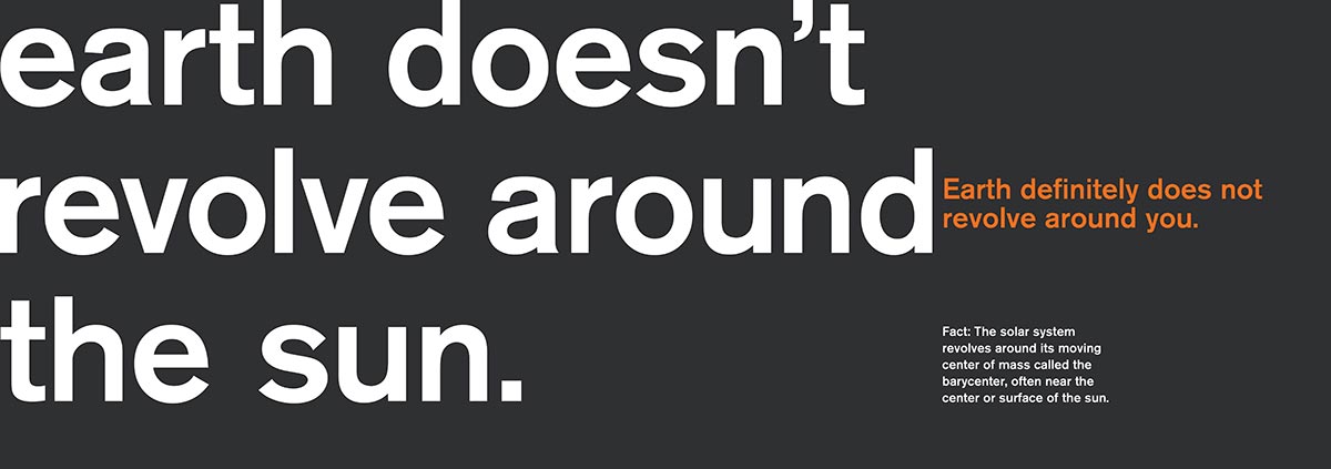
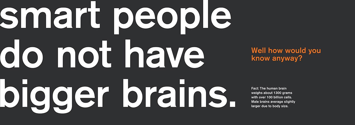
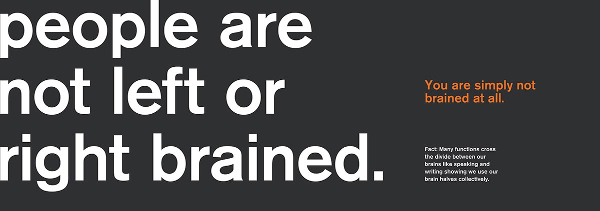
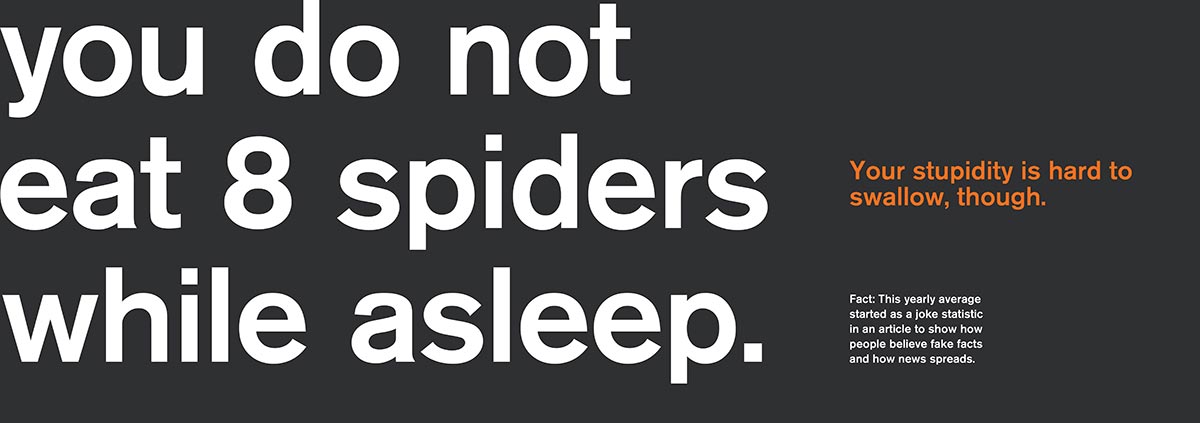
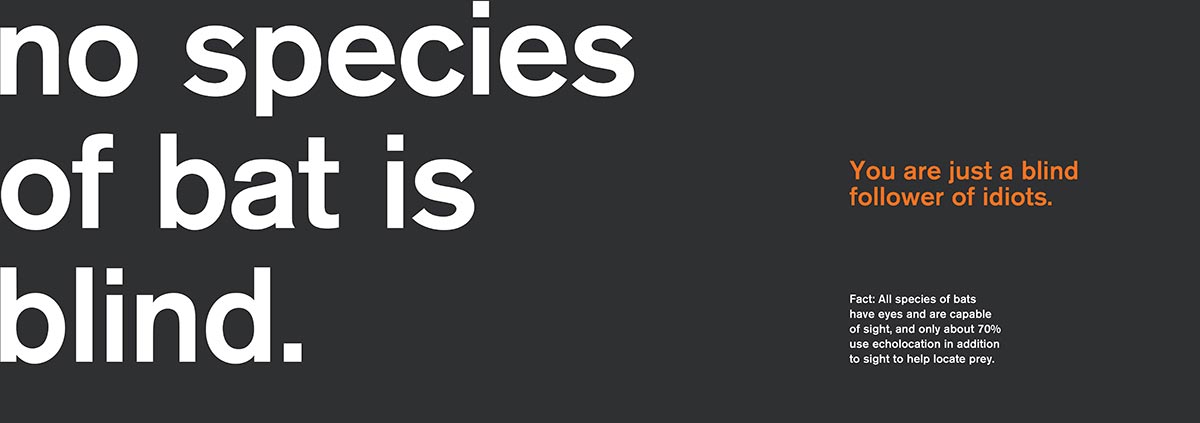
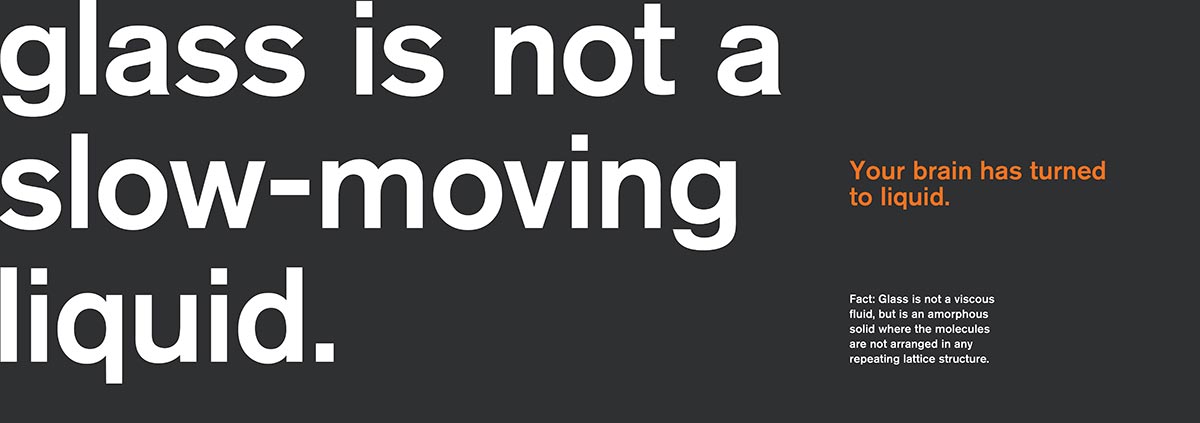
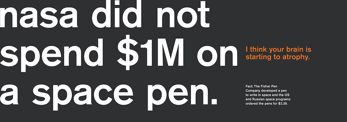
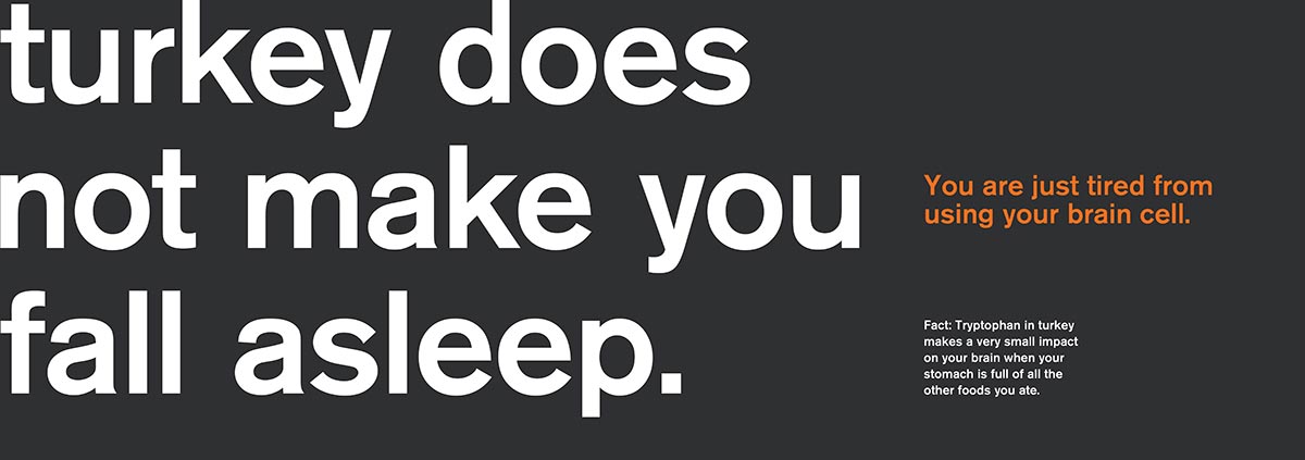
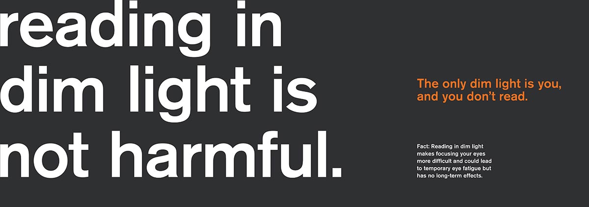
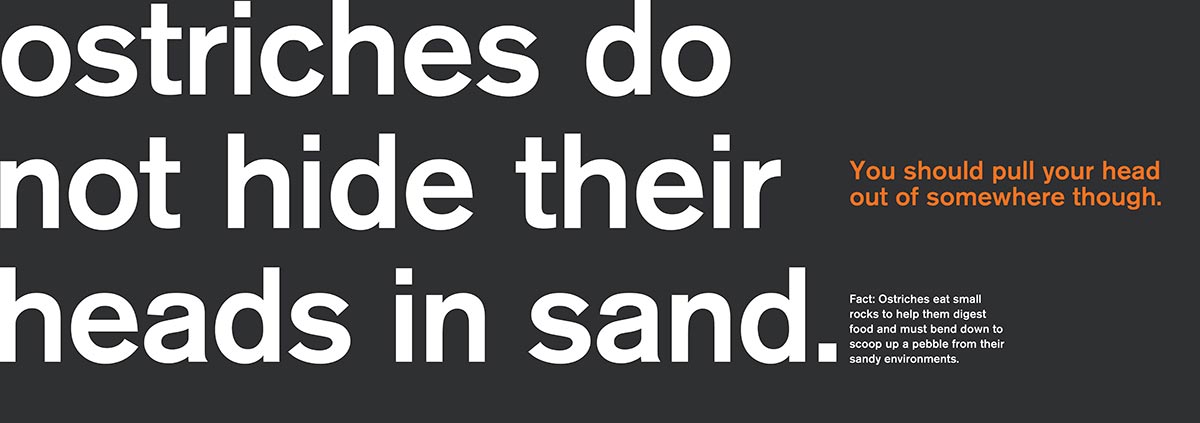
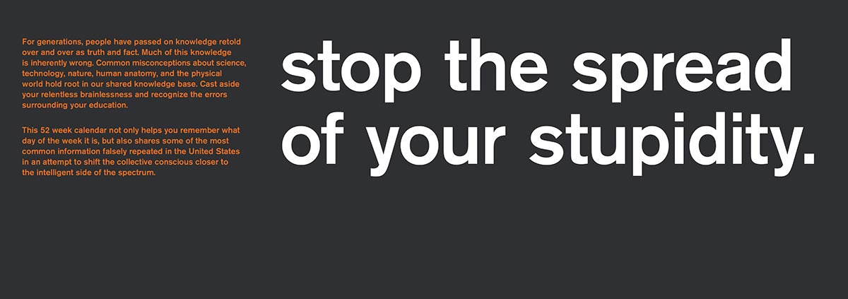
Stop the Spread of Your Stupidity
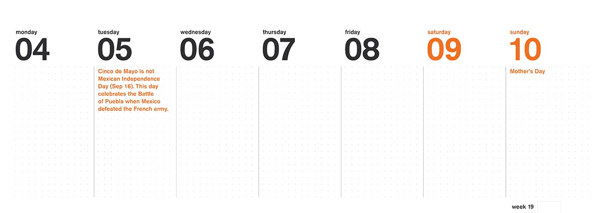
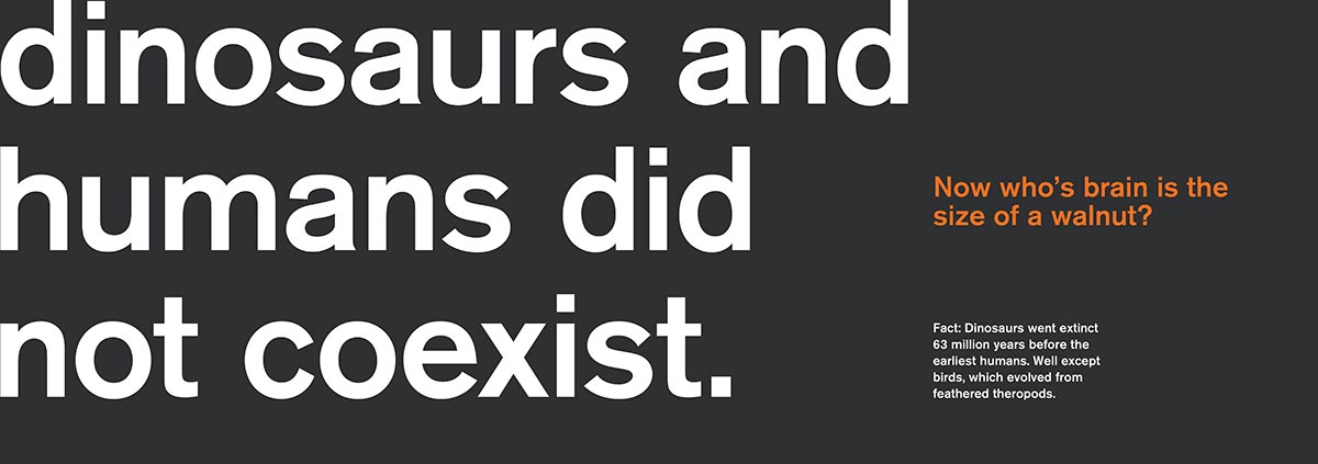
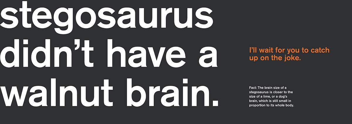
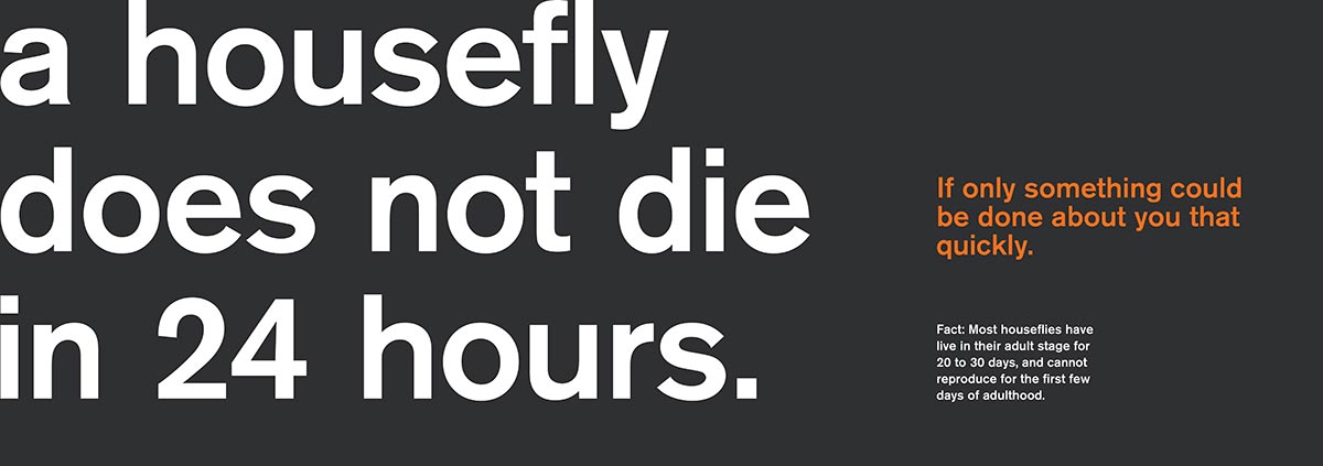
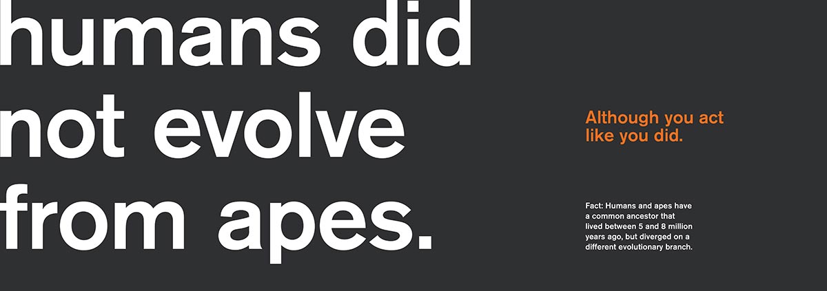
For the Everything You Think Is Wrong Calendar, I wanted to showcase common misconceptions found in American culture that are consistently passed on or spoken as fact. The calendar functions as a weekly planner with a single misconception for each week. Each page showcases a correction to the commonly believed knowledge, an insult to the reader, and a factoid explaining the reality behind the truth.
This 52 week calendar presents not only a way to help them remember when to go to work, but also shares some of the most common information falsely spread and repeated in the world in an attempt to shift the collective conscious closer to the intelligent side of the spectrum.
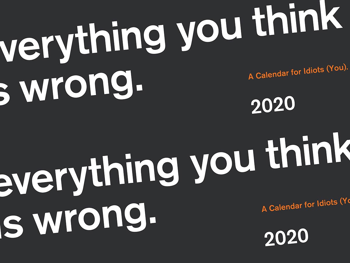
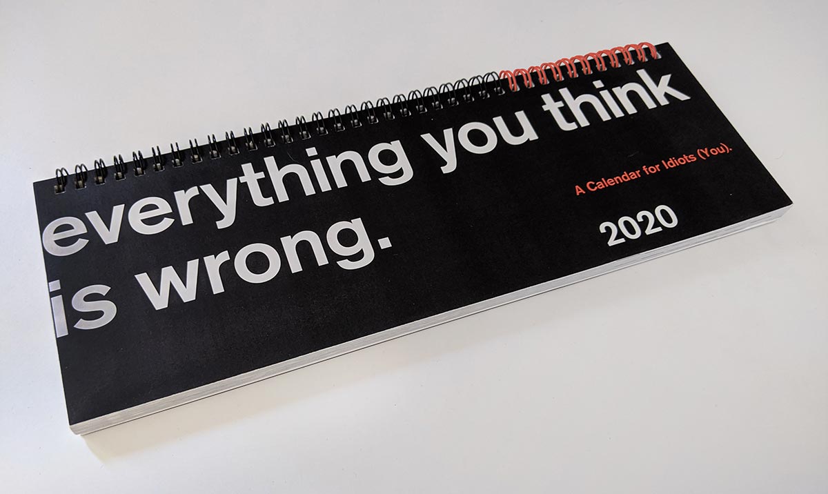
A Calendar for Idiots
The main concept stems from a list of national days, one of which is Everything You Think Is Wrong Day, celebrated on the 15th of March. This day aims to raise awareness of factual inaccuracies, and doubles as a day to let people know that not everything they think is correct. To me, this day should be celebrated year round, so I decided it would make for a good annual project and stretch the day into a full year’s worth of awareness.
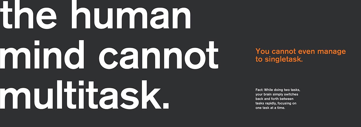
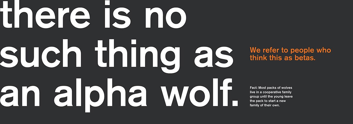
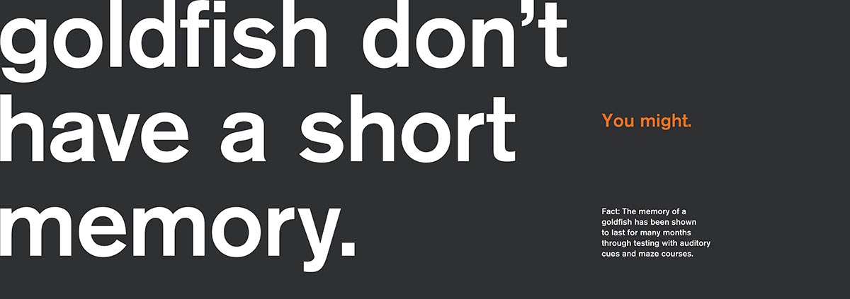
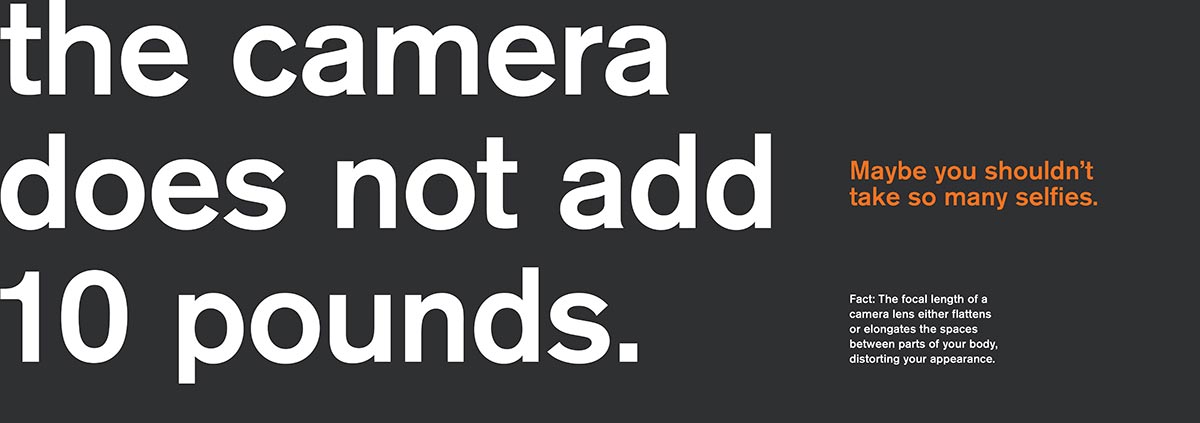
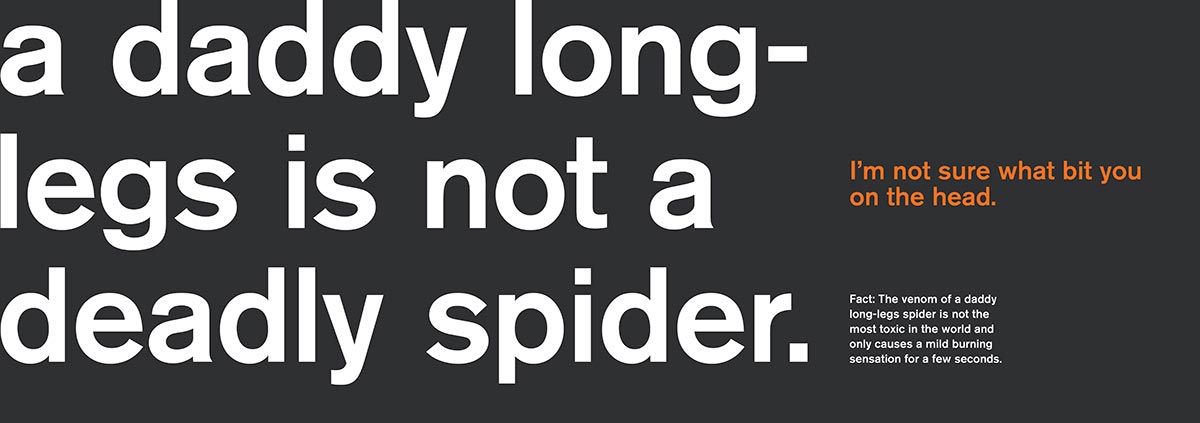
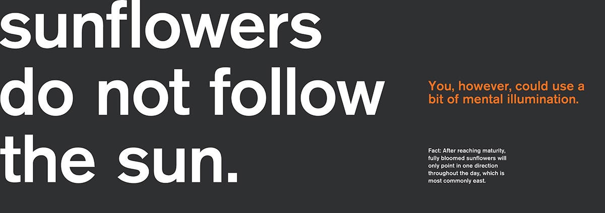
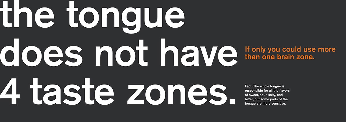
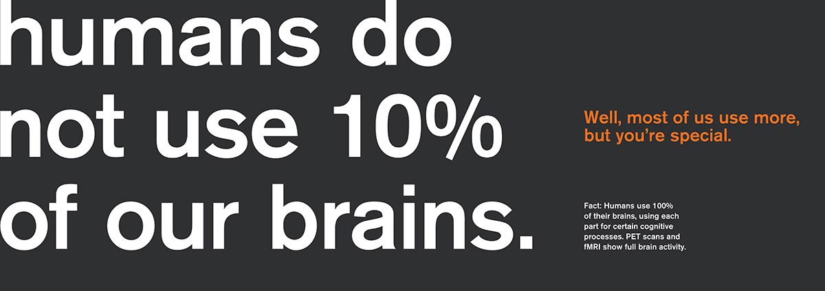
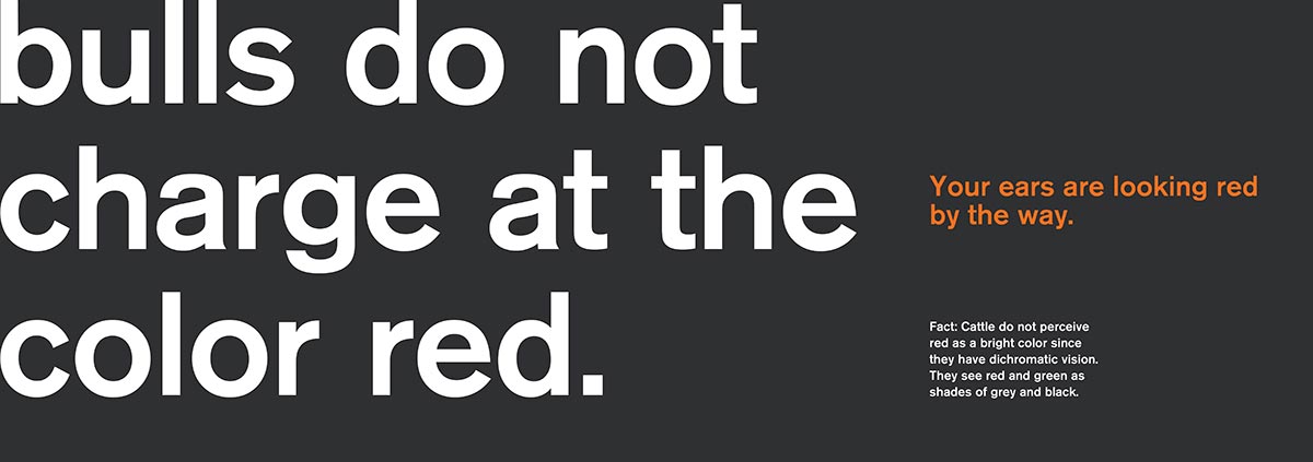
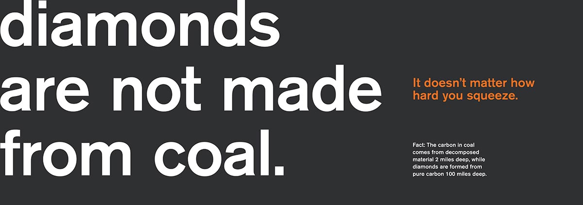
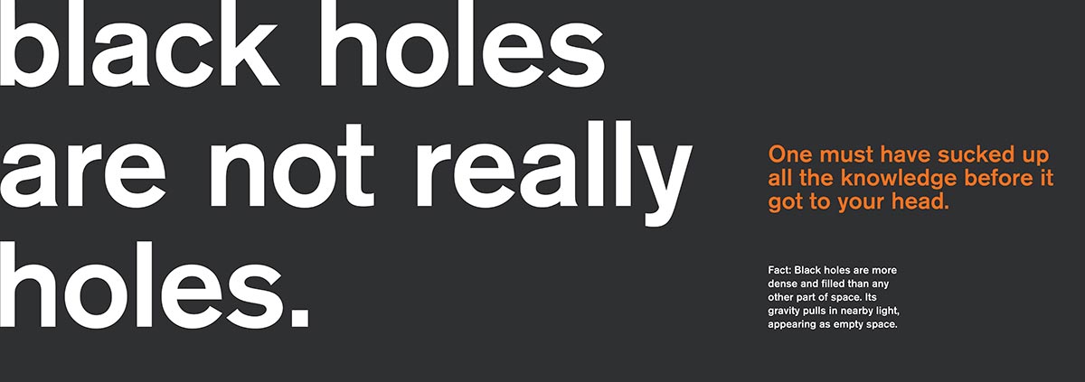
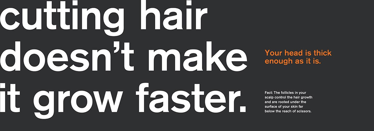
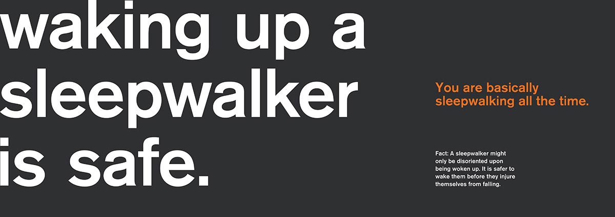
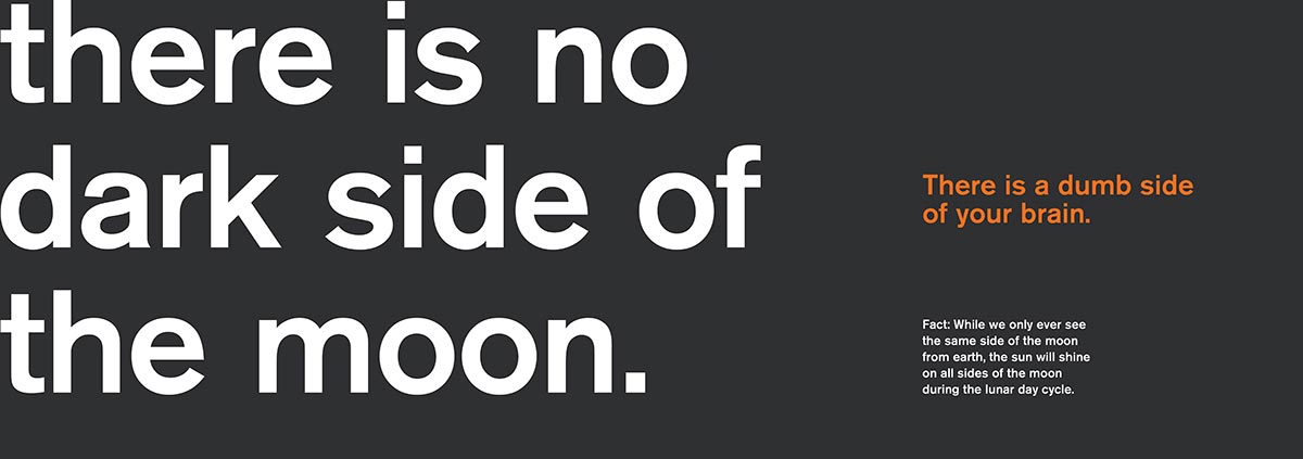
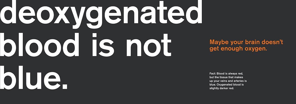
For generations, people have passed on knowledge retold over and over as truth and fact. Much of this knowledge is inherently wrong. Common misconceptions about science, technology, nature, human anatomy, and the physical world hold root in our shared knowledge base. Cast aside your relentless brainlessness and recognize the fallacies surrounding your education.
The calendar is quite comical in nature, since the writing used takes the tone of an insulting know-it-all despite the information being relatively trivial. The words assume the person using the calendar is a complete idiot and relentlessly reminds the reader of their inferiority. The fact that the same page in the calendar is used for a whole week emphasizes the need for prolonged exposure to the truth in order to get an idiot to understand.
With the humorous content and useful form factor, the Everything You Think Is Wrong calendar makes for an interesting tool for people willing to subject themselves to a bit of self-deprecation.


Design Factors
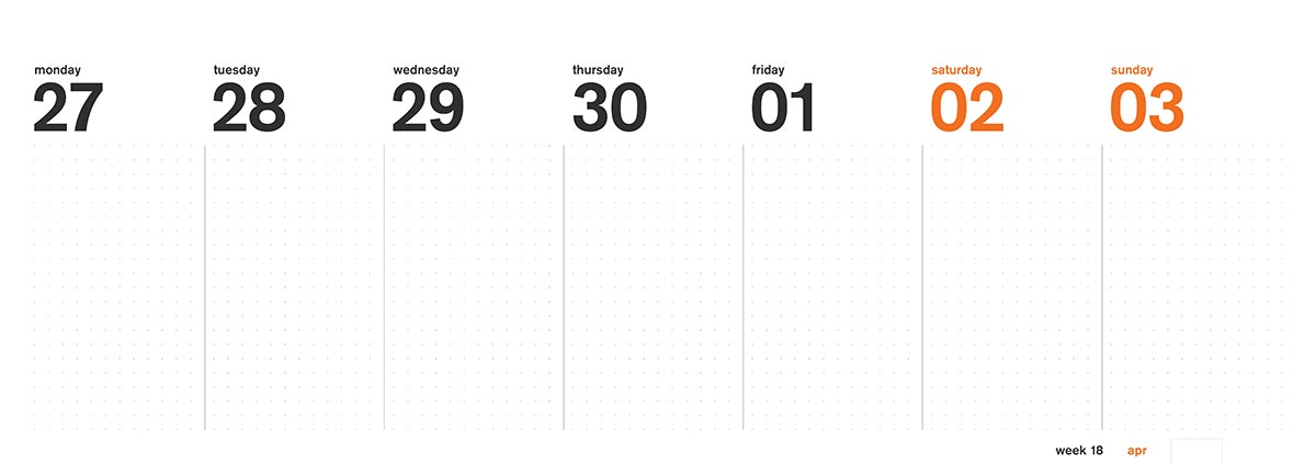
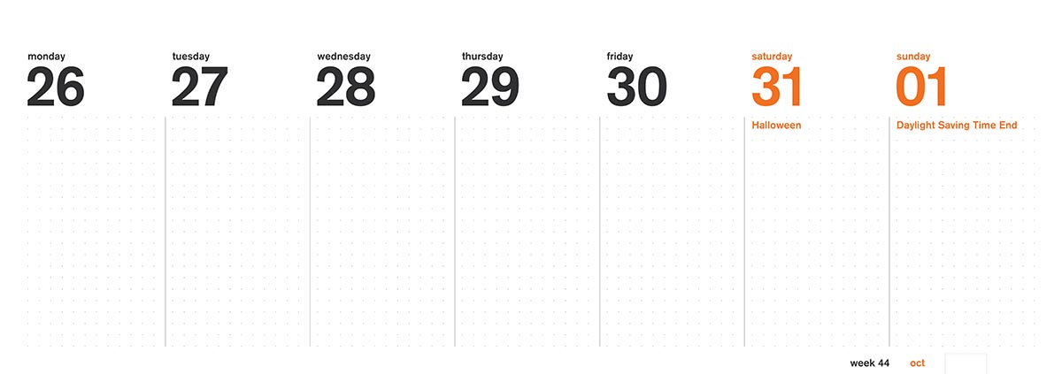
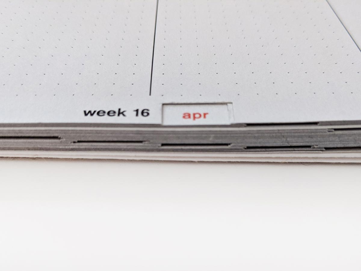
The overall size and proportions of the calendar aims to work well with other desktop objects. The width of the calendar is 77p, which is just slightly smaller than a 13-inch laptop, which many bags can easily accommodate. When unfolded the calendar has the same footprint as a laptop as well. The calendar also has an a-frame backing board allowing the calendar to sit upright on a table and store flat when traveling. To make the yearly calendar more simple to use, recessed tabs are used to keep the overall form factor while making it easy to find a particular month.


Typography and Grid
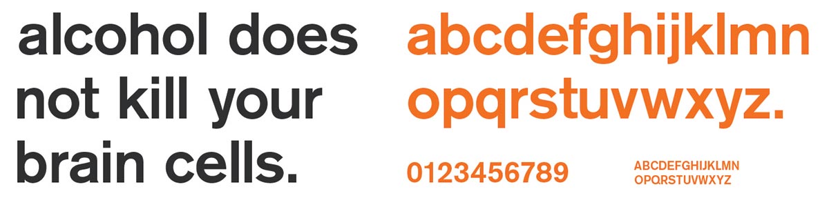
Akzidenz Grotesk in a medium weight is used throughout the entirety of the calendar. Used prominently in the international typographic style, the typeface aims for clarity and frankness, which pairs well with content driven by pure facts. The extreme hierarchy between a 100pt sentence and a 20pt joke followed by a 9pt factoid gives a clear indication of reading order. All the type except for the smallest is set completely solid to remove any sense of wiggle room in the nature of the content. Facts are facts.
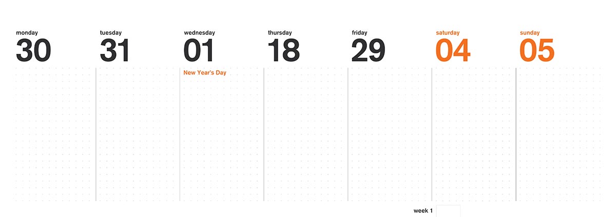
A 7-column grid is utilized to allow for each weekday to have its own column, but it simultaneously allows for an asymmetrical layout fitting of the international type style. The days are arranged starting on Monday with Saturday and Sunday taking up the last two slots. This allows for the grid structure of the upper page to relate back to the grid used on the calendar section in the bottom half. Additionally, the wire binding method also aligns to the grid and the hole spacing mirrors the gridded dots on the calendar. The binding also changes color according to the grid to further reinforce it and allow the person to open the pages in the right direction on the first try—almost like it has been idiot-proofed.