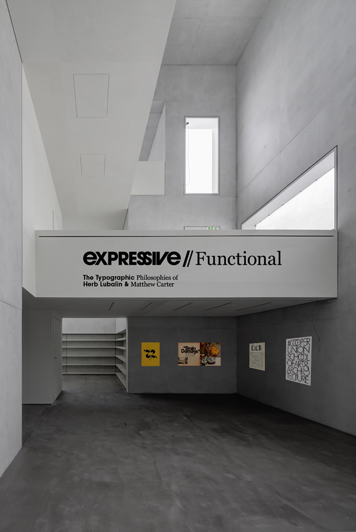
Typographic Exhibition at the Bauhaus
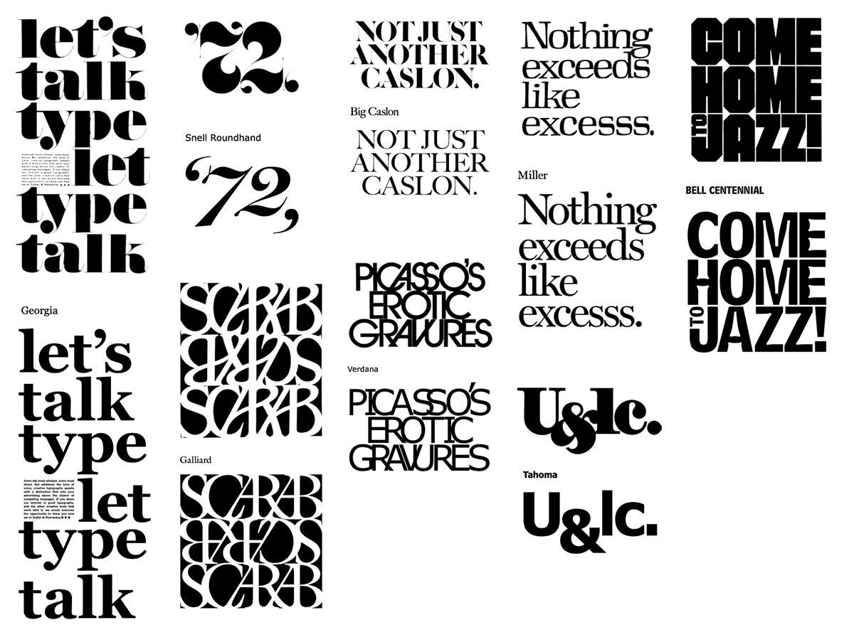
The exhibition for Herb Lubalin and Matthew Carter showcases their philosophies in a way that juxtaposes the expressive nature of Lubalin’s intricate type lock-ups with the practical and functional nature of Carter’s typographic systems. The design layouts are presented as a mixture of the two designer’s work. Using Lubalin’s layouts and text content as the basis for each, the text is replaced either entirely or partially with typefaces designed by Carter, with a more sensible approach to typesetting.
Recreating Lubalin
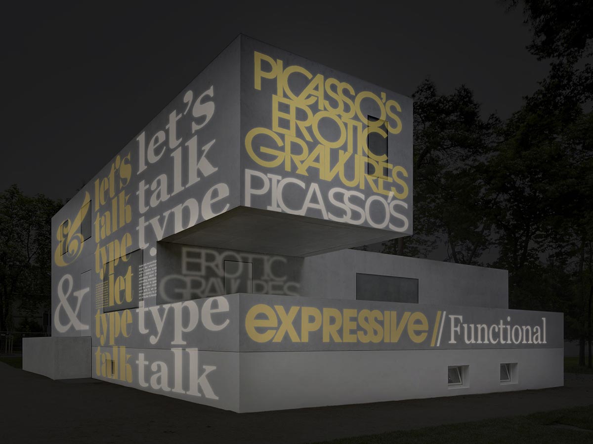
The works that will project on a constant cycle on the exterior of the building showcase Lubalin at his most popular and expressive. Recreating those works with Carter’s functional typefaces simultaneously shows either how delicately elaborate they are or how over the top and unnecessary.
Daytime and Nightime
The exhibition features projections utilizing the work of Herb Lubalin in his original typeface choices and tight lock-up, with only slight modificaitons to better fit the format of projection. After a minute, his work is replaced with a typeface designed by Matthew Carter, but set slightly more traditionally and in tune with the new typeface.
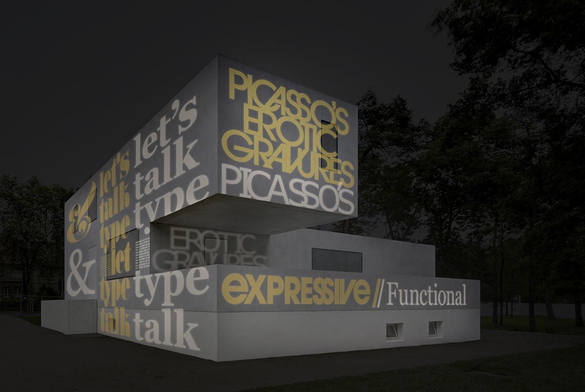
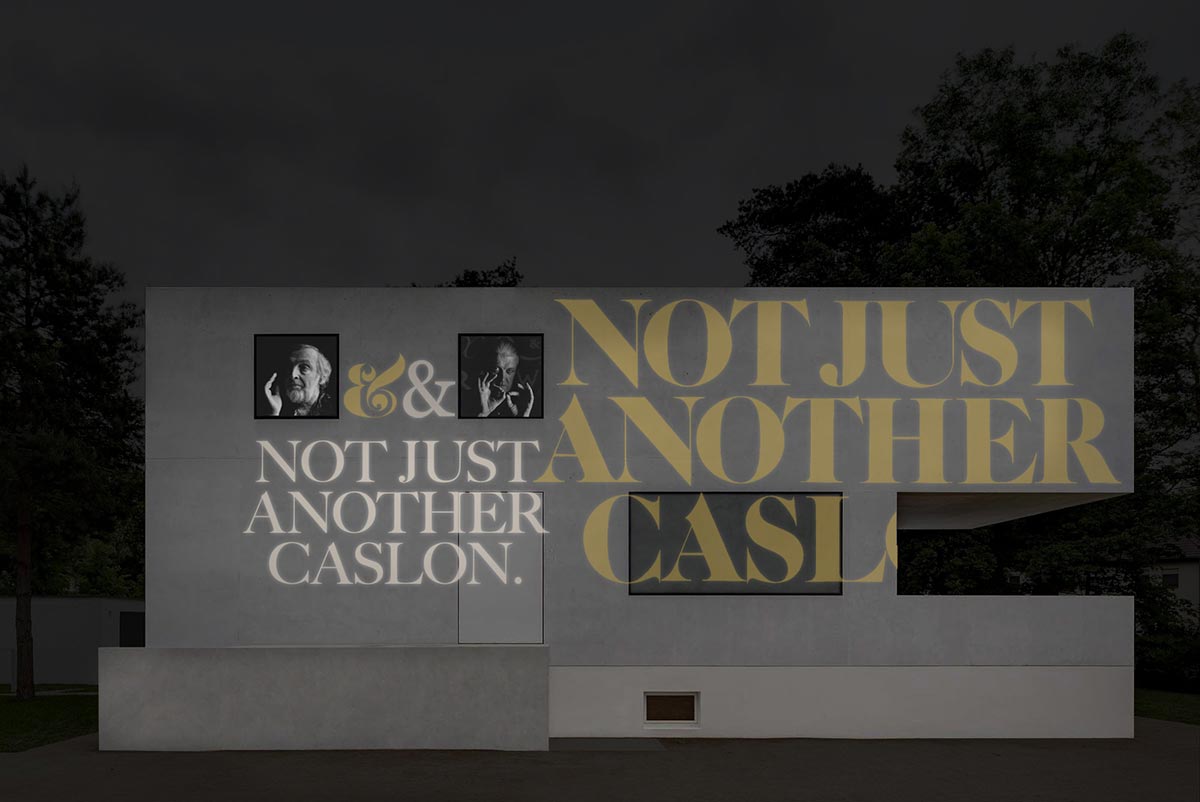
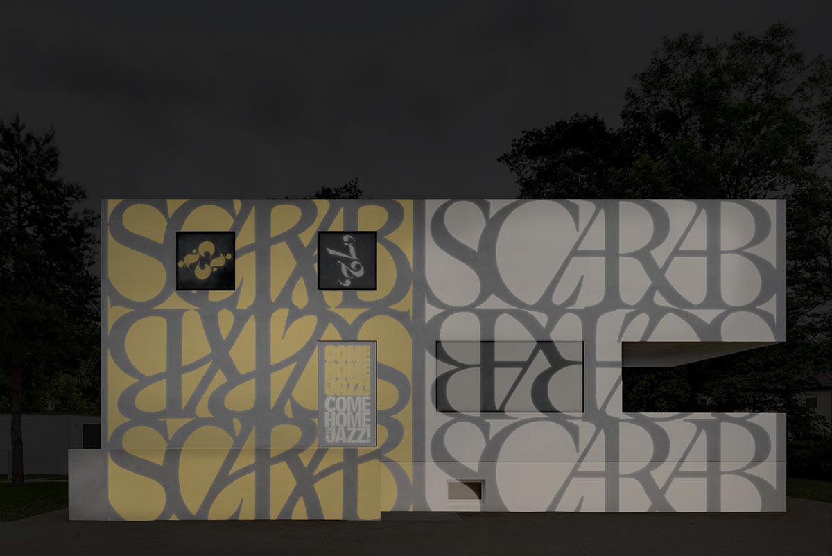
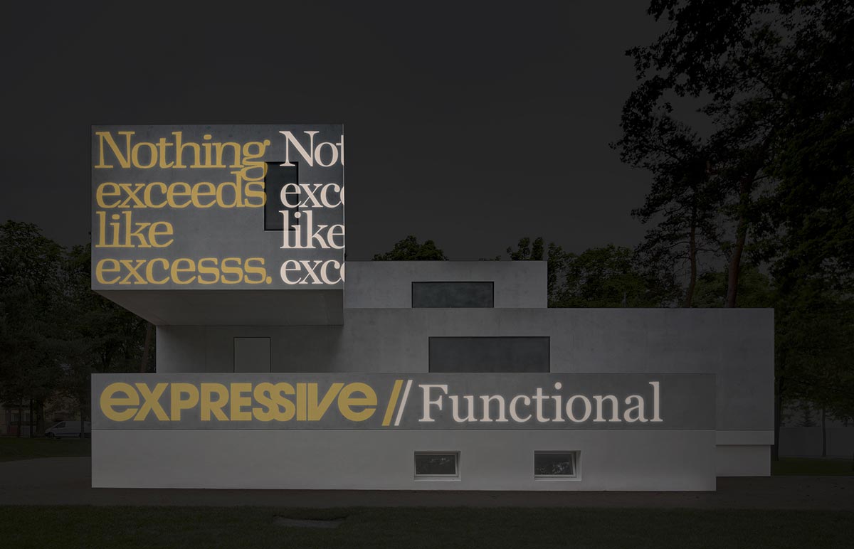
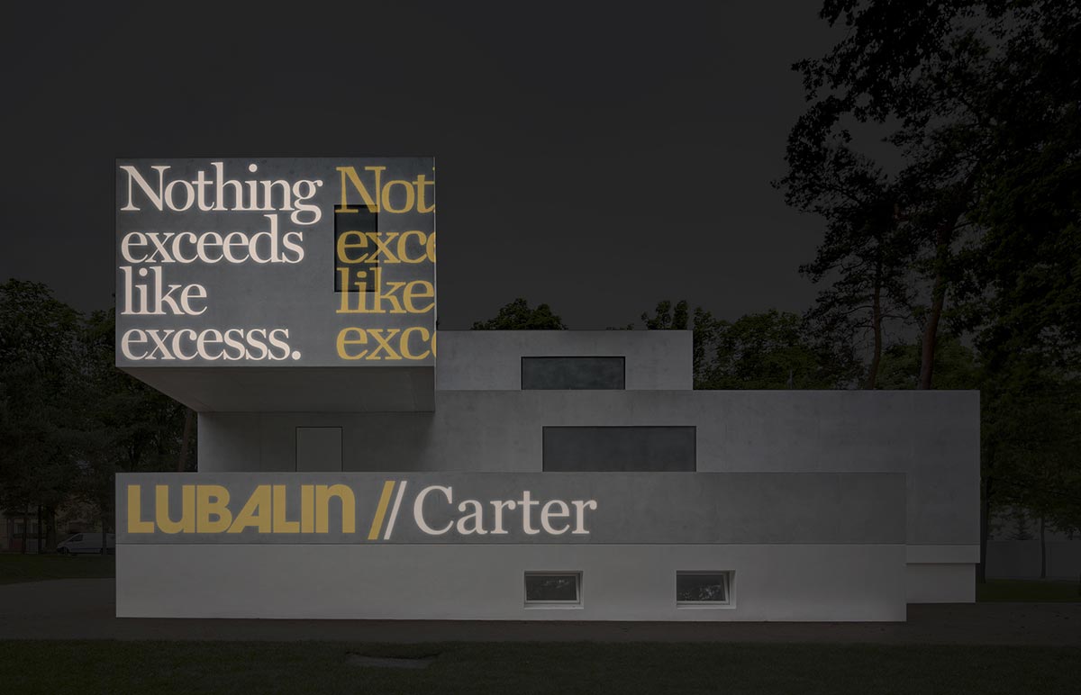
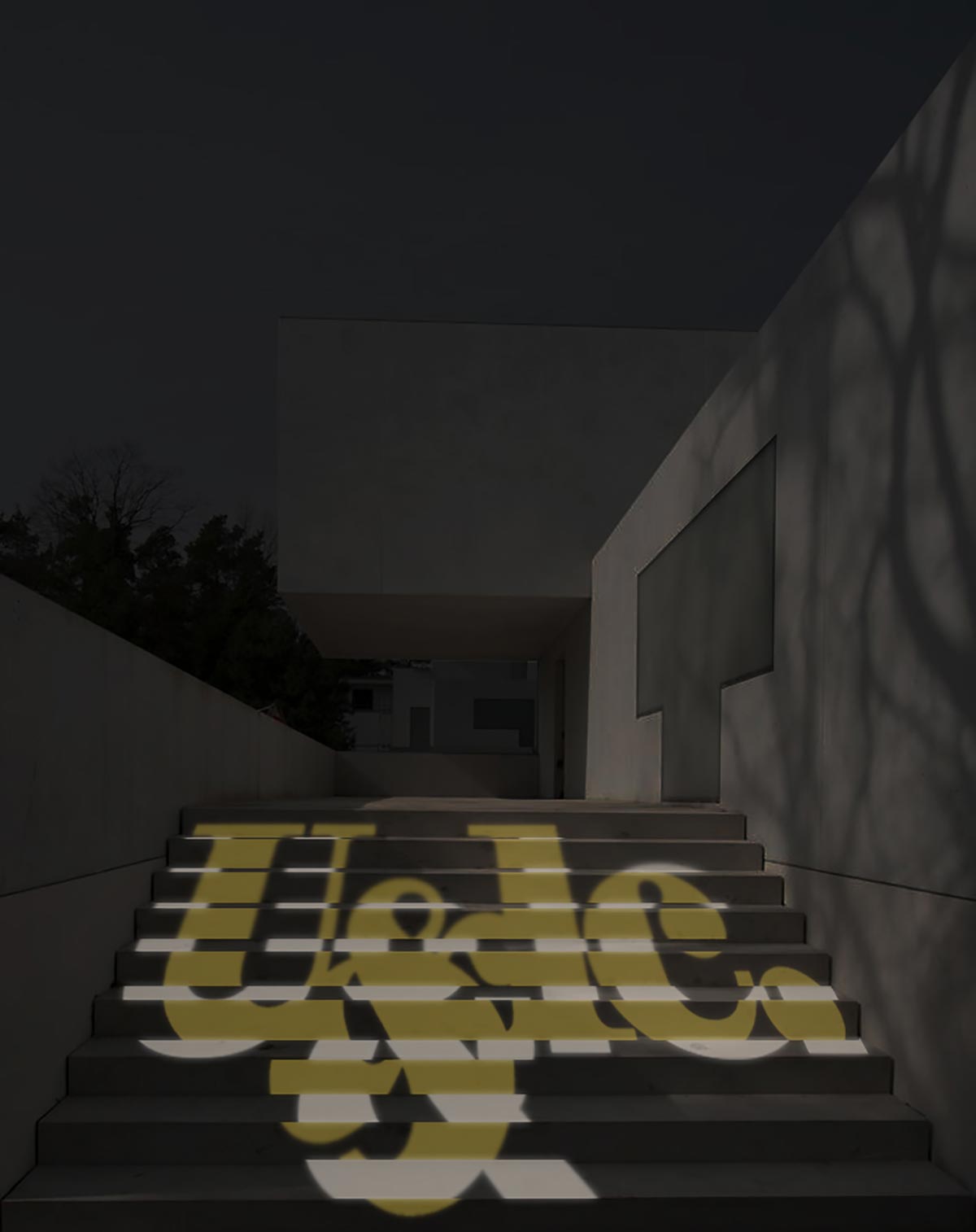
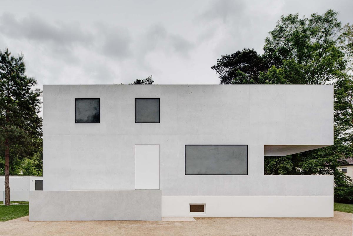
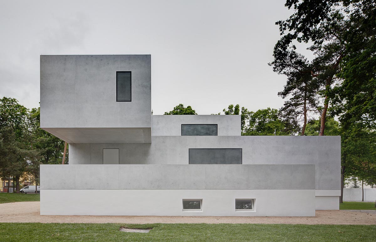
The surface of the New Masters’ House, especially the Gropius House redesigned by Bruno Fioretti Marquez Architects, makes for a great platform to showcase how small variations to an original idea can feel entirely different.
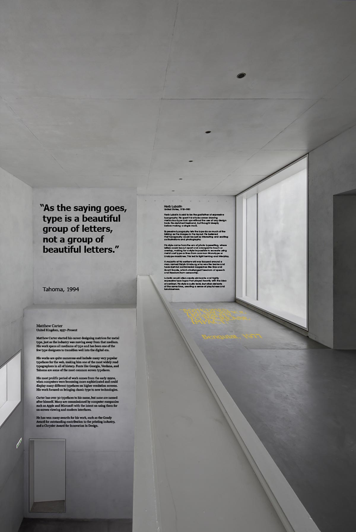
The interior of the exhibition space consists of a more traditional display of informaiton. The walls have textual information about each designer as well as physical samples of their work. The interior space remains open during the day so visitiors can learn about the designers at their own convenience.
Announcement
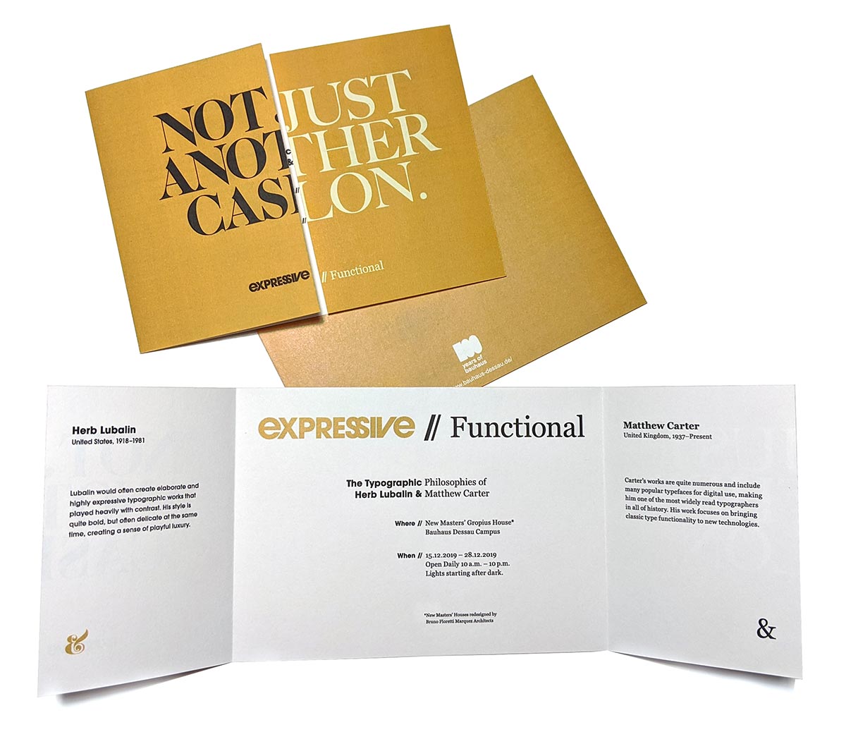
A mailable exhibition announcement showcases the concept of comparing the two designers by having half of Lubalin’s original work on one side of the page and the other being the recreation using Carter’s typefaces. The front folds open along the split of the work and exhibition logo to reveal more information about the exhibition. The announcemnt serves as a reminder for the viewing dates and times as well as giving a small background about the two designeers to generate interest.