When dealing with a literary work in which the text follows a distinct sequence like Annie Dillard’s For the Time Being, I found myself torn between which format reading the book feels more comfortable. Flipping through the pages of the printed book as opposed to infinitely scrolling the repeating subsections of each chapter feels different, but the flaws and merits of each system provide for a difficult decision. Ultimately, the e-book version provides the most options, but the print version gives an overall better aesthetic and typographically sound experience.
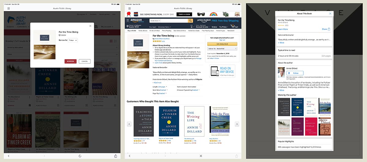
For the Time Being ranks as one of my favorite books, despite it being less of a critical success than her Pulitzer Prize-winning Pilgrim at Tinker Creek. While Dillard’s accolades come highly advertised in the book, each format presents the ads in specific ways. The print edition hints at her masterwork on the cover, opening spread, and among the extra blank pages left over from the final printing signature. These are subtle and ignorable, but the digital book obtrudes with absurdity.
When checking the book out from the public library, I jumped through the hoops of downloading, all while watching my iPad’s battery drops a few percent along the way. I went from the library page to a borrowing page prompting me with similar or more popular books (including Pilgrim at Tinker Creek). Next, the library forced me to visit Amazon to get the Kindle version. Upon opening the e-book, I faced another consumerism-driven pop-up screen enticing me to read other books than the one I had been attempting to read for the last ten minutes. Clearly, the print version gives a better experience.
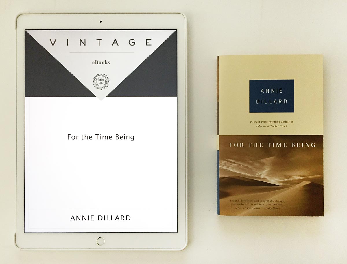
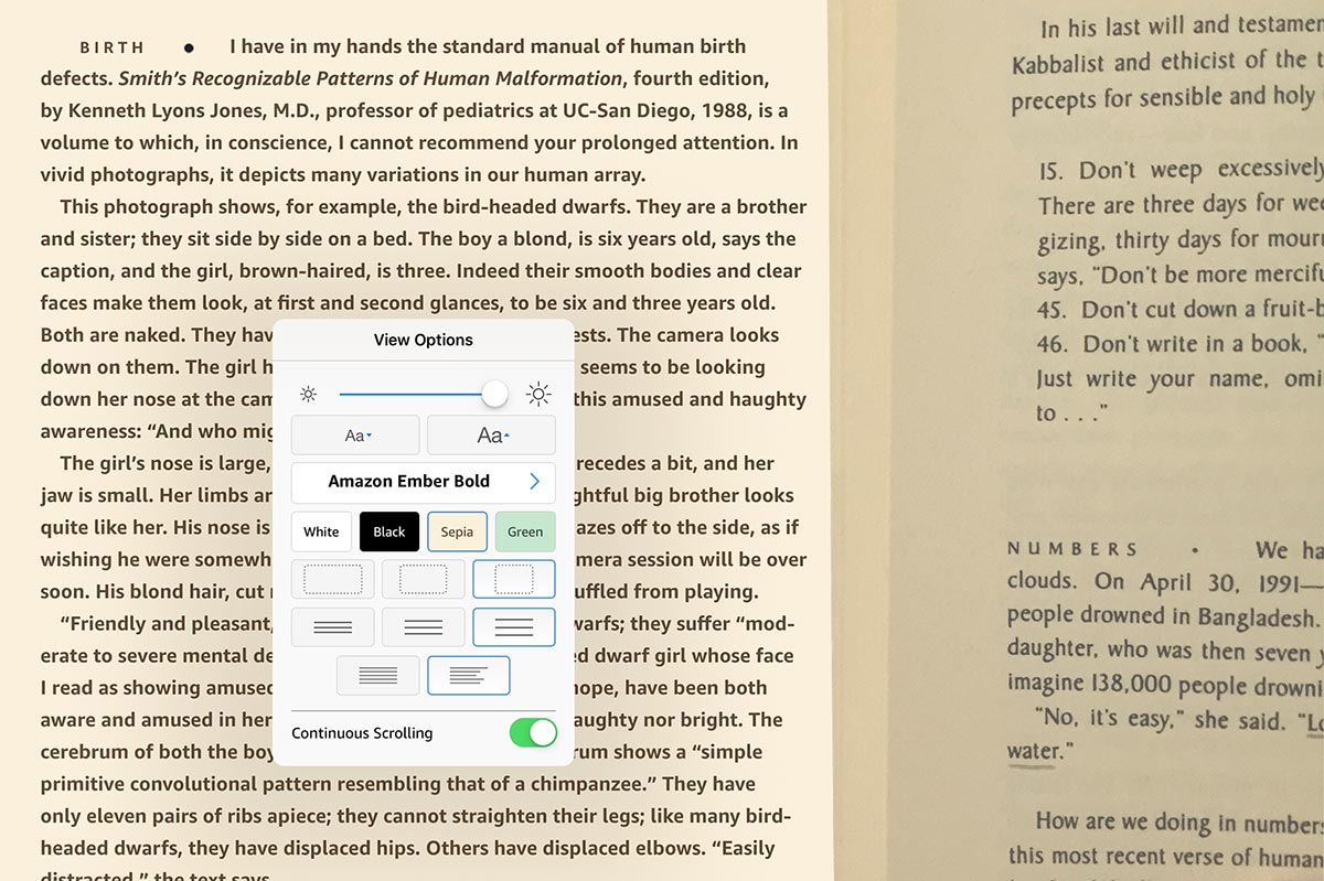
Reading the book on my iPad Pro, which is physically about twice the size of my old high school paperback, tests my eye’s patience. When not viewing pure text, low-resolution jpegs offend the eye. However, the book uses very few images—mainly just the substitute cover and a stylized ellipsis borrowed directly from the printed version. This lazy translation of print to e-book reiterates Blom’s saying about how, “publishers see new distribution channels such as iPads as possibilities to repeat their old trick one more time in new packaging. It doesn’t work” (4). The typography and page layout emphasize the weaknesses of the e-book. The size of the iPad makes for really wide measures of text, even with the most generous settings, while the printed version utilizes a traditional text frame with comfortable margins and leading.
One potential benefit of the e-book allows the typeface to swap out universal standards like Georgia and Helvetica to something more akin to my personal preference. I tried to match the medium-weight condensed typeface found in the print book, but the closest available was Amazon Ember Bold—another ad in the form of a typeface! Regardless of which typeface I chose, none of them conveyed the same sense of mood and tone of Dillard’s eloquent and profound writing style. The ink of the printed book gives way to slight variations from character to character, so each letter has its own identity in relation to how much ink and pressure adhered it to the page. Dillard writes about sand but could equally be talking about the book’s typography saying, “it smooths some of its rough edges” (98). Another difference is the tone of the paper relative to the brightness of the screen. When set to sepia, the screen always has a dirty tint to it compared to the bright white of my iPad’s outer frame. Despite being a darker shade of sepia, the book has no external frame, so eventually, my brain forgets I’m looking at a color and translates the page as white and natural.
The e-book redeems itself with the remarkable way the sections of the chapters work in a scrolling format. For this book in particular, “Dillard's unifying theme is the congruence of thought” (Knopf). The text in the book jumps from idea to idea in short bursts, making for odd section breaks in the printed book. The e-book scrolls right through them unaffected. The infinite nature kept me reading for a longer period, getting lost in the words as opposed to losing immersion each time I turned the physical page, aiding in the work's overall congruence and consistency. In some of Dillard’s older works from the 1970s this wouldn’t be appropriate, but For the Time Being was penned in the internet age, perhaps with the scrolling format in mind.
Overall, the book has advantages in both applications, but ultimately I enjoyed reading the printed book more, despite the customizability of the e-book. Books written for the e-book medium will undoubtedly take advantage of the benefits, but translating older works may not enhance the experience over the traditional paperback—which never displays pop-ups and never drops a battery percent.
From the project: The Underlying Message