A New Event Space in Downtown Austin
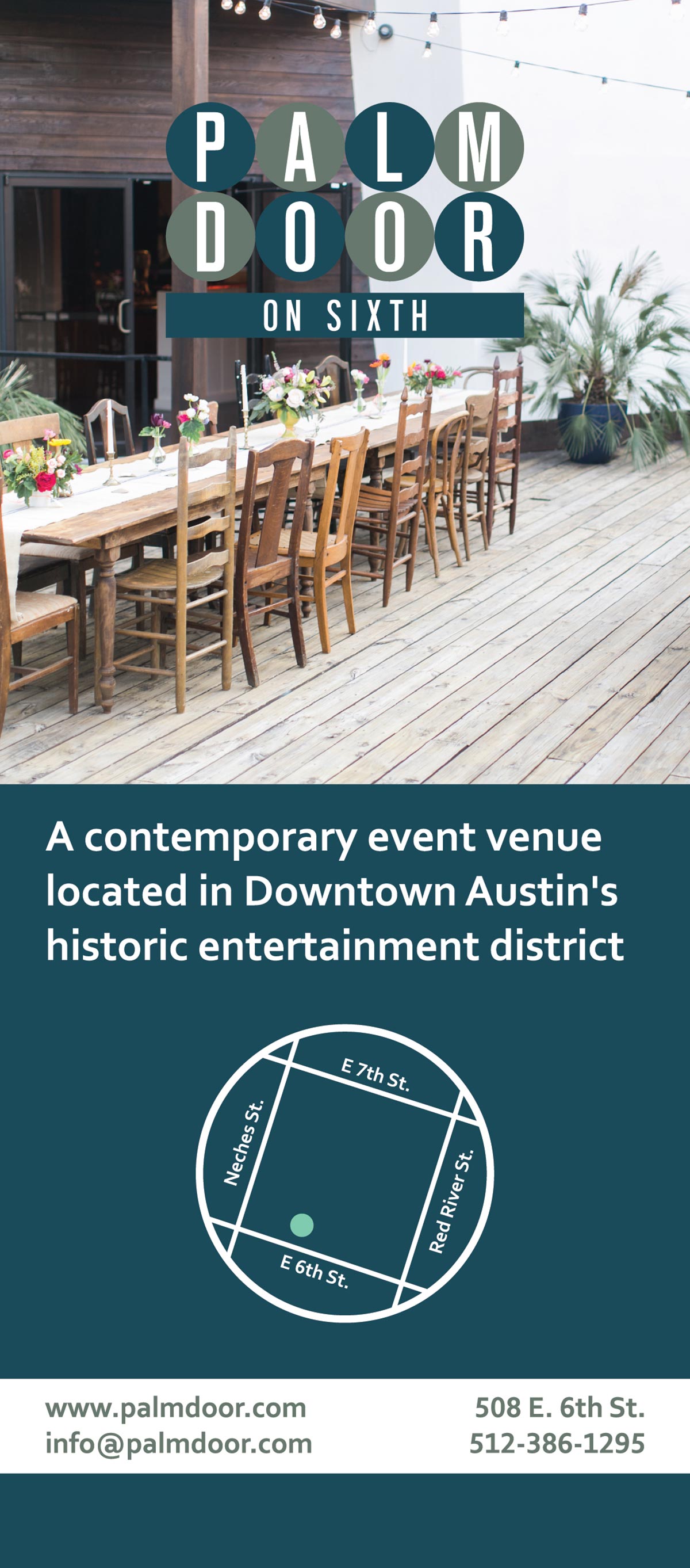
The Palm Door is a small venue located on 4th and Sabine in Downtown Austin, and when plans to buy a new location on Sixth and Red River, the venue wanted to improve their branding and promote awareness. Palm Door wanted to maintain aspects of their original logo, but updated it to work well for the old venue and the new. Each venue wanted to remain under the same stylistic brand, but remain different enough to keep customers from confusing the two locations.
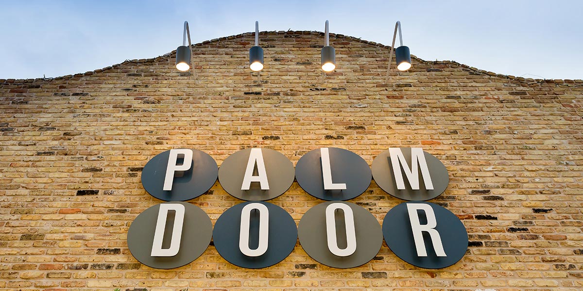
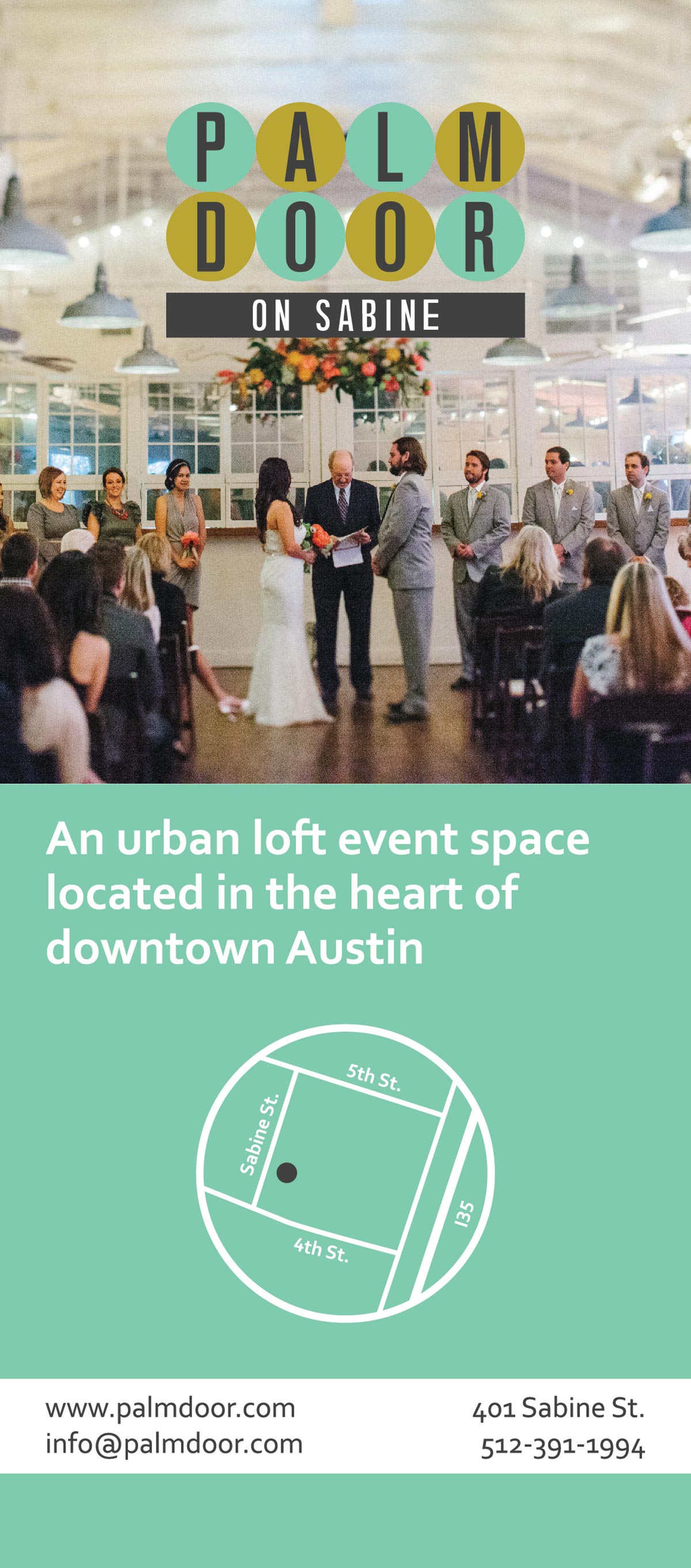
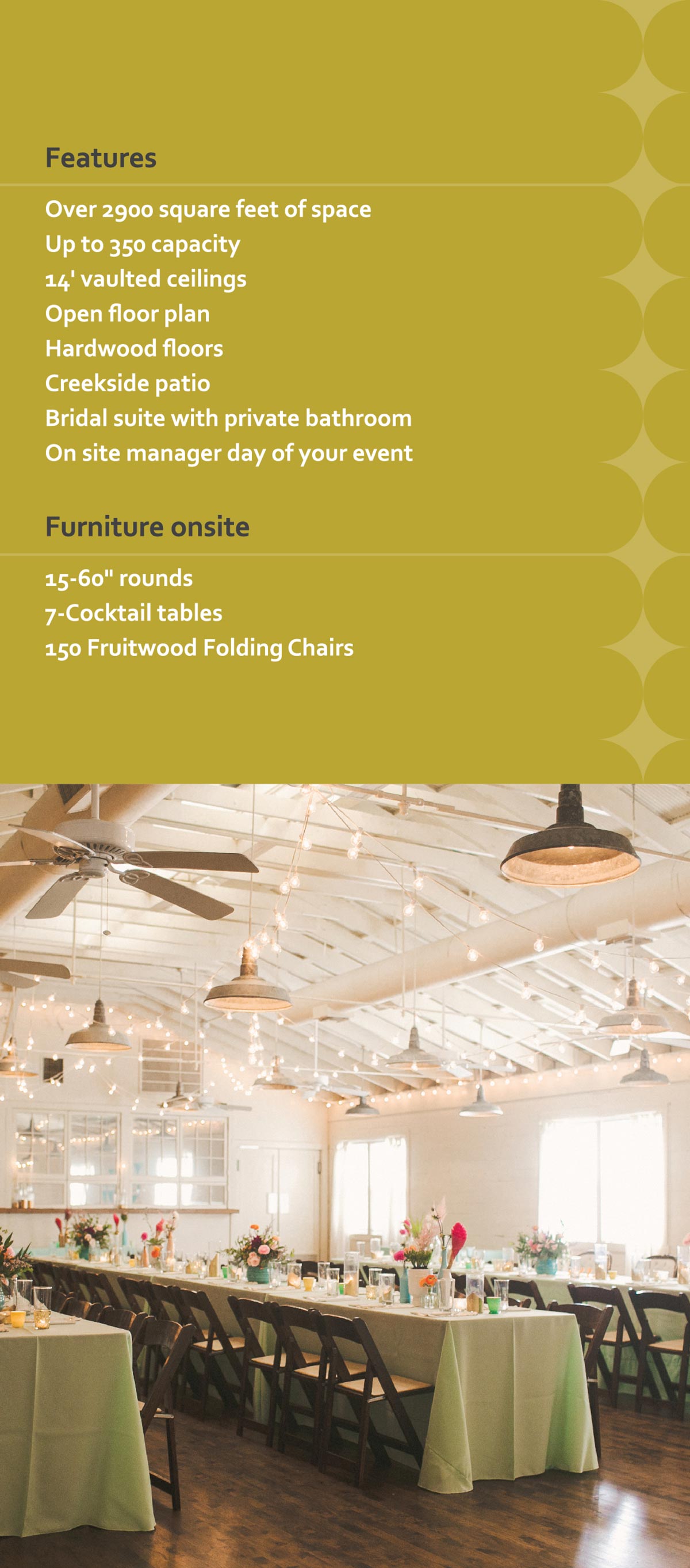
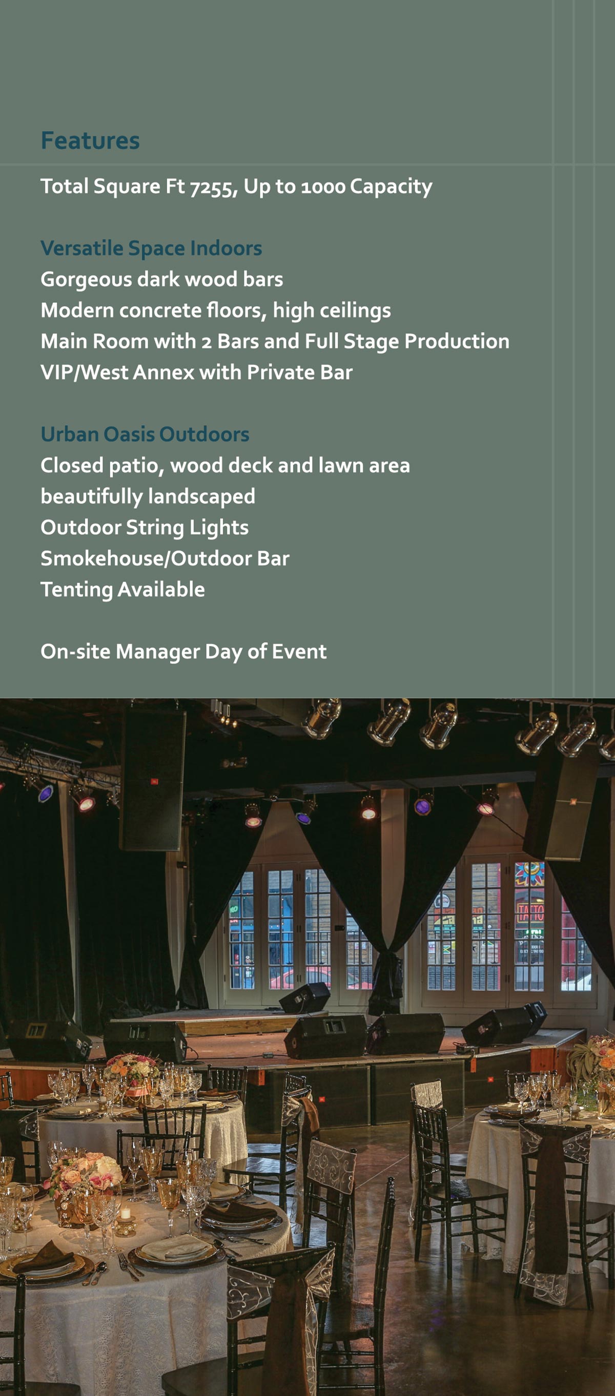
The rebranding called for new typography, an updated color palette, and a new visual identity system. Using photography as a main selling point for the venues, the work includes large, well-lit photographs anchored by a reoccurring dot motif suggesting the shape of the logo.
Cards and Flyers
The maintain the company structure, separate materials were produced in a similar format for each venue.
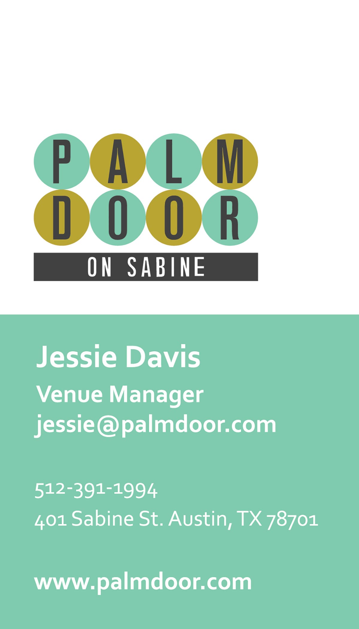
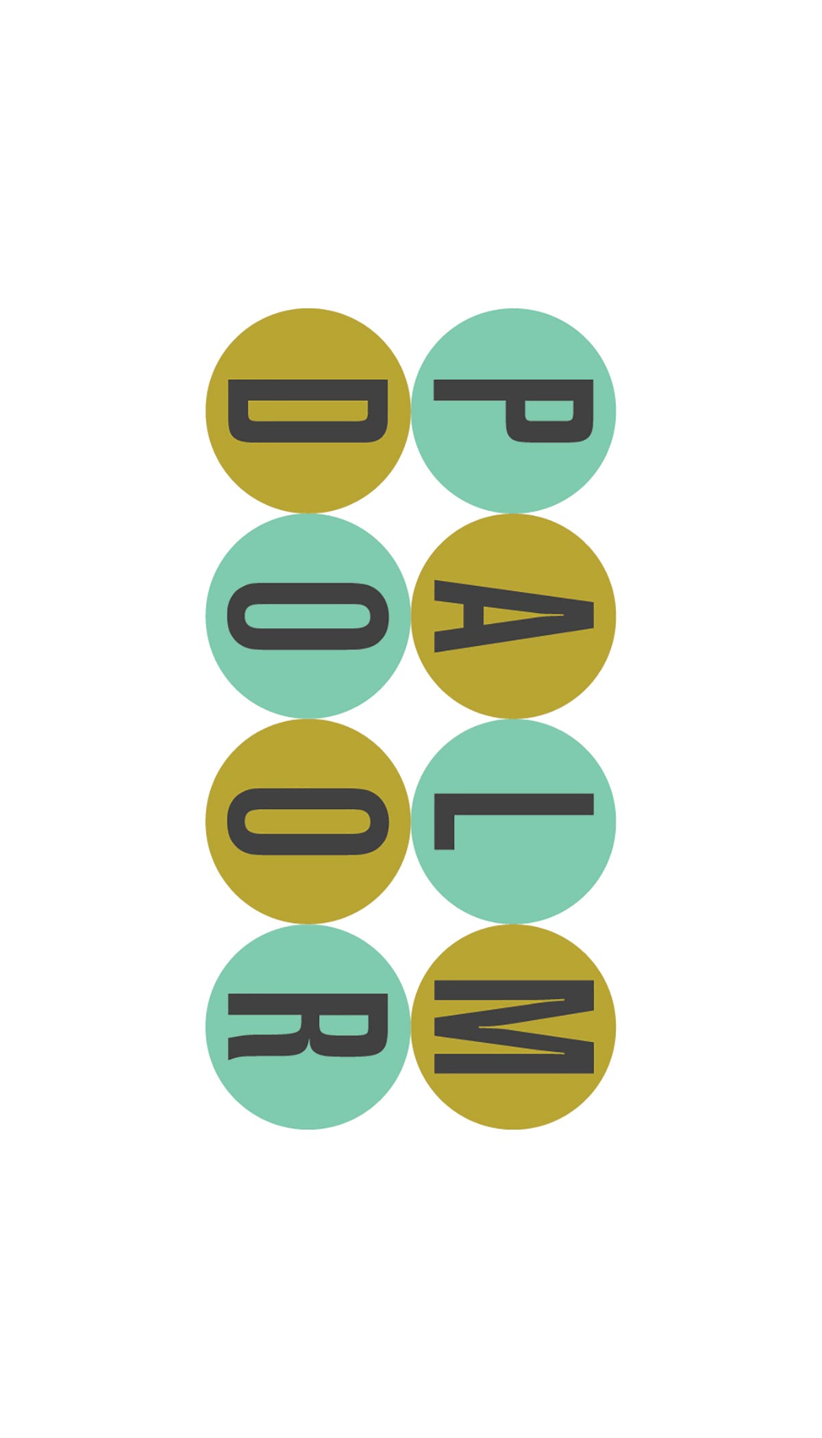
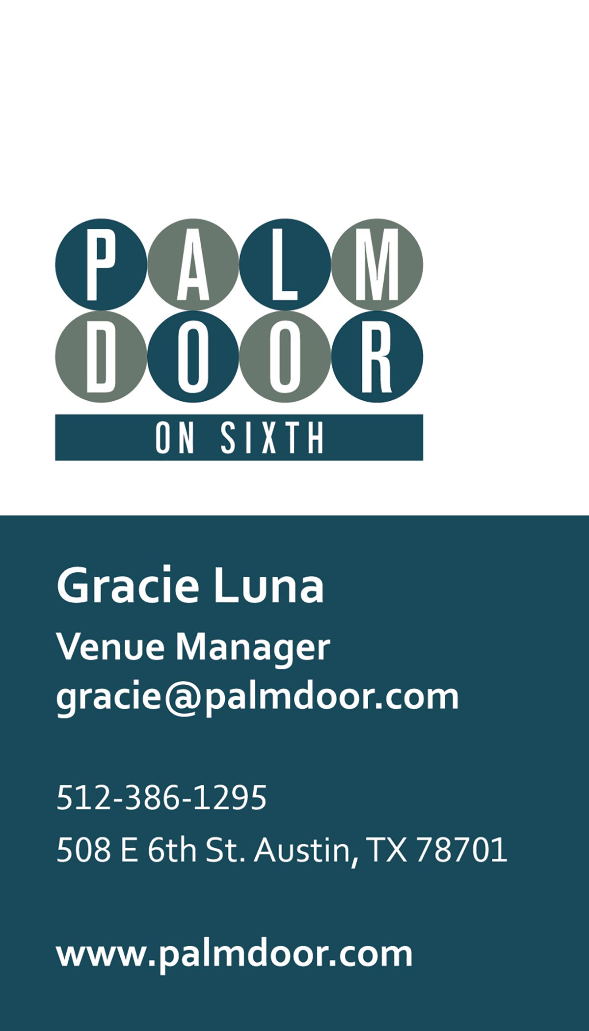
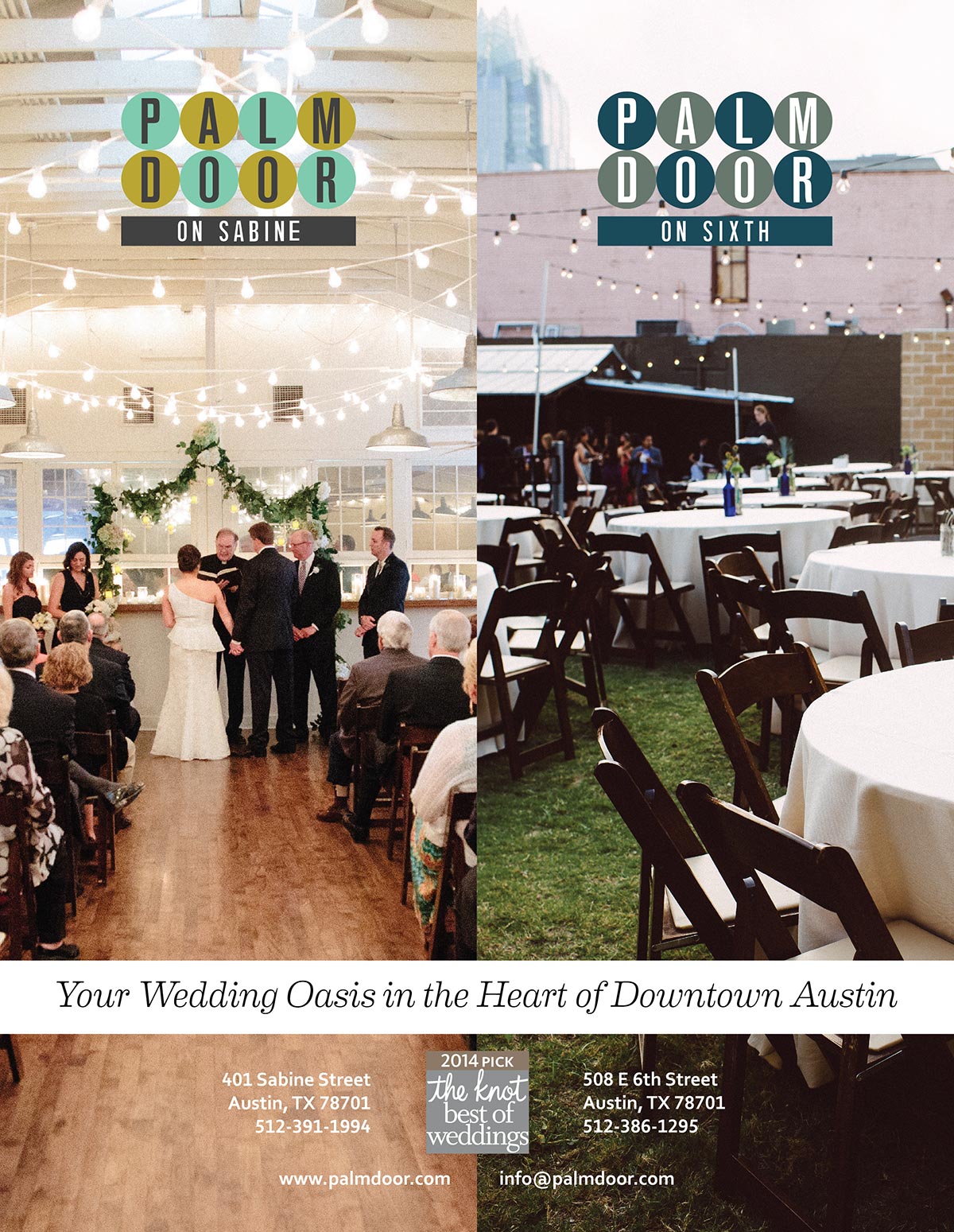
Each venue uses elements from the logo, like the spaces between the circles, to have a more unique identity. The Sabine venue caters more to weddings, while the Sixth is more about music.
Dual Ads
The two venues are often promoted simultaneously, giving way to a visual system that divides the space into two symmetrical halves—presenting their audience with a choice between two excellent venues.