Embrace Southeast Asia
The goals for redesigning the brand and environment for the 888 resturant were to: redefine identity a bring consistency, create authenticity for the restaurant through language, optimize take out, dine in, and buffet experience, update the exterior space to make better use of architecture, develop interior space to differentiate the restaurant, and retool the menu system.
Fortune in a Cohesive Identity
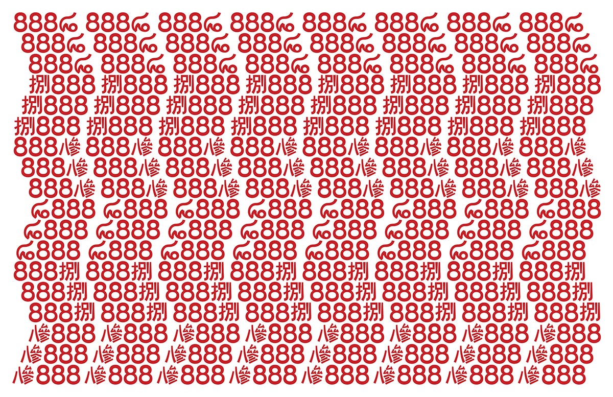
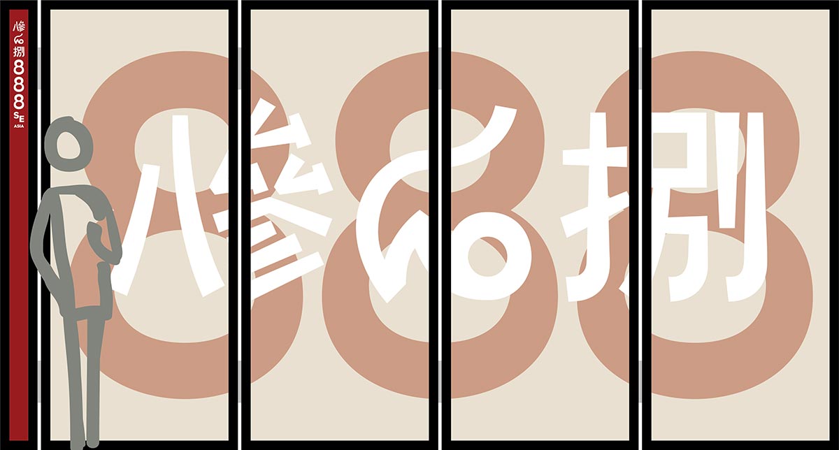
In Asian culture, 8 is the symbol of luck, abundance, prosperity, and opportunity. If 8 is lucky, then three 8s is even luckier. The new identity multiplies the fortune even more with adding the symbols for 8 in traditional Chũ Nôm for Vietnam, Thai, and Mandarin for China. This also makes the restaurant feel more authentic.
While the characters are based on traditional calligraphic characters, the logo updates them with a more modern sans serif styling in order to better match the modern environment of the E. Oltorf shopping center. Many Asian languages can traditionally be written either vertically or horizontally, which has been incorporated into the variations of the logo. The horizontal and vertical versions work well for the awnings on the building or vertical elements like columns and walls.
The color and type strategy come from woodblock prints from China and Dong Ho painting from Vietnam. The type choices have slight tapers and geometric forms that pair well with the modern serif versions of the traditional characters from the logo.

Floor Plan
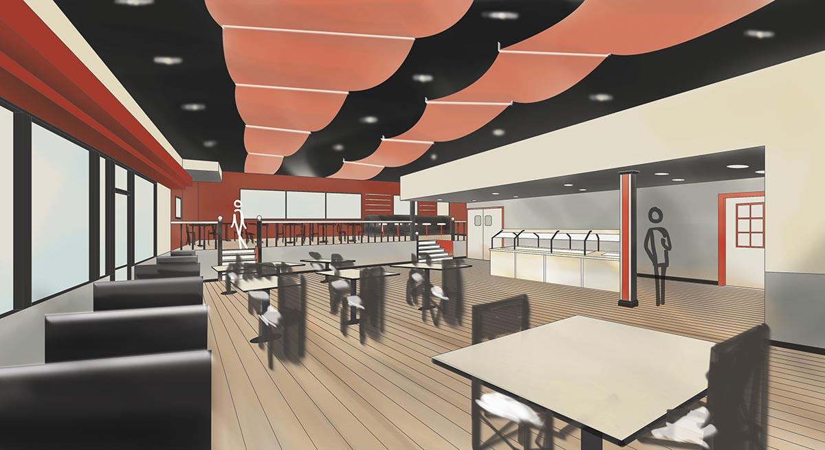
The floor plan shows the position of the new interior and exterior elements. Changes include moving the bar to the upper level and placing the buffet closer to the kitchen, where there is more storage space for plates. This will open up more space in the dining area that will reduce clutter and allow for more spacious table configurations.
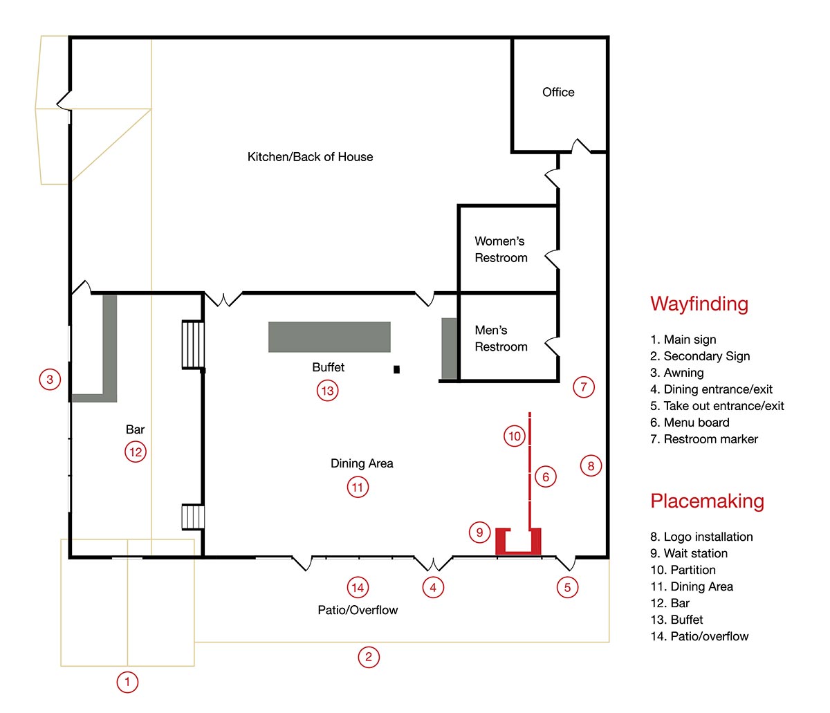
The main space of the restaurant has booths, tables, and bar seating. The buffet is now out of the normal pathway making it easier to navigate during non-buffet hours as well as being closer to the kitchen for prep. The open format allows for greater space around tables. Smaller tables and chairs are used to seat more two-person parties.
Better Use of Space
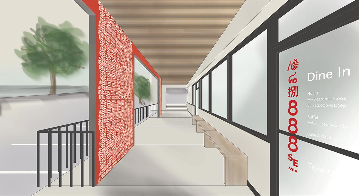
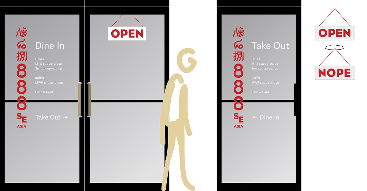
A partition with four panels will help to keep the dine in section of the restaurant semi-separate from the side dealing with take out. This new system will utilize two entrances instead of just one, making it easier for customers to better navigate the space. The partition will also keep those dining in from being disturbed by those ordering or waiting for take out. A recess in the wall now houses a three-dimensional logo instead of a television.
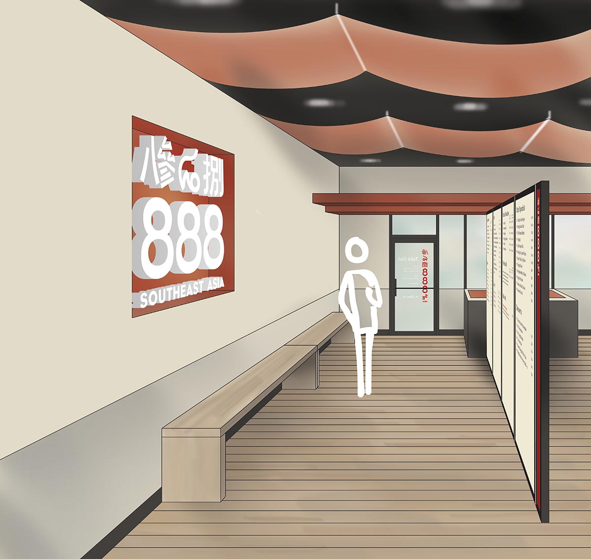
Connected to the menu board is a wait station, where a greeter will sit. The wait station will be out of the way of the door space opening up the area by the door to eliminate crowding while people are being seated. The station also functions as the point of sale for take out orders and can be operated by a single person, since it lies between both entrances.
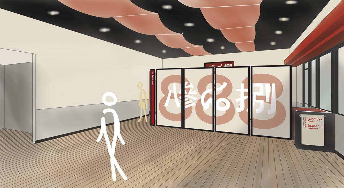
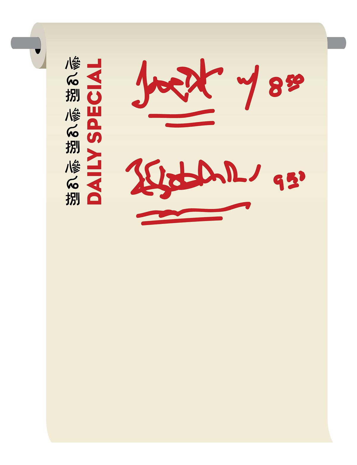
The wait station houses a paper roll with the daily specials right when someone enters the restaurant. It can be cut and rewritten each day.
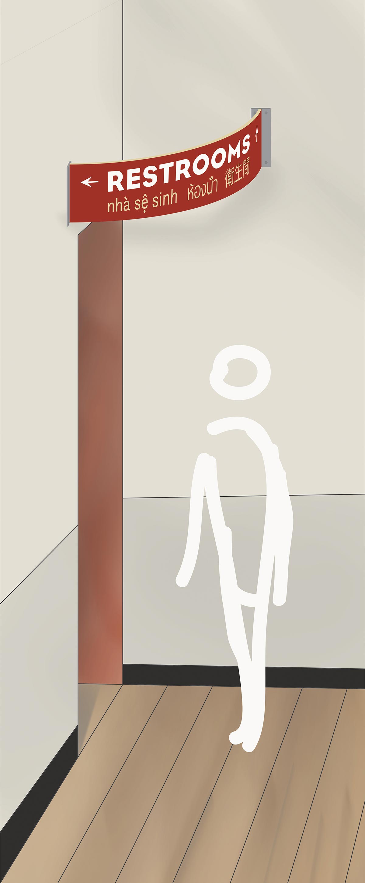
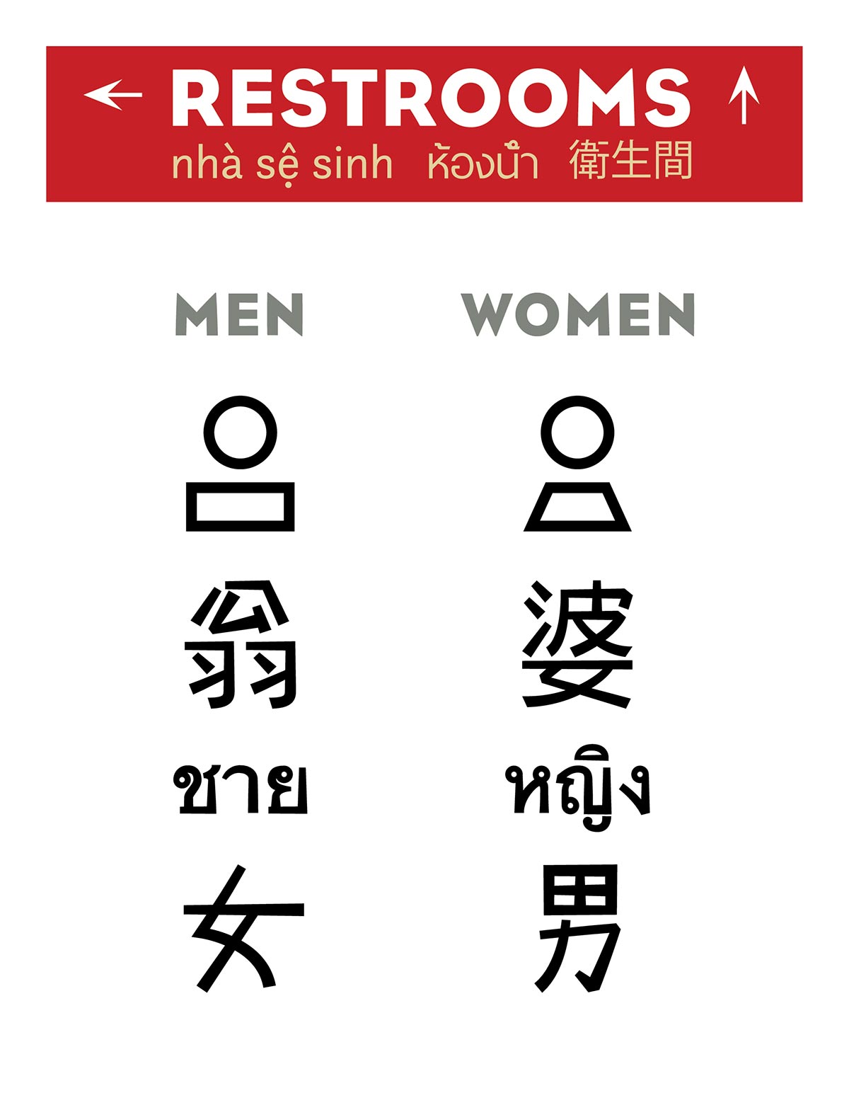
Restroom Signage
The main restroom sign curves above the doorway in order to be visible to people in the dine in area as well as those who come in for take out. The arrows point the appropriate direction depending on the viewer’s vantage point in the room.
The restroom door symbols have been designed to represent each language using the symbol for male and female to further enforce the authenticity of the restaurant. The top is a stylized pictograph of a man and a woman for anyone unfamiliar with Vietnamese, Thai, or Mandarin.
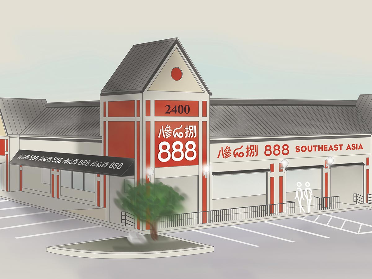
Exterior Signage
The new signage uses affordable materials and helps to establish the various form of the logo from the first impression of the exterior. The signs are less cluttered and are harmonious with architectural elements.
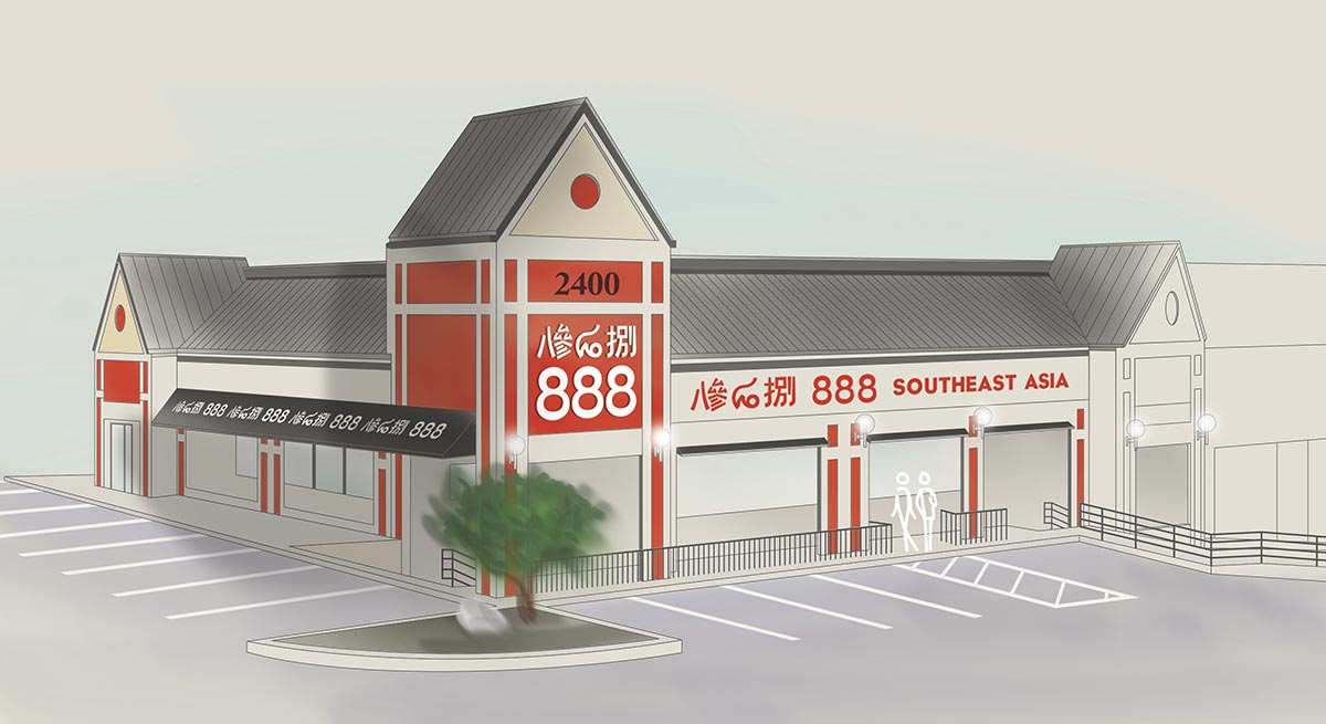
The main door is now dedicated to people dining in the restaurant while the door to the right will be for customers picking up or ordering take out. The arrows at the bottom guide people to use the correct entrance.
Entrance and Patio
The patio section has benches to make waiting for a table more comfortable on busy nights. The wooden ceiling matches interior floors and the walls have a pattern as a surprise reveal visible from inside.